Logo Contest Voting!

51 views
Skip to first unread message

Nisha Thompson

unread,
May 15, 2014, 2:03:55 AM5/15/14
to datameet
Hey Everyone!

Before March's Open Data Camp we wanted a DataMeet logo and had asked people to contribute some design ideas.

We were expecting maybe 1 or 2 ideas that we would adapt.  But were overwhelmed by how awesome everyone on this list is and received almost 15 or so design ideas!

We really couldn't decide which to pick.  We narrowed it down to 9 of the best designed ones and are putting it up to the group to decide.

We want to keep the logo decision to people on this group. So this is how this going to work.

1) Check out the logos at this link: http://datameet.org/wiki/logocontest
2) Pick the logo you like
3) Each logo has a corresponding number to left of it.  
4) Reply to this thread with the number of the logo. 

The logo with the most votes wins.  We won't count any votes that are not replies to this thread. 

The contest will close on the 20th of May. 

Thank you to the designers! Special shoutout to Anand Doshi for designing so many!

We don't have a prize for the designer yet but we will think one up. 

We might edit the final logo slightly, but will keep the integrity of the overall design.

Nisha and Thej


--
Nisha Thompson
DataMeet.org
skype: nishaqt
mobile: 962-061-2245


Thejesh GN

unread,
May 15, 2014, 2:07:06 AM5/15/14
to data...@googlegroups.com
My vote for 2 and 6


Thej
--
Thejesh GN  ತೇಜೇಶ್ ಜಿ.ಎನ್
http://thejeshgn.com
GPG ID :  0xBFFC8DD3C06DD6B0


--
Datameet is a community of Data Science enthusiasts in India. Know more about us by visiting http://datameet.org
---
You received this message because you are subscribed to the Google Groups "datameet" group.
To unsubscribe from this group and stop receiving emails from it, send an email to datameet+u...@googlegroups.com.
For more options, visit https://groups.google.com/d/optout.

Gautam John

unread,
May 15, 2014, 2:19:38 AM5/15/14
to datameet
5 and 6.

Johnson Chetty

unread,
May 15, 2014, 2:19:39 AM5/15/14
to data...@googlegroups.com
On 15 May 2014 11:37, Thejesh GN <i...@thejeshgn.com> wrote:
My vote for 2 and 6

This could be done nicely as options in a poll?
But I think you would have thought about that. :)
 
I like 6.. :)


--
Regards,
Johnson Chetty


Anand Doshi

unread,
May 15, 2014, 2:22:07 AM5/15/14
to data...@googlegroups.com

Thanks Nisha and Thej :D

I’ve used Pixelmator to make these, but it can export to photoshop too. Let me know if and when you need the files.


Thanks,
Anand Doshi.

Ashish Pandey

unread,
May 15, 2014, 2:25:55 AM5/15/14
to data...@googlegroups.com
5 & 6

Sajjad Anwar

unread,
May 15, 2014, 2:29:30 AM5/15/14
to data...@googlegroups.com
6.
--
Sajjad Anwar http://geohacker.in

Nagarajan M

unread,
May 15, 2014, 2:45:00 AM5/15/14
to data...@googlegroups.com

7

Nagarajan M

unread,
May 15, 2014, 2:46:23 AM5/15/14
to data...@googlegroups.com

Sorry I misread the no. It is 6.

On 15 May 2014 11:34, "Nisha Thompson" <ni...@datameet.org> wrote:

Chaitanya Sagar

unread,
May 15, 2014, 2:46:22 AM5/15/14
to data...@googlegroups.com
My vote to 6


Best,

Chaitanya Sagar


Vaishnavi Jayakumar (Inclusive India)

unread,
May 15, 2014, 2:52:59 AM5/15/14
to datameet
9. Hilarious! Needs datameet written underneath somewhere while people puzzle it out! I get the pink-blue but perhaps a more attractive shade of pink and blue may help overall attractiveness. Or use more quirky colours.

5. If it can be made less broad. Captures spirit of datameet perfectly!

Other stuff was very attractive but I guess I'm big on reading meanings into things ;-)


---------------------------------------
VAISHNAVI JAYAKUMAR
http://about.me/vjayakumar


On Thu, May 15, 2014 at 11:33 AM, Nisha Thompson <ni...@datameet.org> wrote:

Sreenivas KN

unread,
May 15, 2014, 3:04:39 AM5/15/14
to data...@googlegroups.com
irrespective of which font/ design you might choose, also focus on the logo colour. pfa a quick snapshot of the colour emotion guide. there could be more on this subject which designers could also check before finalizing the logo.

if this group is about people and data... then the people part (any thing that connotes this) in the logo is missing

great work. hope this helps. cheers.
2013-01-20-Color_Emotion_Guide22.png

Devdatta Tengshe

unread,
May 15, 2014, 4:19:12 AM5/15/14
to data...@googlegroups.com
My vote for 5

Guneet Narula

unread,
May 15, 2014, 5:05:23 AM5/15/14
to data...@googlegroups.com
6 & 8

- Guneet

Sabarish, KSITM

unread,
May 15, 2014, 5:09:23 AM5/15/14
to data...@googlegroups.com
my vote for 6

Vikram Kamath

unread,
May 15, 2014, 5:21:14 AM5/15/14
to data...@googlegroups.com
6 and 9

satyaakam goswami

unread,
May 15, 2014, 5:59:32 AM5/15/14
to data...@googlegroups.com
Thank you to the designers! Special shoutout to Anand Doshi for designing so many!

We don't have a prize for the designer yet but we will think one up. 

We might edit the final logo slightly, but will keep the integrity of the overall design.

​My vote is for Number 6 with slight modification of making it bold.​

Prathamesh Murkute

unread,
May 15, 2014, 9:41:04 AM5/15/14
to data...@googlegroups.com
mine for 9!

Neependra Khare

unread,
May 15, 2014, 10:31:39 AM5/15/14
to data...@googlegroups.com

Thanks


--
Datameet is a community of Data Science enthusiasts in India. Know more about us by visiting http://datameet.org
---
You received this message because you are subscribed to the Google Groups "datameet" group.
To unsubscribe from this group and stop receiving emails from it, send an email to datameet+u...@googlegroups.com.
For more options, visit https://groups.google.com/d/optout.


--
Regards,
Neependra
www.neependra.net

Nisha Thompson

unread,
May 15, 2014, 10:58:24 PM5/15/14
to datameet
i like 3!

and 6
Nisha Thompson
Mobile: 962-061-2245

Gora Mohanty

unread,
May 16, 2014, 4:14:34 AM5/16/14
to data...@googlegroups.com
Hi,

Good job, but almost all seem to have the word "Datameet" in them, IMHO, this does not scale well to when the logo size becomes small.

I vote for 8.

Regards,
Gora

mithila murada

unread,
May 16, 2014, 6:13:20 AM5/16/14
to data...@googlegroups.com
A big shout out to the designers! I see that #6 seems to be a hit amongst the members. I personally like #8 its quite neat and communicates the brand precisely with less fanciness around. 


On Thu, May 15, 2014 at 11:33 AM, Nisha Thompson <ni...@datameet.org> wrote:

Rasagy

unread,
May 16, 2014, 7:38:04 AM5/16/14
to data...@googlegroups.com
My vote also for 6. I would love to see it in two variants: As a wordmark (the original) and as an icon (Something like {D})

Nice ideas btw! :)
--
Rasagy Sharma
UX Design Intern, 
Microsoft IDC

On Thursday, May 15, 2014 11:33:55 AM UTC+5:30, Nisha Thompson wrote:

Shanmugam Murugesan

unread,
May 17, 2014, 12:58:36 AM5/17/14
to data...@googlegroups.com
I vote for 9.

Regards

Dr. Shanmugam M, PhD., PGDIM., PGDHRM
Scientist
PDP, Rajendranagar,
Hyderabad-500 030, India.
Office:040-24017000
Cell: +91-9866429568

Sridhar Gutam

unread,
May 17, 2014, 1:11:48 AM5/17/14
to data...@googlegroups.com
My Vote is for No. 2.

Sridhar

Sridhar Gutam, PhD, ARS
Senior Scientist (Plant Physiology)
ICAR Research Centre for Eastern Region
ICAR Parisar, Bihar Veterinary College Post, Patna 800014
Phone: +91-612-2228805, 2228882, 2223962; Fax: +91-612-2223956
Mobile:+91-9005760036/8005346136
Publications: http://works.bepress.com/sridhar_gutam/


rushabh

unread,
May 17, 2014, 1:26:17 AM5/17/14
to data...@googlegroups.com, jayakumar...@gmail.com, vaishnavi...@inclusiveindia.info
> 9. Hilarious! Needs datameet written underneath somewhere while people puzzle it out! I get the pink-blue but perhaps a more attractive shade of pink and blue may help overall attractiveness. Or use more quirky colours.

Glad you liked it :). The hidden message makes it a bit delightful. I agree about the colours though.


Ganes Kesari

unread,
May 17, 2014, 2:09:00 AM5/17/14
to data...@googlegroups.com
My vote is for #2.

Best Regards,
Ganes.

Pratap Vardhan

unread,
May 17, 2014, 7:08:56 AM5/17/14
to data...@googlegroups.com
6 and then 2

Regards
Pratap Vardhan

Vijayaraghavan R

unread,
May 18, 2014, 8:42:28 AM5/18/14
to data...@googlegroups.com
I'll go for 6 and 8.

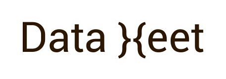
I don't understand why one needs a bar graph in the logo. The words 'data' and 'meet' are enough to set the context. I think the logo should be easy to understand. We are here to un-complicate data, why then complicate the logo.

Vijay

Raman Chima

unread,
May 19, 2014, 2:12:13 PM5/19/14
to data...@googlegroups.com
6 and then 2.


Saket Bisani

unread,
May 19, 2014, 2:27:49 PM5/19/14
to data...@googlegroups.com

8

On May 15, 2014 11:34 AM, "Nisha Thompson" <ni...@datameet.org> wrote:
Hey Everyone!

Before March's Open Data Camp we wanted a DataMeet logo and had asked people to contribute some design ideas.

We were expecting maybe 1 or 2 ideas that we would adapt.  But were overwhelmed by how awesome everyone on this list is and received almost 15 or so design ideas!

We really couldn't decide which to pick.  We narrowed it down to 9 of the best designed ones and are putting it up to the group to decide.

We want to keep the logo decision to people on this group. So this is how this going to work.

1) Check out the logos at this link: http://datameet.org/wiki/logocontest
2) Pick the logo you like
3) Each logo has a corresponding number to left of it.  
4) Reply to this thread with the number of the logo. 

The logo with the most votes wins.  We won't count any votes that are not replies to this thread. 

The contest will close on the 20th of May. 

Thank you to the designers! Special shoutout to Anand Doshi for designing so many!

We don't have a prize for the designer yet but we will think one up. 

We might edit the final logo slightly, but will keep the integrity of the overall design.

Nisha and Thej


--
Nisha Thompson
DataMeet.org
skype: nishaqt
mobile: 962-061-2245


Vipul Kumar

unread,
May 20, 2014, 8:31:41 AM5/20/14
to data...@googlegroups.com
8

Vijay Mhaskar

unread,
May 20, 2014, 8:36:09 AM5/20/14
to data...@googlegroups.com
6
Vijay Shivaji Mhaskar
Pune, India
+919960072012

Ma-roof M

unread,
May 20, 2014, 2:21:46 PM5/20/14
to data...@googlegroups.com

Hi,

My vote for 6.

Given a choice, I would change it slightly to have the braces face each other, which would resemble two faces facing each other. Somewhat like the quick dirty mockup attached. Combined with the document D from the logo in 6, D}{ could also make us a good favicon. Something similar is used by superuser.com. Would be easy for quick uses too as it can be formed vt just text. My 2 paise :-).

Kind regards
Mahroof

Screenshots_2014-05-20-23-31-00.png
Reply all
Reply to author
Forward
0 new messages