Stacked bar charts with negative values
5 724 просмотра
Перейти к первому непрочитанному сообщению

Gianluca Bisceglie
22 июн. 2012 г., 10:17:2722.06.2012
– d3...@googlegroups.com
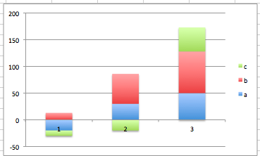
Hi Guys,
All the examples I found cover stacked bars with only positive values.
None covers stacked negative values (Excel example below):
Thanks,
Gian

Frank Guerino
22 июн. 2012 г., 10:29:0722.06.2012
– d3...@googlegroups.com
Hi Gianluca,
I don't know if it helps but this example shows how to address both "Top Down (Negative Values) and Bottom Up (Positive Values) Stacked Bar Charts".
It doesn't address text legends for each axis but does show how to deal with negative vs. positive stacked bar layouts. I hope it helps.
My Best,
Frank

Ziggy Jonsson
22 июн. 2012 г., 17:36:4722.06.2012
– d3...@googlegroups.com
Here is a quick hack that might help. The input d needs to be an array of series. Each element in each series needs to be an object with at least a property "y" describing the value. The routine adds two properties to each element: y0 = the top of each rectangle and size = the height of each rectangle
Example: http://bl.ocks.org/2975320
function barStack(d) {
var l = d[0].length
while (l--) {
var posBase = 0, negBase = 0;
d.forEach(function(d) {
d=d[l]
d.size = Math.abs(d.y)
if (d.y<0) {
d.y0 = negBase
negBase-=d.size
} else
{
d.y0 = posBase = posBase + d.size
}
})
}
return data
}
The extent (min/max) can be calculated after stacking as:
d3.extent(d3.merge(d3.merge(data.map(function(e) { return e.map(function(f) { return [f.y0,f.y0-f.size]})}))))

Miles McCrocklin
22 июн. 2012 г., 18:50:0322.06.2012
– d3...@googlegroups.com
Can someone explain the visual benefits of using negative stacked bar charts.
I don't really understand how this helps the users interpretation of the data.

Ger Hobbelt
22 июн. 2012 г., 19:17:3022.06.2012
– d3...@googlegroups.com
On Sat, Jun 23, 2012 at 12:50 AM, Miles McCrocklin <miles.mc...@gmail.com> wrote:
Can someone explain the visual benefits of using negative stacked bar charts.I don't really understand how this helps the users interpretation of the data.
Of course, other graphs can be used for this scenario, but if you want it in a bar chart and the sums are important...
Met vriendelijke groeten / Best regards,
Ger Hobbelt
--------------------------------------------------
web: http://www.hobbelt.com/
http://www.hebbut.net/
mail: g...@hobbelt.com
mobile: +31-6-11 120 978
--------------------------------------------------
Gianluca Bisceglie
23 июн. 2012 г., 12:43:3223.06.2012
– d3...@googlegroups.com
Hi Ziggy,

thanks for this great example. To make you proud, see below the nice result I get by applying your code. :-)
I use the code below to toggle between a vertical and horizontal bar representation.
function redraw() {var rects = svg.selectAll(".series").data(chartData).enter().append("g").classed("series",true).style("fill", function(d,i) { return color(i)}).selectAll("rect").data(Object).enter().append("rect");rects.attr("x",function(d,i) { return isVerticalChart ? x(i): x(d.y0); }).attr("y",function(d,i) { return isVerticalChart ? y(d.y0) : y(i);}).attr("width", function(d,i) { return isVerticalChart ? x.rangeBand() : (x(d.size)-x(0)); }).attr("height",function(d,i) { return isVerticalChart ? (y(0)-y(d.size)) : y.rangeBand(); })svg.selectAll(".series").data(chartData).exit().style("fill-opacity", 0).remove();}
And I generate domain and range this way:
function generateRange() {
if (isVerticalChart) {
x = d3.scale.ordinal()
.domain(d3.range(chartData[0].length))
.rangeRoundBands([0,width], .1);
y = d3.scale.linear()
.domain([returnDomain().min, returnDomain().max])
.range([height, 0])
.nice();
} else {
x = d3.scale.linear()
.domain([returnDomain().min, returnDomain().max]) //symmetric
.range([0, width])
.nice();
y = d3.scale.ordinal()
.domain(d3.range(chartData[0].length))
.rangeRoundBands([height,0], .1);
}
}
function returnDomain () {
var domain = {};
domain.min = Math.min(d3.min(chartData.extent),0);
domain.max = Math.max(d3.max(chartData.extent),0);
return domain;
}
However applying it to your solution I get this result for the same dataset that displayed the chart above.
I tried hard but could not figure out how to modify my code to work with the data structure generated by your barStack function. Can you see any obvious mistake in what I do above?
Many thanks,
Gian
Ziggy Jonsson
23 июн. 2012 г., 17:13:4423.06.2012
– d3...@googlegroups.com
My first thought is deducting the "size" from "y0" when you switch the axis around
i.e.: .attr("x",function(d,i) { return isVerticalChart ? x(i): x(d.y0-d.size); })
Keep in mind that in the original layout the "y0" referred to the "top left" of each rectangle.
In the new layout, "y0" is referring to the "top right" and by deducting "size" you get back top "top left" (the 'x' attribute of the rect)
See also here:
Gianluca Bisceglie
25 июн. 2012 г., 09:14:3325.06.2012
– d3...@googlegroups.com
Thanks again Ziggy!
It works if I do not add or remove new series.
For testing, when I click on a bar, I randomly generate the number of series and the points for each series.
The axes change correctly but the bars have strange behaviour.
Is this correct?
svg.selectAll(".series rect").data(Object)
.exit().remove();
Thanks,
Gianluca
P.S. Full redraw function with your solution
function redrawData() {
svg.selectAll(".series rect").data(Object)
.exit().remove();
svg.selectAll(".series rect")
.transition().duration(duration).delay(delay)
.attr("x",function(d,i) { return isVerticalChart ? x(i): x(d.y0-d.size); })
.attr("y",function(d,i) { return isVerticalChart ? y(d.y0) : y(i);})
.attr("width", function(d,i) { return isVerticalChart ? x.rangeBand() : (x(d.size)-x(0)); })
.attr("height",function(d,i) { return isVerticalChart ? (y(0)-y(d.size)) : y.rangeBand(); })
svg.selectAll(".series rect")
.on('click', function() {
generateData();
generateRange();
redrawData();redrawAxes();
});
}
Ziggy Jonsson
25 июн. 2012 г., 17:45:3025.06.2012
– d3...@googlegroups.com
I think this is a data-join issue and/or potentially not re-stacking before redraw.
With new data you would essentially need to:
(a) restack (i.e. run barStack again on the new data)
(b) exit the exiting nodes
(c) enter the new nodes
(d) reposition all nodes
In the example above I don't see how you generate your new data, but I suspect on of the actions listed above might be missing.
In case you haven't already, there are really good tutorials and references on the data/enter/exit join-methodology on the d3js.org.
If you get completely stuck, just post your example in full on bl.ocks/jsfiddle/tinkerbin
Miles McCrocklin
25 июн. 2012 г., 18:22:5425.06.2012
– d3...@googlegroups.com
Hey Ger,
Thanks a lot of explaining why this is useful, it makes sense now.
The main thing that concerned me about negative values in a stacked bar chart is you lost the ability to compare two totaled values (the entire height of each stacked bar) easily. I thought about it and looking at the examples everyone is describing and I like the idea.
That being said though, I still feel that the visuals people are recommending here make it difficult to show the total comparison between stacks. While I'm unsure if this is the best design, I decided to try making the axis in between the positive and negative sections of the chart white, or rather the background color. It made the graph easier to analyze personally and maintained the use cases of positive only stacked bar charts.
Here's the example: http://bl.ocks.org/2991587
Any thoughts?
Cheers,
Miles
Ger Hobbelt
26 июн. 2012 г., 20:59:1926.06.2012
– d3...@googlegroups.com
Miles,
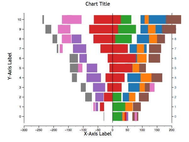
See http://bl.ocks.org/2997144 which is a derivative of your gist (thanks for that!). Definitely a WIP as the blurb is there before the implementation is done, but it's way past bedtime and what /is/ working is the 'sum' display I can see happening in pos+neg stacked bar charts: that is the sum of all the actual values (a.k.a. consolidated bottom line P/L), here plotted as a line, green for gain (profit), red for loss.
I hope the README.md that goes with it is clear on the train of thought: basic point is that there's no use case for the need to compare total bar heights (as in total height of pos+neg bar with the next couple); at least I can't, with a bit of brainstorming here, come up with any scenario that'll pass even the flimsiest reality check.
There /are/ scenarios that get close, but that's just bits of pencil on a napkin and the last part of the README blurb there; I still need to build that one as a working d3 chart. I know how it'll look -- brain already renders an image -- but now I need the time&effort to code it. I'm slow. Grmbl.
OT: Implicit (secondary) point of the blurb in that gist: think through what your chart users will be asking and want quick answers for; you might want to try and explore chart types that are not one-click out of the Excel box, when those might answer the envisioned/expected questions better/faster.
OT #2: I just /had/ to scratch my semicolon itch. I could yabber about Crockford and all that, but that would just be corroborating my feelings there.
Met vriendelijke groeten / Best regards,
Ger Hobbelt
--------------------------------------------------
web: http://www.hobbelt.com/
http://www.hebbut.net/
mail: g...@hobbelt.com
mobile: +31-6-11 120 978
--------------------------------------------------
Gianluca Bisceglie
26 июн. 2012 г., 23:14:2326.06.2012
– d3...@googlegroups.com
Hi Ziggy,
I have followed your points and added my components (clearly marked with //GIAN so you can see them easily) to your bl.ocks example here: http://jsfiddle.net/gibito/7Y7hY/3/
You can see the way I generate and update data. I must make some conceptual error in exiting nodes. I have tried a lot of possible combinations like:
1) svg.selectAll(".series rect").data(chartData).selectAll("rect").data(Object).exit().remove();
2) svg.selectAll(".series rect").data(data).exit().remove();
3) svg.selectAll(".series rect").data(Object).exit().remove();
4) svg.selectAll(".series").data(data).exit().remove();
5) svg.selectAll("rect").data(Object).exit().remove();
etc.
I don't know why, but when I comment out your hardcoded data and replace them with my randomly generated ones I don't see anything in jsfiddle whereas it works for me locally.
Thanks,
Gian
Ziggy Jonsson
27 июн. 2012 г., 14:06:5827.06.2012
– d3...@googlegroups.com
You might want use a debugger and go through the code step by step. I think some of the issues you are facing are not necessarily d3 related.
Examples:
(a) defining variable "data" and then applying variable "chartData",
(b) x.scale domain defined using
data[0].length before "data" is defined,.... etc
(c) You seem to be randomizing the x variables, but keep in mind that in a stack you need the same x values for each of the series (the y can be zero where applicable)
Good luck

O
22 мар. 2013 г., 20:59:4622.03.2013
– d3...@googlegroups.com
Hi,
What a great example! I've been working off of it for some charts of my own and realized it's getting stuck on the word 'extent' with d3.v3
Is there an easy fix for this? Has anyone updated this example for the new d3?
Thanks
.o.
O
22 мар. 2013 г., 21:15:1022.03.2013
– d3...@googlegroups.com
Sorry it's not a version thing, it's another error. working on it.

Lingxiao Xu
7 июн. 2013 г., 09:48:3207.06.2013
– d3...@googlegroups.com, gianluca....@googlemail.com
Hi, it is great to see your posts and these are very helpful to my project. Do you mind that I take a look at your code? I don't need to make any change of directions in this situation, just want to see how did you make the stacked bar chart with negative values. Thanks.

Noah Hall
10 окт. 2015 г., 00:48:3910.10.2015
– d3-js, gianluca....@googlemail.com
how would we position negative values on this example?
Ответить всем
Отправить сообщение автору
Переслать
0 новых сообщений