Complex Donut Chart Design: Unsure where to start.
357 views
Skip to first unread message

jab...@massart.edu
Mar 16, 2018, 9:10:45 AM3/16/18
to d3-js
Hey Guys,
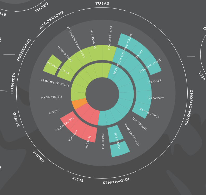
I'm a Graphic designer and D3 newbie trying to create a data visualization I designed some months ago. I'm starting to get a hang of the basics and have been looking around through the thousands of examples online but I can't seem to find anywhere that is a good starting point for creating something that looks like a good starting point.
I've attached an image of it to this post, but I'll insert one below as well.
The closest things I've found are:
this Aster plot | http://bl.ocks.org/dmaulana/937cf99089ae5933b880fa68e2f9b6aa
this Donut chart | https://stackoverflow.com/questions/17507728/d3-js-donut-charts-with-multiple-rings
The Aster Plot doesnt have the divisions between "rows" and the Donut chart doesn's allow me to build the arcs out from the center. So as far as I can tell I would need to duplicate and rig my data to match it. After a solid week of digging around, I think it's time to ask the experts. So, where is the best place for me to start here? Are there any layout tricks that would help me to get this effect?
Note: I am only looking to measure values between 1-4 with the concentric rings.


Erik Stel
Mar 16, 2018, 10:44:12 AM3/16/18
to d3-js
Hi,
You should probably check out https://github.com/d3/d3-shape to get some explanation about d3-arc. These can have an inner and an outer radius. If you have split your data (or can split your data) in 'rows', each 'row' can be drawn using the same pattern as the Aster Plot example. (You just add a number of Aster Plots on top of each other.) All rows have a fixed inner and outer radius (in the image you provided). The width of the arc-segments should be in your data. You might need to 'normalise' this to percentages of the total 'row'-value to allow easy creation of the arc segments.
Does this help? If not, please provide some more info and/or example data.
Kind regards,
Erik
Erik Stel
Mar 16, 2018, 12:14:12 PM3/16/18
to d3-js
Hi,
I tried something on ObservableHQ. Maybe this helps. Check out the pieces of code by clicking on the ">" sign on the left of the blocks. The example does not cover having the same size shapes as your image example by leaving out certain parts. You have to make the data fit this requirement.
Hope this helps,

Frank Guerino
Mar 21, 2018, 10:16:55 AM3/21/18
to d3...@googlegroups.com
Hi,
If you haven't done so already, I recommend taking a look at the D3 Examples Gallery. Specifically, I suggest you take a look at Sunburst examples...
If you haven't done so already, I recommend taking a look at the D3 Examples Gallery. Specifically, I suggest you take a look at Sunburst examples...
I believe the "Sequences Sunburst" will help you learn the most about these types of plots.
I hope this helps.
Frank
--
You received this message because you are subscribed to the Google Groups "d3-js" group.
To unsubscribe from this group and stop receiving emails from it, send an email to d3-js+unsubscribe@googlegroups.com.
For more options, visit https://groups.google.com/d/optout.
Erik Stel
Apr 5, 2018, 3:02:23 AM4/5/18
to d3-js
Hi Jordan and anyone interested,
Based on some example data from Jordan I created an SVG version of the given design. I tried to comment to code enough for people to use or adapt this. If you have any questions, do not hesitate to ask!
You can see the code here: https://bl.ocks.org/ErikOnBike/b542468559630c116e44a3578d9660d9
Cheers,
Erik

Timothy Gregory
Jun 3, 2018, 12:42:34 AM6/3/18
to d3-js
hi Erik
hey well done you've put in a good effort to produce this d3 chart.
this is a good way to represent the data with a clear balanced look although some of the labels are upside down naturally.
it was good of @Guerino1 to suggest you could perhaps adapt code from d3 Sunburst chart.
because it would be great if your Donut chart could expand and collapse the segments.
say if you had a few dozen instruments in an Orchestra then your initial chart acts as the 'Contents' page.
and then clicking the 'Strings' or 'Drum' wedge or any segment can expand to show all the instruments in that section of the Orchestra.
Sunburst does this and allows you to drill down in the chart when you click any segment.
and it has 'alt tips' on hover that show the labels which don't fit on the smaller segments.
those might be some features from d3 Sunburst chart that you could possibly add to your d3 Donut chart in a future release.
Reply all
Reply to author
Forward
0 new messages