Generating graph with chartjs
296 views
Skip to first unread message

Paul Arsenio Blanco Reyes
Jun 8, 2019, 3:25:41 PM6/8/19
to web2py-users
Recently I found the theme "AdminLTE" (https://adminlte.io/themes/AdminLTE/index.html)
I have already implemented it in my application. I would like to generate some graphics like those that appear in the preview but I don't know how yo do it. Would any of you can help me with any example to understand how I can generate them. I will thank you infinitely.
I have already implemented it in my application. I would like to generate some graphics like those that appear in the preview but I don't know how yo do it. Would any of you can help me with any example to understand how I can generate them. I will thank you infinitely.

Massimo Di Pierro
Jun 8, 2019, 3:50:57 PM6/8/19
to web2py-users
Look into dashboard.js. It contains code like:
var line = new Morris.Line({
element : 'line-chart',
resize : true,
data : [
{ y: '2011 Q1', item1: 2666 },
{ y: '2011 Q2', item1: 2778 },
{ y: '2011 Q3', item1: 4912 },
{ y: '2011 Q4', item1: 3767 },
{ y: '2012 Q1', item1: 6810 },
{ y: '2012 Q2', item1: 5670 },
{ y: '2012 Q3', item1: 4820 },
{ y: '2012 Q4', item1: 15073 },
{ y: '2013 Q1', item1: 10687 },
{ y: '2013 Q2', item1: 8432 }
],
xkey : 'y',
ykeys : ['item1'],
labels : ['Item 1'],
lineColors : ['#efefef'],
lineWidth : 2,
hideHover : 'auto',
gridTextColor : '#fff',
gridStrokeWidth : 0.4,
pointSize : 4,
pointStrokeColors: ['#efefef'],
gridLineColor : '#efefef',
gridTextFamily : 'Open Sans',
gridTextSize : 10
});
What you have to do is replace input with something that you can pass from the server. There are many ways. I am going to suggestsimple solution without ajax which assume the html has been converted into a template
var line = new Morris.Line({
element : 'line-chart',
resize : true,
data : MY_DATA_1,
xkey : 'y',
ykeys : ['item1'],
labels : ['Item 1'],
lineColors : ['#efefef'],
lineWidth : 2,
hideHover : 'auto',
gridTextColor : '#fff',
gridStrokeWidth : 0.4,
pointSize : 4,
pointStrokeColors: ['#efefef'],
gridLineColor : '#efefef',
gridTextFamily : 'Open Sans',
gridTextSize : 10
});
Then in the controller that serves the page
def index():
data = [
{ y: '2011 Q1', item1: 2666 },
{ y: '2011 Q2', item1: 2778 },
{ y: '2011 Q3', item1: 4912 },
{ y: '2011 Q4', item1: 3767 },
{ y: '2012 Q1', item1: 6810 },
{ y: '2012 Q2', item1: 5670 },
{ y: '2012 Q3', item1: 4820 },
{ y: '2012 Q4', item1: 15073 },
{ y: '2013 Q1', item1: 10687 },
{ y: '2013 Q2', item1: 8432 }
]
return dict(mydata1 = data)
and in the template, before <script src="dashboad.js"/> you add
<script>{{=ASSIGNJS(MY_DATA_1 = mydata1)}}</script>
This was the data is defined in python, passed to the template, stored in a js variable, and made it visible to the dashboard.js code.

Christian Varas
Jun 9, 2019, 6:06:01 PM6/9/19
to web...@googlegroups.com
II have this site www.climbersoul.cl using AdminLTE, and I with graphics too.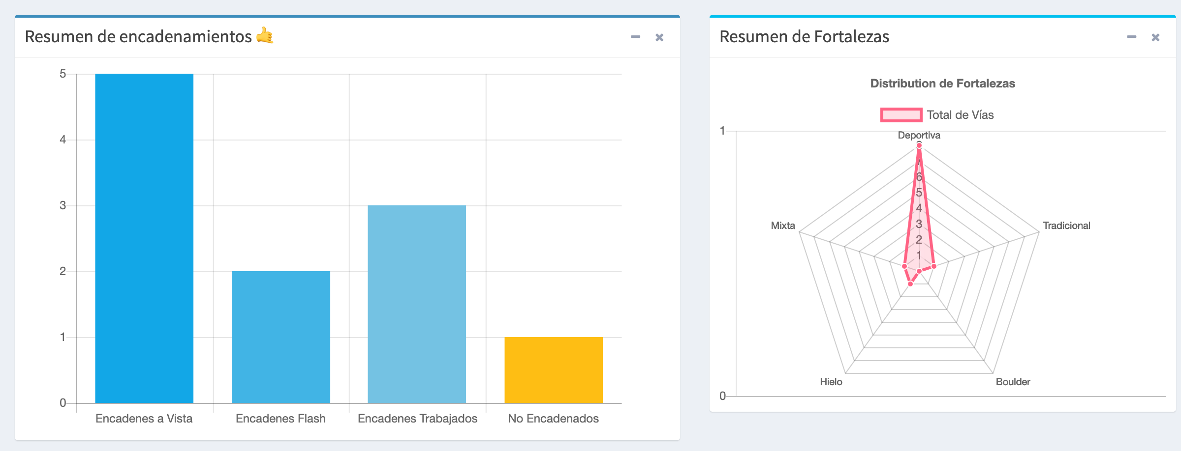
you need to include the libraries first:
This is the code for the bar chart, for other chart is similar, you just need to set the values in the array (are marked)
<div class="col-md-7">
<div class="box box-primary">
<div class="box-header with-border">
<h3 class="box-title">Resumen de encadenamientos 🤙</h3>
<div class="box-tools pull-right">
<button type="button" class="btn btn-box-tool" data-widget="collapse"><i class="fa fa-minus"></i>
</button>
<button type="button" class="btn btn-box-tool" data-widget="remove"><i class="fa fa-times"></i></button>
</div>
</div>
<div class="box-body chart-responsive">
<canvas id="bar-chart" width="800" height="450"></canvas>
</div>
<script>
// Bar chart
new Chart(document.getElementById("bar-chart"), {
type: 'bar',
data: {
labels: ["Encadenes a Vista", "Encadenes Flash", "Encadenes Trabajados", "No Encadenados"],
datasets: [
{
label: "Total de vías",
backgroundColor: ["#12A7E7", "#41B4E5","#74C2E3","#FEBE14"],
data: [{{=len(encadenadas_vista)}},{{=len(encadenadas_flash)}},{{=len(encadenadas_trabajado)}},{{=len(no_encadenadas)}}]
}
]
},
options: {
legend: { display: false },
scales: {
yAxes: [{
ticks: {
beginAtZero: true,
userCallback: function(label, index, labels) {
// when the floored value is the same as the value we have a whole number
if (Math.floor(label) === label) {
return label;
}
},
}
}],
},
title: {
display: false,
text: 'Resumen de Encadenamientos'
}
}
});
</script>
</div>
</div>
you need to include the libraries first:
<script src="https://www.chartjs.org/samples/latest/utils.js"></script>
<script src="https://cdnjs.cloudflare.com/ajax/libs/Chart.js/2.5.0/Chart.min.js"></script>
<script src="https://cdnjs.cloudflare.com/ajax/libs/Chart.js/2.5.0/Chart.min.js"></script>
This is the code for the bar chart, for other chart is similar, you just need to set the values in the array (are marked)
<div class="col-md-7">
<div class="box box-primary">
<div class="box-header with-border">
<h3 class="box-title">Resumen de encadenamientos 🤙</h3>
<div class="box-tools pull-right">
<button type="button" class="btn btn-box-tool" data-widget="collapse"><i class="fa fa-minus"></i>
</button>
<button type="button" class="btn btn-box-tool" data-widget="remove"><i class="fa fa-times"></i></button>
</div>
</div>
<div class="box-body chart-responsive">
<canvas id="bar-chart" width="800" height="450"></canvas>
</div>
<script>
// Bar chart
new Chart(document.getElementById("bar-chart"), {
type: 'bar',
data: {
labels: ["Encadenes a Vista", "Encadenes Flash", "Encadenes Trabajados", "No Encadenados"],
datasets: [
{
label: "Total de vías",
backgroundColor: ["#12A7E7", "#41B4E5","#74C2E3","#FEBE14"],
data: [{{=len(encadenadas_vista)}},{{=len(encadenadas_flash)}},{{=len(encadenadas_trabajado)}},{{=len(no_encadenadas)}}]
}
]
},
options: {
legend: { display: false },
scales: {
yAxes: [{
ticks: {
beginAtZero: true,
userCallback: function(label, index, labels) {
// when the floored value is the same as the value we have a whole number
if (Math.floor(label) === label) {
return label;
}
},
}
}],
},
title: {
display: false,
text: 'Resumen de Encadenamientos'
}
}
});
</script>
</div>
</div>
Cheers.
El sáb., 8 jun. 2019 a las 21:25, Paul Arsenio Blanco Reyes (<blanc...@gmail.com>) escribió:
Recently I found the theme "AdminLTE" (https://adminlte.io/themes/AdminLTE/index.html)
I have already implemented it in my application. I would like to generate some graphics like those that appear in the preview but I don't know how yo do it. Would any of you can help me with any example to understand how I can generate them. I will thank you infinitely.
--
Resources:
- http://web2py.com
- http://web2py.com/book (Documentation)
- http://github.com/web2py/web2py (Source code)
- https://code.google.com/p/web2py/issues/list (Report Issues)
---
You received this message because you are subscribed to the Google Groups "web2py-users" group.
To unsubscribe from this group and stop receiving emails from it, send an email to web2py+un...@googlegroups.com.
To view this discussion on the web visit https://groups.google.com/d/msgid/web2py/213e07a1-8992-4d07-b536-0f75c69982c8%40googlegroups.com.
For more options, visit https://groups.google.com/d/optout.

Dave S
Jun 11, 2019, 12:25:06 PM6/11/19
to web2py-users
On Sunday, June 9, 2019 at 3:06:01 PM UTC-7, Christian Varas wrote:
II have this site www.climbersoul.cl using AdminLTE, and I with graphics too.
you need to include the libraries first:<script src="https://www.chartjs.org/samples/latest/utils.js"></script>
<script src="https://cdnjs.cloudflare.com/ajax/libs/Chart.js/2.5.0/Chart.min.js"></script>
This is the code for the bar chart, for other chart is similar, you just need to set the values in the array (are marked)

Nice! What type of chart is the 2nd one, some sort of polar display?
/dps

Lovedie JC
Jun 11, 2019, 12:33:37 PM6/11/19
to web...@googlegroups.com
I'm following this discussion. Does the chart have a print to image(jpg, png, svg) or pdf?
Hicharts does a nice job.
Regards
--
Resources:
- http://web2py.com
- http://web2py.com/book (Documentation)
- http://github.com/web2py/web2py (Source code)
- https://code.google.com/p/web2py/issues/list (Report Issues)
---
You received this message because you are subscribed to the Google Groups "web2py-users" group.
To unsubscribe from this group and stop receiving emails from it, send an email to web2py+un...@googlegroups.com.
To view this discussion on the web visit https://groups.google.com/d/msgid/web2py/1b1bc784-149a-4886-9bc2-e4182ca58d8e%40googlegroups.com.
Massimo Di Pierro
Jun 15, 2019, 1:53:42 PM6/15/19
to web2py-users
mind highcharts is not free
On Tuesday, 11 June 2019 09:33:37 UTC-7, Lovedie JC wrote:
I'm following this discussion. Does the chart have a print to image(jpg, png, svg) or pdf?Hicharts does a nice job.Regards
On Tue, 11 Jun 2019, 19:25 Dave S <snide...@gmail.com> wrote:
--
On Sunday, June 9, 2019 at 3:06:01 PM UTC-7, Christian Varas wrote:II have this site www.climbersoul.cl using AdminLTE, and I with graphics too.
you need to include the libraries first:<script src="https://www.chartjs.org/samples/latest/utils.js"></script>
<script src="https://cdnjs.cloudflare.com/ajax/libs/Chart.js/2.5.0/Chart.min.js"></script>
This is the code for the bar chart, for other chart is similar, you just need to set the values in the array (are marked)Nice! What type of chart is the 2nd one, some sort of polar display?/dps
Resources:
- http://web2py.com
- http://web2py.com/book (Documentation)
- http://github.com/web2py/web2py (Source code)
- https://code.google.com/p/web2py/issues/list (Report Issues)
---
You received this message because you are subscribed to the Google Groups "web2py-users" group.
To unsubscribe from this group and stop receiving emails from it, send an email to web2py+unsubscribe@googlegroups.com.

António Ramos
Jun 17, 2019, 6:31:09 AM6/17/19
to web...@googlegroups.com
I guess that having vue as a default frontend we shoud try to use vue charts
To unsubscribe from this group and stop receiving emails from it, send an email to web2py+un...@googlegroups.com.
To view this discussion on the web visit https://groups.google.com/d/msgid/web2py/1b1bc784-149a-4886-9bc2-e4182ca58d8e%40googlegroups.com.
For more options, visit https://groups.google.com/d/optout.
--
Resources:
- http://web2py.com
- http://web2py.com/book (Documentation)
- http://github.com/web2py/web2py (Source code)
- https://code.google.com/p/web2py/issues/list (Report Issues)
---
You received this message because you are subscribed to the Google Groups "web2py-users" group.
To unsubscribe from this group and stop receiving emails from it, send an email to web2py+un...@googlegroups.com.
To view this discussion on the web visit https://groups.google.com/d/msgid/web2py/92223ec4-fd55-4e7a-a244-e4580df84d91%40googlegroups.com.
Christian Varas
Jun 17, 2019, 6:38:03 AM6/17/19
to web...@googlegroups.com
Sorry the delay, the second chart is a radar chart
Cheers.
Chris.
--
Resources:
- http://web2py.com
- http://web2py.com/book (Documentation)
- http://github.com/web2py/web2py (Source code)
- https://code.google.com/p/web2py/issues/list (Report Issues)
---
You received this message because you are subscribed to the Google Groups "web2py-users" group.
To unsubscribe from this group and stop receiving emails from it, send an email to web2py+un...@googlegroups.com.
To view this discussion on the web visit https://groups.google.com/d/msgid/web2py/1b1bc784-149a-4886-9bc2-e4182ca58d8e%40googlegroups.com.
Reply all
Reply to author
Forward
0 new messages