
[TW5] Applying CSS to individual Tabs Macro tab titles?
109 views
Skip to first unread message

Hegart Dmishiv
Feb 15, 2016, 10:57:55 PM2/15/16
to TiddlyWikiDev
Tzag everyone,
I see in the tabs Macro documentation that it is possible to add CSS styling to the tabs, by using the class parameter.
I'm still very unskilled with CSS (read as: n00b!) but I would really like to use it for styling the individual tab titles within a tabs macro call. How would I begin doing this? I have a common stylesheet in my TW already which I can add to. What hooks (is that the right word?) can I use to address the individual tab titles background colours? And can I specify two colours for each tab title: one for "selected" state, and one for "unselected" state?
Also, what if the tab macro call in question happens to be for the SideBar tabs? How could I style them?
Kind regards,
Hegart.
I see in the tabs Macro documentation that it is possible to add CSS styling to the tabs, by using the class parameter.
Additional CSS classes for the generateddivelements. Multiple classes can be separated with spaces.
I'm still very unskilled with CSS (read as: n00b!) but I would really like to use it for styling the individual tab titles within a tabs macro call. How would I begin doing this? I have a common stylesheet in my TW already which I can add to. What hooks (is that the right word?) can I use to address the individual tab titles background colours? And can I specify two colours for each tab title: one for "selected" state, and one for "unselected" state?
Also, what if the tab macro call in question happens to be for the SideBar tabs? How could I style them?
Kind regards,
Hegart.

Mat
Feb 16, 2016, 7:42:10 AM2/16/16
to TiddlyWikiDev
Read about Stylesheets
Basiclaly, you define a class with your desired propoerties.
It is also possible to do this straight in the tiddler with a local style. For example;
However, there are reasons why it is not so good to do this tiddlerlocally... but I can't recall them right now. For one thing, there is a difference between statis styling and dynamic styling where the latter is when you e.g use macros or transclude parts in the styling (e.g the "yello" could be {{mycolor}}). Fellow Ton Gerner posted a link to me very recently in a thread here on the boards to an explanation he has done on this. Do a little search. I think it was less than a month ago.
Ok, hope this is of any value even if it could have been more explicit.
<:-)
Basiclaly, you define a class with your desired propoerties.
It is also possible to do this straight in the tiddler with a local style. For example;
<style>
.myStyle {
    background:yellow;
}
</style>
However, there are reasons why it is not so good to do this tiddlerlocally... but I can't recall them right now. For one thing, there is a difference between statis styling and dynamic styling where the latter is when you e.g use macros or transclude parts in the styling (e.g the "yello" could be {{mycolor}}). Fellow Ton Gerner posted a link to me very recently in a thread here on the boards to an explanation he has done on this. Do a little search. I think it was less than a month ago.
Ok, hope this is of any value even if it could have been more explicit.
<:-)
Hegart Dmishiv
Feb 16, 2016, 1:05:49 PM2/16/16
to tiddly...@googlegroups.com
Hi Mat,
Thanks for the reply. I think I'm okay with how to apply styles using CSS, I just need to know what to style to get the individual tab titles to be different colours. Oh, and for the SideBar tabs, there's also the little matter of where to apply the style from. :-P
Hegart.
Thanks for the reply. I think I'm okay with how to apply styles using CSS, I just need to know what to style to get the individual tab titles to be different colours. Oh, and for the SideBar tabs, there's also the little matter of where to apply the style from. :-P
Hegart.

Ton Gerner
Feb 16, 2016, 1:38:13 PM2/16/16
to TiddlyWikiDev
Hi Hegart,
Have a look at my 'Bluish' theme. See the - commented - styles in http://tw5custom.tiddlyspot.com/#Stylesheet%20'Bluish'%20theme
Cheers,
Ton
Have a look at my 'Bluish' theme. See the - commented - styles in http://tw5custom.tiddlyspot.com/#Stylesheet%20'Bluish'%20theme
Cheers,
Ton
Hegart Dmishiv
Feb 16, 2016, 1:54:42 PM2/16/16
to TiddlyWikiDev
Hegart Dmishiv
Feb 16, 2016, 2:17:41 PM2/16/16
to tiddly...@googlegroups.com
Hi Ton,
Okay, so I got that part working and understood, thanks. Now, how would I style each individual button, so that in a single <<tabs>> instance, one tab title could be a different colour to the other, and they would be different again when selected? I want a darker shade of the same colour when a tab is selected, as you would expect, but I also want each tab to be of a different (specific) base colour. Is this possible?
Also, I guess I can create my own new names for the styles, so that they are not the defaults, which apply to every instance of the <<tabs>> macro, then just use the class= parameter when calling <<tabs>>, right?
Thanks again,
Hegart.
Okay, so I got that part working and understood, thanks. Now, how would I style each individual button, so that in a single <<tabs>> instance, one tab title could be a different colour to the other, and they would be different again when selected? I want a darker shade of the same colour when a tab is selected, as you would expect, but I also want each tab to be of a different (specific) base colour. Is this possible?
Also, I guess I can create my own new names for the styles, so that they are not the defaults, which apply to every instance of the <<tabs>> macro, then just use the class= parameter when calling <<tabs>>, right?
Thanks again,
Hegart.
Ton Gerner
Feb 16, 2016, 3:10:12 PM2/16/16
to TiddlyWikiDev
Hi Hegart,
Okay, so I got that part working and understood, thanks. Now, how would I style each individual button, so that in a single <<tabs>> instance, one tab title could be a different colour to the other, and they would be different again when selected? I want a darker shade of the same colour when a tab is selected, as you would expect, but I also want each tab to be of a different (specific) base colour. Is this possible?
I don't know if that is possible. Be aware I am just an end user, no developer or programmer ;-)
Also, I guess I can create my own new names for the styles, so that they are not the defaults, which apply to every instance of the <<tabs>> macro, then just use the class= parameter when calling <<tabs>>, right?
In principle you have to use the core classes, e.g. 'tc-tab-selected' etc. To add your own classes there are 2 possibilities:
1) Overwrite the shadow tabs macro ($:/core/macros/tabs) and add your own classes.
2) Define your own tabs macro - based on the core macro - and use that for your own tabs (e.g. a macro <<tab>> instead of <<tabs>>).
Cheers,
Ton
Hegart Dmishiv
Feb 16, 2016, 3:24:40 PM2/16/16
to tiddly...@googlegroups.com
Hi Ton,
I don't know if that is possible. Be aware I am just an end user, no developer or programmer ;-)
Also, likewise. ;-)
In principle you have to use the core classes, e.g. 'tc-tab-selected' etc.
So I can't just use <<tabs class=".my-more-sidebar .my-tab-buttons button.my-tab-selected" ...>> or whatever, then? That was what I was expecting to be able to do, after reading the docs.
2) Define your own tabs macro - based on the core macro - and use that for your own tabs (e.g. a macro <<tab>> instead of <<tabs>>).
Ton Gerner
Feb 16, 2016, 3:41:28 PM2/16/16
to TiddlyWikiDev
Hi hegart,
So I can't just use <<tabs class=".my-more-sidebar .my-tab-buttons button.my-tab-selected" ...>> or whatever, then? That was what I was expecting to be able to do, after reading the docs.
I don't think so, but just try it. Use the browser dev tools to inspect the elements.
OK.
Cheers,
Ton
Cheers,
Ton
Hegart Dmishiv
Feb 18, 2016, 11:36:27 AM2/18/16
to TiddlyWikiDev
Hi Ton,
I don't think so, but just try it. Use the browser dev tools to inspect the elements.
I'm not overly familiar with the browser dev tools. I had a go anyway, with a "hit-n-miss" approach, and managed to get the deselected tab buttons to change colour, but not the currently selected one. Neither have I had any success yet at making each tab title in a single <<tabs>> call be a different colour. I wouldn't even know where to begin with that. Surely it should be possible though?
Kind regards,
Hegart.
Hegart Dmishiv
Feb 18, 2016, 11:59:30 AM2/18/16
to TiddlyWikiDev
Here's a demo of what I'm trying to achieve, mocked up in the GIMP.
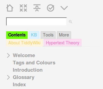
It should match the colour code I've established for my latest {{DesignWrite}} exercise.
Hegart.
Ton Gerner
Feb 18, 2016, 2:12:59 PM2/18/16
to TiddlyWikiDev
Hi Hegart,
For using the browser dev tools:
Just right-click on the element of interest and select 'Inspect element' from the menu.
For a minimalistic tab coloration (using HTML color names) try:
Cheers,
Ton
For using the browser dev tools:
Just right-click on the element of interest and select 'Inspect element' from the menu.
For a minimalistic tab coloration (using HTML color names) try:
/* RED TABS */
.my-red-tab-buttons .tc-tab-buttons button.tc-tab-selected {
     color: white;
     font-weight: bold;
     background-color: red;
}

.my-red-tab-buttons .tc-tab-buttons button {
     color: black;
     background-color: salmon;
}

/* GREEN TABS */

.my-green-tab-buttons .tc-tab-buttons button.tc-tab-selected {
     color: white;
     font-weight: bold;
     background-color: green;
}

.my-green-tab-buttons .tc-tab-buttons button {
     color: black;
     background-color: lightgreen;
}
Cheers,
Ton
Reply all
Reply to author
Forward
0 new messages