Competition for v5.1.22 artwork
310 views
Skip to first unread message

Jeremy Ruston
Sep 10, 2019, 11:58:54 AM9/10/19
to TiddlyWiki
Now that v5.1.21 is out it’s time to open the competition for the new release banner artwork for v5.1.22. (See https://groups.google.com/d/msg/tiddlywiki/l47ZZzWdDb8/6s0p_3QeCgAJ for the previous competition).
The rules for the competition are:
* The version number (with the correct punctuation) must be clear and readable, otherwise I’m open to any media and style
* The image must be a PNG, JPEG or SVG of exactly 560x315 pixels
* The bottom 46 pixels will be obscured by the banner text “What’s new in 5.1.22”
* Feel free to enter an updated version of artwork entered in a previous competition
* Reply to this message with your entry, or any questions
Good luck to everyone. In about 10 days I’ll set up an online voting form as before.
Best wishes
Jeremy.


Mohammad
Sep 17, 2019, 2:20:19 AM9/17/19
to TiddlyWiki
love the lego icon :-)
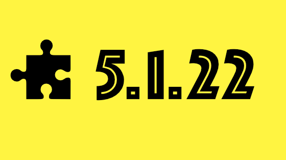
Jeremy Ruston
Sep 17, 2019, 3:26:59 AM9/17/19
to tiddl...@googlegroups.com
Hi Thomas
That’s great, thank you for the first entry!
Voilà. Attached SVG is about a third the size of the PNG.
The current v5.1.22-prerelease banner image is just a placeholder until the competition is completed.
Best wishes
Jeremy
Cheers, Thomas<5.1.22-plugin.png>--
You received this message because you are subscribed to the Google Groups "TiddlyWiki" group.
To unsubscribe from this group and stop receiving emails from it, send an email to tiddlywiki+...@googlegroups.com.
To view this discussion on the web visit https://groups.google.com/d/msgid/tiddlywiki/65420131-24bd-48ea-97f3-3cfc40325a37%40googlegroups.com.
<5-1-22-plugins.svg><5.1.22-plugin.png>


Mat
Sep 17, 2019, 5:33:00 AM9/17/19
to TiddlyWiki
Markus, cool image. Just make sure to note:
* The bottom 46 pixels will be obscured by the banner text “What’s new in 5.1.22”
<:-)
Markus Adler
Sep 17, 2019, 5:45:01 AM9/17/19
to TiddlyWiki
Ups!
Thanks for hint. Updated picture is online.
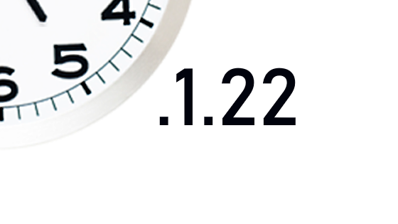
Jeremy Ruston
Sep 17, 2019, 6:06:28 AM9/17/19
to tiddl...@googlegroups.com
Hi Mat
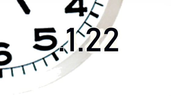
Forgive me for stating the obvious but; This symbolizes the inner essence of mans existential struggle in the universe.
The concept is great but I fear that at the moment it may not satisfy the first requirement, that the version number be clear and readable. Particularly at small sizes, the “5” is lost. Perhaps it could be tweaked?
Best wishes
Jeremy
<5.1.22_clock.png>
<:-)
--
You received this message because you are subscribed to the Google Groups "TiddlyWiki" group.
To unsubscribe from this group and stop receiving emails from it, send an email to tiddlywiki+...@googlegroups.com.
To view this discussion on the web visit https://groups.google.com/d/msgid/tiddlywiki/3a499c2e-067b-4472-a213-ccd95733aee7%40googlegroups.com.
<5.1.22_clock.png><5.1.22_clock.png>
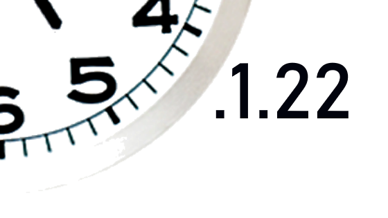
Jeremy Ruston
Sep 17, 2019, 6:59:06 AM9/17/19
to tiddl...@googlegroups.com
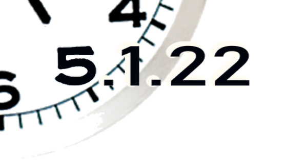
Hi Mat
I think the second one is much better. The version number could perhaps be more prominent by expanding it to fill more of the available space.
Best wishes
Jeremy
On 17 Sep 2019, at 11:53, Mat <matia...@gmail.com> wrote:
Jeremy Ruston wrote:[...]the version number be clear and readable.Thanks for input! Does any of these fulfill the requirements? (The roughness is intentional - but might not be appropriate)
<5.1.22_clock_2.png>
<5.1.22_clock_3.png>
--
You received this message because you are subscribed to the Google Groups "TiddlyWiki" group.
To unsubscribe from this group and stop receiving emails from it, send an email to tiddlywiki+...@googlegroups.com.
To view this discussion on the web visit https://groups.google.com/d/msgid/tiddlywiki/529dab0b-74bf-4d64-a397-4dfacd06cce6%40googlegroups.com.
<5.1.22_clock_3.png><5.1.22_clock_2.png><5.1.22_clock_2.png><5.1.22_clock_3.png>
Mat
Sep 17, 2019, 7:13:24 AM9/17/19
to TiddlyWiki
Jeremy Ruston wrote:
I think the second one is much better. The version number could perhaps be more prominent by expanding it to fill more of the available space.
Good to hear. By "second one" you mean the one with the .1.22 on the side or the overlapping one? (The order is different in my posts text vs the attachments.)
<:-)

@TiddlyTweeter
Sep 17, 2019, 7:30:12 AM9/17/19
to TiddlyWiki
Ciao Mat

Nice design. Could be an opener for a TV show. (https://www.youtube.com/watch?v=AI4jbJRMEKM)
Couple of three points ...
1 - make the FONT of the number 5.1.22 be the same.
2 - maybe change the COLOUR? Could be subtle lower grey. Might also work in a stand-out colour.
3 - SLIGHTLY enlarge the number
TT
Mat
Sep 17, 2019, 7:54:16 AM9/17/19
to TiddlyWiki
Thanks for input TT. Before I do anything I need to know which one qualifies at all.
But to your points:
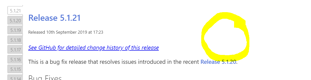
I can't fully match the fonts because the clock is a fragment from a photo so I don't know what font it is. But I do agree it could be stretched horizontally for better match. Other than that I find it cool that the clock and the added digits are not too similar. I want there to be a contrast so that it is clear(-er) that the information kind of piggybacks on a real thing. Numbers are very sterile per se, little emotive meaning, so I like to dress it up into something contextual. (I really love the current 5.1.21 thingy... incidentally also a clock)
<:-)
Jeremy Ruston
Sep 17, 2019, 8:01:31 AM9/17/19
to tiddl...@googlegroups.com
Hi Mat
On 17 Sep 2019, at 12:13, Mat <matia...@gmail.com> wrote:
Good to hear. By "second one" you mean the one with the .1.22 on the side or the overlapping one? (The order is different in my posts text vs the attachments.)
I meant this copied below.
Best wishes
Jeremy

@TiddlyTweeter
Sep 17, 2019, 8:09:34 AM9/17/19
to TiddlyWiki
I can't fully match the fonts because the clock is a fragment from a photo so I don't know what font it is.
Right. Maybe you could "bold the text part" and add a slight "haze" to approximate the clock look?
FWIW, I'd vote for it because its economical and combines a succinct image of TIME with the v. number.
Just thoughts
TT
Mat
Sep 17, 2019, 8:39:09 AM9/17/19
to TiddlyWiki
@Jeremy - BTW, it would be fun if the old release banners for each version could be shown in the Releases tiddler for a nice clicking back to reminisce and get inspired for making new submissions. Perhaps in this vincinity:
<:-)
@TiddlyTweeter
Sep 17, 2019, 12:00:39 PM9/17/19
to TiddlyWiki
UPvote. x

Julio Peña
Sep 17, 2019, 3:06:08 PM9/17/19
to TiddlyWiki
Hello all,
I hope you are all well.
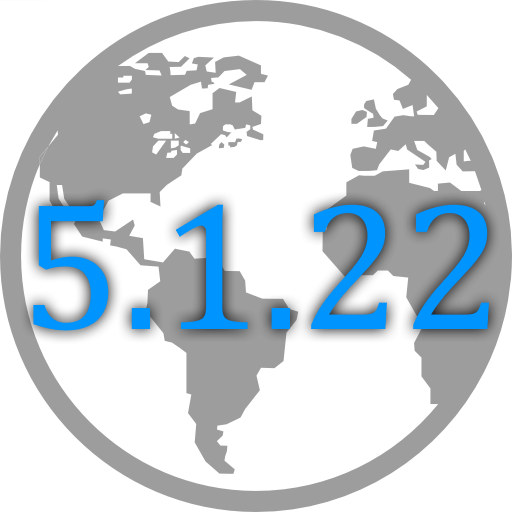
Well, I figured why not get in on the fun... I don't get to contribute much so here is my 2 cents.
One can say I have "global" ambitions...haha
Best regards to all,
Julio
Mat
Sep 17, 2019, 3:15:05 PM9/17/19
to TiddlyWiki
Julio, nice one. Maybe it is my computer screen but are you sticking to the rules (the size) that Jeremy detailed in the first post?
Just trying to help.
<:-)
Julio Peña
Sep 17, 2019, 4:00:46 PM9/17/19
to TiddlyWiki
ooops....Mat thanks...I'll resize....like they say..."haste makes waste".
Julio Peña
Sep 17, 2019, 4:07:25 PM9/17/19
to TiddlyWiki
Revised.....to the specifications...I kinda like the elongated effect...

On Tuesday, September 17, 2019 at 3:15:05 PM UTC-4, Mat wrote:

coda coder
Sep 17, 2019, 4:20:33 PM9/17/19
to TiddlyWiki
Just for fun...


TonyM
Sep 17, 2019, 9:15:52 PM9/17/19
to TiddlyWiki
Looks Like "Beer o'clock" to me :)

Sycom
Sep 18, 2019, 4:08:09 AM9/18/19
to TiddlyWiki
Hello,
here is my proposal. Called it Brexit :-( edition. Fortunately, TW has no border...
Cheers,
Sylvain
@sycom
![]()
Mat
Sep 18, 2019, 11:12:13 AM9/18/19
to TiddlyWiki
Sycom - you've come up with something that I failed to do; A concept that ties the version with the times of the outside world events. I like this and it should be... ehm "fun"... to look back at old banners and recall the era.
We'll see what Jeremy says but I suspect that particularly that last digit is a bit hard to read tho.
<:-)
Sylvain Comte
Sep 18, 2019, 11:36:35 AM9/18/19
to tiddl...@googlegroups.com
@Mat thanks for feedback
Sylvain
I totally agree with your opinion about limited readability of second 2. I made some adjustments on the coin by vectorizing, but it missed the point. Unfortunately there is no 2 euros or 2 pounds banknote. But I may create them as Fenimore Buttercup did for the 3 dollars one (http://mirror.uncyc.org/wiki/3_dollar_bill :-)
Can't win each time, neh ;-) ?
For creators and other contenders, did you know that 22 is a Brazilian number? Thinking to the present rainforest issues might be inspiring...
Cheers
@sycom
--
You received this message because you are subscribed to a topic in the Google Groups "TiddlyWiki" group.
To unsubscribe from this topic, visit https://groups.google.com/d/topic/tiddlywiki/rYrja18_SfQ/unsubscribe.
To unsubscribe from this group and all its topics, send an email to tiddlywiki+...@googlegroups.com.
To view this discussion on the web visit https://groups.google.com/d/msgid/tiddlywiki/5ac69ebf-854e-4ce6-a829-952139819f91%40googlegroups.com.
Reply all
Reply to author
Forward
0 new messages