W3(H2O) at 22GHz
33 views
Skip to first unread message

Michiel Klaassen
Nov 6, 2022, 1:38:16 PM11/6/22
to camras-forum, sara-list
Hi All,
I am writing up the measurements we have done with the Sao Giao radio telescope for the parac site.First:
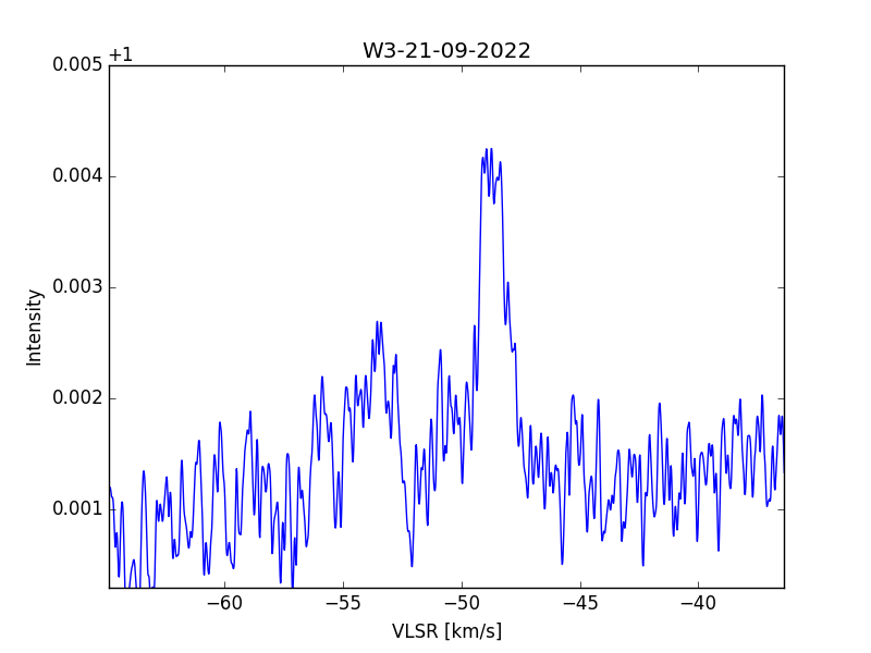
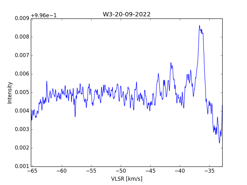
W3(H2O) see figure xx1. Integration time is difference in index numbers X5 minutes.
We do not have a calibrated scale yet, so it was assumed that we just take the average of the published values. That seems to work for the methanol profile of W3(OH), but not for W3(H2O).
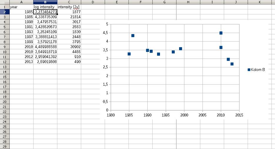
We made a graph of some published data see xx2 and were forced to calculate the log value in a graph, because the differences are high and would not fit the graph. We found peak values ranging from 490 to 30902 Jy. Perhaps there is a cadence, but for now we assume that the latest 2013 value of 490Jy could be best.
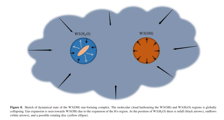
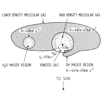
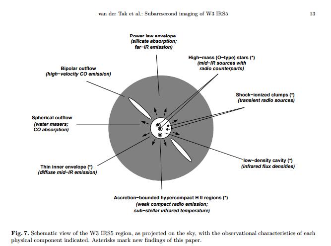
But why is it so variable. It seems that W3(H2O) is a different region; see figure xx. So while W3(OH) is a simple cloud, W3(H2O) is further in its evolution and is forming a disk already and erupts polar outflows. see figure xx3
When looking at the measured curve it is different to the gathered profiles at www.maserdb.net. In our graph the top is not pointy at the peak, but more flat; consisting of several peaks. This could indicate multiple slow rotating clouds.
Michiel
parac.eu

Dr. Rich Russel
Nov 6, 2022, 1:41:36 PM11/6/22
to vmin...@gmail.com, camras...@googlegroups.com, sara...@googlegroups.com
Michiel,
Great work!
We will be having the RTOP ZOOM session in 20 minutes - can you join and show some of this?
Thanks
Rich
SARA TREASURER is inviting you to a scheduled Zoom meeting.
Topic: SARA Radio Telescope Observation Party (RTOP)
Time: Nov 6, 2022 02:00 PM Eastern Time (US and Canada)
Every month on the First Sun, 11 occurrence(s)
Nov 6, 2022 02:00 PM
Dec 4, 2022 02:00 PM
Jan 1, 2023 02:00 PM
Feb 5, 2023 02:00 PM
Mar 5, 2023 02:00 PM
Apr 2, 2023 02:00 PM
May 7, 2023 02:00 PM
Jun 4, 2023 02:00 PM
Jul 2, 2023 02:00 PM
Aug 6, 2023 02:00 PM
Sep 3, 2023 02:00 PM
Please download and import the following iCalendar (.ics) files to your calendar system.
Monthly: https://us06web.zoom.us/meeting/tZ0lc-GsqzspHt0BN8p0yDz1mAAzCnbfgR_m/ics?icsToken=98tyKuGhpj8iHtGVsx2ORpx5Go-gWejwmGJegrcNvjG9E3BKRhmnO8NjKJFxEt7X
Join Zoom Meeting
https://us06web.zoom.us/j/89848450349
Meeting ID: 898 4845 0349
One tap mobile
+17193594580,,89848450349# US
+16699006833,,89848450349# US (San Jose)
Dial by your location
+1 719 359 4580 US
+1 669 900 6833 US (San Jose)
+1 253 215 8782 US (Tacoma)
+1 346 248 7799 US (Houston)
+1 669 444 9171 US
+1 309 205 3325 US
+1 312 626 6799 US (Chicago)
+1 360 209 5623 US
+1 386 347 5053 US
+1 507 473 4847 US
+1 564 217 2000 US
+1 646 931 3860 US
+1 689 278 1000 US
+1 929 205 6099 US (New York)
+1 301 715 8592 US (Washington DC)
Meeting ID: 898 4845 0349
Find your local number: https://us06web.zoom.us/u/kbqFuDqniS
--
--
You received this message because you are subscribed to the Google
Groups "Society of Amateur Radio Astronomers" group.
To post to this group, send email to sara...@googlegroups.com
To unsubscribe from this group, send email to
sara-list-...@googlegroups.com
For more options, visit this group at
http://groups.google.com/group/sara-list?hl=en
---
You received this message because you are subscribed to the Google Groups "Society of Amateur Radio Astronomers" group.
To unsubscribe from this group and stop receiving emails from it, send an email to sara-list+...@googlegroups.com.
To view this discussion on the web visit https://groups.google.com/d/msgid/sara-list/CAABBjRCZ5dLcvjtzoErH292dO8qsHN5ACLUp2vHgSKyesEt2gA%40mail.gmail.com.
Michiel Klaassen
Nov 8, 2022, 3:51:32 AM11/8/22
to camras-forum, sara-list
All,
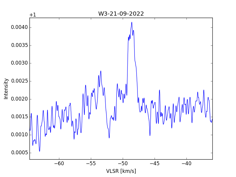
So, I accidentally swapped two x scales from different days.When corrected we see that the main peak lies on -37km/s and not on -49km/s.
This means that the source cannot be W3(H2O), so it must be W3(IRS5).
This also explains why there is a plateau and not a peak.
Now the data results of Eduard and I match.
Because I could not find W3(H2O) in the first place, I searched in circles around the given location. This was done automatically of course for some hours.
I will try the same procedure to make an estimate of the intensity scale.
Another interesting thing is that although the top is almost flat, in the literature sometimes a narrow peak stands on top of the plateau.
Because it is very narrow, it is easily averaged and disappears. I will re-examine the data to see if a narrow peak can be isolated; perhaps by correlating consecutive time lines.
Fun and learning all the time.

Eduard Mol
Nov 8, 2022, 4:23:29 AM11/8/22
to sara-list
Hi,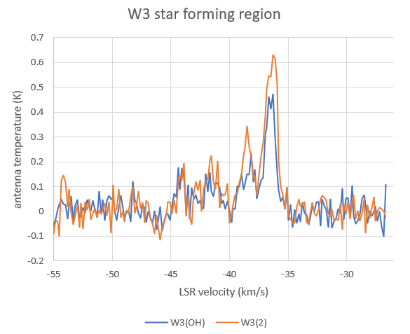
Now I see the post with my results was only sent to the CAMRAS list and not to the SARA list
So, here are my spectra of the W3 region. Both W3(H2O) and W3 IRS5 are within the 1.2 degree wide beam of my 1-metre dish. To figure out which of the sources was detected, I pointed the dish at the positions of W3(H2O) and W3 IRS5. These two sources are only 20 arcmin apart, considerably less than the beamwidth of the dish but enough to make a measurable difference. A relatively strong signal was detected at -37 km/s, with some weaker peaks at -38- -41 km/s. The peaks at -37 and -38 km/s were clearly stronger when the dish was pointed at the position of W3 IRS5. No emission was detected at the expected LSR velocity of W3(H2O) at -48 km/s.
--
Je hebt dit bericht ontvangen omdat je bent geabonneerd op de groep 'Camras-forum' van Google Groepen.
Als je je wilt afmelden bij deze groep en geen e-mails van de groep meer wilt ontvangen, stuur je een e-mail naar camras-forum...@googlegroups.com.
Ga naar https://groups.google.com/d/msgid/camras-forum/CAABBjRAYwiR8eD7ttcEkF8Z68EqNMcKD-Xi8fP4Jz0hw9U0dyA%40mail.gmail.com om deze discussie op internet te bekijken.
Michiel Klaassen
Nov 8, 2022, 8:44:03 AM11/8/22
to sara-list
W3 IRS5 sent a selfie
--
--
You received this message because you are subscribed to the Google
Groups "Society of Amateur Radio Astronomers" group.
To post to this group, send email to sara...@googlegroups.com
To unsubscribe from this group, send email to
sara-list-...@googlegroups.com
For more options, visit this group at
http://groups.google.com/group/sara-list?hl=en
---
You received this message because you are subscribed to the Google Groups "Society of Amateur Radio Astronomers" group.
To unsubscribe from this group and stop receiving emails from it, send an email to sara-list+...@googlegroups.com.
To view this discussion on the web visit https://groups.google.com/d/msgid/sara-list/CAFcm1Q7oOk7-RNSumn6Y9rPRjzC1UeXUB%3DrNLJmotRwfJ2pXZA%40mail.gmail.com.
Michiel Klaassen
Nov 8, 2022, 3:05:05 PM11/8/22
to sara-list, camras-forum
All,
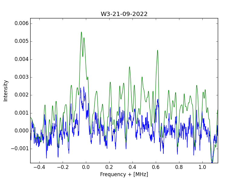
When re-examining the data and now showing also the power values above the average (graph bleu) values, then you get graph b.
Note that to the far left and far right side both graphs have the same value.
These are the silent parts; they just display the average nois; no change.
In the middle you see that the green graph is elevated, and shows peaks.
In my opinion this shows that there are peaks coming from the source.
However with our simple amateur equipment we cannot enhance them in a standard way.
I will put the raw data also on the website, so if you want, you can also struggle with it.
As a reference enter W3IRS5 in google and also in maserdb.net
Have fun with the hobby, and I hope I did not annoy you too much with my posts.
Michiel
parac.eu
Reply all
Reply to author
Forward
0 new messages