bug in plot?
123 views
Skip to first unread message

David Joyner
Mar 14, 2024, 6:04:27 AMMar 14
to SAGE support, David Joyner
Hi:
I'm trying to show my students a plot of
a rational function whose graph is basically 1,
so I plotted
f(x) = (x^2+0.0001)/(x^2+0.0001000001)
However, there is a problem: Note the difference between
plot((x^2+0.0001)/(x^2+0.0001000001), (x,-10,10))
(which dips down near x=0) and
(which dips down near x=0) and
plot((x^2+0.0001)/(x^2+0.0001000001), (x,-10,10), ymin = -0.1, ymax = 1.5)
(which basically looks like a straight line).
Same problem for lists:
sage: L = [(x/100, f(x/100)) for x in range(-100, 100)]
sage: list_plot(L) # bug?
sage: list_plot(L, ymin=-0.5, ymax=1.5) # good
sage: list_plot(L) # bug?
sage: list_plot(L, ymin=-0.5, ymax=1.5) # good
This is using 'SageMath version 10.3.rc1, Release Date: 2024-02-29' on an ubuntu machine. Can anyone tell what is going on here? I'm happy to attached jpgs of the plots I get, if desired.
For comparison, it appears that Sympy plots this correctly.
- David Joyner

Dima Pasechnik
Mar 14, 2024, 10:35:50 AMMar 14
to sage-s...@googlegroups.com
It might help seeing your graphs here, too.
--
You received this message because you are subscribed to the Google Groups "sage-support" group.
To unsubscribe from this group and stop receiving emails from it, send an email to sage-support...@googlegroups.com.
To view this discussion on the web visit https://groups.google.com/d/msgid/sage-support/CAEQuuAXPcQ6_g67a7L4bdy1Ko%2BFH1VnHAT25G3LfY6XR1mMaEg%40mail.gmail.com.

kcrisman
Mar 14, 2024, 1:51:28 PMMar 14
to sage-support
On Thursday, March 14, 2024 at 10:35:50 AM UTC-4 dim...@gmail.com wrote:
It might help seeing your graphs here, too.
Try this:
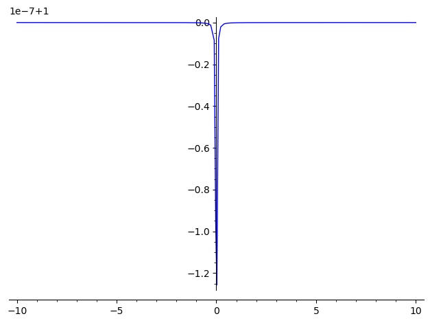
Notice the label 1e-6 + 1, the offset option for matplotlib. I'm surprised that's showing up here for the first time, I don't recall that showing up before, but as we've noted at #34233 there were changes a while back in mpl that our code failed to keep up with.
One thing one could try, then, is to add, in addition to the
rcParams['axes.formatter.use_mathtext'] = True
at #34233 is to see whether one of these (or whatever the right syntax is) might help:
rcParams['axes.formatter.use_offSet'] = False
rcParams["axes.formatter.offset_threshold"]
David Joyner
Mar 14, 2024, 2:22:02 PMMar 14
to sage-s...@googlegroups.com
On Thu, Mar 14, 2024 at 1:51 PM kcrisman <kcri...@gmail.com> wrote:
On Thursday, March 14, 2024 at 10:35:50 AM UTC-4 dim...@gmail.com wrote:It might help seeing your graphs here, too.Try this:
That's the list plot I get as well, thanks Karl!
I'm confused why adding the ymin and ymax optional arguments fixes the problem. They seem like independent behaviors.
Also, I spoke too soon about it working on Sympy. I simply tried the Live Sympy cell online with the default arguments, where it does work.
However, if you use sympy on the command line, it seems to have the same sort of bug. Your suggestion below suggests it is an upstream
bug in matplotlib, right?
To view this discussion on the web visit https://groups.google.com/d/msgid/sage-support/6e860869-43e0-48fe-b25d-805edfdf98a7n%40googlegroups.com.
David Joyner
Mar 14, 2024, 2:26:36 PMMar 14
to sage-s...@googlegroups.com
On Thu, Mar 14, 2024 at 10:35 AM Dima Pasechnik <dim...@gmail.com> wrote:
It might help seeing your graphs here, too.
It is attached, Dima. Note that the correct graph should be
(for all practical purposes) simply the plot of the constant function 1 for all x.
To view this discussion on the web visit https://groups.google.com/d/msgid/sage-support/CAAWYfq1DheVMU-33w7uvSFn1HrtWqrNWT4ciH6W3AtvF-J4_jw%40mail.gmail.com.

Nils Bruin
Mar 14, 2024, 5:09:23 PMMar 14
to sage-support
I get the impression that without setting ymin,ymax you just end up with a tiny range for the y-axis and its labelling is just very weird. I think the labels displayed are shifted and scaled. So the error is just how the labels are printed. That looks the same as https://github.com/sagemath/sage/issues/34233
The default behaviour would be to derive ymin and ymax from the sampled points, and in your point plot example, those values vary from 1-1e-6 to 1+0e-6. So I think the range is derived appropriately. The labels on the y-axis are just printed in a misguided way.
Dima Pasechnik
Mar 14, 2024, 5:32:52 PMMar 14
to sage-s...@googlegroups.com
On 14 March 2024 21:09:22 GMT, Nils Bruin <nbr...@sfu.ca> wrote:
>I get the impression that without setting ymin,ymax you just end up with a
>tiny range for the y-axis and its labelling is just very weird. I think the
>labels displayed are shifted and scaled. So the error is just how the
>labels are printed. That looks the same as
>https://github.com/sagemath/sage/issues/34233
>
or something like this printed above the graph.
So when x is very close to 0 one indeed sees this "sharp" drop, by 10^9 or something...
Dima Pasechnik
Mar 14, 2024, 8:15:28 PMMar 14
to sage-s...@googlegroups.com
Attached in the plot with x in [-0.1,0.1] - and it is actually OK, I think the minimum (with x=0) is where it should be, at 0.9999990...
It's a bit confusing that the y-axis is labelled this way, but the offset of +1 is indicated at the
label above.
Dima
>
Dima Pasechnik
Mar 14, 2024, 8:17:11 PMMar 14
to sage-s...@googlegroups.com
I meant 0.9999990 x 10^-6, as indicated on the label.
David Joyner
Mar 15, 2024, 5:13:24 AMMar 15
to sage-s...@googlegroups.com
That's good news, that it's just a matplotlib bug in the labeling of the y-axis in the default case.
Thanks everyone!
It's a bit confusing that the y-axis is labelled this way, but the offset of +1 is indicated at thelabel above.Dima>
--
You received this message because you are subscribed to the Google Groups "sage-support" group.
To unsubscribe from this group and stop receiving emails from it, send an email to sage-support...@googlegroups.com.
To view this discussion on the web visit https://groups.google.com/d/msgid/sage-support/CAAWYfq2qWATF3Jkx_RjvF_BeK1tOD_ge3kUV7eNFtTtm8oK8qg%40mail.gmail.com.
Dima Pasechnik
Mar 15, 2024, 8:15:21 AMMar 15
to sage-s...@googlegroups.com
On Fri, Mar 15, 2024 at 9:13 AM David Joyner <wdjo...@gmail.com> wrote:
On Thu, Mar 14, 2024 at 8:17 PM Dima Pasechnik <dim...@gmail.com> wrote:On Fri, Mar 15, 2024 at 12:15 AM Dima Pasechnik <dim...@gmail.com> wrote:On Thu, Mar 14, 2024 at 9:32 PM Dima Pasechnik <dim...@gmail.com> wrote:
On 14 March 2024 21:09:22 GMT, Nils Bruin <nbr...@sfu.ca> wrote:
>I get the impression that without setting ymin,ymax you just end up with a
>tiny range for the y-axis and its labelling is just very weird. I think the
>labels displayed are shifted and scaled. So the error is just how the
>labels are printed. That looks the same as
>https://github.com/sagemath/sage/issues/34233
>
Good catch! So it seems indeed the same story, just on the microscale. With the patch from #34233 I get essentially the same graph, but with extra 10^-9
or something like this printed above the graph.
So when x is very close to 0 one indeed sees this "sharp" drop, by 10^9 or something...
>The default behaviour would be to derive ymin and ymax from the sampled
>points, and in your point plot example, those values vary from 1-1e-6 to
>1+0e-6. So I think the range is derived appropriately. The labels on the
>y-axis are just printed in a misguided way.Attached in the plot with x in [-0.1,0.1] - and it is actually OK, I think the minimum (with x=0) is where it should be, at 0.9999990...I meant 0.9999990 x 10^-6, as indicated on the label.That's good news, that it's just a matplotlib bug in the labeling of the y-axis in the default case.
it's not a bug, it's a feature. :-)
indeed,
import matplotlib as mpl
mpl.rcParams['axes.formatter.useoffset'] = False
plot((x^2+0.0001)/(x^2+0.0001000001), (x,-0.1,0.1))
mpl.rcParams['axes.formatter.useoffset'] = False
plot((x^2+0.0001)/(x^2+0.0001000001), (x,-0.1,0.1))
produces the normal labelling of y-axes, without an offset.
Perhaps we should have an example like this in the manual.
HTH
Dima
--Thanks everyone!--It's a bit confusing that the y-axis is labelled this way, but the offset of +1 is indicated at thelabel above.Dima>
You received this message because you are subscribed to the Google Groups "sage-support" group.
To unsubscribe from this group and stop receiving emails from it, send an email to sage-support...@googlegroups.com.
To view this discussion on the web visit https://groups.google.com/d/msgid/sage-support/CAAWYfq2qWATF3Jkx_RjvF_BeK1tOD_ge3kUV7eNFtTtm8oK8qg%40mail.gmail.com.
You received this message because you are subscribed to the Google Groups "sage-support" group.
To unsubscribe from this group and stop receiving emails from it, send an email to sage-support...@googlegroups.com.
To view this discussion on the web visit https://groups.google.com/d/msgid/sage-support/CAEQuuAW6GJUaeJYds-sSJ4qktrid0U5Hn%2ByKdV684MUBWb6z6Q%40mail.gmail.com.
kcrisman
Mar 15, 2024, 3:42:49 PMMar 15
to sage-support
it's not a bug, it's a feature. :-)
Correct.
import matplotlib as mpl
mpl.rcParams['axes.formatter.useoffset'] = False
plot((x^2+0.0001)/(x^2+0.0001000001), (x,-0.1,0.1))produces the normal labelling of y-axes, without an offset.Perhaps we should have an example like this in the manual.
Or rather, should the default be useoffset False? We already change one of the defaults in https://github.com/sagemath/sage/pull/37502 and I wonder how often people are seeing this offset; I've personally never seen it actually show up before, but maybe it's more common than we think. Has anyone seen it on ask.sagemath?
Dima Pasechnik
Mar 15, 2024, 3:52:18 PMMar 15
to sage-s...@googlegroups.com
On 15 March 2024 19:42:48 GMT, kcrisman <kcri...@gmail.com> wrote:
>
>
>it's not a bug, it's a feature. :-)
>https://discourse.matplotlib.org/t/default-format-of-axis-offset-label/23162/2
>
>
>Correct.
>
>import matplotlib as mpl
>mpl.rcParams['axes.formatter.useoffset'] = False
>plot((x^2+0.0001)/(x^2+0.0001000001), (x,-0.1,0.1))
>
>produces the normal labelling of y-axes, without an offset.
>Perhaps we should have an example like this in the manual.
>
>
>
>Or rather, should the default be useoffset False?
large numbers next to the y-axis may produce if their common messy offset is not taken into account.
<https://matplotlib.org/stable/api/ticker_api.html#matplotlib.ticker.ScalarFormatter.set_useOffset>
I would say that for teaching purposes it might be set to off, but otherwise it might be useful to have it on.
Nils Bruin
Mar 15, 2024, 5:44:15 PMMar 15
to sage-support
On Friday 15 March 2024 at 12:42:49 UTC-7 kcrisman wrote:
Or rather, should the default be useoffset False?
Yes, I think that would be reasonable to do. Clearly, offsets being used without the user knowing they exist can easily lead to confusion and misinterpreting the graph, as had been demonstrated here. With the default off, the user would get an ugly graph. If they want to improve it, they would hopefully read the documentation. If we document "useoffset" then the user could find it there.
Dima Pasechnik
Mar 16, 2024, 8:55:03 AMMar 16
to sage-s...@googlegroups.com
I'd think that matplotlib's defaults are defaults for a good reason.
I'd rather add a note in the docs saying how to change this option.
--
You received this message because you are subscribed to the Google Groups "sage-support" group.
To unsubscribe from this group and stop receiving emails from it, send an email to sage-support...@googlegroups.com.
To view this discussion on the web visit https://groups.google.com/d/msgid/sage-support/24d2b075-0b6f-40f2-8170-67d7a2b36c36n%40googlegroups.com.
kcrisman
Mar 16, 2024, 8:00:37 PMMar 16
to sage-support
I'd think that matplotlib's defaults are defaults for a good reason.
Agreed, but not a good *mathematical* reason. It is a good *data analysis* reason (appropriate for mpl), which is not the same thing. I can't think of a single mathematics textbook, talk, or other purely mathematical setting in which I've ever seen an offset of that type. Axes are always when the variables = 0, end of story.
I'd rather add a note in the docs saying how to change this option.
Naturally, we can do that anyway, and in fact should include several examples of the type of usage where that would be helpful.
Nonetheless, especially since Sage does not seem to be used very heavily for data applications (pandas, numpy, or others long since filling that gap), I would also recommend changing that default.
Reply all
Reply to author
Forward
0 new messages