New RAF Logo
30 views
Skip to first unread message

Moritz Wagner
Nov 9, 2022, 10:49:18 AM11/9/22
to RochesterAreaFlyers
Hello all,
Sara Fort, a designer and RAF member, has offered to help us redesign our RAF logo if we would like to do so. She has proposed 4 different designs as a start which you can view in the attached PDF.
The board discussed this last night at our meeting and we decided to open the discussion to the whole google group. So please look at the different versions and let us know which one you like best and if you would change anything on that design.
Please keep your comments short.
Thank you,
Moritz

Katrin Parsiegla
Nov 9, 2022, 11:02:45 AM11/9/22
to rochester...@googlegroups.com
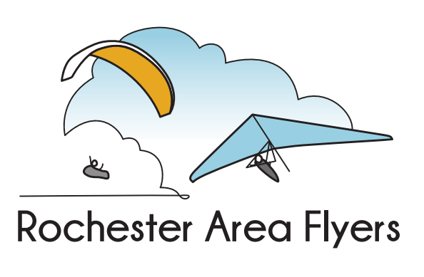
I like the first logo best.
--
***Be sure to check the Group Calendar often!***
http://www.google.com/calendar/embed?src=rochesterareaflyers%40gmail.com&ctz=America/New_York
***Bristol Mtn Weather & Webcam***
- https://www.wunderground.com/dashboard/pws/KNYNAPLE32
- https://www.bristolmountain.com/webcam/
You received this because you are subscribed to "RochesterAreaFlyers"
To post to this group, send email to:
rochester...@googlegroups.com
To unsubscribe from this group, send email to:
rochesterareafl...@googlegroups.com
For more options, visit this group at:
http://groups.google.com/group/rochesterareaflyers?hl=en
---
You received this message because you are subscribed to the Google Groups "RochesterAreaFlyers" group.
To unsubscribe from this group and stop receiving emails from it, send an email to rochesterareafl...@googlegroups.com.
To view this discussion on the web visit https://groups.google.com/d/msgid/rochesterareaflyers/eca8e99e-417c-4297-be92-3197234bf1aen%40googlegroups.com.

hughes1313
Nov 9, 2022, 11:21:57 AM11/9/22
to Katrin Parsiegla, rochester...@googlegroups.com
I like that one, too. The only change I'd like is to see thin lines from the PGers hands towards the ends of the wing. Full lines aren't needed, just short segments 'suggesting' that there is some connection between the pilot and the wing. They wouldn't necessarily have to actually connect at the pilot or wing
The image would look nice on shirts and promotional materials.
For letterhead and web banner usage. the image could be shifted to appear at the left, followed by the name.
Marty
To view this discussion on the web visit https://groups.google.com/d/msgid/rochesterareaflyers/CAPRzCpKq6QTCmid34oYUy23%3DngLHA%3Dhu6_qf6FOKE3FgFhptwQ%40mail.gmail.com.

Tim DuBois
Nov 9, 2022, 11:28:35 AM11/9/22
to rochester...@googlegroups.com
I like how the second logo integrates the picture with the title (paraglider wrapping around the R)
I prefer the cloud versus the mountain.
____________________________
Tim DuBois
Dunedin, FL / Naples, NY
Mobile: +9048030142
timothy...@gmail.com
Tim DuBois
Dunedin, FL / Naples, NY
Mobile: +9048030142
timothy...@gmail.com
To view this discussion on the web visit https://groups.google.com/d/msgid/rochesterareaflyers/CAPRzCpKq6QTCmid34oYUy23%3DngLHA%3Dhu6_qf6FOKE3FgFhptwQ%40mail.gmail.com.

chris toomey
Nov 9, 2022, 11:38:31 AM11/9/22
to rochester...@googlegroups.com
I prefer the mountain over the cloud. Perhaps because I rarely get to see the clouds up close? Chris
Sent from my iPhone
On Nov 9, 2022, at 10:54 AM, Moritz Wagner <moritz.wa...@gmail.com> wrote:
Hello all,
--

Steve Lynch
Nov 9, 2022, 11:52:29 AM11/9/22
to rochester...@googlegroups.com
I like #2 best. But they all look great
-Steve Lynch
On Nov 9, 2022, at 11:21 AM, 'hughes1313' via RochesterAreaFlyers <rochester...@googlegroups.com> wrote:
To view this discussion on the web visit https://groups.google.com/d/msgid/rochesterareaflyers/794348240.97927.1668010915902%40aol.com.

John OHearn
Nov 9, 2022, 12:35:25 PM11/9/22
to RochesterAreaFlyers
From an artistic perspective, I like the second one better. But for advertising, I think the first one would be better. (I would like to see a connection between pilot and wing)

jrdpo2
Nov 9, 2022, 12:58:02 PM11/9/22
to rochester...@googlegroups.com
I like that one as well! :)
To view this discussion on the web visit https://groups.google.com/d/msgid/rochesterareaflyers/CAPRzCpKq6QTCmid34oYUy23%3DngLHA%3Dhu6_qf6FOKE3FgFhptwQ%40mail.gmail.com.

Bill Vickery
Nov 9, 2022, 6:20:02 PM11/9/22
to RAF
#1
The fancy fonts - the F looks like an H
To view this discussion on the web visit https://groups.google.com/d/msgid/rochesterareaflyers/CAO583CQimc%3D3xyFHeGw-v3WJancOAb0_LKyHEetR%3Dfw2R%2Bri2Q%40mail.gmail.com.

matthew conrad
Nov 9, 2022, 9:31:34 PM11/9/22
to rochester...@googlegroups.com
I opened the pdf and made my choice before looking at any other responses....
I like the second one best. only change might be to put the pg and hg pics from the first one in place on the second one - lighter version. (may have to adjust angle/direction of hg from first to match second).
my .02.
Matthew Conrad
my second vote would be first one.


--

Jared Yates
Nov 9, 2022, 10:06:15 PM11/9/22
to rochester...@googlegroups.com
I'm not current on membership so take my input with a grain of salt. But I do a fair amount of decoration including embroidery, vinyl cutting, and hiring screen printers. If the design is intended to be applied to shirts or cut from vinyl to be applied to signs etc, the gradients make the process much more challenging/expensive. It is worthwhile to consider what things the logo will be applied to, what processes will be used, and what the capabilities of those processes are.
To view this discussion on the web visit https://groups.google.com/d/msgid/rochesterareaflyers/952354810.678884.1668047485946%40mail.yahoo.com.

Robert Slebodnik
Nov 9, 2022, 11:28:00 PM11/9/22
to rochester...@googlegroups.com
I like the first one (the one with the tinted clouds and the coloring on the underside of the paraglider).
I agree that there should be lines or hints of lines on the paraglider.
(The logos with the mountains have mountains that don't look like the hills that we have here. I agree that the letter "F" in the "fancy" font looks like an "H.")
On Wed, Nov 9, 2022 at 10:49 AM Moritz Wagner <moritz.wa...@gmail.com> wrote:
--

Mark Donahoe
Nov 10, 2022, 11:59:47 AM11/10/22
to RochesterAreaFlyers
I liked #2 the best.
To view this discussion on the web visit https://groups.google.com/d/msgid/rochesterareaflyers/CAFGRrqrOVVBGyz4OQDUr%3Dr9n_pQ8xLkYLSCqQSDo_iq%3DtD3QgA%40mail.gmail.com.

Brian Vogel
Nov 19, 2022, 1:46:21 PM11/19/22
to rochester...@googlegroups.com
Thank you for putting these together, Sara!
I've already shared some of my thoughts with the members who attended our last BOD meeting, but it was only discussed briefly and I think there is a lot more to discuss. There's already been some great points brought up already in the discussion here. *To both Sara and the RAF membership, I propose we create a committee of interested folks and a hold separate meeting outside of our regular BOD meeting to discuss the brand refresh*. Reply off-list if you are interested and we can get something on the calendar for next year.
My background for the past 20 years or so has been as developer with a focus on UX design. I've done a number of brand-refreshes and updates because a designer wasn't available, or the customer didn't have the budget to hire an agency. I've also been through many re-brandings meetings with agencies that specialize in branding. It is important it is to create a comprehensive branding system that reflects the brand's identity, is consistent, and looks great across all different kinds of media. *We should have a process for re-branding and it shouldn't just be ad-hoc on our discussion list.*
In my view, the RAF logo should meet the following requirements:
- Say something about who we are.
- Have versions for a light background and versions for a black background.
- It should look good and be understandable in a single color.
- Needs to be simple enough to fit in a tiny space on a business card and still be legible
- Different treatments for different orientations: a longer orientation for things like website banners, and shorter format for t-shirts or other media.
- Should not take too much attention away from the piece of media where it was being used.
- Look great anywhere it is used: website, business card, flyer, t-shirt, drink bottle, button, a-frame sign...etc.
I've attached the logo I did for the RAF 4-5 years ago, I think it captures most of the requirements, but there's room for improvement. Visually, it's a bit corporate looking and would benefit from more movement. Below my designs are three logos from outdoor-related brands that I think have good logos and meet the requirements above.
View here if the attachment does not work: https://drive.google.com/file/d/1CEoDt8aWCP452pcRjViDV9sN-goZTT1f/view?usp=sharing
View here if the attachment does not work: https://drive.google.com/file/d/1CEoDt8aWCP452pcRjViDV9sN-goZTT1f/view?usp=sharing
REI - The pine tree and mountain forms let you know that the brand has something to do with the outdoors. The letter of the logo evokes the feeling of a shorter mountain in the foreground with its angular triangular lines nature. The logo works by itself, but it also doesn't over-take another design when used in conjunction with another logo. Here is an example t-shirt: fce5bbe8-06df-463d-b7ca-f966233c6ac0 (337×510) (rei.com). The main problem I see with the new logo is that it is very detailed and would tend to draw considerable attention to the logo.
GROC - This is logo was designed locally by a GROC member and I think it's great. It is fun and has a lot of movement. You see a glimpse of a trail winding through a forest and the GROC lettering itself reminds me of boulders or a rock garden that you might encounter on a trail. GROC maintains trails for both cyclists and hikers, so I am assuming that the omission of a bicycle is purposeful. The wordmark can be decoupled from the tree and trail iconography and it's still recognizable. The treatment in the image is 2-color, but the light green color could be replaced with transparent, and it still works.
Ozone - The top portion of the logo evokes the form of a paraglider and is also a Z inside of an O. The wordmark also works without the icon.
In my design, I tried to capture a paraglider and hang glider soaring above the ground. Because "Rochester Area Flyers" is so long, it tends to diminish the iconography to a degree. I much prefer just RAF + the iconography. The GROC logo handles this well I think, it works with or without the full text. I like the illustration in the logo proposal #2 but the forms would need to be simplified to turn it into a logo that would perform well everywhere we need it. We need additional treatments so it would fit on the website w/out having to re-design the site. Jared's point about vinyl cutting or embroidery is a good one to keep in mind, the updated design would preclude us from doing that. More colors get expensive fast too - this is point #4 on my requirement list.
Thank You,
Brian
To view this discussion on the web visit https://groups.google.com/d/msgid/rochesterareaflyers/CADAET_0aSZXkK6h6DsN5zwiLzjyruNw%2B0OrRVd3NPvrZYmLvbw%40mail.gmail.com.
hughes1313
Nov 19, 2022, 2:16:24 PM11/19/22
to Brian Vogel, rochester...@googlegroups.com
I like the idea of forming a designated group to discuss and decide on a club logo. Having everyone give thoughts and suggestions can give a basic framework, but won't ever come to a consensus.
Technical I don't think we have a 'current' logo. There is a design on the board we use for static displays but I don't know if it was ever officially adopted. The designs on the website and the last T shirt orders were the individual choices of Brian and Marty, who were tasked with making those things happen.
My issue with the web logo is that non- pilots wouldn't identify the arc and triangle as wings. The last T shirt design was too detailed to be useful across the various media. I think Sara's nice designs come closer to answering the club's needs.
Marty
-------- Original message --------
From: Brian Vogel <br...@flytepark.com>
Date: 11/19/22 1:46 PM (GMT-05:00)
To view this discussion on the web visit https://groups.google.com/d/msgid/rochesterareaflyers/CAJm-eZ3ntopSsF48aoChO6kz%2BCd5r-Hqy9ubFD6fW7dkSKT35Q%40mail.gmail.com.
Brian Vogel
Nov 19, 2022, 3:11:51 PM11/19/22
to hughes1313, rochester...@googlegroups.com
I see the primary purpose of the meeting(s) to discuss what the requirements are, because right now everyone is asking for different things. We can get into closer alignment there for sure, and the outcome at the end will be a lot better. We could probably get it done in two meetings, one to discuss the tweaks and another to get the 2nd round of iterations approved. It's not necessary to reach a consensus, we can just vote. I would propose that Sara handle a 2nd round of iterations if she is willing to.
In my view, it isn't crucial the iconography be instantly recognizable by anyone as hang gliding or paragliding related. It's much more important to have recognizable and consistent branding. All three example logos (Ozone, GROC, REI) get to this point. Clear forms that look great at any size, any color. You have some idea that REI might be outdoor related because of the tree and mountains, but there's no way to know it's a retail store by looking at the logo. The RAF logo probably won't be used as a stand-alone item in most cases, it will be paired with big colorful photos and illustrations. The later part I think would meet your requirement, and Rick's as well. From the BOD meeting, my interpretation is that Rick wanted a nice illustration for t-shirts that had both a hang glider and paraglider. Where we're using it on the website, there are two giant pictures of hang gliders right below.
I didn't think I had more to add to the discussion after my comments at the BOD meeting, but today I was working on a new 4x6 flyer for the club. My concept for the flyer is an eye-catching photo montage/illustration on the front with a call to action and then then descriptive text about our club on the back. Mocking up with the Sara's logo, I felt it was a little busy so that's what prompted me to share my thoughts with the group. Overall, I like the direction that things are headed but I think tweaks are needed before we'll be able to use it in all places.
Thank You,
Brian
hughes1313
Nov 20, 2022, 9:34:12 PM11/20/22
to rochester...@googlegroups.com
Some ramblings of an old guy who's NOT a trained, experienced professional Marketing Designer.
I disagree with
"... it isn't crucial the iconography be instantly recognizable by anyone as hang gliding or paragliding related. It's much more important to have recognizable and consistent branding. "
Branding, by a logo, phrase, jingle, or idea, let's a business make itself known and differentiate itself from others in the field.
We are not a business competing with similar marketers for customers. Through huge expensive ad campaigns Nike, Apple, and McDonald's have logos that are instantly recognizable so that people think of them when considering a purchase.
We want to spark interest in free flight, inform potential pilots that we exist, and that we have HG training to satisfy their interest.
Anyone actively seeking to become a pilot can easily find us, and won't really care what our logo is, as long as they can easily get information and answers. Most of our members found RAF on their own.
I believe our aim is to capture the attention of people who may not actively be considering free flight.
When wearing the RAF shirts and sweatshirts I've often had conversation opportunities prompted by someone seeing the designs. Most have been started by my hearing comments nearby like, "my brother went parasailing once", or "I used to see hang gliders near Dansville."
Some were initiated directly to me, "Do you fly?", "I'd love to do that."
If the design isn't easily recognized as a PG or HG, we're just making a logo for ourselves, not the public.
If our aim is to attract attention to the club's existence, Sara, who IS a trained, experienced, professional Marketing Designer, has offered some great designs.
To view this discussion on the web visit https://groups.google.com/d/msgid/rochesterareaflyers/CAJm-eZ1WW5v_6krstrF74bi6OGhtTJ6eQcazs%2B7FOM_bwrXWAw%40mail.gmail.com.
Brian Vogel
Nov 21, 2022, 6:56:03 AM11/21/22
to rochester...@googlegroups.com
I hear you Marty. My main take-away from this discussion and previous is that you need nice illustration for a t-shirt that is clearly recognizable. Our goals are the same, but our use cases are a bit different. Your t-shirt requirement is better accomplished by an illustration and wordmark not by a logo composed of iconography and wordmark.
To view this discussion on the web visit https://groups.google.com/d/msgid/rochesterareaflyers/1094569748.255837.1668998050702%40aol.com.
Reply all
Reply to author
Forward
0 new messages