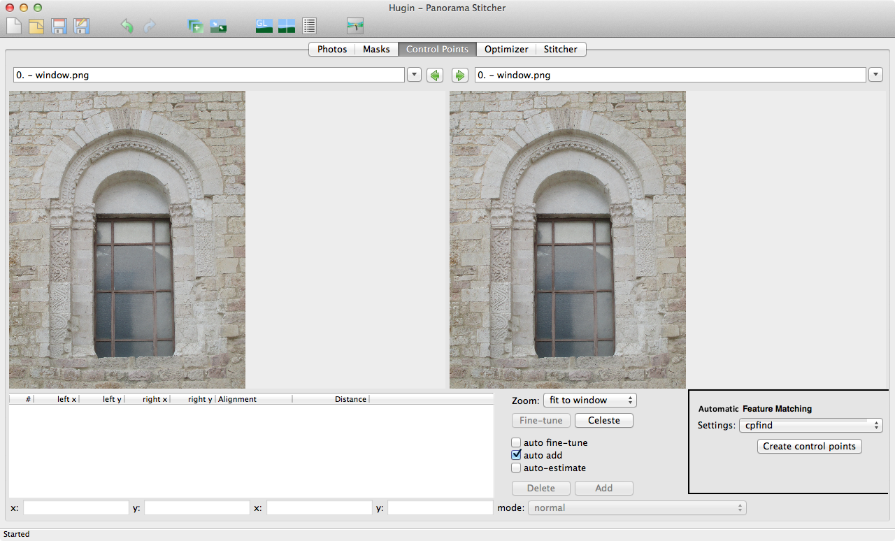
Interface comments: The Fast Preview Window
61 views
Skip to first unread message

John Muccigrosso
Oct 19, 2014, 6:06:22 PM10/19/14
to hugi...@googlegroups.com
I find a few things about the Fast Preview window confusing:
1. It's the same things as Simple mode. I think I see that the functions you want in it are nearly all the ones you want in Simple mode (you don't need to add photos when you're using it simply as Preview), but still, why is it identical? I guess this pertains to the Assistant tab, which doesn't seem necessary when you're not working in Simple mode.
2. It takes over the whole screen (on my Mac anyway) and so it isn't clear that it's a new window, instead of a replacement view for the other one. The old Preview window is a smaller window and so it's clear what has happened.
3. It has no close button, nor does it respond to the keyboard equivalent for closing. I can close it using the usual widget (red button in the "traffic light" in upper left corner), but this is odd behavior, especially since when I'm using it as the Fast Preview and not simple mode, I want to close it so that I can return to the main window. I realize that I can just go back to the main window by using the keyboard command for that (command-`) and just leave it open, but that is not nearly the behavior that you expect less expert users to know about, and it's weird to have to do it anyway when I expect to close the Preview window when I'm done with it.
So am I missing something important about this window, or is this one of those unresolved UI things.

T. Modes
Oct 20, 2014, 11:20:50 AM10/20/14
to hugi...@googlegroups.com
Am Montag, 20. Oktober 2014 00:06:22 UTC+2 schrieb John Muccigrosso:
I find a few things about the Fast Preview window confusing:1. It's the same things as Simple mode. I think I see that the functions you want in it are nearly all the ones you want in Simple mode (you don't need to add photos when you're using it simply as Preview), but still, why is it identical? I guess this pertains to the Assistant tab, which doesn't seem necessary when you're not working in Simple mode.
Even in advanced mode the assistant can be helpful, e.g. for getting a first starting point without doing all by hand.
2. It takes over the whole screen (on my Mac anyway) and so it isn't clear that it's a new window, instead of a replacement view for the other one. The old Preview window is a smaller window and so it's clear what has happened.
The preview windows store the last used size and restore it at the next start. So you used the old preview window the last time in smaller size and the fast preview window in a bigger size.
3. It has no close button, nor does it respond to the keyboard equivalent for closing. I can close it using the usual widget (red button in the "traffic light" in upper left corner),
This is a conflict in two sentences: either there is a close button - the normal "red light" on Mac OSX or the normal "close" button on other systems- or there is no close button.
I don't see the point of have a dedicated close button when there is the normal close control on the window.
John Muccigrosso
Oct 20, 2014, 1:26:01 PM10/20/14
to hugi...@googlegroups.com
On Monday, October 20, 2014 11:20:50 AM UTC-4, T. Modes wrote:
Am Montag, 20. Oktober 2014 00:06:22 UTC+2 schrieb John Muccigrosso:I find a few things about the Fast Preview window confusing:1. It's the same things as Simple mode. I think I see that the functions you want in it are nearly all the ones you want in Simple mode (you don't need to add photos when you're using it simply as Preview), but still, why is it identical? I guess this pertains to the Assistant tab, which doesn't seem necessary when you're not working in Simple mode.
Even in advanced mode the assistant can be helpful, e.g. for getting a first starting point without doing all by hand.
Yes, it's very helpful. It's just that because it IS the simple mode, it's a little confusing when it opens up. At least, I was confused and still find it odd.
I guess I expect the Preview window to be a kind of temporary thing: open it up to do something, then close it. Instead it looks like I can just work completely in there (which I can, of course).
2. It takes over the whole screen (on my Mac anyway) and so it isn't clear that it's a new window, instead of a replacement view for the other one. The old Preview window is a smaller window and so it's clear what has happened.
The preview windows store the last used size and restore it at the next start. So you used the old preview window the last time in smaller size and the fast preview window in a bigger size.
Ah, that must be it. I did it so long ago, I guess, that I'd forgotten.
3. It has no close button, nor does it respond to the keyboard equivalent for closing. I can close it using the usual widget (red button in the "traffic light" in upper left corner),
This is a conflict in two sentences: either there is a close button - the normal "red light" on Mac OSX or the normal "close" button on other systems- or there is no close button.
I don't see the point of have a dedicated close button when there is the normal close control on the window.
As I just wrote above, I expected the preview window to open so I can do something in it, and then be easily dismissed. Often this kind of window has it's own "OK" button to close it, or responds to command-W, so you don't have to press the red stoplight. It isn't always the case that there's a button like "OK", but the missing keyboard equivalent really is standard.
However, the Preview isn't really like that; it's really an alternative way to work with many of the functions of Hugin, in some ways more limited than the main window, but also offering features that aren't in the main window (like the visual cropping and moving).
So I guess that's it for me (and this conversations has helped to clarify that): it's like the Preview window is trying to be two things: OTOH, a simpler interface to Hugin's functionality, capable of doing everything a user might need for a straightforward stitching. On the other, it's the way to access certain features, even when in expert mode.
Frankly I find that the interface gets in the way of understanding what to do next or what exactly is happening sometimes.
For example - and I'm straying a bit OT here - why aren't the CP functions all on the CP tab? Ditto the optimize commands? Having two places to work with the same things is confusing when first encountered (or it was for me anyway).
T. Modes
Oct 20, 2014, 2:26:56 PM10/20/14
to hugi...@googlegroups.com
Am Montag, 20. Oktober 2014 19:26:01 UTC+2 schrieb John Muccigrosso:
As I just wrote above, I expected the preview window to open so I can do something in it, and then be easily dismissed. Often this kind of window has it's own "OK" button to close it, or responds to command-W, so you don't have to press the red stoplight. It isn't always the case that there's a button like "OK", but the missing keyboard equivalent really is standard.
All modal dialogs in Hugin have a ok button. Only the non-modal dialogs have no ok button, but these can be used parallel to the main window.
And concerning "standard", this is platform specific. Most keyboards don't have a command key.
And then Apple is using a completely different way of how application should behave. This is not so easy to implement in a platform independent way.
As long as no Mac developer is working on this, this will not change. This is difficult to implement on other operating systems.
For example - and I'm straying a bit OT here - why aren't the CP functions all on the CP tab? Ditto the optimize commands? Having two places to work with the same things is confusing when first encountered (or it was for me anyway).
I don't know to which you refer. On the cp tab there are all functions which work with cp in *both* windows. Functions which needs the selection of more images are on the photos tab.
The same for the optimizer: when using the optimizer presets the photos tab is used. This should be enough for most use case, there is no need to fiddle with the optimizer tab. Only when using the custom optimizer setting the optimizer tab is used. In this case the optimizer presets on the photo tab does not apply and all work can be done on the optimizer tab.
John Muccigrosso
Oct 20, 2014, 3:53:49 PM10/20/14
to hugi...@googlegroups.com
On Monday, October 20, 2014 2:26:56 PM UTC-4, T. Modes wrote:
Am Montag, 20. Oktober 2014 19:26:01 UTC+2 schrieb John Muccigrosso:As I just wrote above, I expected the preview window to open so I can do something in it, and then be easily dismissed. Often this kind of window has it's own "OK" button to close it, or responds to command-W, so you don't have to press the red stoplight. It isn't always the case that there's a button like "OK", but the missing keyboard equivalent really is standard.
All modal dialogs in Hugin have a ok button. Only the non-modal dialogs have no ok button, but these can be used parallel to the main window.
And concerning "standard", this is platform specific. Most keyboards don't have a command key.
And then Apple is using a completely different way of how application should behave. This is not so easy to implement in a platform independent way.
As long as no Mac developer is working on this, this will not change. This is difficult to implement on other operating systems.
I figured as much. Just explaining why this feels odd to me (and I assume to other Mac users as well).
For example - and I'm straying a bit OT here - why aren't the CP functions all on the CP tab? Ditto the optimize commands? Having two places to work with the same things is confusing when first encountered (or it was for me anyway).
I don't know to which you refer. On the cp tab there are all functions which work with cp in *both* windows. Functions which needs the selection of more images are on the photos tab.
The same for the optimizer: when using the optimizer presets the photos tab is used. This should be enough for most use case, there is no need to fiddle with the optimizer tab. Only when using the custom optimizer setting the optimizer tab is used. In this case the optimizer presets on the photo tab does not apply and all work can be done on the optimizer tab.
(First off, I realize there was a long thread on this back in May 2012 when the UI was overhauled.)
The Photos tab contains two things that really aren't about selecting the photos and that in fact have their own tabs: control points and optimizations. So it isn't really the "Photos" tab, it's the "Photos, CP and Optimizer" tab, except when you need to work more with CP and optimization, when you need to use other tabs. From the perspective of a new user, that was confusing to me. Why not just have those last two on their respective tabs, even if you don't need to do anything else there? One can even imagine that toggling the mode from Simple to Advanced affects what's shown on these tabs, instead of opening a new window.
In terms of usage, it's not uncommon to use the Photos tab to create control points and then go to the Control Points tab to check them out, is it? In fact you have to do that, don't you, because there's no way to auto-generate CPs without being on the Photo tab? And then you go back to the Photos tab to run the optimizer, right? (All this assuming you're not in the Simple mode.)
Optimization might not be like CPs, in that it often "just works", but to my mind, having a tab that appears only when the custom option is chosen is odd. It's not like the interface is so cluttered that having the extra tab ruins things. Why not just have it there all the time, just like the masks tabs which is often not necessary to use.
But I'd also make the Preview window its own tab, instead of a separate window. Why does it get special treatment? That also was confusing to me. I suspect it's because of the attempt to turn it into the Simple mode. But again, as a new user, it was more confusing than "simple" to me. (There were comments about this back in May 2012 too.) Make it a tab - without the Assistant sub-tab - and then the entire UI would be more uniform, to my mind.
I'm attaching a few mock-ups of what I'm talking about.
Again, I realize there was a long go-round on this a while ago, so I'm just trying to articulate how Hugin's interface is confusing for someone who's fairly adept at using a computer (if not at doing panoramas). In particular I find that the Simple interface is not so simple, and given how convoluted a workflow can be (set control points, optimize, set more points, optimize other things, etc etc), the UI should be helping more than it is.
One man's opinion.

David W. Jones
Oct 21, 2014, 1:21:05 AM10/21/14
to hugi...@googlegroups.com
main window, and everything else dialog boxes/menus/whatevers. But I'm a
fan of the old TARGA TIPS graphics program UI, where the image was all
you saw and right-clicking on the image popped up a menu tree where you
could navigate to whatever command/tool you needed.
I also wouldn't describe the revised UI as an overhaul. It's not much
more than a mild tweaking to me.
--
David W. Jones
gnome...@gmail.com
wandering the landscape of god
http://dancingtreefrog.com

Marius Loots
Oct 21, 2014, 2:16:42 AM10/21/14
to hugi...@googlegroups.com
Hallo All,
Monday, October 20, 2014, 9:53:49 PM, you wrote:
John> Optimization might not be like CPs, in that it often "just works", but to
John> my mind, having a tab that appears only when the custom option is chosen is
John> odd. It's not like the interface is so cluttered that having the extra tab
John> ruins things. Why not just have it there all the time, just like the masks
John> tabs which is often not necessary to use.
John> But I'd also make the Preview window its own tab, instead of a separate
John> window. Why does it get special treatment? That also was confusing to me. I
John> Again, I realize there was a long go-round on this a while ago, so I'm just
John> trying to articulate how Hugin's interface is confusing for someone who's
John> fairly adept at using a computer (if not at doing panoramas). In particular
John> I find that the Simple interface is not so simple, and given how convoluted
John> a workflow can be (set control points, optimize, set more points, optimize
John> other things, etc etc), the UI should be helping more than it is.
John> One man's opinion.
I agree with the above points, so it's not just one opinion. I
personally use the optimizer tab a lot more than the masks, and when
first installing the 2013 version, had a mad scramble to find the
missing tab. Ended up having to search the web. And trying to explain
to someone how to attempt a custom optimization, adds the additional
step of - select on the one tab something that will make another tab
appear. Then go to the newly appeared tab...
On the topic of the optimizer tab, although somewhat handy having the
numbers there, I also preferred the old style tick boxes. I think this
has also been mentioned. My usage of the numbers would only come into
play when something is seriously wrong and I needed a cue as to where
to start looking. But only as a pointer, not the numbers itself. And
this probably applies to the majority of users and definitely to new
users of hugin.
(btw, thanks to the programmers for putting up with this)
Groetnis
Marius
mailto:mlo...@medic.up.ac.za
--
add some chaos to your life and put the world in order
http://www.mapungubwe.co.za/
http://www.chaos.co.za/
skype: marius_loots
Hierdie boodskap en aanhangsels is aan 'n vrywaringsklousule
onderhewig. Volledige besonderhede is by
www.it.up.ac.za/documentation/governance/disclaimer/
beskikbaar.

Rogier Wolff
Oct 21, 2014, 3:41:51 AM10/21/14
to hugi...@googlegroups.com
On Mon, Oct 20, 2014 at 08:20:50AM -0700, T. Modes wrote:
> This is a conflict in two sentences: either there is a close button
> - the normal "red light" on Mac OSX or the normal "close" button on
> other systems- or there is no close button. I don't see the point
> of have a dedicated close button when there is the normal close
> control on the window.
I understand the reasoning.... However some programs manage to create
> This is a conflict in two sentences: either there is a close button
> - the normal "red light" on Mac OSX or the normal "close" button on
> other systems- or there is no close button. I don't see the point
> of have a dedicated close button when there is the normal close
> control on the window.
a window that DOES NOT have the normal close button. I have now
figured out how to get the window-menu (control-middlemouse in the
title bar IIRC -- update: NO, i didn't remember correctly it's
control-leftmouse (*) ), and I can close those windows.
Apparently those windows are "popup questions" which on other window
managers still do get the close button, so the developers left their
own close button out, but on mine they don't because when they were
still just a simple question I'd make the window go away by either
clicking YES or NO.
So..... IMHO, something can be said for always including a
"close"/"exit"/"continue" button somewhere because you can't be sure
that the window manager always provides such a button in a visible
manner.
Roger.
(*) This is to show that it is rare enough that I don't use it often
enough to remember how I did it last time.... Now I'm a heavy
computer-user...
--
+-- Rogier Wolff -- www.harddisk-recovery.nl -- 0800 220 20 20 --
- Datarecovery Services Nederland B.V. Delft. KVK: 30160549 -
| Files foetsie, bestanden kwijt, alle data weg?!
| Blijf kalm en neem contact op met Harddisk-recovery.nl!
John Muccigrosso
Oct 21, 2014, 9:04:25 AM10/21/14
to hugi...@googlegroups.com
That too would at least be consistent. Right now I think the inconsistency is part of what makes Hugin feel awkward.
I also wouldn't describe the revised UI as an overhaul. It's not much
more than a mild tweaking to me.
Not my term originally. :-) That's the language in the thread back from May 2012:
John Muccigrosso
Oct 21, 2014, 9:08:10 AM10/21/14
to hugi...@googlegroups.com, mlo...@medic.up.ac.za
On Tuesday, October 21, 2014 2:16:42 AM UTC-4, Marius Loots wrote:
On the topic of the optimizer tab, although somewhat handy having the
numbers there, I also preferred the old style tick boxes. I think this
has also been mentioned. My usage of the numbers would only come into
play when something is seriously wrong and I needed a cue as to where
to start looking. But only as a pointer, not the numbers itself. And
this probably applies to the majority of users and definitely to new
users of hugin.
Yes, now that you say that, it is odd to have a pop-up menu that presents multiple variants that could be a series of
checkboxes. A redesigned Optimizer tab would easily have room for those, I should think.
(btw, thanks to the programmers for putting up with this)
Indeed! And for a great piece of software.
David W. Jones
Oct 22, 2014, 1:31:25 AM10/22/14
to hugi...@googlegroups.com
and forth between the two windows ...
> I also wouldn't describe the revised UI as an overhaul. It's not much
> more than a mild tweaking to me.
>
> Not my term originally. :-) That's the language in the thread back from
> May 2012:
>
> https://groups.google.com/d/topic/hugin-ptx/r5TFwyP7U-4/discussion
Reply all
Reply to author
Forward
0 new messages