[Introduction] 'Making the Raisins in the Bun'

Kalapi Gajjar-Bordawekar
Kalapi Gajjar-Bordawekar
Kalapi Gajjar-Bordawekar
On Thursday, 30 June 2016 08:38:34 UTC+5:30, Kalapi Gajjar-Bordawekar wrote:
Kalapi Gajjar-Bordawekar
Kalapi Gajjar-Bordawekar
On Sunday, 3 July 2016 10:06:00 UTC+5:30, Kalapi Gajjar-Bordawekar wrote:
30 June 2016. Bangalore, India.1. Admina. We had a 2-hour hangout today where we discussed everyone's 'Raisin' decks and production workflows.2. Productiona. Character Sets:
I worked on determining how many characters/glyphs in the entire character set are either 'drawn', 'composites', or 'either' (depending on the context, these could be either outlines or composites). I created a 'README.md' file containing a brief summary of the data I collected which Dave incorporated directly into the readme file for the 'GF 2016 Glyph Sets' sub-directory (found here <https://github.com/google/fonts/blob/master/tools/encodings/GF%202016%20Glyph%20Sets/README.md>).
Kalapi Gajjar-Bordawekar
Kalapi Gajjar-Bordawekar

Alexei Vanyashin
2. Next Stepsa. Start the next sprint to expanding Vernon Adams' 'Bevan' typeface.b. Ask Dave about hosting Vernon's projects on 'https://github.com/googlefonts'c. Some questions for the team with regards to the character set.* Should we add 0x02BC (apostrophemod) to the Plus set since it's used in 'napostrophe'. We have included it the Pro set.* Not all fonts require '.case' alternates of the below marks (dotbelowcomb.case, dieresisbelowcomb.case, commaaccentcomb.case, cedillacomb.case, ogonekcomb.case, brevebelowcomb.case, macronbelowcomb.case). Maybe we make them optional but keep them in the Plus set and make a note somwhere of it.* Similarly not all fonts require 'zero.zero' (slashed zero). While this may be obvious I think we should document it somewhere (maybe in the Wiki feature on GitHub?).
Kalapi Gajjar-Bordawekar
Alexei Vanyashin
b. @Alexei - I realised that since we've included the Unicode fractions ¼ (0x00BC) and ¾ (0x00BE) in the Plus set, it would be useful to include the 'foursuperior' character (0x2074) which is already included in most fonts because it is used as a component in the fractions. :|

Jacques Le Bailly

Dave Crossland
Dave, are you OK if I expand it to GF Plus ?
Kalapi Gajjar-Bordawekar
Kalapi Gajjar-Bordawekar
Kalapi Gajjar-Bordawekar

Dave Crossland
Thanks Kalapi. I recommend using a sharp spike rather than a rectangle so that even a few pax of clipping is easily visible.
Kalapi Gajjar-Bordawekar


Khaled Hosny
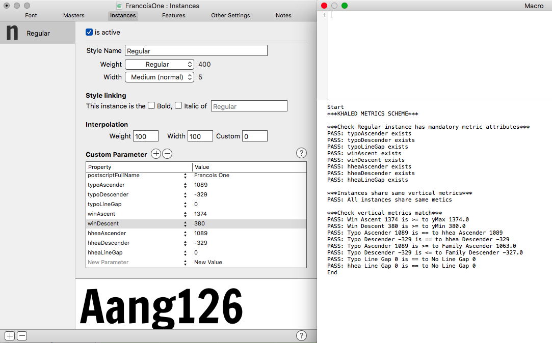
> hhea typoAscender: == usWinAscent (for cross platform compatibility)
> hhea typoDescender: == usWinDescent (for cross platform compatibility)
for line spacing (on MacOS and in FreeType).
Regards,
Khaled
Kalapi Gajjar-Bordawekar


Alexei Vanyashin
Hi Kalapi,
Welcome back (to our humble show)!
Number 3 is definitely too tight.
Does Glyphs calculate the metrics as you propose automatically, or is there need to add custom hhea and winAscent parameters to each instance?
--
You received this message because you are subscribed to a topic in the Google Groups "Google Fonts Discussions" group.
To unsubscribe from this topic, visit https://groups.google.com/d/topic/googlefonts-discuss/W4PHxnLk3JY/unsubscribe.
To unsubscribe from this group and all its topics, send an email to googlefonts-dis...@googlegroups.com.
To post to this group, send email to googlefon...@googlegroups.com.
Visit this group at https://groups.google.com/group/googlefonts-discuss.
To view this discussion on the web visit https://groups.google.com/d/msgid/googlefonts-discuss/f1984957-21d4-4954-a1ff-97ebd0146650%40googlegroups.com.
For more options, visit https://groups.google.com/d/optout.
Dave Crossland
Number 3 is definitely too tight.
Does Glyphs calculate the metrics as you propose automatically, or is there need to add custom hhea and winAscent parameters to each instance?
Dave
Khaled Hosny
* OS/2 Win metrics: text clipping, any part of the text outside
the Win metrics will be clipped.
* OS/2 Typo metrics: line spacing, but you need to set also the
“USE_TYPO_METRICS” fsSelection bit to make sure applications will use
it.
* hhea metrics: line spacing as well, some applications will prefer it
over OS/2 Typo metrics (MacOS, FreeType).
So for consistent line spacing OS/2 Typo metrics and hhea metrics must
be identical. To avoid clipping, OS/2 Win metrics should be at least
the font bbox (for some fonts or scripts where glyphs are stacked
vertically, it will need to be even bigger than the bbox).
This is all in ideal world, but the main problem is that some
applications (notably on Windows) will use OS/2 Win metrics for line
spacing, so the convention was to set all the three metrics identically.
My original proposition was to ignore those buggy applications (no Web
browser suffers from this AFAIK) and go with the ideal setting.
Regards,
Khaled
On Tue, Jul 19, 2016 at 11:44:06PM -0700, Kalapi Gajjar-Bordawekar wrote:
> Hi Khaled,
>
> Nice to meet you and thanks for the reply! :)
>
> Because we can only sort-of control how type designers (who submit fonts
> for the directory) will deal with dimensions/proportions of letterforms, we
> need to make sure that the default setting isn't too tight. Usually, the
> Latin capital letters are drawn between 700-800 units high (on 1000 UPM).
> Now as you said, Mozilla FireFox uses the hhea for line height via FreeType
> so when I tried your approach on Libre Franklin I got the following result:
>
> 1. The original metrics which are 125% of UPM and equal in all tables:
>
>
> 3. And, the new metrics plus setting hhea to typo metrics:
>
Khaled Hosny
1) Set OS/2 Typo and hhea metrics to the values that gives the desired
line spacing for *non Vietnamese text*.
2) Set OS/2 fSelection “USE_TYPO_METRICS” bit.
3) Set OS/2 Win metrics to big enough value to avoid any clipping.
Then test the font with this setup and see if there are any problems
with any of the major browsers.
The above setup will mean that by default Vietnamese line spacing will
be too tight and users of Vietnamese text will need to explicitly set
CSS line spacing to a better value. This is not ideal, but it is a
better trade-off IMO than scaling down the accents.
Alternatively, if we are fine with looser line spacing by default, then
we can change 1) to give better default line spacing for Vietnamese
text.
Regards,
Khaled
Dave Crossland
> the font bbox (for some fonts or scripts where glyphs are stacked
> vertically, it will need to be even bigger than the bbox).
I suppose ǹoth̗̦̳̳in̴g ̇ͫ̐ca̢ͬn be done about unicode stacked combining characters....
Dave
Dave Crossland
There seem to be missing from your analysis (a) linegap values and (b) this "all ink within 125% of UPM" rule that Pablo and Eben have proposed.
Khaled Hosny
> Hi Khaled
>
> There seem to be missing from your analysis (a) linegap values and (b) this
> "all ink within 125% of UPM" rule that Pablo and Eben have proposed.
have different preferences.
> You make a good point here:
>
> > To avoid clipping, OS/2 Win metrics should be at least
> > the font bbox (for some fonts or scripts where glyphs are stacked
> > vertically, it will need to be even bigger than the bbox).
>
> Is there any yet any program that will calculate the max bbox from
> stacking?
> But perhaps we could account for the combinations specified by OpenType
> layout?
common issue in Arabic since combining marks are always placed during
layout with no recomposed forms, so the font bbox does not account for
them). I think we can either have some text with common combinations,
pass it though HarfBuzz and calculate the maximum ink box of the text
after layout, or try to generate possible combinations from the layout
tables and do the above.
Regards,
Khaled
Khaled Hosny
Regards,
Khaled
Dave Crossland
On Wed, Jul 20, 2016 at 01:33:41PM -0400, Dave Crossland wrote:
> Hi Khaled
>
> There seem to be missing from your analysis (a) linegap values and (b) this
> "all ink within 125% of UPM" rule that Pablo and Eben have proposed.
I always set line gap to zero and just forget about it, but others might
have different preferences.
> Is there any yet any program that will calculate the max bbox from
> stacking?
I don’t know any.
> But perhaps we could account for the combinations specified by OpenType
> layout?
I was just thinking about a way to automate this the other day (it is a
common issue in Arabic since combining marks are always placed during
layout with no recomposed forms, so the font bbox does not account for
them). I think we can either have some text with common combinations,
pass it though HarfBuzz and calculate the maximum ink box of the text
after layout, or try to generate possible combinations from the layout
tables and do the above.
Dave
Khaled Hosny
> Hi
>
> On 20 July 2016 at 13:45, Khaled Hosny <khale...@eglug.org> wrote:
>
> > On Wed, Jul 20, 2016 at 01:33:41PM -0400, Dave Crossland wrote:
> > > Hi Khaled
> > >
> > > There seem to be missing from your analysis (a) linegap values and (b)
> > this
> > > "all ink within 125% of UPM" rule that Pablo and Eben have proposed.
> >
> > I always set line gap to zero and just forget about it, but others might
> > have different preferences.
>
>
> OK :) So, my take on your recommendation is to set the typo and hhea
> metrics to 125% or so of the UPM, both linegaps to 0, and set the win
> metrics to something larger; this avoids repositioning/reflow for fonts
> using that standard already, and no one sees any clipping, but there is
> inconsistent rendering between browsers using Apple/freetype and Windows
> text rendering APIs; ie OSX, iOS, Android, GNU, and Chrome
> (on-all-platforms) will have 'good' default line spacing and no clipping,
> and MSIE/Edge/Firefox on Windows will have different line spacing (much
> taller?
USE_TYPO_METRICS is not set, and I vaguely remember that the other
Windows browsers do the same, but we need to double check this again.
> And your Arabic fonts in Google Fonts today, are an example of this
> approach?
Regards,
Khaled

Eben Sorkin
The old rule was 125% of the UPM but at least with *browsers* the last time I did a check this limit was no longer in effect. 2 years prior to that you could rely on clipping occurring on the web - unless it was a single line! @ lines is where you saw the clipping.
So this change was a big deal and a very happy result.
So as a practical matter if you wanted to support Vietnamese on the web and you didn’t want to scale your font down you could actually change to 133% of the UPM in your vertical metrics (or whatever) with no clipping as long as you set hhea, os2 & typo values to the same 133% of UPM with zero linegaps. I could not find an upper limit at the time. So the the upper limit was "what’s practical” or “what makes typographic sense?".
I had been keen on knowing the answer to this for the sake of some Devanagari projects so that I could work out how best to handle stacked letters/signs in a single glyph.
I also did tests with adobe apps and they also seemed to play nice.
There were some windows apps that didn’t like this ( I don’t recall what ) but Office seemed to deal with it well.
I concluded that the limits now had more to do with typographic relationships and what looked reasonable than with the underlying tech.
It may be a good time to re-do the tests since mine were done at least 2 years ago which is ancient history in web time. We have also seen 2 editions of Windows since then etc.
Similarly the assumptions I was working with e.g. that web is #1 and major applications were #2 and the #3 random other apps were not going to drive our choices could be similarly reassessed.
I would be happy to re-test or to provide my test fonts to others to run tests. I am not 100% sure what timeline I can offer.
-e.
> You received this message because you are subscribed to the Google Groups "Google Fonts Discussions" group.
> To unsubscribe from this group and stop receiving emails from it, send an email to googlefonts-dis...@googlegroups.com.
> Visit this group at https://groups.google.com/group/googlefonts-discuss.
Dave Crossland
The old rule was 125% of the UPM but at least with *browsers* the last time I did a check this limit was no longer in effect.
I would be happy to re-test or to provide my test fonts to others to run tests. I am not 100% sure what timeline I can offer
Currently, almost all fonts in Google Fonts have all 3 metrics (win, typo, hhea) set to the y-direction ink bounding box ('ink box') and both linegaps set to 0. This policy was set by Raph back in 2011 and documented on the old Google Web Fonts wiki, archived at https://github.com/googlefonts/gf-docs/blob/master/VerticalMetricsRecommendations.md
1. Do nothing :) Leave the vertical metrics as they are, and draw outside them. We need to test if we still see cropping for Windows Firefox users when the font’s OS/2 fsSelection “USE_TYPO_METRICS” bit is set, or if we see cropping only when it is not. It seems that when we do see such clipping, no amount of CSS line-spacing can stop that, so we're considering other options.
3. Update the vertical metrics using the existing policy, where they are all the same. No-one will ever see any clipping, and line spacing is consistent across all browsers/platforms, but this will cause repositioning and reflowing for everyone, and most people will need to update their CSS, figuring out they should apply negative CSS line-spacing to get the same paragraph texture as before. The problem with this is that for fonts with a very tall ink box (like Latin-Arabic fonts) the line spacing becomes unusually tall, which is not ideal.
So, the tests to be done next are about how the OS/2 fsSelection USE_TYPO_METRICS bit can effect use of the OS/2 Win metrics, and if its better to set those win metrics to clip (as in 1) or not (as in 2) or bite the bullet (as in 3.)
Dave

Richard Fink
To view this discussion on the web visit https://groups.google.com/d/msgid/googlefonts-discuss/409B54AB-44A2-42C6-A944-77FF8216BAAC%40eyebytes.com.
Dave Crossland
Hi kalapi
Since nhung is out this week please could you ensure all the fonts you worked on so far are completed to their appropriate glyphs sets, and test the v metrics as described above, and then we can sync up in about 11 hours from now :)
If you manage to do all that, and be grateful if you could take a close look at fontbakery and get it running on 1 or more of your completed font projects :)
Cheers
Dave
Kalapi Gajjar-Bordawekar


![]()


Kalapi Gajjar-Bordawekar
Kalapi Gajjar-Bordawekar

Kalapi Gajjar-Bordawekar


Dave Crossland
Hi
(Replying back on list)
On Jul 25, 2016 3:00 AM, "Kalapi Gajjar-Bordawekar" <kalapi...@gmail.com> wrote:
>
>> What are the benefits of this approach?
>
> It's futureproof.
Please could you unpack this?
> It means that we do not have to calculate 125% for new fonts and we follow a method that's more in line with the spec.
My concern is that we end up herding the collection towards 2 different v metric configurations, which increases complexity of the overall Google Fonts product... So this approach would be a kid of local maximum, and while its better for individual new families, to make the whole collection better, the global maximum (accounting for positioning stability, and simplicity for text environments without linespacing control which are legion) is to use Khaled's approach for everything.
But I spoke to Omer about this and he said that we should herd the collection towards what is most correct and future-proof (whatever that means in the details) but we should also minimize disruption for users, so we should use Khaled's approach when updating fonts already published by today, but use Kalapi's approach for each new family going forwards.
BTW there is another thread on this topic in http://typedrawers.com/discussion/1705/webfont-vertical-metrics-strategies
Cheers
Dave
Kalapi Gajjar-Bordawekar
Dave Crossland
BTW there is another thread on this topic in http://typedrawers.com/discussion/1705/webfont-vertical-metrics-strategies
Dave Crossland
By futureproof I simply mean that the strategy follows the OTSpec in its definitions of these values and sticking to these will ensure that vertical dimensions will be consistent in current and future applications.
I agree with your conclusion.
Great!
Dave

Dave Crossland
Dave
Kalapi Gajjar-Bordawekar


Cheers,
Kalapi
Jacques Le Bailly
3. Questionsa. This one is for Jacques. Is it a good idea to have to versions of the 'J' in a font as follows:
Kalapi Gajjar-Bordawekar


Marc Foley


Dave Crossland
One of the descenders has a positive actual value 👀
Kalapi Gajjar-Bordawekar

</div
Kalapi Gajjar-Bordawekar

Nhung Nguyen

Nhung Nguyen
Kalapi Gajjar-Bordawekar
Kalapi Gajjar-Bordawekar

fig: Schwa, Schwa.ss01, schwa, schwa.ss01
</div
Dave Crossland
a. I spent most of the morning inspecting Nhung's Vietnamese extension for Montserrat.
Kalapi Gajjar-Bordawekar
Kalapi Gajjar-Bordawekar
Kalapi Gajjar-Bordawekar
a. I completed updating 'Anaheim' to the Plus character set (except Vietnamese, but that is obvious!). The fork on my <a href="https://github.com/kalapi/ana
Dave Crossland
I've shared some observations on the Montserrat-specific thread just now (sorry for the delay on this!).
Dave Crossland
I added case diacritics for Anton and it's ready for you to review here: https://github.com/crystaltype/AntonFont
Nhung Nguyen
Kalapi Gajjar-Bordawekar
Kalapi Gajjar-Bordawekar
Kalapi Gajjar-Bordawekar
a. I made a local copy of the remote branch 'GF2016-fix' (which has since been deleted) on the google/fonts repo and tried to fix the merge conflicts in pull request <a href="https://github.com/google/fonts/pull/302" rel="nofollow" target="_blank" onmousedown="this.href='https://www.google.com/url?q\x3dhttps%3A%2F%2Fgithub.com%2Fgoogle%2Ffonts%2Fpull%2F302\x26sa\x3dD\x26sntz\x3d1\x26usg\x3dAFQjCNFsRbIqrcpz9YFbFpGTpnwUMrBCEw';return true;" onclick="this.href='https://www.google.com/url?q\x3dhttps%3A%2F%2Fgi
Kalapi Gajjar-Bordawekar
Kalapi Gajjar-Bordawekar

After:

Vietnamese:


Currency:

![]()
![]()
Other than glyph expansions, I also updated some outlines in existing glyphs
Before:

After:


new:

Dave Crossland
a. @Dave: the current release of Oswald uses a vertical metrics approach where all metrics are 5% +/- yMax and yMin applied to all entries. The new package uses Khaled's approach and there are expected line-height changes. How would you like me to proceed?
Kalapi Gajjar-Bordawekar
Kalapi Gajjar-Bordawekar

Dave Crossland
Ok, i'll try to figure this out since the original numbers are arbitrary and based on 2048 UPM while the new project is 1000 UPM.

Pablo Impallari
--
You received this message because you are subscribed to the Google Groups "Google Fonts Discussions" group.
To unsubscribe from this group and stop receiving emails from it, send an email to googlefonts-discuss+unsub...@googlegroups.com.
To post to this group, send email to googlefonts-discuss@googlegroups.com.
Visit this group at https://groups.google.com/group/googlefonts-discuss.
To view this discussion on the web visit https://groups.google.com/d/msgid/googlefonts-discuss/CAEozd0wJZAyv_eh%2BfVse2RsPo_jq1iy0fSKcEv2vcFA6FMS08w%40mail.gmail.com.
--
Pablo Impallari
Kalapi Gajjar-Bordawekar
On Thursday, 25 August 2016 13:45:55 UTC+5:30, Pablo Impallari wrote:
Please, before extending projects, always test the glyph's migration against the original files to see if the migration was successful or not.Hi Kalapi,About Dancing Script: Are you able to generate font files from the Glyphs source?
2016-08-24 15:51 GMT-03:00 Dave Crossland <da...@lab6.com>:
On 24 August 2016 at 14:44, Kalapi Gajjar-Bordawekar <kalapi...@gmail.com> wrote:Ok, i'll try to figure this out since the original numbers are arbitrary and based on 2048 UPM while the new project is 1000 UPM.
A few px is not a problem :)
--
You received this message because you are subscribed to the Google Groups "Google Fonts Discussions" group.
To unsubscribe from this group and stop receiving emails from it, send an email to googlefonts-discuss+unsub...@googlegroups.com.
To post to this group, send email to googlefon...@googlegroups.com.
Visit this group at https://groups.google.com/group/googlefonts-discuss.
To view this discussion on the web visit https://groups.google.com/d/msgid/googlefonts-discuss/CAEozd0wJZAyv_eh%2BfVse2RsPo_jq1iy0fSKcEv2vcFA6FMS08w%40mail.gmail.com.
Jacques Le Bailly
Op woensdag 24 augustus 2016 20:51:53 UTC+2 schreef Dave Crossland:
Kalapi Gajjar-Bordawekar
Pablo Impallari
Kalapi Gajjar-Bordawekar
Pablo Impallari
--
You received this message because you are subscribed to the Google Groups "Google Fonts Discussions" group.
To unsubscribe from this group and stop receiving emails from it, send an email to googlefonts-discuss+unsub...@googlegroups.com.
To post to this group, send email to googlefonts-discuss@googlegroups.com.
Visit this group at https://groups.google.com/group/googlefonts-discuss.
To view this discussion on the web visit https://groups.google.com/d/msgid/googlefonts-discuss/9d630cad-2853-4f14-9bef-a1657dc5e281%40googlegroups.com.
Kalapi Gajjar-Bordawekar
Kalapi Gajjar-Bordawekar
Kalapi Gajjar-Bordawekar
<a href="https://lh3.googleusercontent.com/-Y6-P0_SKuYE/V48DUcun4cI/AAAAAAAABjw/OKOgtjBqs-kj9WrI0WrKba_v2T7NBP1nwCLcB/s1600/Sheet_1.png" style="margin-left:1em;margin-right:1em" rel="nofollow" target="_blank" onmousedown="this.href='https://lh3.googleusercontent.co
Kalapi Gajjar-Bordawekar
Pablo Impallari
--
You received this message because you are subscribed to the Google Groups "Google Fonts Discussions" group.
To unsubscribe from this group and stop receiving emails from it, send an email to googlefonts-discuss+unsub...@googlegroups.com.
To post to this group, send email to googlefonts-discuss@googlegroups.com.
Visit this group at https://groups.google.com/group/googlefonts-discuss.
To view this discussion on the web visit https://groups.google.com/d/msgid/googlefonts-discuss/3b4fc429-36d2-4b87-ba80-c43480190fd9%40googlegroups.com.
Kalapi Gajjar-Bordawekar
To post to this group, send email to googlefon...@googlegroups.com.
Visit this group at https://groups.google.com/group/googlefonts-discuss.
To view this discussion on the web visit https://groups.google.com/d/msgid/googlefonts-discuss/3b4fc429-36d2-4b87-ba80-c43480190fd9%40googlegroups.com.