Alegreya Cyrillic

Alexei Vanyashin
Alexei Vanyashin


Juan Pablo del Peral is actively working on Cyrillic extension of Alegreya family. This thread will be used for Cyrillic reviews.
--
You received this message because you are subscribed to a topic in the Google Groups "Google Fonts Discussions" group.
To unsubscribe from this topic, visit https://groups.google.com/d/topic/googlefonts-discuss/IlHtSsEE1hg/unsubscribe.
To unsubscribe from this group and all its topics, send an email to googlefonts-discuss+unsub...@googlegroups.com.
To post to this group, send email to googlefonts-discuss@googlegroups.com.
Visit this group at https://groups.google.com/group/googlefonts-discuss.
To view this discussion on the web visit https://groups.google.com/d/msgid/googlefonts-discuss/6b5ef2da-fd56-4ec1-8bc0-e9c39fd33bce%40googlegroups.com.
For more options, visit https://groups.google.com/d/optout.
Alexei Vanyashin
Bottom: after (corrected layer)

Bottom: after (corrected layer)

brevecomb-cy in the Regular master

б I would try a different junction with an inflection

Juan Pablo del Peral :: Huerta Tipográfica
. . . . . . . . . . . . . . . . . . . . . . . . . . . . . . . . . . . . . . . . . .
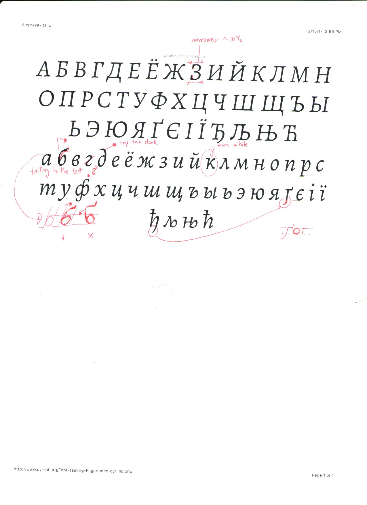
Alexei Vanyashin
-
лм -
ьъ -
brevecomb-cy -
зlacks a bottom terminal. Match withэ -
фshould more similar to bowls formd+p -
б


Alexei Vanyashin
Hi Juan,
Good job with the updates on Italic. Here is the next round of comments.
Simultaneously you can continue expanding the Cyrillic Plus range. You can use my GlyphsDataCYR.xml file to speed up components generation. Drop it in the same folder as your Glyphs file, and restart Glyphs. Once you have created descender-cy descender-cy.case strokeshortcomb
you can use the 'Make Component Glyphs' function to auto-generate most of the component-based glyphs.
ж the new form is great
к
Would be good to have an upward flick in the bottom limb. The current form feels too Greek (kappa), and this abrupt movement isn't supported in other glyphs.

У — diagonal is too dark
Й Cyrillic kratka (breve). Uppercase forms require a wider kratka
I have added a brevecomb-cy.case for Italic:
The Bold Ф is too light in both Italic and Roman styles. The sides of the bowls should be thicker.

I suggest raising the stem above the CAP height to create more space for the bowls.
References:
г д я
г is too wide, and the middle angle can be sharper
я adjust the angle of the bowl an seen on the image
д the ascender isn't right yet. It is too long.

Juan Pablo del Peral :: Huerta Tipográfica
%2016.01.19.png?part=0.1&view=1)
. . . . . . . . . . . . . . . . . . . . . . . . . . . . . . . . . . . . . . . . . .
Alexei Vanyashin
Hi AlexeiThank you so much for your quick response! I have a lot to do :)A simple question: are the semiserifs okay now?
%2016.01.19.png?part=0.1&view=1)
Alexei Vanyashin

Alexei Vanyashin


Juan Pablo del Peral :: Huerta Tipográfica
. . . . . . . . . . . . . . . . . . . . . . . . . . . . . . . . . . . . . . . . . .

Thomas Linard
The dev version https://github.com/huertatipografica/Alegreya-libre/tree/dev added polytonic Greek support. Could this new version use the "B set" proposed by Irene Vlachou https://github.com/irenevl/Google-Greek-Sets and discussed here? Many thanks!

Juan Pablo del Peral
Hi,
The dev version https://github.com/huertatipografica/Alegreya-libre/tree/dev added polytonic Greek support. Could this new version use the "B set" proposed by Irene Vlachou https://github.com/irenevl/Google-Greek-Sets and discussed here? Many thanks!
Thomas Linard
No problem, enjoy your new home. I'm looking forward the new version of Alegreya!
Juan Pablo del Peral :: Huerta Tipográfica
. . . . . . . . . . . . . . . . . . . . . . . . . . . . . . . . . . . . . . . . . .
Thomas Linard
Juan Pablo del Peral :: Huerta Tipográfica
. . . . . . . . . . . . . . . . . . . . . . . . . . . . . . . . . . . . . . . . . .
Thomas Linard
Fantastic work! And you thought about double gamma and double lambda ligatures! Lovely! 😊
Now my comments and suggestions:
You should use the Greek filter lists (they need update, but it's better than nothing): https://github.com/google/fonts/tree/greek-glyphsets/tools/encodings/GF%202016%20Glyph%20Sets/Greek
In particular, the two cases of the kai ligature from the Core set are missing and the small cap kai from the Expert is of course missing too (but in the definitive version, if it's validated, the Expert set will have also Greek superior letters).
Warning: these lists favor the practice of iota subscript, while you choose to follow the Western tradition of iota adscript by default (https://en.wikipedia.org/wiki/Iota_subscript).
I find disturbing that neither smcp or c2sc give accentued small caps. smcp + ss05 or c2sc + ss05 give accentued small caps (but, in this cas, with subscript iota). ss06 gives small cap adscript iota.
A better practice, I think, is when smcp give small cap adscript iota (if adscript iota is the default) and c2sc all small caps.
For this reason, I adapted in this spreadsheet the Greek practice of Irene (iota subscript by default) to a complete small caps system:
- Default: cap + iota subscript
- salt or ss0x: cap + iota adscript
- smcp or s2sc : small cap + iota subscript
- smcp + salt or ss0x : cap + small cap iota adscript
- smcp or s2sc + salt or ss0x: small cap + small cap iota adscript
Nothing related, but the Capital Sharp S in Alegreya follows the "Dresden" design with a corner at the top left. Alegreya Sans follows the Dresden design with a an arc at the top left:
https://typography.guru/journal/capital-sharp-s-designs/
It's a matter of personal taste, but I think the Dresden design, particularly with a corner, works better for more geometric typefaces that Alegreya. The "Zehlendorf" design appears more suitable.
Juan Pablo del Peral :: Huerta Tipográfica
. . . . . . . . . . . . . . . . . . . . . . . . . . . . . . . . . . . . . . . . . .
Juan Pablo del Peral :: Huerta Tipográfica
%2018.52.06.png?part=0.1&view=1)
. . . . . . . . . . . . . . . . . . . . . . . . . . . . . . . . . . . . . . . . . .
Thomas Linard
You can take a look at Brill's SC implementation (by John Hudson) http://www.brill.com/about/brill-fonts
(Warning: Brill follows the Western practise of the iota adscript by default)
The smcp feature substitutes accented lowercase by accented small caps.
But the calt feature substitutes two contiguous accented caps or accented small caps by unaccented ones.
Set all caps texts in unaccented form is a fairly common practise (but shouldn't be imposed on users). To achieve this, Brill has a long series of unaccented small caps, I don't think it's necesserary (unaccented alpha, epsilon, omicron, omega and upsilon exist anyway). So, for me, it isn't exactely correct to speak of four versions of unaccented small caps: two versions exist for the unaccented alpha, epsilon, omicron, omega and upsilon anyway.
If you want this type of implementation in both Alegreya, it'll be more like this:

I used salt, but of course it's can be a ss0x feature also. And tell me if my examples aren't clear (I hope they are!).
By the way, the 2017 Greek Glyph Sets are (almost?) ready to be merged in the master branch. If you think the proposed list of glyphs for the Expert set doesn't allow a good implementation of small caps, I think it's always time to make corrections.
Alexei Vanyashin


Alexei Vanyashin

Alexei Vanyashin
Juan Pablo del Peral :: Huerta Tipográfica
. . . . . . . . . . . . . . . . . . . . . . . . . . . . . . . . . . . . . . . . . .
juandelperal
---------- Forwarded message ----------
From: Panagiotis Haratzopoulos <p.ha...@gmail.com>
Date: 2017-02-16 9:46 GMT-03:00
Subject: Re: [googlefonts-discuss] Alegreya Cyrillic
To: "\"Juan Pablo del Peral :: Huerta Tipográfica\"" <ju...@huertatipografica.com>
As a conclusion, you never use accent diacritics in Capitals.
I hope this answers your question.
Best
Juan Pablo del Peral :: Huerta Tipográfica

. . . . . . . . . . . . . . . . . . . . . . . . . . . . . . . . . . . . . . . . . .
Thomas Linard
When you choose to made a monotonic Greek typeface, you know your first public will be native speakers. But when you extend to polytonic Greek, which isn't commonly used in Greece anymore, you must know that your public, for the polytonic part, will be in good part non-native. And the Western tradition of Greek printing isn't less noble than the native one. In fact, Greek has been printed first in the Western world!
It may sound stupid to require to set in diacritics, for uppercase or lowercase, texts written at a time when no diacritics existed (and even no double case — uppercase and lowercase —, like Latin in the same time — and yet nobody wants to go back to a single case, ISN'T IT?😉), yet it's the common practice in academic edition of ancient Greek texts in the Western world.
Not that I am against the native practice. In fact, I found Irene's proposal interesting, precisely in part because the Greek practice (iota subscript for lowercase and uppercase) was the default.
So, when I read "[ypogegrammeni] [= iota subscript] diacritic in lower case becomes [prosgegrammeni] [= iota adscript] diacritic, when it is set in capitals", I wonder: has the Western practice become so common in Greece that the Greeks themselves have forgotten their own tradition?
https://en.wikipedia.org/wiki/Iota_subscript
"Different conventions exist for the treatment of subscript/adscript iota with uppercase letters. In Western printing, the most common practice is to use subscript diacritics only in lowercase environments and to use an adscript (i.e. a normal full-sized iota glyph) instead whenever the host letter is capitalized. When this happens in a mixed-case spelling environment (i.e. with only the first letter of a word capitalized, as in proper names and at the beginning of a sentence), then the adscript iota regularly takes the shape of the normal lowercase iota letter (e.g. ᾠδεῖον → Ὠιδεῖον). In an all-capitals environment, the adscript is also regularly capitalized (ΩΙΔΕΙΟΝ). In Greece, a more common convention is to print subscript diacritics both with lowercase and uppercase letters alike. Yet another, intermediate convention is to use lowercase adscript iotas both for mixed-case and for all-capitals words (e.g. ΩιΔΕΙΟΝ), or to use a special glyph in the shape of a smaller capital iota in the latter case (ΩΙΔΕΙΟΝ).[11]"
Thomas Linard
The Google Fonts Greek Glyphs Sets have been released.
Btw, I found in this document why the tradition of iota subscript no longer seems to be followed everywhere in Greece:
- The first approach (capital subscript) is to treat uppercase as equivalent to lowercase: if a mute iota is tucked underneath a lowercase vowel, it should also be tucked underneath an uppercase vowel. This is what the mediaeval scribes did, and it turns up both in pre-Modern Western typography of Classical Greek, and in Modern Greek typography—particularly that associated with the Church.
- The second approach (capital adscript) is to take capitals—and all caps text in particular—as equivalent to Ancient Greek text, which after all didn't have any lower case. In Ancient Greek writing, /oːi/ was written in capitals, as ΩΙ. So in a modern all caps text, the thinking goes, the same should be done: the capital version of ῳ is ΩΙ. This is seen sometimes in the west. In that case, the iota is no longer subscript, ypogegrammeni (written underneath the letter), but adscript, prosgegrammeni (written next to the letter).
- The third approach (small adscript) is a compromise: the capital version of the iota subscript is adscript, written next to the letter, but not as a full-sized capital iota. It appears either as a lowercase iota (full-sized or smaller than normal), or as a small-caps iota. This is usual practice in the West, and frequent outside the Church in Greece as well.
Alexei Vanyashin
--
You received this message because you are subscribed to a topic in the Google Groups "Google Fonts Discussions" group.
To unsubscribe from this topic, visit https://groups.google.com/d/topic/googlefonts-discuss/IlHtSsEE1hg/unsubscribe.
To unsubscribe from this group and all its topics, send an email to googlefonts-dis...@googlegroups.com.
To post to this group, send email to googlefon...@googlegroups.com.
Visit this group at https://groups.google.com/group/googlefonts-discuss.
To view this discussion on the web visit https://groups.google.com/d/msgid/googlefonts-discuss/CABoOcJkpOY84%3DVuc9%3DYMtaEdzfb5K2b9_kLvLS-NdOf8zo%2BpdA%40mail.gmail.com.
For more options, visit https://groups.google.com/d/optout.