Displaying bit data (1/0)
56 views
Skip to first unread message

Eljakim Burger
Jan 13, 2020, 11:16:15 AM1/13/20
to Google Visualization API
Dear all,
I would like to display the behaviour of a bit on a time-axis. Like you see in a logic analyzer (See added image). Would this be possible with Google Charts? I suppose, the chart type "SteppedAreaChart" would be the best option, to prevent diagonal lines.
The chart should be capable of handling over a 1000 datapoints, if this is possible?
Thanks in advance.
Best regards,
Eljakim Burger

Daniel LaLiberte
Jan 13, 2020, 11:32:00 AM1/13/20
to Google Visualization API
SteppedArea would probably be easier to deal with, and a few thousand data points should be no problem. The values can be 0s and 1s, or true and false, though not many people use the boolean type, so you may discover some issues.
You may want to set the area opacity to 0, to show only the lines. The domain values being continuous time values (rather than discrete string values) means that each of the steps will be labeled on the trailing end, which means you will need an extra initial value before your first row of data.
Hope that helps.
--
You received this message because you are subscribed to the Google Groups "Google Visualization API" group.
To unsubscribe from this group and stop receiving emails from it, send an email to google-visualizati...@googlegroups.com.
To view this discussion on the web visit https://groups.google.com/d/msgid/google-visualization-api/40bee20d-3e25-4e66-880a-399c8600ff39%40googlegroups.com.
Daniel LaLiberte
Jan 13, 2020, 11:35:27 AM1/13/20
to Google Visualization API
An alternative to consider for your domain axis is to set the hAxis.type option to 'category', so that it behaves more like discrete values, with the axis tick centered on each step, but the spacing between category ticks will all be identical. See an example at: https://jsfiddle.net/dlaliberte/puobter1/3/
Eljakim Burger
Jan 13, 2020, 11:52:26 AM1/13/20
to Google Visualization API
Thank you very much.
What I don't understand, how does the options variable work? I would like to change the horizontal axis to the datetime format.
Op maandag 13 januari 2020 17:32:00 UTC+1 schreef Daniel LaLiberte:
Op maandag 13 januari 2020 17:32:00 UTC+1 schreef Daniel LaLiberte:
SteppedArea would probably be easier to deal with, and a few thousand data points should be no problem. The values can be 0s and 1s, or true and false, though not many people use the boolean type, so you may discover some issues.You may want to set the area opacity to 0, to show only the lines. The domain values being continuous time values (rather than discrete string values) means that each of the steps will be labeled on the trailing end, which means you will need an extra initial value before your first row of data.Hope that helps.
On Mon, Jan 13, 2020 at 11:16 AM Eljakim Burger <eljaki...@gmail.com> wrote:
Dear all,--I would like to display the behaviour of a bit on a time-axis. Like you see in a logic analyzer (See added image). Would this be possible with Google Charts? I suppose, the chart type "SteppedAreaChart" would be the best option, to prevent diagonal lines.The chart should be capable of handling over a 1000 datapoints, if this is possible?Thanks in advance.Best regards,Eljakim Burger
You received this message because you are subscribed to the Google Groups "Google Visualization API" group.
To unsubscribe from this group and stop receiving emails from it, send an email to google-visualization-api+unsub...@googlegroups.com.
To view this discussion on the web visit https://groups.google.com/d/msgid/google-visualization-api/40bee20d-3e25-4e66-880a-399c8600ff39%40googlegroups.com.
--
Daniel LaLiberte
Jan 13, 2020, 12:13:16 PM1/13/20
to Google Visualization API
If your domain values, in the first column, come in as datetime values, then the hAxis will display ticks as datetime values, formatted by the default rules. See the documentation on dates and times here: https://developers.google.com/chart/interactive/docs/datesandtimes
You can specify the formatted representation of each value also, using the {v: value, f: formatted-value} representation of each cell in the table. Or you can format the values using a DateFormatter. See: https://developers.google.com/chart/interactive/docs/reference#dateformat
The format of tick values, however, is specified separately from the format of data values. There is more documentation about axes here: https://developers.google.com/chart/interactive/docs/customizing_axes
On Mon, Jan 13, 2020 at 11:52 AM Eljakim Burger <eljaki...@gmail.com> wrote:
Thank you very much.
What I don't understand, how does the options variable work? I would like to change the horizontal axis to the datetime format.
Op maandag 13 januari 2020 17:32:00 UTC+1 schreef Daniel LaLiberte:
SteppedArea would probably be easier to deal with, and a few thousand data points should be no problem. The values can be 0s and 1s, or true and false, though not many people use the boolean type, so you may discover some issues.You may want to set the area opacity to 0, to show only the lines. The domain values being continuous time values (rather than discrete string values) means that each of the steps will be labeled on the trailing end, which means you will need an extra initial value before your first row of data.Hope that helps.
On Mon, Jan 13, 2020 at 11:16 AM Eljakim Burger <eljaki...@gmail.com> wrote:
Dear all,--I would like to display the behaviour of a bit on a time-axis. Like you see in a logic analyzer (See added image). Would this be possible with Google Charts? I suppose, the chart type "SteppedAreaChart" would be the best option, to prevent diagonal lines.The chart should be capable of handling over a 1000 datapoints, if this is possible?Thanks in advance.Best regards,Eljakim Burger
You received this message because you are subscribed to the Google Groups "Google Visualization API" group.
To unsubscribe from this group and stop receiving emails from it, send an email to google-visualizati...@googlegroups.com.
To view this discussion on the web visit https://groups.google.com/d/msgid/google-visualization-api/40bee20d-3e25-4e66-880a-399c8600ff39%40googlegroups.com.
--
--
You received this message because you are subscribed to the Google Groups "Google Visualization API" group.
To unsubscribe from this group and stop receiving emails from it, send an email to google-visualizati...@googlegroups.com.
To view this discussion on the web visit https://groups.google.com/d/msgid/google-visualization-api/f4fb3e8d-6134-40a2-8da4-e8ac2c817706%40googlegroups.com.

Frank Häfele
Jun 22, 2022, 2:40:13 PM6/22/22
to Google Visualization API
Hello Guys,
have you solved this issue?
I have the same problem.
I have the same problem.
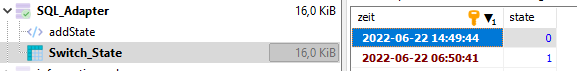
I saved the state of microcontroller output (0 or 1) to sql database and I want to display the data as a digital signal over time.
The first column has type "datetime", the second the value of the mic (0/1).
The first column has type "datetime", the second the value of the mic (0/1).
But the data drawed does not fullfill my expectation.
What does I make wrong?
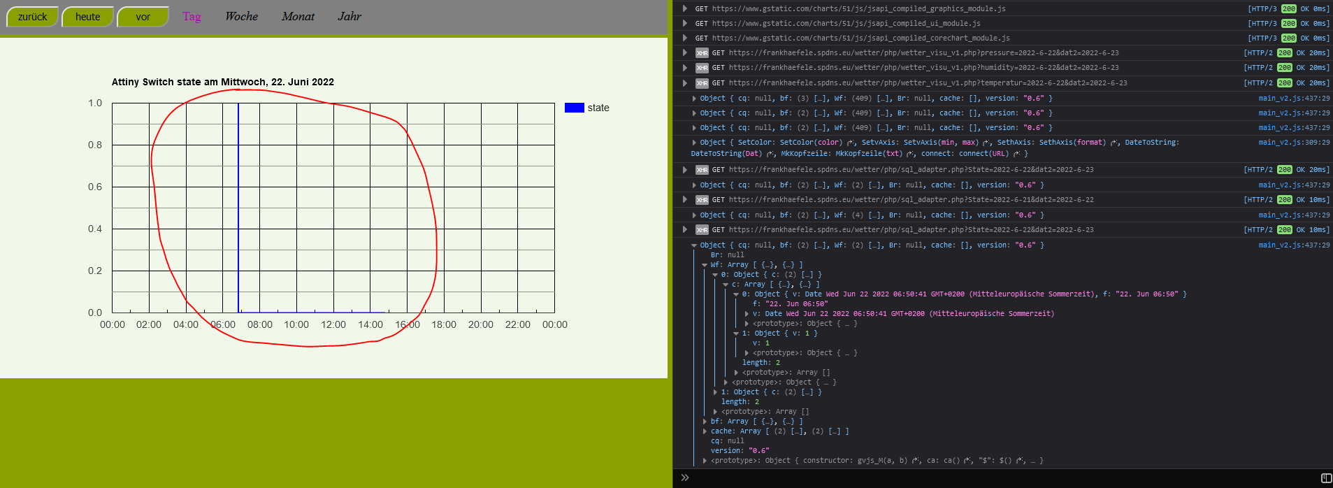
The data looks like:
Reply all
Reply to author
Forward
0 new messages