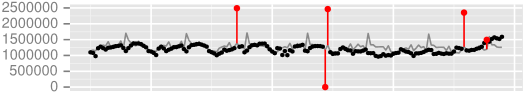
Can I do this - expected vs actual linechart with outliers highlighted

Gatnus
I'm new to Google Visualization and haven't seen what I'm looking to do
anywhere in the online documentation. I'm displaying a linechart with
day/hour on the X axis and 2 graphs - expected and actual on the Y axis. I would like to add a "highlight" graph similar to the red in the image below - when the actual vs expected meets a mathematical formula, I'd like to show a "highlight this data point" as too high (red dot on top) or too low (red dot on bottom)....I only want the red lines / marks to appear when required, ie when the actual vs expected formula indicates "too high" or "too low". If I can't draw the dot at the end of the line, at least drawing a line in another color to indicate an outlier would be useful. Any help would be greatly appreciated.
<html>
<head>
<script type="text/javascript" src="https://www.gstatic.com/charts/loader.js"></script>
<script type="text/javascript">
google.charts.load('current',{'packages':['corechart']});
google.charts.setOnLoadCallback(drawChart);
function drawChart() {
var data = google.visualization.arrayToDataTable([
['date/hr', 'Expected', 'Actual'],
['20160930.0', 5510870, 1948956],
['20160930.1', 1645700, 1835563],
['20160930.2', 3827840, 1832456],
...<many other data points> ...
]);
var options = {
title: 'mychart expected vs actual',
curveType: 'function',
legend: { position: 'bottom' }
};
var chart = new google.visualization.LineChart(document.getElementById('curve_chart'));
chart.draw(data, options);
}
</script>
</head>
<body>
<div id="curve_chart" style="width:1920px; height: 500px"></div>
</body>
</html>

Daniel LaLiberte
--
You received this message because you are subscribed to the Google Groups "Google Visualization API" group.
To unsubscribe from this group and stop receiving emails from it, send an email to google-visualization-api+unsub...@googlegroups.com.
To post to this group, send email to google-visualization-api@googlegroups.com.
Visit this group at https://groups.google.com/group/google-visualization-api.
To view this discussion on the web visit https://groups.google.com/d/msgid/google-visualization-api/7eb7dbbc-5b79-4b01-a449-be45322d83bb%40googlegroups.com.
For more options, visit https://groups.google.com/d/optout.
Gatnus
Intervals looks like it would work well for me and make the chart much cleaner *if* I can find a way to retrieve the numbers that would indicate "very high", "high", "low", and "very low" and show those in the interval...Right now, I am only able to get an indicator which tells me which category the "actual" data falls in - "very low", "low", "acceptable", "high", "very high". If I can't get the developer to give me the threshold numbers, is there a way to indicate when a data point falls into the "very high" or "very low" category - such as the line with the red dot in the original sample?
To post to this group, send email to google-visua...@googlegroups.com.
Visit this group at https://groups.google.com/group/google-visualization-api.
To view this discussion on the web visit https://groups.google.com/d/msgid/google-visualization-api/7eb7dbbc-5b79-4b01-a449-be45322d83bb%40googlegroups.com.
For more options, visit https://groups.google.com/d/optout.
Daniel LaLiberte
To unsubscribe from this group and stop receiving emails from it, send an email to google-visualization-api+unsubscr...@googlegroups.com.
To post to this group, send email to google-visua...@googlegroups.com.
Visit this group at https://groups.google.com/group/google-visualization-api.
To view this discussion on the web visit https://groups.google.com/d/msgid/google-visualization-api/7eb7dbbc-5b79-4b01-a449-be45322d83bb%40googlegroups.com.
For more options, visit https://groups.google.com/d/optout.
--
You received this message because you are subscribed to the Google Groups "Google Visualization API" group.
To unsubscribe from this group and stop receiving emails from it, send an email to google-visualization-api+unsub...@googlegroups.com.
To post to this group, send email to google-visualization-api@googlegroups.com.
Visit this group at https://groups.google.com/group/google-visualization-api.
To view this discussion on the web visit https://groups.google.com/d/msgid/google-visualization-api/78f61bd2-c366-4580-bdaf-3b0f7d927f68%40googlegroups.com.