Flutter 2.0: Still no "layout system", "app structure", native widgets for web & desktop?
447 views
Skip to first unread message

Karsten Silz
Mar 7, 2021, 11:46:28 AM3/7/21
to Flutter Development (flutter-dev)
Hi!
I build native mobile apps with Flutter. But in mid-March, I give two conference talks about how Java developers should build front-ends (here and here, English dry-run from February here). I‘ll recommend Flutter over React Native for mobile there, but need your input on Flutter 2.0. Here are my statements. Please let me know if I got my facts correct!
1. Flutter 2.0 has no built-in layout system
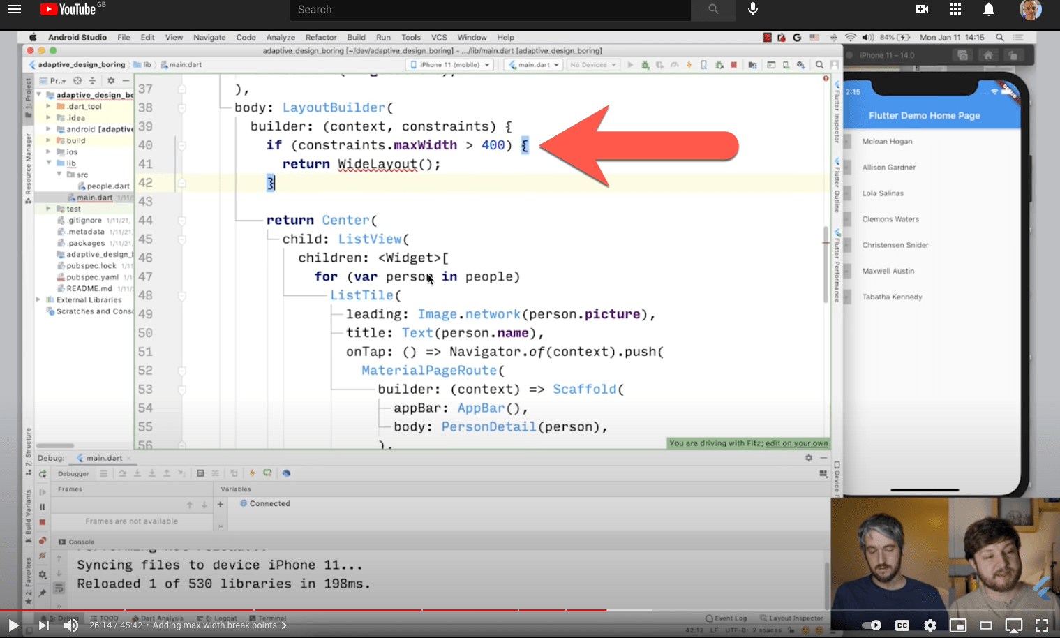
„Layout“ here means a high-level construct that shows a different UI on a phone in landscape vs portrait, or on a phone vs. tablet. Examples are the Bootstrap grid or the CSS Flexbox. The web app demo from Flutter Engage had the two-column layout built into the component itself and used width breakpoints (YouTube time-coded link):

I use flutter_bootstrap in my Flutter apps. It‘s too coarse-grained for phones (everything below 576 pixel is one category), but it‘s better than a sharp stick to the eye.
2. Flutter 2.0 has no concept of an „app structure“
What I mean here is the whole UI layout is automatically different on, say, a phone vs a tablet, web page or desktop. For instance, a bottom navbar becomes a sidebar, and the main view shows more content or different content (like the table and the detail view at the same time). I think Android does that with fragments. Here‘s a screenshot from that Android fragments link, illustrating my point:

3. Flutter 2.0 has no native widget sets for web or desktop, and none are in sight/announced/in the works.
„Native widget set“ means that it looks like a Windows application, a Mac application, or an un-styled HTML page:


From what I can see, there‘s still just Material widgets and iOS ones. The Flutter Engage keynote showed the „Folio“ app as a good example of an app that‘s at home on mobile, desktop, and web. But the desktop app looked as non-native as any Electron app on a Mac (YouTube time-coded link):

I understand that re-painting all native UI widgets is a big & boring & on-going task. You can tell by seeing Google struggle here: Dark mode took a year to arrive properly on iOS, I think. Password autofill in form fields took two years, form fields with error messages took more than two years (just arrived in 2.0), and a proper iOS table is still missing.

Kevin Chadwick
Mar 7, 2021, 12:16:34 PM3/7/21
to Flutter Development (flutter-dev)
All of your questions misunderstand flutter.
On Sun, 7 Mar 2021, 16:46 Karsten Silz, <karste...@gmail.com>
1. Flutter 2.0 has no built-in layout system„Layout“ here means a high-level construct that shows a different UI on a phone in landscape vs portrait, or on a phone vs. tablet. Examples are the Bootstrap grid or the CSS Flexbox. The web app demo from Flutter Engage had the two-column layout built into the component itself and used width breakpoints
I shall just answer the first as this information can easily be found!
This is easily done but should not be. The important thing is the screen dimensions and Flutter handles pixel density in a good way. The layout can easily respond to any device from a watch to a wall screen.
On a personal note. I am not interested in device dependent native looks. I want the best widget to run on all platforms.

Benedicte Roussel
Mar 7, 2021, 3:17:56 PM3/7/21
to Flutter Development (flutter-dev), Kevin Chadwick
I totally agree with @Kevin, my point of view is that you are mobile-minded and if I say: 'media query' can help you are going to shout, but believe me it will not spoil your mobile app, on the contrary.
Then you can do quite better than those examples ... they were just a quick show.
To be cross-platform minded can be tricky but it is absolutely possible with Flutter
--
You received this message because you are subscribed to the Google Groups "Flutter Development (flutter-dev)" group.
To unsubscribe from this group and stop receiving emails from it, send an email to flutter-dev...@googlegroups.com.
To view this discussion on the web visit
https://groups.google.com/d/msgid/flutter-dev/CANNfpqct4xnO6-gjHj_4TeqouCk37544q5YKfa%3D%2B1PwB_H9JkQ%40mail.gmail.comYou received this message because you are subscribed to the Google Groups "Flutter Development (flutter-dev)" group.
To unsubscribe from this group and stop receiving emails from it, send an email to flutter-dev...@googlegroups.com.
To view this discussion on the web visit
.
Karsten Silz
Mar 8, 2021, 2:15:43 AM3/8/21
to Flutter Development (flutter-dev)
Hi,
Thank you for your comments!
About question 1:
I think you misunderstood me. I do have an adaptive layout in my app, I know how to query the screen width, and I am using flutter_bootstrap in my app (I said so in my post). I also build responsive web applications. My point was that Flutter has neither a high-level construct of a "layout system" (like CSS Flexbox) nor does th the Flutter team endorse a plugin (like they did with Provider for state management). Instead, they manually query just the width - in the Engage demo (see above) and in the recent episode of the "Boring Show" where they talked about adaptive layout (https://youtu.be/n6Awpg1MO6M?t=1574):
I think a separation of concerns with a "layout system" would be better structurally and easier for Flutter beginners. Bootstrap and CSS went with a grid approach, so that is a good candidate.
So from your feedback I gather that my point 1 is correct: Flutter 2.0 has no built-in layout system. Would you agree?
About question 2:
From your feedback I get that my point 2 is correct: Flutter 2.0 has no concept of an „app structure“. Would you agree?
About question 3:
Again, sorry if I was too brief. I know that you can always build your own UI with your own conventions (like Netflix or the Folio app in Engage). And you can use Material Components on all platforms, too. I was asking about native-looking apps. I think they are valuable because they look and behave like many other apps the users, so they can be easier to use - the users then already know how to interact with them and discover their functionality. It seems liken the Flutter team agrees - that's why we have the Cupertino native widget set for iOS.
From your feedback I get that my point 3 is correct: Flutter 2.0 has no native widget sets for web or desktop, and none are in sight/announced/in the works. Would you agree?
Benedicte Roussel
Mar 8, 2021, 2:27:37 AM3/8/21
to Flutter Development (flutter-dev), Karsten Silz
Karsten Silz
Mar 8, 2021, 2:51:15 AM3/8/21
to Flutter Development (flutter-dev)
I'm sorry, but I don't understand "What does do Wrap?".
Benedicte Roussel
Mar 8, 2021, 3:20:49 AM3/8/21
to Flutter Development (flutter-dev), Karsten Silz
Just approach Flutter/dart with fresh eyes. Does a Java dev is looking for his/her XML files for his/her design? No, he adopts a new approach. Someone coming from the web should appreciate not to have Html + CSS + JS but just dart and Flutter to organize the structure of his/her app...
If you do not appreciate that you are still free to go along with the technic you want
Karsten Silz
Mar 8, 2021, 4:10:54 AM3/8/21
to Flutter Development (flutter-dev)
Hello,
I'm afraid we still don't understand each other. I love development with Flutter. I think declarative front-ends are the future of UI development. I say as much in my talk: time-coded YouTube link and code samples in SwiftUI, Flutter, Jetpack Compose, .NET MAUI, and React. In my talk, I recommend Flutter for mobile development and suggest Flutter plugins.
This post is about what I consider missing functionality in Flutter. I'm looking for a simple "Yes" or "No" on what I hope are three clear problem statements. So far, I haven't seen anything that backs a "No".
Benedicte Roussel
Mar 8, 2021, 6:07:56 AM3/8/21
to Flutter Development (flutter-dev), Karsten Silz
The community started with lots of people having some mobile backgrounds so you can not put the blame on them if what they show is not so much web-friendly in the approach.
But they have been the first to 'accept' or 'adopt' or 'try' an ios/android cross-platform approach, they have got this 'merit' even if some tended to find back or reproduce the same thing they were used to.
Now the same for you, why are you using bootstrap???? You are in Flutter/Dart, a structured 'Widget'/'Class'/'componet'/'wrapper'/... world, summarized by the word widget

Stefan Matthias Aust
Mar 8, 2021, 6:27:33 AM3/8/21
to Benedicte Roussel, Flutter Development (flutter-dev), Karsten Silz
Hi Karsten,
I think, you're formally correct in your observations but there might be disagreement in the importance of those observations.
1) In Flutter, you layout using containers, row, column, and stack widgets. There's also a still somewhat limitted table widget. As you normally don't create text-heavy multicolumn magazin style layout or product landing pages, that is sufficient and adequart. You're supposed to create the adaption to different window sizes yourself as you'd do with other native GUI toolkits.
If you need more, you've all the basic building blocks available. I spend perhaps three hours (I had to understand the interaction between widgets, elements and render objects) creating a cell layout widget, that supports spanning over multiple rows or columns to implement something like a photo wall. I used the same technique to implement a responsive multicolumn text layout (wrapping only whole paragraphs unfortunately).
I still find the RichText element somewhat lacking and I'd love to see support for text floating around other widgets (in 1997 or so, the Squeak Smalltalk system did support such text layout which was still fully editable, just saying) or at least configurable paragraph margins, but if you know the limitation, you can take the time to write it yourself into account. For me, the killer feature is, that I write it myself because I can get even below the render object layer and paint on the canvas myself.
2) Last time I checked, Fragements only provided a way to componentize your UI, but you were supposed to layout them to your liking yourself. The same is true for Flutter. However, while Fragments always look like an afterthought, widgets in Flutter are quite universell and if you fancy a master/detail widget which displays its content side-by-side or on top of each other, I'd guess you need an hour to come up with something that works.
3) You're right. There is no adequat Windows or macOS look. There's also no Ubuntu look, but that's at least announced to be available sometimes in the future.
If you need such a look for your project, you should be prepared to do it yourself (or hire someone) if you don't want to hope that there will be some community provided package. Creating a high-fidelity macOS BigSur look could easily take a month of work, depending on the number of widgets you need. At least, it is possible to customize the look and feel.
To view this discussion on the web visit https://groups.google.com/d/msgid/flutter-dev/1774341023.992136.1615201644483%40mail.yahoo.com.
Kevin Chadwick
Mar 8, 2021, 7:03:14 AM3/8/21
to Flutter Development (flutter-dev)
On 3/8/21 11:27 AM, Stefan Matthias Aust wrote:
> You're supposed to create the
> adaption to different window sizes yourself as you'd do with other native
> GUI toolkits.
If that applies to Flutter, then it applies to CSS. There are flex options in
> You're supposed to create the
> adaption to different window sizes yourself as you'd do with other native
> GUI toolkits.
Flutter.
Kevin Chadwick
Mar 8, 2021, 7:10:48 AM3/8/21
to Flutter Development (flutter-dev)
On 3/8/21 7:15 AM, Karsten Silz wrote:
> I also build responsive web applications. My point was that Flutter
> has neither a *high-level* construct of a "layout system" (like CSS
> I also build responsive web applications. My point was that Flutter
> Flexbox)
You are assuming that they should have a *high level* construct. CSS flexbox
being *high level* being a benefit is an assumption that you have made and isn't
better than what Flutter offers. In fact, I could argue that it is more painful.
Look up the flex directive or the many youtube videos or the responsive section
on flutter.dev. It may be less siloed to understand initially (because css is
separate) rather than now I finally understand flex grid I can get going.
However, IMO there are less tedious bugs to deal with, later on. You use flex
where you need it and go back to alternative behaviour such as for text
size/wrapping or buttons, crucially on a widget basis (often collumns or rows).
You can use stacks of course, if you want to, somewhat akin to css absolute
positioning. You would need multiple css grids for differing devices (differing
by screen dimensions).
It is actually easier to work with Flutter widgets designed for small screens to
responsive web (expand, wrapping) than the other way around (porting web
elements, for smaller screens)

Jitendra Kumar Kumawat
Mar 9, 2021, 12:35:25 AM3/9/21
to Kevin Chadwick, Flutter Development (flutter-dev)
Hello, My Dear Friend! Please like and subscribe to this youtube channel! Here you learn :
1: Creating a Modern Promo Video in After Effect
2: Modern Mobile Application Development in Flutter
3: Modern Web App with React-Hooks.
4: Modern Video Editing
5: Principle of Animation
6: Creating JavaScript Games.
https://youtu.be/cWnMXlFL_Qs
--
You received this message because you are subscribed to the Google Groups "Flutter Development (flutter-dev)" group.
To unsubscribe from this group and stop receiving emails from it, send an email to flutter-dev...@googlegroups.com.
To view this discussion on the web visit https://groups.google.com/d/msgid/flutter-dev/43e39f7a-de6e-b342-8ee2-72132f658ed6%40gmail.com.
Karsten Silz
Mar 9, 2021, 1:32:03 AM3/9/21
to Flutter Development (flutter-dev)
Hi Stefan,
Thank you for your thoughtful response!
1) Let me show you what the "high-level construct of a layout system" looks like in my app. My app uses cards as a level of content between the bottom nav bar and a "list of stuff". They're still pretty basic for now, content-wise. Here are my cards in portrait mode:

In landscape mode, I can show two rows:

On my iPhone XS Max, in "wide landscape mode", I can see three rows:

If I were to do this in Flutter myself, I would switch between one column, two rows, and one row, depending on the screen width. A couple of flags, the card widgets as variables because they are used in multiple places, nothing too difficult. But it wouldn't be "Flutter-like" - you know, the widgets as one stream of builder-pattern code. Maybe you can do this more elegantly with flex properties/widgets in Flutter? Please reply and let me know!
How do I do this now? As I already mentioned, I use the flutter_bootstrap plugin. That transfers the concept of the Bootstrap grid to Flutter. What's the Bootstrap grid? Two things:
- The screen has rows. Each row has twelve columns.
- The rows come in six different sizes, from "extra small" (less than 576 pixels wide) to "extra extra large" (wider than 1400 pixels). The latter one is new in Bootstrap 5, it used to end at "extra large" (wider than 1200 pixels).
The key is that you can specify how many columns your content takes up for multiple sizes. So for my cards, I say:
- 12 columns in extra small: Each card fills the whole width (col-12). That's portrait mode.
- 6 columns in small: I show two cards per row (col-sm-6). That's landscape mode. Since the total number of columns exceeds 12, the third card (columns 13-18) automatically wraps to a new row.
- 4 columns in medium: Now I show three cards in a row (col-md-4). That's wide landscape mode on my iPhone XS Max.
Here's my simplified code, with one asterisk:
return BootstrapContainer(
children: [
BootstrapRow(
children: <BootstrapCol>[
BootstrapCol(
sizes: 'col-12 col-sm-6 col-md-4',
child: // visit card,
),
BootstrapCol(
sizes: 'col-12 col-sm-6 col-md-4',
child: // customer card,
),
BootstrapCol(
sizes: 'col-12 col-sm-6 col-md-4',
child: // veterinary card,
)
],
),
],
);
To me, this has four advantages over the "plain Flutter with Rows & Columns approach":
- It's more Flutter-like: No flags, no widget variables, no branches, just the builder pattern in action.
- It's more obvious: I can parse & understand the compact sizes: 'col-12 col-sm-6 col-md-4' much quicker than the control flow of flags, widget variables, and branches.
- It's a higher level of abstraction: Software development is the history of raising the level of abstraction in our code. To me, this is such a raised level.
- It's familiar: This only applies to people like me that know the Bootstrap grid.
So, what's the asterisk? I mentioned in my original post that the Bootstrap grid is "too coarse-grained for phones (everything below 576 pixels is one category)". And a 4 inch iPhone 5 is 568 pixels wide in landscape mode, just a hair below the 576-pixel breakpoint for "extra small". So a card is six columns wide in extra small if the screen width > 560 pixels wide (and less than 576):
final width = SDevice.instance.retrieveScreenWidth(context);
final smallWidth = width >= 560 ? 'col-6' : 'col-12';
return BootstrapContainer(
children: [
BootstrapRow(
children: <BootstrapCol>[
BootstrapCol(
sizes: '$smallWidth col-sm-6 col-md-4',
child: // visits card,
),
BootstrapCol(
sizes: '$smallWidth col-sm-6 col-md-4',
child: // customer card,
),
BootstrapCol(
sizes: '$smallWidth col-sm-6 col-md-4',
child: // veterinary card,
)
],
),
],
);
Now I do have one variable. But that's still better than the alternatives to me.
I found the Bootstrap grid to work well here. I think it does miss that one "extra extra small size". But then again, it was built for websites in general, not for phones specifically.
Please show me if you can achieve this elegantly with "flex code" in plain Flutter. Thank you!
2) Thank you for letting me know that Android fragments don't apply automatically! Switching a bottom nav bar for a side bar seems such an obvious approach, beyond a certain screen size. I certainly hope that this becomes a feature in frameworks. Yes, of course, we can all do this ourselves in our code. But why should we if if "soo obvious"?
3) It's great that Ubuntu gets its native widget set. But for my app, that's irrelevant. Windows and macOS count for me.
I seriously doubt that you can repaint a whole OS widget set in one man-month, as you suggested: It's dark mode, it's light mode, it's animations, it's a lot of stuff. And you can sink weeks into possible showstopper issues like "janky animations on iOS".
I was hoping for some sort of announcement at Flutter Engage, but none came from what I know. I submitted this as a question with #FlutterAsk, but they didn't pick it up. I'm afraid Google isn't going to do this. I mean more than two years after 1.0, we still don't have a proper iOS table widget!
I'm also afraid it's too big for a community effort. And as a third-party or commercial vendor, I'd be hesitant to step in here. What if Google does release such a widget set after all? And would Microsoft and Apple support a cross-platform framework by repainting all their OS widgets for Flutter? Microsoft maybe, once they figure out what "fluent design" really looks like in Windows. But Apple? Probably not.
Karsten Silz
Mar 9, 2021, 2:54:48 AM3/9/21
to Flutter Development (flutter-dev)
Hi,
I shared my code earlier today. Can you do the „switch between one column/two rows/one row“ there with Flex or Expanded? I thought that they only apply within a row/column, not around.
Karsten Silz
Mar 9, 2021, 3:10:06 AM3/9/21
to Flutter Development (flutter-dev)
Hi,
I shared my code earlier today. To me and my limited knowledge of Flutter, my „Bootstrap approach“ is more Flutter-like than the alternatives I know. Then again, I don‘t know all alternatives. I‘m happy to learn!
In my defense: I did include a link to the Flutter bootstrap plugin in my original posting and a reply to you. Its example shows that it‘s just widgets. Please let me know how I can make it more obvious in future posts that you should read a link in my post. That would have saved you some time! I‘m new here, so I don‘t know the etiquette. 😓
It also seems that Flutter was not the „the first to 'accept' or 'adopt' or 'try' an ios/android cross-platform approach“. Adobe gave it a shot way back in 2011 (PDF manual, YouTube video). Also, Qt supported iOS and Android somewhere after 2011, so it may have preceded Flutter, too.
Stefan Matthias Aust
Mar 9, 2021, 8:26:20 AM3/9/21
to Karsten Silz, Flutter Development (flutter-dev)
Your solution using flutter_bootstrap seems to do the trick for you.
Do you want something like this in the core product? There isn't, but it's easy enough to create this on demand.
Here's an example I came up with in ~15min: https://dartpad.dev/c8e2cb98eb66de8466d055b0b69051ac?null_safety=true
[...]
To me, this has four advantages over the "plain Flutter with Rows & Columns approach":
- It's more Flutter-like: No flags, no widget variables, no branches, just the builder pattern in action.
- It's more obvious: I can parse & understand the compact sizes: 'col-12 col-sm-6 col-md-4' much quicker than the control flow of flags, widget variables, and branches.
I agree, however even more Flutter-like would probably not using strings but constants like for example
sizes: const [Cols(12), Cols.sm(6), Cols.md(4)]
2) Thank you for letting me know that Android fragments don't apply automatically! Switching a bottom nav bar for a side bar seems such an obvious approach, beyond a certain screen size. I certainly hope that this becomes a feature in frameworks. Yes, of course, we can all do this ourselves in our code. But why should we if if "soo obvious"?
Because it is difficult to create a "one size fits all" solution here.
3) It's great that Ubuntu gets its native widget set. But for my app, that's irrelevant. Windows and macOS count for me.I seriously doubt that you can repaint a whole OS widget set in one man-month, as you suggested: It's dark mode, it's light mode, it's animations, it's a lot of stuff. And you can sink weeks into possible showstopper issues like "janky animations on iOS".
The trick is to not waste time on things you cannot fix :-) That month of work was of course a rough guess, somewhat based on the fact that way back in 1996 I created a Windows 95 look for VisualWorks Smalltalk. But that were simpler times with simpler graphics and without shadows and gradients. I noticed that some people already created Sketch or Figma widget libraries which are hopefully faithful to the original (let's take Big Sur as an example) and easier to study than the real UI.
Looking at https://flutter.dev/docs/development/ui/widgets you'd need to skin text button, elevated button and outlined button, check box and radio button. This is relatively easy. Then you'd need to create a new text field or at least a special input decoration. iOS scroll bars refresh indicator should also work in Big Sur. The list view's list tiles need tweaking but it might be needed to create new widgets for scrolling tables and tree instead. Another pain point are context menus and dropdown menus. You'd probably have to create them from scratch. That would take a few days each. To get the correct icons, you might need a special widget using apples special icon font, I haven't looked into this. Then you'd need to adapt a material theme to make text and stuff use the right font and sizes and paddings. I've no good idea what to do with a Scaffold and its AppBar and FAB, because that's something you don't see in typical desktop apps. Still, porting the existing set of widgets isn't that big of a deal. Mainly, because may controls you would expect don't exist yet. For BigSur you'd want to get semitransparent side bars (which are impossible), resizable panes (for which you'd have a good idea how to store them), a tool bar and title bar combination (only possible with a native plugin) and a desktop menu (again only possible with a native plugin).
Creating a modern macOS app would be fun, but takes a lot of work.
The same is probably true for Windows.
Right now, Flutter works best if you ignore the native look and create your own custom look that works cross platform. Luckily, most if not all of our customers want this for mobile apps and if they get another platform nearly for free, I'm sure they don't want this to look like Windows or macOS but like "their" app.
Technically, you're correct. However, I'm pretty sure that most customer will not notice a different between a true UITableView and a ScrollView or ListView with https://api.flutter.dev/flutter/cupertino/CupertinoFormSection-class.html which is the only reason I can think of that anybody wants to use those rounded cells.
When doing iOS development I was most often frustrated that I could display iOS controls the way I wanted. With Flutter, I have this freedom which is something I value more than getting the (boring) default look out of the box.
I'm also afraid it's too big for a community effort. And as a third-party or commercial vendor, I'd be hesitant to step in here. What if Google does release such a widget set after all? And would Microsoft and Apple support a cross-platform framework by repainting all their OS widgets for Flutter? Microsoft maybe, once they figure out what "fluent design" really looks like in Windows. But Apple? Probably not.
I'm not sure that Apple would object. Qt does all its rending itself, too, doesn't it? And there are quite a view Qt applications written for macOS.
Stefan
Karsten Silz
Mar 9, 2021, 1:42:21 PM3/9/21
to Flutter Development (flutter-dev)
Talking about cross-platform frameworks that predated Flutter: How could I forget the "other three guys" from my talk on front-ends for Java developers?
- Oracle open-sourced the Android & iOS versions of JavaFX in 2013 (at least they announced it). I'm not sure if that ever really amounted to a production-ready framework, but that would place it well before Flutter.
- Xamarin let you build mobile apps back in 2013. Now I don't think you have a single codebase, as with Flutter. But hey, it's a cross-platform framework for mobile!
- And how could I forget React Native! What do you guys call React Native around here? The arch-enemy? The nemesis? The "other guys who are also in trouble for anti-trust and fake news"? 😉 Anyhow, according to Wikipedia, its first release was in March 2015.
If you know of any major cross-platform framework for mobile that I missed, please let me know! I'll continue to talk about front-ends for Java, so I want to stay up-to-date. Thank you!
Karsten Silz
Mar 9, 2021, 3:00:49 PM3/9/21
to Flutter Development (flutter-dev)
On Tuesday, March 9, 2021 at 1:26:20 PM UTC eib...@gmail.com wrote:
Your solution using flutter_bootstrap seems to do the trick for you.Do you want something like this in the core product? There isn't, but it's easy enough to create this on demand.
I think you can't do web applications without a proper layout system. Breakpoints ain't gonna cut it in my humble opinion - you're spanning phones to desktop. That's why people invented layout systems for the web in the first place! There's enough prior art out there (Bootstrap Grid, CSS Grid & Flexbox, ...) that the Flutter team could cook up something new & exciting. Or they embrace an existing plugin as they did with Provider.
[...]To me, this has four advantages over the "plain Flutter with Rows & Columns approach":
- It's more Flutter-like: No flags, no widget variables, no branches, just the builder pattern in action.
- It's more obvious: I can parse & understand the compact sizes: 'col-12 col-sm-6 col-md-4' much quicker than the control flow of flags, widget variables, and branches.
I agree, however even more Flutter-like would probably not using strings but constants like for examplesizes: const [Cols(12), Cols.sm(6), Cols.md(4)]
That's genius! I thought about single properties for every size but didn't think of the array. Agreed, that's much more Flutter-like!
2) Thank you for letting me know that Android fragments don't apply automatically! Switching a bottom nav bar for a side bar seems such an obvious approach, beyond a certain screen size. I certainly hope that this becomes a feature in frameworks. Yes, of course, we can all do this ourselves in our code. But why should we if if "soo obvious"?Because it is difficult to create a "one size fits all" solution here.
I still believe "nav bar to sidebar" is no-brainer. But you're right, I seem to hold that opinion quite exclusively. 😩
3) It's great that Ubuntu gets its native widget set. But for my app, that's irrelevant. Windows and macOS count for me.I seriously doubt that you can repaint a whole OS widget set in one man-month, as you suggested: It's dark mode, it's light mode, it's animations, it's a lot of stuff. And you can sink weeks into possible showstopper issues like "janky animations on iOS".
[...]
Creating a modern macOS app would be fun, but takes a lot of work.
I recorded this little screencast on my Mac with a macOS Big Sur Finder window. You can watch it here. A couple of observations:
- The icons on the toolbar at the top disappear/re-appear on window resize, but the search field remains.
- Re-implementing the "Customize the toolbar" dialog would be a royal pain in the butt, you know, with all the wiggling and stuff.
- There's also built-in behavior with the sidebar - reordering icons.
That is a lot of work to "re-paint in Flutter"!
The same is probably true for Windows.
Yes.
Right now, Flutter works best if you ignore the native look and create your own custom look that works cross platform. Luckily, most if not all of our customers want this for mobile apps and if they get another platform nearly for free, I'm sure they don't want this to look like Windows or macOS but like "their" app.
It's your own custom look or Material. So you have two options!
I mean more than two years after 1.0, we still don't have a proper iOS table widget!Technically, you're correct. However, I'm pretty sure that most customer will not notice a different between a true UITableView and a ScrollView or ListView with https://api.flutter.dev/flutter/cupertino/CupertinoFormSection-class.html which is the only reason I can think of that anybody wants to use those rounded cells.
Not in my experience. The material table elements have the wrong font sizes, the wrong padding, and the wrong colors. And I believe they don't have the "more" arrow on the right, and they can't show data there, either. You can in iOS:

So I'm using a fork of flutter_cupertino_settings as the base for my table. For proper iOS tables, I still need to add swipe left/right on table cells, deletion, and reordering in edit mode. I think that's at least partially covered by some other plugins. And then you have slivers and lazy construction of elements and other shenanigans. On top, I need to do all the positioning, padding, font/color selection for the rest of the table myself, including the heading above and the descriptions below the table, light mode and dark mode, and all with dynamic font sizes.
Look, I don't know how Flutter development is with Material. I imagine it's like assembling a car from nice parts - an engine, a chassis, a steering wheel, an entertainment system, and so on. They all fit together, happy workers in white overalls on the assembly line, Kaizen, group work, you're done in 20 hours, that kind of thing. Native iOS development in Flutter is like Google dumping a big pile of screws and wheels and cables and chips and metal parts on the floor of that ol' rusty, dusty production hall with the broken windows and saying: "You got all the parts you need!" Well, you do, it just takes so much freakin' time to build a nice car with it! And after a day you look all dirty, you got oil on your clothes, you got bruises on your head, and you cut yourself on the sharp metal. And when you stand up and you look around, you realize that everybody who wants to build such a nice car suffers as much as you do! So a few weeks pass by, and you can't help shouting "Why?" into the void. There's no answer, so after a moment, you sigh and carry on. And deep down you wonder if the guys in the other hall, with their nice car parts and their fancy overalls, occasionally get a speck of oil on their pants or at least bump their head from time to time...
I built my first prototype with Flutter in the summer of 2019 (YouTube video). It is frustrating that a year and a half later, iOS is often still a "bunch of parts on the floor". Look, I understand why we got AdWords in Flutter 2.0. I don't use ads, but they're gonna make money for Google and help to keep Flutter out of the "Killed by Google" graveyard. But was rewriting the navigator really more important than proper iOS tables? To me, it wasn't. But I'm probably a minority among developers (implementing a native iOS UI).
When doing iOS development I was most often frustrated that I could display iOS controls the way I wanted. With Flutter, I have this freedom which is something I value more than getting the (boring) default look out of the box.
I want to stay as close as possible to the default iOS look & feel. I think it makes my app easier to use (it works like "all the other apps") and reduces my support volume ("Where's the edit button?").
I'm also afraid it's too big for a community effort. And as a third-party or commercial vendor, I'd be hesitant to step in here. What if Google does release such a widget set after all? And would Microsoft and Apple support a cross-platform framework by repainting all their OS widgets for Flutter? Microsoft maybe, once they figure out what "fluent design" really looks like in Windows. But Apple? Probably not.I'm not sure that Apple would object. Qt does all its rending itself, too, doesn't it? And there are quite a view Qt applications written for macOS.
Sorry for my bad wording. What I meant to say was "I don't think Apple is going to do the work of repainting all their macOS UI as widgets in Flutter for Google." I don't think they'd reject an app for it - they don't on iOS. And with all the anti-trust action against their App store policies going on, I'd be surprised if they started rejecting them now.
One last thing: If I had a wish, I'd get Google to build "native widgets for the web". You know, unstyled HTML controls/elements so you can style with Bootstrap or CSS or any other "web way". I know we've talked about desktop a lot, but let's forget the desktop for a moment: Web + mobile, truly from one codebase - that's killer stuff.
Now when I heard during Flutter Engage that adding the link widget was a noteworthy event, I first thought it was an insider joke. Google, the web company that built its empire on following links, didn't have links in Flutter web until now?! But I think it's real. At that speed, I have to wait a while before my unstyled HTML controls/elements are complete...
Stefan
Karsten
Kevin Chadwick
Mar 10, 2021, 6:08:31 AM3/10/21
to Flutter Development (flutter-dev)
On Tue, 9 Mar 2021, 07:54 Karsten Silz, <karste...@gmail.com> wrote:
Hi,I shared my code earlier today. Can you do the „switch between one column/two rows/one row“ there with Flex or Expanded? I thought that they only apply within a row/column, not around.
I haven't had time to review your code but I may get around to it. Perhaps I am missing some details but AFAICT, your comments have shown a lack of widget knowledge. My point is that generally you want your site to respond to any device and not set devices. Obviously you will test the important ones with chrome dev tools. Some widgets should be constrained and some sections use a grid. Others like text can size their font and your placement, padding and wrapping of those depends on the screen size and not a hardcoded pre chosen *around*. YMMV but I feel like dealing with this on an iterative widget basis seems easier than my experience with css, high level abstract designs. I will acknowledge that most of my responsive web knowledge is pre css grid. I chose flutter over that and js/npm.
On Monday, March 8, 2021 at 12:10:48 PM UTC m8il...@gmail.com wrote:On 3/8/21 7:15 AM, Karsten Silz wrote:
> I also build responsive web applications. My point was that Flutter
> has neither a *high-level* construct of a "layout system" (like CSS
> Flexbox)
You are assuming that they should have a *high level* construct. CSS flexbox
being *high level* being a benefit is an assumption that you have made and isn't
better than what Flutter offers. In fact, I could argue that it is more painful.
Look up the flex directive or the many youtube videos or the responsive section
on flutter.dev. It may be less siloed to understand initially (because css is
separate) rather than now I finally understand flex grid I can get going.
However, IMO there are less tedious bugs to deal with, later on. You use flex
where you need it and go back to alternative behaviour such as for text
size/wrapping or buttons, crucially on a widget basis (often collumns or rows).
You can use stacks of course, if you want to, somewhat akin to css absolute
positioning. You would need multiple css grids for differing devices (differing
by screen dimensions).
It is actually easier to work with Flutter widgets designed for small screens to
responsive web (expand, wrapping) than the other way around (porting web
elements, for smaller screens)
--
You received this message because you are subscribed to the Google Groups "Flutter Development (flutter-dev)" group.
To unsubscribe from this group and stop receiving emails from it, send an email to flutter-dev...@googlegroups.com.
To view this discussion on the web visit https://groups.google.com/d/msgid/flutter-dev/42503fe1-8671-4340-a18d-dc7af2366146n%40googlegroups.com.
Karsten Silz
Mar 10, 2021, 7:16:27 AM3/10/21
to Flutter Development (flutter-dev)
On Wednesday, March 10, 2021 at 11:08:31 AM UTC m8il...@gmail.com wrote:
On Tue, 9 Mar 2021, 07:54 Karsten Silz, <karste...@gmail.com> wrote:Hi,I shared my code earlier today. Can you do the „switch between one column/two rows/one row“ there with Flex or Expanded? I thought that they only apply within a row/column, not around.I haven't had time to review your code but I may get around to it. Perhaps I am missing some details but AFAICT, your comments have shown a lack of widget knowledge. My point is that generally you want your site to respond to any device and not set devices. Obviously you will test the important ones with chrome dev tools. Some widgets should be constrained and some sections use a grid. Others like text can size their font and your placement, padding and wrapping of those depends on the screen size and not a hardcoded pre chosen *around*. YMMV but I feel like dealing with this on an iterative widget basis seems easier than my experience with css, high level abstract designs. I will acknowledge that most of my responsive web knowledge is pre css grid. I chose flutter over that and js/npm.
Thank you for your response! It does seem like I do have problems making myself understood here - I believe Bened (?) didn't understand me, either. So let me try again.
My app implements a grid:
- 1 column with three widgets (portrait on a phone)
- 1 column with 1 row of two widgets and a third widget (normal landscape on a phone)
- 1 row with three widgets (landscape on a big phone)
So yes, my app "responds to any device". It just implements this differently than perhaps you would: With my knowledge of Flutter, I'd built this as a Column or a Row or a mixture of both, based on screen width. But I prefer the Bootstrap plugin approach I've shown because there
- I just deal with one container widget (BootstrapCol) instead of two (Column, Row), and
- The configuration ("'col-12 col-sm-6 col-md-4'") is more compact than flags & variables with Column & Row and more familiar to me.
And yes, looking at the widgets in my code before declaring that I show a "lack of widget knowledge" would indeed be helpful. Well, maybe you do get around to it. It's not that long! 😉

Wojciech S. Czarnecki
Mar 10, 2021, 9:15:27 AM3/10/21
to flutt...@googlegroups.com, karste...@gmail.com
Dnia 2021-03-07, o godz. 08:46:28
Karsten Silz <karste...@gmail.com> napisał(a):
> Here are my statements. Please let me know if I got my facts correct!
> *1. Flutter 2.0 has no built-in layout system*
No it has not.
It spares Flutter architect/developer from wasting time deciding which of eight hundred seventy three web/css frameworks to use.
> „Layout“ here means a high-level construct that shows a different UI on a phone in landscape vs portrait, or on a phone vs. tablet.
No such universal construct is possible. Even cassowary would need separate sets of constraints for each viewport/font-size permutation.
> *2. Flutter 2.0 has no concept of an „app structure“* What I mean here is the whole UI layout is *automatically* different on, say, a phone vs a tablet, web page or desktop.
As laws of physics applied to the design demand :)
1" smartwatch differs a bit compared to ultrawide 20" and to the 105" TV. There can be a single app, but UX flow on these devices must differ too. And there is no magic wand, no spell, that can autogenerate UX flows for you. At least none I know of.
> *3. Flutter 2.0 has no native widget sets for web or desktop, and none are
> in sight/announced/in the works. *
Wrong expectations here. It was announced (AFAIR) that desktop being "native" is NOT a concern for Flutter. Even for Fuchsia.
Note, that as time goes by **more and more** people will be accustomed to mobile (Android/iOS) aesthetics and routes. Biggest markets proved this already: in China 800+ million users is online, 98 percent of them via a mobile device. India has 500+ million users online, 80 percent of them from mobile devices. Even in Europe it was 2019 IIRC when over 50% users accessed the web from mobile platforms. Soon, if not now, there will be less friction to train juvenile employee at office desktop Flutter app than at "truly native" one (as she'd use mobile apps since kindergarten).
> But the desktop app looked as non-native as any Electron app on a Mac
Why nobody whines that web pages (apps) do not look "native to the web"?
> Dark mode took a year to arrive properly on iOS, I think. Password autofill in form fields took two years, form fields with error messages took more than two years (just arrived in 2.0), and a proper iOS table is still missing
Flutter 1.0 was released December 4, 2018 - two years, three months and a couple of days ago.
Flutter 2.0 supports two major mobile platforms, future hi-speed web, and has preliminary support for all three major desktop OSes.
All above came to us **TWO** years.
For the comparison: Xanadu (precursor to all the hypertext software) implementation began in 1960,
in 1998 an incomplete PoC implementation was released, then - after a while - first "working" stack
called OpenXanadu appeared in 2014.
> and a proper iOS table is still missing
This is an Open Source software. Please implement proper iOS table for us all, or wait until someone most in need will do.
> I use flutter_bootstrap <https://pub.dev/packages/flutter_bootstrap in my Flutter apps. It‘s too coarse-grained for phones (everything below 576 pixel is one category)
This package is open sourced. You can change that 576px threshold. But nothing in Flutter (nor any other framework) will spare you from devising separate **UI** and **UX** for at least classes of devices. One user may have 8" device with 400+dpi density, other may use 32" 1440x720px TV.
Over time such needs will be addressed with helper code, too. See for example: https://pub.dev/packages/flutter_screenutil .
Hope this helps,
--
Wojciech S. Czarnecki
<< ^oo^ >> OHIR-RIPE
Karsten Silz <karste...@gmail.com> napisał(a):
> Here are my statements. Please let me know if I got my facts correct!
No it has not.
It spares Flutter architect/developer from wasting time deciding which of eight hundred seventy three web/css frameworks to use.
> „Layout“ here means a high-level construct that shows a different UI on a phone in landscape vs portrait, or on a phone vs. tablet.
> *2. Flutter 2.0 has no concept of an „app structure“* What I mean here is the whole UI layout is *automatically* different on, say, a phone vs a tablet, web page or desktop.
As laws of physics applied to the design demand :)
1" smartwatch differs a bit compared to ultrawide 20" and to the 105" TV. There can be a single app, but UX flow on these devices must differ too. And there is no magic wand, no spell, that can autogenerate UX flows for you. At least none I know of.
> *3. Flutter 2.0 has no native widget sets for web or desktop, and none are
> in sight/announced/in the works. *
Wrong expectations here. It was announced (AFAIR) that desktop being "native" is NOT a concern for Flutter. Even for Fuchsia.
Note, that as time goes by **more and more** people will be accustomed to mobile (Android/iOS) aesthetics and routes. Biggest markets proved this already: in China 800+ million users is online, 98 percent of them via a mobile device. India has 500+ million users online, 80 percent of them from mobile devices. Even in Europe it was 2019 IIRC when over 50% users accessed the web from mobile platforms. Soon, if not now, there will be less friction to train juvenile employee at office desktop Flutter app than at "truly native" one (as she'd use mobile apps since kindergarten).
> But the desktop app looked as non-native as any Electron app on a Mac
> Dark mode took a year to arrive properly on iOS, I think. Password autofill in form fields took two years, form fields with error messages took more than two years (just arrived in 2.0), and a proper iOS table is still missing
Flutter 2.0 supports two major mobile platforms, future hi-speed web, and has preliminary support for all three major desktop OSes.
All above came to us **TWO** years.
For the comparison: Xanadu (precursor to all the hypertext software) implementation began in 1960,
in 1998 an incomplete PoC implementation was released, then - after a while - first "working" stack
called OpenXanadu appeared in 2014.
> and a proper iOS table is still missing
> I use flutter_bootstrap <https://pub.dev/packages/flutter_bootstrap in my Flutter apps. It‘s too coarse-grained for phones (everything below 576 pixel is one category)
This package is open sourced. You can change that 576px threshold. But nothing in Flutter (nor any other framework) will spare you from devising separate **UI** and **UX** for at least classes of devices. One user may have 8" device with 400+dpi density, other may use 32" 1440x720px TV.
Over time such needs will be addressed with helper code, too. See for example: https://pub.dev/packages/flutter_screenutil .
Hope this helps,
--
Wojciech S. Czarnecki
<< ^oo^ >> OHIR-RIPE

Jishnu Raj
May 22, 2022, 2:28:18 AM5/22/22
to Flutter Development (flutter-dev)
You better stop criticizing his statements.
I also agree to his statements about the Flutter version 2.0
They introduced Flutter like code once, and use in multiple platforms.
But I think that's absolutely wrong. Yes, you can use it in multiple platforms, but for pages if I have to make separate views like MobileLoginScreen, TabletLoginScreen and DesktopLoginScreen and I have to use them with media query or layout builder by matching with screen size, then how on earth does it become code once and use in multiple platforms?
I love Flutter, and I've decided to give shift all of my future project designs from React + MUi to Flutter.
But I would really like to do code once and release in multiple places (Not only in the case of platform support, but also UI Responsiveness).
And again, I didn't get it how to show cupertino widgets for iOS and Macos, and Material widgets for Other platforms without having to write separate pages or widgets for their individual platform.
If instead of CupertinoButton and ElevatedButton we had NativeButton that shows CupertinoButton for iOS and MacOS, and ElevatedButton for other platforms automatically, that would be awesome! (I don't know if it already exists, but) manually implementing this feature in each individual projects for each and every individual widgets really takes a lot of time
Reply all
Reply to author
Forward
0 new messages