"Flat" App Scheme
Webb Hinton

Greg Ercolano
On 4/26/21 11:29 PM, Webb Hinton wrote:
What do people think about offering a "Flat" scheme for FLTK?
I think this would make for a lot of out of the box appeal, and when people are shopping around for GUI libraries, having a couple style options is certainly a big plus.
I think there's no arguing as well that GUI design trends have moved away form skeuomorphisms.
I know this might go against the "Light" in FLTK, but could go a long way into giving the library a more modern look.
I like the idea -- just in the last week or so I had to make an FLTK project with a flat
UI to spec. It was easy to do though by just changing the buttons to FL_FLAT_BOX
and playing around with the colors.
But it would be nice if it could all be switched with Fl::scheme().
A flat scheme would be easier to implement than the other schemes we have
already, as there's probably not much to it.
Also, now that FLTK has SVG, that could be leveraged for antialiased lines
to do the subtle curves on the buttons and boxes, if one wanted to get "fancy".
FLTK 1.x doesn't really provide an "easy" way for end users to re-theme all
the FLTK widgets; IIRC you pretty much have to hack FLTK's code to add a new
scheme. So providing, for example, an SVG based scheme wouldn't be something
one could do as an external project AFAIK.. unless it were provided as a patch.
It's been discussed to provide a way to allow scheming more easily, but
I don't think anyone's come up with a demo, let alone an API design that
works for 1.x.
I think FLTK 2.x might have provided this, not sure..
I never got familiar with 2.x
wea...@gmail.com
Hello,What do people think about offering a "Flat" scheme for FLTK?I think this would make for a lot of out of the box appeal, and when people are shopping around for GUI libraries, having a couple style options is certainly a big plus.
Greg Ercolano
On 4/27/21 1:33 AM, wea...@gmail.com wrote:
[..]On the other hand these flat UIs have the downside that you can't tell what's a button, what's a menu and what's a label or just a background. You can hardly tell them apart. Sometimes it's even hard to tell with hovering your mouse over them, because the highlight coloring is also not that different from normal coloring.
Heh, I have the same complaint.
Even Apple fell into this sinkhole with iOS; for a while
buttons weren't even delineated,
just clickable black text. If there were any delineation
clues, they were very low contrast,
bad for folks who have a hard time seeing subtle shades of
gray/colors. Horrible UI design.
I noticed iOS improved over the last year or so, getting more
consistent using e.g. blue text
for most things that are clickable, since people are used to
clicking "underlined blue text"
links in browsers.
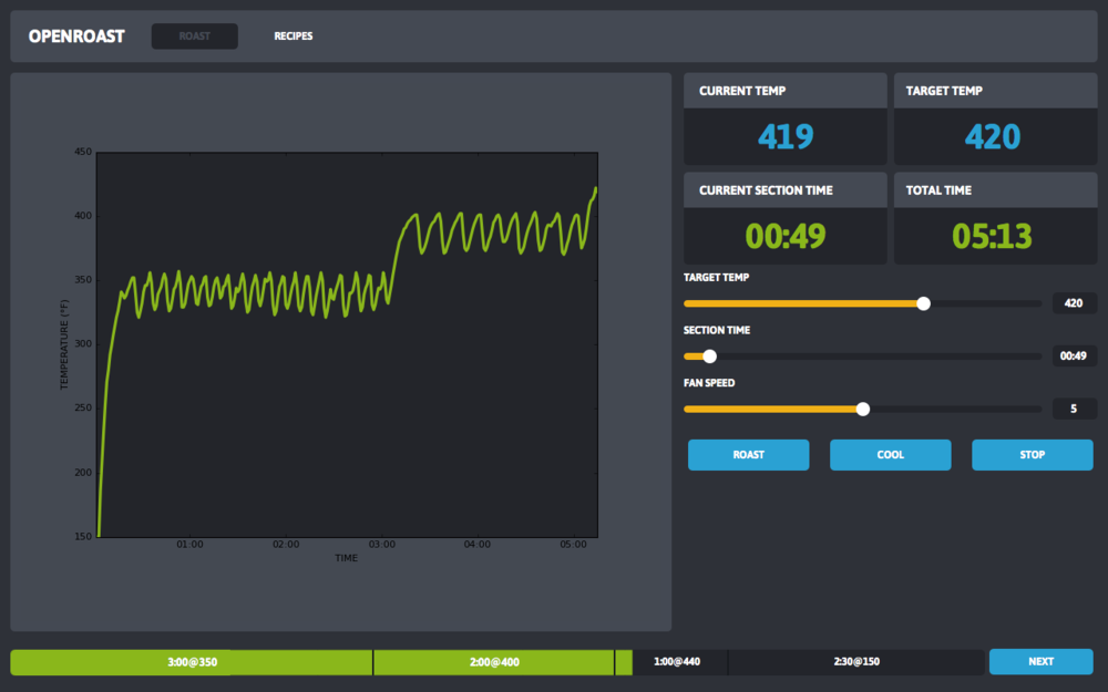
I think in the OP's example though, it's mostly clear what's a
button (blue) and what isn't.
But it sure is easy for flat buttons to be suddenly confusing.
(Do I push the "green things"
or the "blue things"?) And at the top left in the OP's
screenshot, I expect a lot of people
wouldn't know if they can click "ROAST" and "RECIPES" or not,
and might not get that
they act like tabs until they click them.
In silly apps it's OK for people to "feel around" the UI to
explore it,
but e.g. for industrial control, randomly clicking things
could send equipment through a wall,
so it's a good idea for the UI to be clear about what's a
button and what isn't..!
We'd just have to pick a clear widget set where tabs are
clearly tabs, buttons are buttons, etc.
Ian MacArthur
On the plus side this flat style (available in win10 and maybe win8) is looking nice and clean. On the other hand these flat UIs have the downside that you can't tell what's a button, what's a menu and what's a label or just a background. You can hardly tell them apart. Sometimes it's even hard to tell with hovering your mouse over them, because the highlight coloring is also not that different from normal coloring.With proper/stronger coloring I think a "flat" FLTK UI can be way better than any default win10 UI.
Albrecht Schlosser
> On 4/26/21 11:29 PM, Webb Hinton wrote:
>
>> What do people think about offering a "Flat" scheme for FLTK?
>>
>> I think this would make for a lot of out of the box appeal, and when
>> people are shopping around for GUI libraries, having a couple style
>> options is certainly a big plus.
>
> FLTK project with a flat
> UI to spec. It was easy to do though by just changing the buttons
> to FL_FLAT_BOX
> and playing around with the colors.
>
> But it would be nice if it could all be switched with Fl::scheme().
majority of possible changes is related to drawing boxes. Specifically
"playing around with the colors" is /not/ a scheme option, this would
need to be done at application level - if e.g. button colors in the
"flat" scheme need to be different than in other schemes.
Of course you can also change the internal color table when switching
schemes in your application.
> A flat scheme would be easier to implement than the other schemes
> we have already, as there's probably not much to it.
which could be all you need to do here. Call the FL_FLAT_BOX drawing
function for all box types (but not FRAME types) or something similar to
that.
Drawing decent box shapes (rounded corners) is just one drawing function
that needs to be implemented if this is desired.
> Also, now that FLTK has SVG, that could be leveraged for
> antialiased lines
> to do the subtle curves on the buttons and boxes, if one wanted to
> get "fancy".
> FLTK 1.x doesn't really provide an "easy" way for end users to
> re-theme all the FLTK widgets; IIRC you pretty much have to
> hack FLTK's code to add a new scheme. So providing, for
> example, an SVG based scheme wouldn't be something
> one could do as an external project AFAIK.. unless it were provided
> as a patch.
*required* (see the "gleam" scheme) but to activate the new boxtypes
there's some glue code and changes in the box type enumeration necessary
which can currently only be done in a library patch.
> It's been discussed to provide a way to allow scheming more
> easily, but I don't think anyone's come up with a demo, let
> alone an API design that works for 1.x.
Fl_Scheme with derived classes Fl_Scheme_Gtk, Fl_Scheme_Gleam and so on.
My vision is to be able to add a new scheme in one source and one header
file in user code or maybe even as a plugin. Since each scheme inherits
a parent scheme class you would "only" need to override some virtual box
and maybe other drawing methods with minimal code.
Registering a new scheme at runtime would automatically add it to
(Fl_Choice) scheme selections so you could also test it in fluid, demo,
and unittests and you could provide your own Fl_Choice scheme selection
widget or menu with all /currently/ available (i.e. loaded) schemes.
I got the basics working but there's still much to do before I can
provide a fully working prototype.
My working model is the long-standing addition of the "oxy" scheme which
is similar but IMHO superior to the "gleam" scheme but its
implementation needs too many patches in the FLTK core. I hope I can
simplify this to the "one source and one header file" approach.
> I think FLTK 2.x might have provided this, not sure..
> I never got familiar with 2.x
definition (colors and such) that could be "inherited" by different
widgets so you could switch the appearance of many or all widgets at
once by modifying a base style in one place rather than changing all
widgets.
pvr...@btinternet.com
Anyway, returning to the original question, a flat style is actually pretty easy to make in fltk since the stock widgets all support a FL_FLAT_BOX style. If the UI is reasonably simple it is easy to set all the widgets box styles to flat and set "sensible" colours (for some value of sensible) and that's about it...
duncan
There are some limitations of what we can do with FLTK schemes.
[ . . . ]
I've been working on this and my basic API design is a base class
Fl_Scheme with derived classes
[ . . . ]
I got the basics working but there's still much to do before I can
provide a fully working prototype.
Ian MacArthur
Is there a way to globally change styles for buttons? Or do you have to code each one individually?
Greg Ercolano
Anyway, returning to the original question, a flat style is actually pretty easy to make in fltk since the stock widgets all support a FL_FLAT_BOX style.
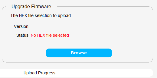
Yes, and I found in fluid you can set a button's Box: to Boxes -> RFLAT_BOX to get a round-edged button that, when colored blue, can look like this in an excerpt of an application screenshot:
And in the above, the "rounded frame" is just an Fl_Box with the Box: set to Frames -> ROUNDED_FRAME in fluid,
and the "Upgrade Firmware" that interrupts the frame line is just an Fl_Box over it that has the Box: set to boxes -> FLAT_BOX
with a color matching the window's background color (which has been made an almost-white).
That's all pretty trivial styling just with stock widgets. I didn't change the Fl::scheme() at all. For flat widgets, the default
FLTK scheme is best, since it doesn't introduce any gradients and such that would affect the flat look.
Ian MacArthur
>
> 3: Derive your own button class and add a (static) method that allows the style to be changed "globally" on the fly. Now, I've done this in the past, but don't really recall the details. ISTR that I had to tweak the draw() method of the derived class to check the "global" style for each redraw(), such that setting the "global" flag and calling redraw() on the main window had the desired effect. But... I can't find the an actual example here.
It also has a “dark” mode (cough, sorta...) because there’s been some chat about that recently.
What this “dark mode” actually illustrates is mainly how hard it is to do a decent dark mode...
See attached...


