package.elm-lang.org design mockups
Richard Feldman
I recently got inspired by a talk I saw at YGLF, from Vitaly Friedman of Smashing Magazine. He talked about a visual redesign of Smashing that they've been working on for over a year.
Some of the things he talked about which stood out to me were:
- On the Web, visual designs are overwhelmingly comprised of rectangles and circles.
- Websites can be more fun and aesthetically pleasing if they venture outside the realm of rectangles and circles, although this makes them harder to implement.
- We can incorporate visual elements from a site's subject matter into the design of the site itself.
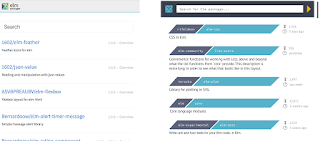
Package Search
From a design perspective, I think the user's goal on these pages is to decide which package (if any) they want to learn more about. I think "how often it's been downloaded" and "how recently has it been updated" are the key things to know when deciding to investigate further, but the design should still work visually even if those elements are not present.
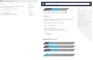
View a Package
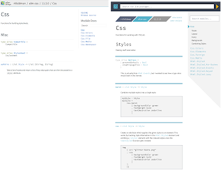
View an individual Module
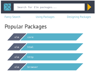
Initial Page Load
The idea here is to show the popular packages on initial page load of package.elm-lang.org, rather than having them in the sidebar. This is because:
- It makes them easier to discover (I've seen people miss that core is in the middle of the right sidebar)
- It shows them the same way as how they're shown when you search for them
- It frees up screen space by not having the sidebar.
I'm not sure if these should display the "downloads" and "last modified" icons. That info probably isn't useful to the end user when it comes to these packages.
Feedback welcome!
-Richard
Evan Czaplicki
--
You received this message because you are subscribed to the Google Groups "elm-dev" group.
To unsubscribe from this group and stop receiving emails from it, send an email to elm-dev+unsubscribe@googlegroups.com.
To view this discussion on the web visit https://groups.google.com/d/msgid/elm-dev/d886c0ec-2580-424e-9c7e-8bdb16ec35fc%40googlegroups.com.
For more options, visit https://groups.google.com/d/optout.
Berry Groenendijk
Op maandag 6 november 2017 22:41:24 UTC+1 schreef Evan Czaplicki:
To unsubscribe from this group and stop receiving emails from it, send an email to elm-dev+u...@googlegroups.com.
Jan Hrček
- The fact that package / name / version "breadcrumbs" have different colors. I often mistakenly click different breadcrumbs, so this would help to disambiguate the links.
- +1 to adding #of downloads to the package. Although having the ability to sort by that "column" would be useful as well, because the list of packages for some generic package searches often turns out quite long
What bothers me: the shapes of tangrams - since they're tilted to the right, the page looks too asymetric / dynamic, which bothers me a bit. If you absolutely have to include them, please prefer something more symmetric, this (google image search "arrow breadcrumb"): http://lh6.ggpht.com/2t9xejPppZmb2YYZC3HS1uizPi-ByKSy2BPpg4f908TmQmojv7yunutuMoavuXqlxUUrSyPA7KF7I7UtkzTG8vCuYl3hUsLh0xI
W. Brian Gourlie
Richard Feldman
Alan H
- I don’t have a source for this, but I think in general monospaced text is harder to read. Obviously code examples and code spans are always going to be monospaced, but I suspect bringing monospaced text to things like the search box and author/package names and package versions reduces legibility without much benefit.
- Using the parallelogram shape as a stand-in for slashes may not be so obvious. It doesn’t seem consistent, either; in the updated mockup, the same design element separates author-package and package-version. AFAIK only the first is otherwise represented with a slash. I agree with W. Brian that it would be best to restore the literal slash.
- I was glad to see Evan mentioned contrast. This is an important point. I have been raising accessibility awareness among some of my co-workers and I can tell you at a glance that the lighter blue Elm logo color is does not produce an accessible contrast level on white (or light gray for that matter). The darker blue is fine! Here's a site I like to use to check contrast levels: http://leaverou.github.io/contrast-ratio/#%235ab1c8-on-white (Good news, though: Black on that blue is a strong, accessible-at-any-level contrast!)
- More on contrast: The following is a super general complaint I have with … pretty much every site on the Internet, so it’s only specific to these mockups in that it does apply to them. Basically: Rethink anytime something is gray instead of a dark enough color that it feels like black. Example: The version number requirements for dependencies. It’s a light enough gray that it doesn't pass a11y checks. Why is is light gray? Usually this signifies something of lesser importance. I try to suggest alternative techniques to emphasis the things that are most important (rather than reducing contrast of the less-important things). And it's true that the package description and example usage are going to be more important, on the whole, than dependencies' versions. It does matter though, and the page order already establishes some of the relative importance. (Not using monospace will reduce appeared size/importance a bit). The installation command should have higher contrast — as is, it looks a lot like a disabled input. And I would say that that widget is actually one of the most important parts of the package page.
- I liked the introduction of the parallelogram motif for package list headings. I think an alignment change would have made them feel more like headings. See modified mockup below:

- I do like the silver background for the right sidebar. This feels like a good way to indicate separation and a secondary nature. I also think the triangle indicator for the currently active package in the sidebar is a much more obvious and noticeable treatment.
- Back to contrast — the light blue color still works for accents! So things like the HR / vertical separator are totally fine in this delightful color. Things like that triangle indicator could be the light blue color, too.
- I think Evan alluded to this, but it might be best to remove the border around code examples as I’m not sure it is saying anything important that couldn't otherwise be observed. (That’s more or less another way to say it's not 'chartjunk,' as Evan is using Tufte’s word for it)
- Downloads is a good metric and good to highlight. Downloads in the last week or month is an even better metric!
- Information hierarchy: IMHO the proper hierarchy would be to restore the top bar to be 'global' in function/purpose: Use the Elm logo and include the site name/purpose “Elm Packages.” Put the search box up there. Then everything specific to the current page or current package should be within the main content area (with the exception of the current package indicator in the sidebar, of course). This would match the mental model visitors have from nearly every other site out there, and visually reflect the conceptual nesting of packages belonging to the greater site. The latest mockups kind of have a global package search 'under' the specific package's header, which doesn't map to that hierarchy


