Differential Tractography Tract Color Rendering: Scaling by dec_qa
93 views
Skip to first unread message

Noah Mehringer
Jul 26, 2021, 8:15:40 AM7/26/21
to DSI Studio
Hello,
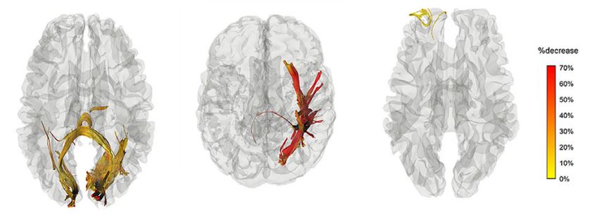
I'm attempting to create clear figures out of my differential tractogram results by color-coding the tracts according decreased QA (dec_qa). This figure from your differential tractography paper looks fantastic:
However, when I scale the tract color, I'm not sure what my scale means: 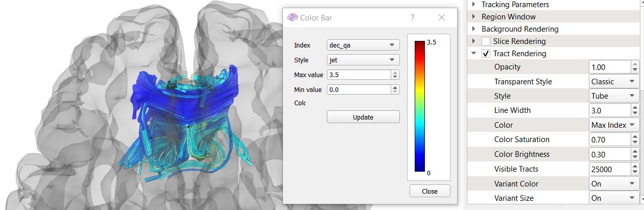
The minimum is 0, and the maximum is 3.5, but is this a decrease in the actual value of QA or a percentage change? I'd like to change the color scale so that the min. value (blue) is 15% (the QA change threshold I used) and the max. value (red) is something near 100%.
Additional question: When rendering color, do you prefer to use the 'Max Index', 'Averaged Index', or 'Local Index' in certain situations?
Thank you for your time!
Noah

Frank Yeh
Jul 26, 2021, 9:18:12 AM7/26/21
to dsi-s...@googlegroups.com
max=1.0 and min=0.15
Additional question: When rendering color, do you prefer to use the 'Max Index', 'Averaged Index', or 'Local Index' in certain situations?
Local index is more informative.
Frank
Thank you for your time!Noah
--
You received this message because you are subscribed to the Google Groups "DSI Studio" group.
To unsubscribe from this group and stop receiving emails from it, send an email to dsi-studio+...@googlegroups.com.
To view this discussion on the web visit https://groups.google.com/d/msgid/dsi-studio/6ac9528a-c2b9-4e51-9f00-bed1e18e7429n%40googlegroups.com.
Reply all
Reply to author
Forward
0 new messages