Tasker material design

John Doe
yes, I know UI is not the most important part of Tasker, however we would like to have apps with a standard UI. On my phone the only app with holo style is Tasker. Looking at styles.xml, it seems should be quite easy to convert Holo theme to Material theme for API 21+ without touching too much. There are two levels of re-design in my opinion. Inserting appbar layout, fab, recycler view, coordinator layout, toolbar, navigation bar or drawer and so on requires effort, I know. However you could simply change the style keeping the current widgets and layouts (the short way). In this way at least for API 21+, we could have a bit of a new "fresh" UI in Tasker too. I hope to see a "material Tasker" soon :)
Regards.
John Doe

Pent
Pent

Rory Harnisch
John Doe
Pent
Great. Let me know if you need help.
Thanks for the offer :-)
Won't be including the material theme time picker, it's just too big
and clumsy to have more than one on-screen at once and doesn't
scale if you shrink its available layout.
Pent
Pent
the Tasker logo as primary (action bar) and dark (status bar) colours :-)
Pent
John Doe
PS: I like orange :)

Jay M
Quick question but if your experimenting with MD will you be using the v7 support library, it should make the actions/overflow visible in the Actionbar/Toolbar on Android TV.
--
You received this message because you are subscribed to the Google Groups "Tasker" group.
To unsubscribe from this group and stop receiving emails from it, send an email to tasker+un...@googlegroups.com.
Visit this group at https://groups.google.com/group/tasker.
For more options, visit https://groups.google.com/d/optout.
Jay M ︻芫══一
Pent
Quick question but if your experimenting with MD will you be using the v7 support library,
Don't know how far I will go yet, might not be necessary.
it should make the actions/overflow visible in the Actionbar/Toolbar on Android TV
For what would I use the support library which would enable the overflow on TVs ?
Pent
Jay M
When I got my Android TV last year I found some of my sideloaded apps weren't showing the overflow or actions and googling told me its because the OS isn't the same as it is on phones and tabs. There is no menu the remote doesn't have any sort of a menu key and there is no recents apps key either so long pressing that to bring up the menu isn't possible. Anyways i started experimenting with basic Android development to try and figure out why only some apps had this problem and I found if I made an app that uses the default Material Theme the actions and overflow didn't show up same thing happened with Holo themes.
After adding the support library the actions and overflow did show up. If I switched to a Toolbar instead of an Actionbar the actions and overflow also showed up. Of course this is only based on my own experiments and you know way more than I do but as your currently experimenting with MD Tasker I just thought I would mention it because the app already works great on Android TV the only problem I found is with the Actionbar.
--
You received this message because you are subscribed to the Google Groups "Tasker" group.
To unsubscribe from this group and stop receiving emails from it, send an email to tasker+un...@googlegroups.com.
Visit this group at https://groups.google.com/group/tasker.
For more options, visit https://groups.google.com/d/optout.
Pent
problem of having no way to test it.
Pent
Jay M
Glad I could be of some help, I can test if you need me to just let me know.
--
You received this message because you are subscribed to the Google Groups "Tasker" group.
To unsubscribe from this group and stop receiving emails from it, send an email to tasker+un...@googlegroups.com.
Visit this group at https://groups.google.com/group/tasker.
For more options, visit https://groups.google.com/d/optout.
Pent
Pent
Pent
can be scaled and coloured, so I would only need to include them once.
You should then be able to select the tint (or a previously selected tint of course) when choosing the
icon.
A limitation is that notification icons will have to be white until 6.0+ devices and
the same could be true for launcher shortcuts, also past 6.0+, havn't got that far yet.
Pent

Scott Almond
John Doe
Pent
I hope you will include them under drawable-anydpi folder. If you include them under drawable folder, Android Studio will generate at least four png for each xml file to be backward compatible with older versions. It means the APK will be a looooot larger than now.
I'm still on Eclipse and Ant :-)
I tried your suggestion, it was twice as much space used in the apk as with drawable-v21
when generated with ant.
At the moment, the icons add 800k, which is bearable.
Pent

Joshua Bosco
Pent
Please don't change!!!!!
Change what ? Theme to material ?
Pent
Pent
it goes with the Tasker icon.
But is the white text/icons on orange disgusting ? Too playful ?
Is it weird having white icons in top/bottom bars and black icons everywhere else ?
Should the popup menus have a coloured background and also have white icons ?
Would having all icons and text black be far preferable ?
Pent
Scott Almond
Scott Almond
John Doe
Pent
On Thursday, 9 February 2017 13:14:29 UTC+1, John Doe wrote:
It seems quite good :) Did you use two different colors for tab and bottom bar?
No, must be a trick of the light :-)
It seems slightly different. About white color: if you see here https://material.io/guidelines/style/color.html#color-color-palette the color hex values are black or white according to the picked color.
Thanks, hadn't noticed that. Then I would have to use a very dark orange to be able to use the white text/icons.
>Another suggestion is to use an accent colors for important actions like the profile switch.
Thanks for the input both.
Pent
Jay M
looking real sexy
--
You received this message because you are subscribed to the Google Groups "Tasker" group.
To unsubscribe from this group and stop receiving emails from it, send an email to tasker+un...@googlegroups.com.
Visit this group at https://groups.google.com/group/tasker.
For more options, visit https://groups.google.com/d/optout.

Abdullah Alahdal
Pent
I would suggest to remove the bottom bar (projects bar) and use a side bar instead which can be swiped from the side
There are probably difficulties with the drag-and-drop mechanics and I would also need to change my whole
build environment for obscure technical reasons, which sadly isn't on the cards right now.
Pent

Sean Williams
Proposal for light-theme colours attached. I would like to use the oranges because
it goes with the Tasker icon.
But is the white text/icons on orange disgusting ? Too playful ?
That's alot of orange! I like the orange accent for tab markers etc. but I'm also considering could I look at that for several hours while editing in Tasker, something a little more neutral like the darker grey from the Tasker icon might be more suitable?
Should the popup menus have a coloured background and also have white icons ?
I must admit I currently use the dark theme due to a medical issue with my eyes so light and bright colours can be an issue. However I do prefer a more bland interface and as the Tasker ui is essentially an editor of sorts you can spend alot of time in there. Alot of colour can be distracting.

Pete Bradshaw

Matt
- (awesome to see the material icons coming)
- Ability to colour tint the project tabs would be great
- option in preferences to retain old colour scheme (some people dont like to change)
- mark project tab as hidden
- add a colour tint to the tasks in the tab *(for easy grouping them for bigger projects)
Pent
Probably couple of weeks.
> Cant wait to play with the new version.
very few mechanical changes.
Pent
Mateusz Żołnierczyk
--
You received this message because you are subscribed to a topic in the Google Groups "Tasker" group.
To unsubscribe from this topic, visit https://groups.google.com/d/topic/tasker/VOR8HlHdVrs/unsubscribe.
To unsubscribe from this group and all its topics, send an email to tasker+un...@googlegroups.com.

Poll Person

Kristin Schbach
Pent
The new icon support it's something I'm looking most forward to, could you get them saved for each project in a specific folder? So the icon file swap would be possible as well? I think this would be great for changing the colour of the icons. Unless you want to introduce a new action change colour tint (select project, icon, colour) :)
I didn't understand all of that, but you can select any colour you want for the icons on an individual basis.
Pent
Pent
I'm not the best at designing things, but I think if you're going to try to make it look material design, It should have a bit more rearranging. I think it would be quite nice if the projects were in a side menu and the '+' button was a FAB button like it is in most every other app.
I agree and spent quite a lot of time trying to get my build environment able to do that, but failed in the end.
It will have to come at a future time unfortunately, when I have time to upgrade my environment.
Currently I prioritise some Nougat features higher (quick-settings, app shortcuts).
Pent

Kevin
Matt
I didn't understand all of that, but you can select any colour you want for the icons on an individual basis.
Pent
Also is the dark theme confirmed? A lot of people asked this on the social media. I;m happy to update them if you have the answer to it.
Pent
For me, a black AMOLED friendly theme is more important then material design :)
I hear you.
Pent
Pent
Also is the dark theme confirmed?
At least one.
Pent
Pent
Holo themes will not be available on 5.0+ devices.
There will be an almost fully dark theme, but probably with orange accents.
Pent
John Doe

Andrea Centorrino
Jay M
It should be possible already he added a dialog so you can accept the disclaimer see the link for more info last comment is from me might be worth a read if you have a Android TV https://groups.google.com/forum/m/#!topic/tasker/fiQSn_rcodU
I know that my request is not strictly related to Material (re)Design, sorry in advance for the OT: is it possible, in a future version, to add a way to install and launch Tasker on Android TV without workarounds?
--
You received this message because you are subscribed to the Google Groups "Tasker" group.
To unsubscribe from this group and stop receiving emails from it, send an email to tasker+un...@googlegroups.com.
Visit this group at https://groups.google.com/group/tasker.
For more options, visit https://groups.google.com/d/optout.
Scott Almond
Pent
Hows the update going +Pent, any closer to the release?
Yes, though I got a bit-sidetracked unfortunately.
Pent
Jay M
take your time but hurry up 😁
--
You received this message because you are subscribed to the Google Groups "Tasker" group.
To unsubscribe from this group and stop receiving emails from it, send an email to tasker+un...@googlegroups.com.
Visit this group at https://groups.google.com/group/tasker.
For more options, visit https://groups.google.com/d/optout.

Jesper Poulsen
>
> Please don't change!!!!!
>
>
> Change what ? Theme to material ?
Yes.
Material Design sucks.
Pent
Material Design sucks.
I think so too, but you can't fight the flow unfortunately.
Pent
Jesper Poulsen
>
> Material Design sucks.
>
>
> I think so too, but you can't fight the flow unfortunately.
Pent
Then make it optional at least.
Technical difficulties with that unfortunately. But don't worry, it's not that much different.
Pent
Rory Harnisch
Pent,
Do you have a PayPal account? I'd like to donate if possible.
Thank you,
-Rory
--
You received this message because you are subscribed to a topic in the Google Groups "Tasker" group.
To unsubscribe from this topic, visit https://groups.google.com/d/topic/tasker/VOR8HlHdVrs/unsubscribe.
To unsubscribe from this group and all its topics, send an email to tasker+un...@googlegroups.com.
Pent
Do you have a PayPal account? I'd like to donate if possible.
Thanks for the thought but it's more trouble than it's worth due to tax administration.
Pent
Pent
Also the 'too much orange' problem!
Hallelujah!
Pent

Arno Esterhuizen
On Thursday, February 9, 2017 at 11:49:25 AM UTC+2, Pent wrote:
Proposal for light-theme colours attached. I would like to use the oranges because
it goes with the Tasker icon.
But is the white text/icons on orange disgusting ? Too playful ?
Is it weird having white icons in top/bottom bars and black icons everywhere else ?
Should the popup menus have a coloured background and also have white icons ?
Would having all icons and text black be far preferable ?
Pent

Rod
Pent
Pent, when this big update out, will get a discount like years ago with Tasker v4.0/Holo UI?
You mean a reduced purchase price ? I'm not a businessman, but I suspect it's a bad idea
to pre-announce a reduction in price.
Pent

pr0d
Pent
that the app has to be hardware accelerated for the shadows to appear, so there'll be a new Preference in the next version
(off = less memory used, on = nicer UI)
Default theme starting to look pretty smart!
Last main problem is the floating action button for Add/Delete. Choices are to fake it, or
to move the whole of Tasker over to Android Studio, which will take weeks, but it has
to happen sometime anyway...
Pent
John Doe
Pent
If you want I've got the FAB code, I can send you via email. It doesn't need support library or anything special and it's backward compatible with pre-lollipop.
Pent
John Doe
Pent
I sent you an email with the code
Got it, thanks. Spent the morning wrestling to get a decent shadow above a view
instead of below, so unfortunately didn't have time to try it out yet. You'd think
that it would be possible to specify that in the framework when specifying
elevation... it's obviously not heretical to do want it, since Play Music does.
Pent
Pent
attached.
I've tried to suggest the projects being at a higher 'logical' level than tasks, profiles
etc by the bottom bar the same, darker, colour as the action bar, and with the shadows.
I'm unsure about the + button. I think it looks better with the orange colour, but it's
logically for adding one of the ice-cream coloured things at the top. When it's deep
orange you get the idea it's for adding a project.
Still unsure if it's too playful, but there are 5 other more standard-coloured themes
for orange haters.
Pent
Rory Harnisch
Pent,
Thank you for the updates first and foremost!
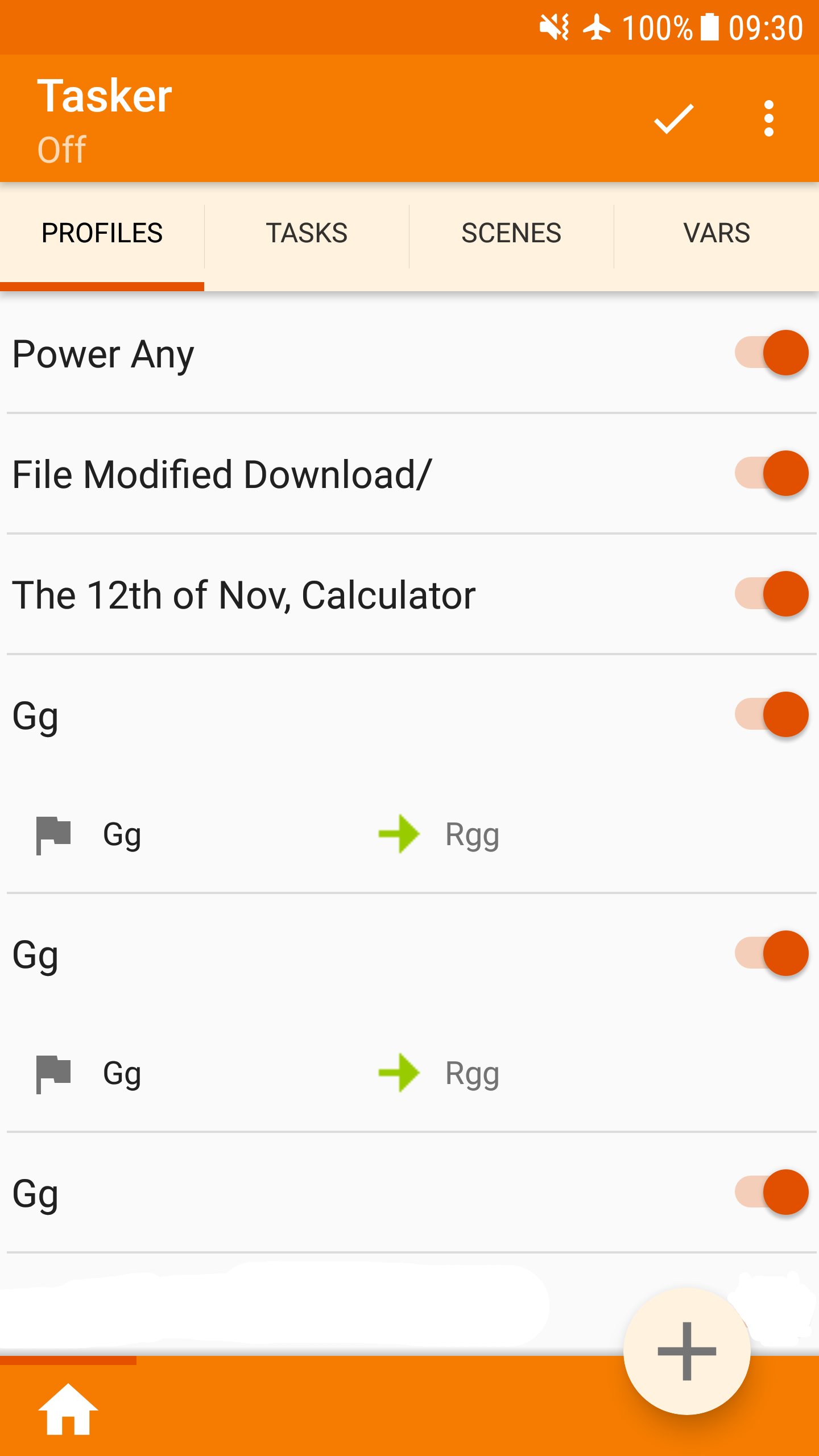
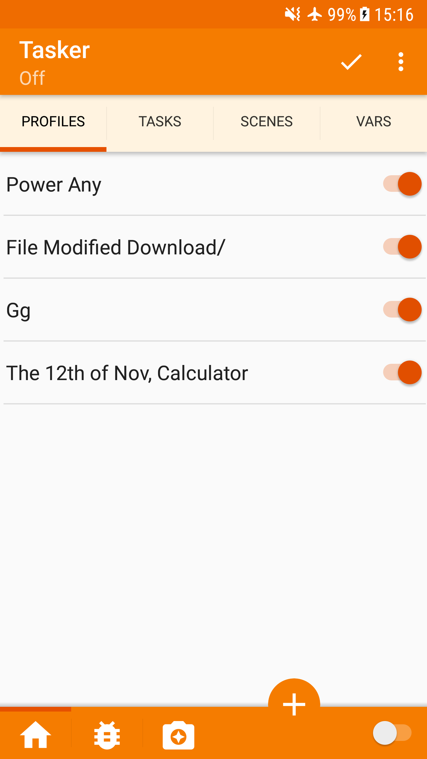
I have a question about the switch at the bottom right corner of the photos. Is that the on/off switch for Tasker? If so, is there a reason it is at the bottom instead of at the top left? (Similar to toggling Tasker on/off by long pressing the icon in the current version from the main screen). Also, the top left text says "off". Is that just the way you intend to visually show the user the status of Tasker, by both the switch and text? For the record, I'm not trying to criticize, I'm just curious.
As for the color theme. This is only my opinion but I'm interested in seeing the other color schemes if you have a chance to share! What about holding a poll? The highest voted theme gets to be standard!
Either way, love your work and thank you again.
-Rory
--
John Doe
1) Too much colors, the tabs should have the same color of the action bar
2) Bottom bar has just another color? It's seems lighter than the action bar. Maybe different elevation?
3) FAB in that position it's not really the best thing you can do. You just need to put it on the lower right corner. As alternative the FAB can be attached to a view, but the Tasker UI it's still too much complex to add another element, so I would prefer a floating action button on the right. What's the problem? You need something like that:
<FrameLayout>
<your main layout here.......>
<ImageView> <-------FAB here with right alignment
</FrameLayout>
4) Accent color is better but in my opinion is too much similar to the primary color (too much orange again). As general rule, the accent color should be the inverted color of your primary color, just because it is the "accent" :)
5) The switch in the bottom bar is something a bit weird to be honest, it would be more logical to have an item in the overflow menu in my opinion.
Pent
I have a question about the switch at the bottom right corner of the photos. Is that the on/off switch for Tasker?
Yes.
If so, is there a reason it is at the bottom instead of at the top left?
Lines up with the profile switches, logically disables them all, looks messy by itself in the bar.
(Similar to toggling Tasker on/off by long pressing the icon in the current version from the main screen). Also, the top left text says "off". Is that just the way you intend to visually show the user the status of Tasker, by both the switch and text?
Yes. When it's on, just 'Tasker' shows there. I might be graying out the profile switches when
Tasker is disabled too, then it will make even more sense.
As for the color theme. This is only my opinion but I'm interested in seeing the other color schemes if you have a chance to share!
They all need tweaking here and there at this point.
Pent
Pent
1) Too much colors, the tabs should have the same color of the action bar
Then there's way too much orange (see previous screenshot), and the tasks etc have the same 'level' as the projects.
I like the different colour, since it matches the + button it's immediately obvious that the
button adds a task or whatever, rather than a project.
2) Bottom bar has just another color? It's seems lighter than the action bar. Maybe different elevation?
Should be the same, but will check.
3) FAB in that position it's not really the best thing you can do. You just need to put it on the lower right corner.
It looks horrible with the on/off switches underneath it. Or do you mean where the Tasker on/off switch is now ?
4) Accent color is better but in my opinion is too much similar to the primary color (too much orange again). As general rule, the accent color should be the inverted color of your primary color, just because it is the "accent" :)
Yes, but every inverted (or other non-neutral colour) I tried looked horrible, especially with so many switches on the right
in that colour.
5) The switch in the bottom bar is something a bit weird to be honest, it would be more logical to have an item in the overflow menu in my opinion.
Possibly.
Thanks for the feedback :-)
Pent
John Doe
1) Too much colors, the tabs should have the same color of the action bar
Then there's way too much orange (see previous screenshot), and the tasks etc have the same 'level' as the projects.
I like the different colour, since it matches the + button it's immediately obvious that the
button adds a task or whatever, rather than a project.
You can choose anything of course, it's just your app. I was providing just some hint according to Google Material design guidelines. Yes I know, the have the same level but it's how the UI should work. The + (or FAB) button should have the accent color, not the primary color.
2) Bottom bar has just another color? It's seems lighter than the action bar. Maybe different elevation?
Should be the same, but will check.3) FAB in that position it's not really the best thing you can do. You just need to put it on the lower right corner.
It looks horrible with the on/off switches underneath it. Or do you mean where the Tasker on/off switch is now ?
Yes, I know. This is the reason why I sad to remove the switch and use a item in the overflow menu.
4) Accent color is better but in my opinion is too much similar to the primary color (too much orange again). As general rule, the accent color should be the inverted color of your primary color, just because it is the "accent" :)
Yes, but every inverted (or other non-neutral colour) I tried looked horrible, especially with so many switches on the right
in that colour.
This is a site that helped me. Maybe you can find a good combination: https://codecrafted.net/randommaterial/ As you can see from the web site, the accent is always really different from the primary, don't be afraid to use colors ;)
Mat
Pent
they can so can I :-)
This is a site that helped me. Maybe you can find a good combination: https://codecrafted.net/randommaterial/ As you can see from the web site, the accent is always really different from the primary, don't be afraid to use colors ;)
Will have a look tomorrow, thanks.
Pent
John Doe

Rich D
As you can see from the web site, the accent is always really different from the primary, don't be afraid to use colors ;)
Perhaps a splash of blue in remembrance of years gone bye..... :)
John Doe
Rory Harnisch
Pent,
Have you tried this website to test potential color combinations?
https://www.materialpalette.com/
-Rory
Yep. totally agree. Usually with orange purple/blue/light blue are the best choices.
Perhaps a splash of blue in remembrance of years gone bye..... :)
--

Raul SC
I think it would be a good idea to use the pale yellow in the bottom area, and use the orange only in the upper area, on the floating buttons, and the switches.
The only problem would be the contrast of the drop down menu, but It could be solved by obscuring the rest of the scene while the menu is displayed.
Pent
Let's ignore the colour issue for now until I have had a chance to try those useful links.
I took out the enable/disable switch and moved the variables filter toggle icon to the Variables menu up top (double-tap)
so there's less going on in the bottom right.
The add button now also has the official standard size.
Is it better positioned now ? (again, let's ignore the colour for now)
Unfortunately, it looks very silly if it's floating fully on the list because of the bottom bar and the
profile on/off switches.
Pent
Mateusz Żołnierczyk
--
You received this message because you are subscribed to a topic in the Google Groups "Tasker" group.
To unsubscribe from this topic, visit https://groups.google.com/d/topic/tasker/VOR8HlHdVrs/unsubscribe.
To unsubscribe from this group and all its topics, send an email to tasker+un...@googlegroups.com.
Visit this group at https://groups.google.com/group/tasker.
For more options, visit https://groups.google.com/d/optout.
Raul SC
You could try moving the lower menu, where the profiles are stored to the top. Maybe that way I wanted too loaded the top, it would be a matter of trying.
John Doe
John Doe
Pent
Better but the + icon seems too large for a FAB. It should be 24dp. and the mini-fab should be 40dp (the normal one is 56dp).
You lost me there, why should it be 24dp when the normal one is 56dp ?
Pent
John Doe
Source: https://material.io/guidelines/components/buttons-floating-action-button.html
Pent
Size of internal icon should be 24dp (the + icon in your case). The size of the circle should be 40dp for mini size and 56dp for normal size.
Ah, that's what you meant :-)
I like the redesigned icon, if you have a reddit account can you find an email for the author so I can ask
about using it ?
Pent

Guus Apeldoorn
>
> I'm NickFromNSA (the OP of the imgur gallery), one of the designers that worked on the redesign.
> If you want to get in touch, you can send me an email at in...@guusapeldoorn.nl. My friend (the Fabian Doornbos mentioned in the description of the first picture) and I can do some further polishing of the UI as well if you're interested. His email is fabiand...@gmail.com. Hope to hear from you soon!
Pent
It's possible now everything else moved away from the bottom and is logically better, since profiles etc come within projects.
The project tab would not be visible in beginner mode, so at first launch user would just see profile etc tabs,
overflow and + button.
With the projects in the action bar, when not in beginner mode, the Tasker title (and 'Off' when disabled) would show for a second
before the project bar appears.
An 'add' button for new projects would then also be possible, which would be an action bar action
or would be under the overflow button (where the project bar isn't in the action bar).
Pent
Mateusz Żołnierczyk
The top section takes considerable amount of space in the mock up. Wonder if it's possible to hide the projects tabs by swipe up and bring it back by swipe down on the profile tabs. This way the screen estate is better and we keep the moving tasks between the projects feature?
This could mean that tabs could be at the top or bottom (with a hiding fab button).
Just a thought
--
Abdullah Alahdal
Rich D
Opinions on project tabs up top ?
Pent
Or maybe it is the time to think of my suggestion on 9 Feb to have the project as a sidebar
I've thought of it a lot and decided against it.
Apart from technical problems with implementation due to me still being on Eclipse,
leaving open takes too much horizontal space and the navigation draw is supposed
to be globally accessible throughout the app, but I can't have people switching
projects in the middle of editing actions.
Pent
Pent
The top section takes considerable amount of space in the mock up.
Not the action bar version.
Wonder if it's possible to hide the projects tabs by swipe up and bring it back by swipe down on the ptabs. This way the screen estate is better and we keep the moving tasks between the projects feature?
I could put a thumb at the RHS of the profile,tasks etc bar for dragging it up down when not in beginner mode.
Pent
Rich D
--
You received this message because you are subscribed to the Google Groups "Tasker" group.
To unsubscribe from this group and stop receiving emails from it, send an email to tasker+unsubscribe@googlegroups.com.
Rich D
What will be at the bottom of the display? By the looks of it you can't use it for items as the + button will cover enable/disable and the drag tab.
Raul SC
It will only be necessary to take into account, that the primitive scene the sufficient vertical slip, so that it does not overlap in the switches of the profiles.
I also think that the action of Activate and Deactivate Tasker, does not need to be displayed in the scene, and could be placed in the options menu. I particularly, is an option that I have not used since I used the application.
If you finally keep the profiles at the top, I can tell my grandchildren that I collaborated on the aspect of Tasker XD
Scott Almond
