Re: [silverstripe-dev] Abridged summary of silverstripe-dev@googlegroups.com - 8 updates in 1 topic
18 views
Skip to first unread message

Klemen Novak
Jul 15, 2016, 11:22:20 AM7/15/16
to silverst...@googlegroups.com
Guys, how about flattening the icons altogether, using material icons (or, alright, FontAwesome) as a basis? I've found myself flattening the CMS interfaces the past 3 clients, removing gradients etc. You could use a custom icon, and color it based on its status, then play with drop shadows, borders(glow shadows). I kinda feel we have the opportunity to make everything even cleaner and I feel image icons - if nothing else - should become svg's. Things are looking a bit weird on my retina here.
Otherwise - I prefer the full orange badge (Version 2) - the cleaner, simpler the interface, the more intuitive it is. It really is just an indicator - a flat round dot/circle.
On Fri, Jul 15, 2016 at 7:55 AM, <silverst...@googlegroups.com> wrote:
- Responsive CMS interactive mockup - 8 Updates
Mark Muller <mark.msp...@googlemail.com>: Jul 14 07:59AM -0700
Hi Paul,
For me version two, however I would be concerned with the bottom bar being
crunched on smaller devices maybe a combo of the two for small/medium
devices? So version one for phones and ...more
Jonathon Menz <jono...@gmail.com>: Jul 14 10:35AM -0700
I like version two better too. I find it more intuitive and I think the
Preview button gets the weight it deserves in that design as an important
action in the workflow. In version one users may ...more
"Sam Minnée" <s...@silverstripe.com>: Jul 14 10:30PM
I tend to prefer version 2 better, although I definitely think that they'd
benefit from some user testing with some copywriters / cms users.
One thing that occurs to me is that if the typical ...more
Paul Clarke <pa...@silverstripe.com>: Jul 14 04:01PM -0700
Often the first step is preview (or review) even before edits are
considered, that is why I was interested to see if moving it from the end
step, to any step in the process. For example changing ...more
Jonathon Menz <jono...@gmail.com>: Jul 14 04:18PM -0700
Maybe the button label needs to be something other than 'Preview'. That
label to me implies that you can view changes before you commit them (by
hitting Save or Save & Publish), but unless ...more
Paul Clarke <pa...@silverstripe.com>: Jul 14 05:42PM -0700
Some interesting ideas there, I will have a play to see if that makes sense
in practice.
...more
Michael Strong <mst...@silverstripe.com>: Jul 15 01:28PM +1200
I prefer version 1. The reason being that I think it makes more sense to
keep the navigation in one place (header) and actions together in the
footer. It also looks a lot less busy than version 2. ...more
Naomi Guyer <adr...@gmail.com>: Jul 15 02:04AM
I prefer version 1 as well, for similar reasons to Michael. If version 2,
perhaps the button could be more subtle? Though, even knowing it lives
there on desktop, it took me longer to find it in the ...more
You received this digest because you're subscribed to updates for this group. You can change your settings on the group membership page.
To unsubscribe from this group and stop receiving emails from it send an email to silverstripe-d...@googlegroups.com.
Klemen Novak
Jul 15, 2016, 11:44:00 AM7/15/16
to silverst...@googlegroups.com
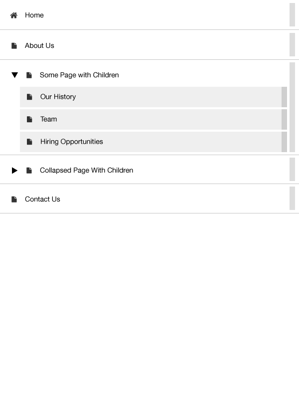
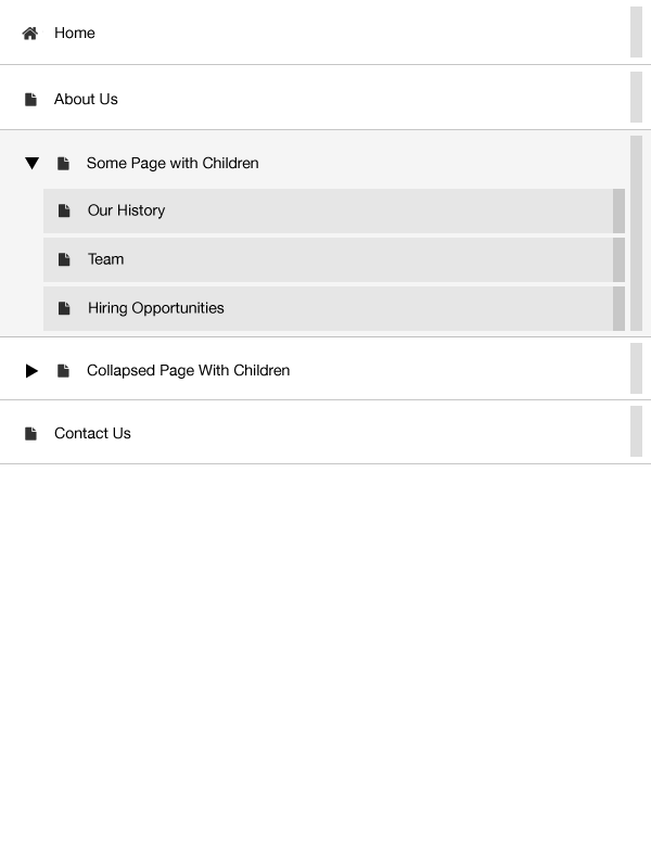
Hi guys, I got inspired -- here's a mockup of how I envisioned it on mobile -- we could play with levels (e.g. children pages are "inwards a bit", so the deeper you go, the subtly darker the container goes - test of that in #2.
I just see blocks that would work well on mobile using your finger or on desktop with the mouse. On desktops, if we choose, we could probably remove the lines since they'd have to stretch across the container..
Klemen Novak
Jul 15, 2016, 11:44:42 AM7/15/16
to silverst...@googlegroups.com
Oh, whole point of this being that the color of the icon can indicate the state of the page...
Reply all
Reply to author
Forward
0 new messages