bivariate normal ellipse

josef...@gmail.com
I always wanted a normal distribution ellipse, and finally borrowed
some code from the old and new scikits.learn.
However, I cannot match up the length/size of the confidence ellipse.
Josef

John Hunter
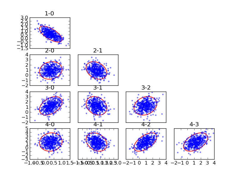
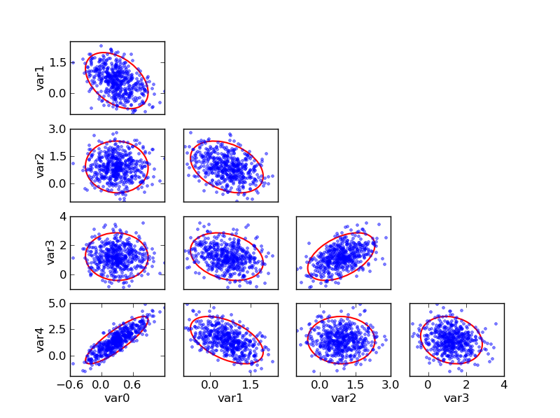
> multivariate normal scatters with 90% probability ellipses
When you get tick label overlap, you may want to consider the
"MaxNLocator" which will choose at most N ticks. When you are packing
in a lot of columns for example, you may only want three x-ticks.
import matplotlib.ticker as mticker
for ax in axes:
if ax.is_last_row() or ax.is_first_col():
ax.xaxis.set_major_locator(mticker.MaxNLocator(3))
I'm free-styling in the example above, so see
http://matplotlib.sourceforge.net/search.html?q=codex+maxnlocator for
working examples.
Also, when your titles are overlapping your graphs, consider the new
"tight_layout" options in v1.1.x
http://matplotlib.sourceforge.net/users/whats_new.html#tight-layout
JDH
josef...@gmail.com
> On Fri, Oct 14, 2011 at 10:27 AM, <josef...@gmail.com> wrote:
>
>> multivariate normal scatters with 90% probability ellipses
>
> When you get tick label overlap, you may want to consider the
> "MaxNLocator" which will choose at most N ticks. When you are packing
> in a lot of columns for example, you may only want three x-ticks.
>
> import matplotlib.ticker as mticker
>
> for ax in axes:
> if ax.is_last_row() or ax.is_first_col():
> ax.xaxis.set_major_locator(mticker.MaxNLocator(3))
Works well, I didn't know there is a is_last_row, is_first_col, I was
keeping track manually by counting
>
> I'm free-styling in the example above, so see
> http://matplotlib.sourceforge.net/search.html?q=codex+maxnlocator for
> working examples.
>
> Also, when your titles are overlapping your graphs, consider the new
> "tight_layout" options in v1.1.x
>
> http://matplotlib.sourceforge.net/users/whats_new.html#tight-layout
the titles were left over from testing, initially I had the plots transposed.
I think statsmodels will need some helper functions that automatically
create a grid similar to this. I still need to upgrade matplotlib to
get the figure title.
Thanks,
Josef
>
> JDH
>
josef...@gmail.com
my gallery got a new exhibit
https://picasaweb.google.com/106983885143680349926/Joepy#5663446443722234690
Josef
>
> Thanks,
>
> Josef
>
>>
>> JDH
>>
>

John Marino
josef...@gmail.com
<jdma...@alumni.princeton.edu> wrote:
> The gallery graphs are impressive.
Thanks,
Most were just quick graphs to illustrate the statistical results, but
I'm getting better in a bit of fine-tuning.
For example, visual comparison of some covariance estimators in
sklearn (plus pca factor decomposition)
https://picasaweb.google.com/106983885143680349926/Joepy#5663799000423045266
Josef

Skipper Seabold
Nice. Are you publishing the code too?
Skipper
josef...@gmail.com
I started the graphics branch in my fork, that has the new
scatter_ellipse, and plot_corr for which I had a simple version in an
example script but is now mostly cleaned up.
Most of the other plots are still spread out in committed or
uncommitted script files.
Josef
>
> Skipper
>
Skipper Seabold
Cool. I think this will be a useful reference until mpl gallery is
whipped into shape. I might have a few scripts here and there to add.
Skipper
josef...@gmail.com
The purpose is different, the mpl gallery is mainly to illustrate how
to create plots with matplotlib, while we would like to have a
collection of statistical plots, more like the
http://addictedtor.free.fr/graphiques/ link that you posted.
Since cleaning up plots and converting them to nice functions can be
quite time consuming, I thought using a central dumping ground for
example plots would be good. Then we would have a starting point and
can clean them up as we find time and/or are in the mood for it.
Josef
>
> Skipper
>