
Adam Lasnik
- New responsive design that adjusts to the width of the window
- New row-based layout that better showcases panoramic / landscape photos
- Photo titles now appear only on hover
- Link from photos on groups pages now go to the photos page, instead of the photo explorer
- A single click lets you add all your favorite photographers who have signed up to Google+ to a circle
Tucky
+1
phamhoanghai
agracier
It may be asking a lot, but is it not possible to provide options for choosing different layouts? I've gone to great trouble posting vertical photos that alternate with square and horizontal and now the whole look is messed up.
And as a last aside - I see that still not all groups have an 'add' button next to them. Shouldn't this be fixed first before tinkering with the layout?
Shain Paiment
Adam Lasnik
Roger Powell
- New responsive design that adjusts to the width of the window
- Photo titles now appear only on hover
Wim Constant
Op donderdag 28 november 2013 00:17:27 UTC+1 schreef Roger Powell:
agracier
This makes the page look out of proportion somehow. Why not just use fixed heights for all rows? Sites like Flickr have their layout in that manner and while the horizontal layout of rows is not all that appealing, at least they keep their rows a constant height.
I've also noticed that with ctrl+ that the page expands beyond the screen width of a monitor. Shouldn't it be limited so that the map/tags/favorite photographers/groups always remain visible on the monitor, while only photos increase/decrease in size?
On Wednesday, November 27, 2013 10:49:45 PM UTC+1, Adam Lasnik wrote:
Wim Constant
Op donderdag 28 november 2013 00:33:46 UTC+1 schreef agracier:
SteveT
Shain Paiment
Works good with Google chrome but not Internet Explorer. I don't like Chrome, still unhappy, but i'll make due of now.
Tucky
(With not the same height, but almost the same image height).
Jacenty
- Now as I watch someone's page, to see the title, I have to hover mouse over each image.
- Thumbnails of wide panoramas are pixelated.
- In IE thumbnails are out of proportions, and the page looks terrible:

Shain Paiment
Tags don't work and grouping pics on you groups still has some groups that have on ADD or REMOVE button. I still would like to have a button to go back to the old Panoramio.
Adam Lasnik
Roger Powell
OK, I understand the hovering is deliberately not included on the person's home page. Thanks, Wim, for the explanation.
Roger Heath
Roger Heath
mbe21 - offline
thinsing
~Marlene~
hvbemmel
davidcmc58
Lady GooGoo La La
agracier
I don't understand why there is such a large open area left white. It serves no purpose visually and for a casual browser, it appears as if the page is finished or as if the collection of photos is at an end.
Shouldn't the row of photos extend until the page links and conversations appear on the page? Visually it looks like a book being printed with too much of a page left blank.
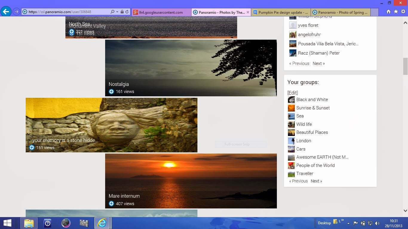
sixten_imgs
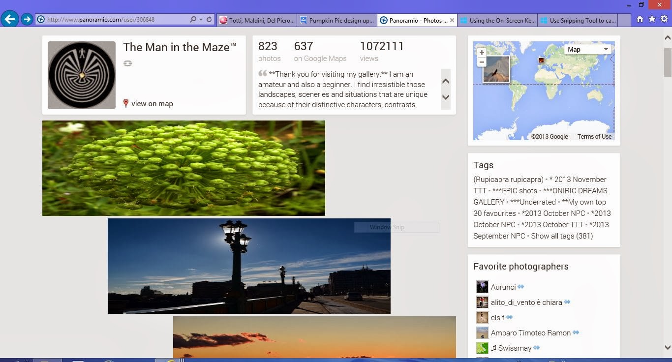
The Man in the Maze™
Oh my, oh what happened this morning,What is this? THis new Panoramio version is worse than the previous one.
- Thumbnails of pictures are deform and enlarged and out of proportions, and the page looks very bad

The Man in the Maze™
Terrible surprise, this is how Panoramio appears on my screen this morning with deform images!
fl☃cke
PS - also no link to group invitations ?! (Windows 7 & Mozilla)
sixten_imgs
torstai, 28. marraskuuta 2013 12.05.04 UTC+2 The Man in the Maze™ kirjoitti:
Terrible surprise, this is how Panoramio appears on my screen this morning with deform images!
The Man in the Maze™
The Man in the Maze™
sixten_imgs
GyurIca
2013. november 28., csütörtök 12:22:42 UTC+1 időpontban sixten_imgs a következőt írta:
I think that at least Chrome ( for some reason :) and Opera browsers show the photos in their real size, not stretched.Opera's trouble still is that in it this map based service Panoramio does not show the map at all...
torstai, 28. marraskuuta 2013 13.09.22 UTC+2 The Man in the Maze™ kirjoitti:
starMAN
IE 10.9200.16736 --> 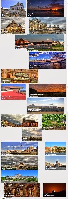
hvbemmel
SteveT


Draken
axking77
Galatas ©
I am rapidly losing patience with Panoramio. Once the classic view goes , so do I
SteveT
hvbemmel
Richard Forster
haut medoc
Apart from the comments I have read I have noticed on my user page that a number of photos are missing from each page. Is this a consequence of not using google chrome?
Panamon-Creel
SteveT
df3vi
Am Mittwoch, 27. November 2013 22:49:45 UTC+1 schrieb Adam Lasnik:
Updated, based on your feedback...
- New responsive design that adjusts to the width of the window
- New row-based layout that better showcases panoramic / landscape photos
- Photo titles now appear only on hover
- Link from photos on groups pages now go to the photos page, instead of the photo explorer
- A single click lets you add all your favorite photographers who have signed up to Google+ to a circle
Enjoy, and for those of you who celebrate it, Happy Thanksgiving!
SteveT
On Thursday, 28 November 2013 13:45:37 UTC, SteveT wrote:
Here are three pages of problems under Chrome with the latest update to PanoramioA thumbnail is nearly squeezed out on the top row and distortion is happening to some of the wide Panoramas
To be limited to only two columns of thumbnails on a 24" Monitor is not exactly what is required
This shows a large gap between last thumbnail and page numbers
CheersStephen
On Wednesday, 27 November 2013 21:49:45 UTC, Adam Lasnik wrote:
Updated, based on your feedback...
- New responsive design that adjusts to the width of the window
- New row-based layout that better showcases panoramic / landscape photos
- Photo titles now appear only on hover
- Link from photos on groups pages now go to the photos page, instead of the photo explorer
- A single click lets you add all your favorite photographers who have signed up to Google+ to a circle
Akanna
Richard Forster
motorhand
Hovering the title is a good idea, but I think a title could be very important for a picture.
So I would like to ask if the title can be put under the picture (only one row, rest cut off).
And in the hover could be the information about GE accepted, GE places, nº of views and nº of comments.
Another question:
could it make sense having more than 24 pictures at one page, perhaps 32 or 48 ?
Best regards !
Matthias
Tomas K☼h☼ut
Graham Davey
♠ c0l0gne1 ♣
I would greatly prefer the comprehensive view because all my uploads have been in matching groups of three same sized photos. With the pumpkin pie design update my pages have lost their order and look a mess. I will refrain from uploading any more photos until I know which look is here to stay.
Jacenty
IIIека

Richard Forster
Hello - I checked my page using Chrome and it appears as it should. I checked my page on the laptop using IE11 and its a mess, however the navigation buttons for access to all my photos appear.
hvbemmel
Lomno
laurence_cox
On Wednesday, 27 November 2013 21:49:45 UTC, Adam Lasnik wrote:
Pom'
question 1 : do horizontal pictures have a better dignity than vertical or square ones ?
my answer is : "definitely not".
then, why should they treated better by the new new new Panoramio layout, which torments vertical ones, and trivializes square ones ? (still, it's not looking as messy as it did in the most recent former new Panoramio funny experiment, nice move)
waiting for an answer. and hoping we'll eventually be back to a solution like in classic Panoramio, the one I used to like, where all pictures did get the same dignity... and space.
question 2 : is the new new new Panoramio designed (among other unknown goals) in order to eradicate tags ? because it has become so uneasy to deal with tags, that I'm thinking about erasing all my tags instead of getting mad trying to update them blindly. Please get them back under the pictures...
question 3 : why the conversation space should be kept ? since we can't see anymore which picture is commented (unrecognizable thumbnails), and hardly can read what's said and by who (too tiny text), why shouldn't we go all the way and get rid of the comments part ?
regards, pom'
Draken
Pom'
Draken
Pom'
and yes, everyone of us, including yourself, and myself, is very very very tiny compared to all the users. still, a feedback to the experiments as been asked for, and even the tiny users should say their mind, even if they might not represent the majority - which remains to be proved anyway :)
df3vi
But why is it made so hard to recognize the icons? They are just 25% the size of what they used to be! There must be a certain intention in doing so, or do you think the programmers are unable to produce a better design?
Removal of comments wasn't asked for seriously, and I think everyone else understood that - and maybe you did, too.
Pom'
thank you df3vi I'm feeling a little less tiny now ;)
Draken
"I don't know what you mean by 'glory,' " Alice said.
Humpty Dumpty smiled contemptuously. "Of course you don't—till I tell you. I meant 'there's a nice knock-down argument for you!' "
"But 'glory' doesn't mean 'a nice knock-down argument'," Alice objected.
"When I use a word," Humpty Dumpty said, in rather a scornful tone, "it means just what I choose it to mean—neither more nor less."
"The question is," said Alice, "whether you can make words mean so many different things."
"The question is," said Humpty Dumpty, "which is to be master—that's all."
pom'
You should know "tiny" was not meant as an aggression. Don't be defensive when no one is attacking you.
Pom'
Sorry too If I might have thought it was not a very kind answer when my opinion has been called tiny tiny, my poor English again.
regards, pom',
Draken
Pom'
alright Draken, what you said is that my opinion represents a tiny tiny minority.
which, as I said before, is another opinion, and remains to be proved ; and I'll not try to quantify how much of a minority or a majority it represents : I've been imprudent enough for today, and in my remote country it's time for bed.
kind regards, pom'
phamhoanghai
®mene
Updated, based on your feedback...
- New responsive design that adjusts to the width of the window
- New row-based layout that better showcases panoramic / landscape photos
- Photo titles now appear only on hover
- Link from photos on groups pages now go to the photos page, instead of the photo explorer
- A single click lets you add all your favorite photographers who have signed up to Google+ to a circle
Enjoy, and for those of you who celebrate it, Happy Thanksgiving!
motorhand
It's very funny what the new horizontal order makes to the older pictures after uploading a new one.
Always a surprise about becoming a big one small now, and inversely.
A little improvement should be done at very extreme horizontal or vertical dimensions.
By the way, in a very old version of panoramio we had a row with four pictures (when I remember well).
And I don't think it is a very good concept to align images after an optical system, according to a website design.
I see many galleries with three times the same sunset or mountain view, only to fill the row properly.
This behavior reduces the picture quality altogether, but I think the new new design will act a tiny against that.
- - - -
The thumbnails at the conversations must become bigger (100px at long edge), I agree with that suggestion.
And I still believe, it could be a good idea, having more than 24 pictures at one page (only when this will not burden the loading times too much).
Best regards !
Matthias
~Marlene~
~Marlene~
Fravanpa
Op woensdag 27 november 2013 22:49:45 UTC+1 schreef Adam Lasnik:
Fravanpa
Trintignant
Mike Fowkes
zerega
- New responsive design that adjusts to the width of the window
- New row-based layout that better showcases panoramic / landscape photos
- Photo titles now appear only on hover
Does not work in Firefox. Titles appear permanently, but that's fine with me.
Pom'
about the new Panoramio the point that I really didn't get - but maybe they told about it, I've not read all the forums or blogs, too uneasy and long for me, is why a new version of Panoramio was absolutely needed.
I've been trying to understand it by the new functions the new Panoramio allows, but I honestly can't see none, except bigger thumbnails of pictures (for smart-phones I guess ?) and this Google+ thing, which doesn't interest me at all, so far, but that they push so hard into us.
on the opposite what I can actually see are lost or less easy to use functions, like ability to take care of tags or to follow conversations, because of too little thumbnails in the conversation zone. And a new display which gives advantage to horizontal pictures, and disadvantages vertical and square ones, for no good reason, according to me.
regards
fl✵cke
Pom'
SteveT

On Wednesday, 27 November 2013 21:49:45 UTC, Adam Lasnik wrote:
Updated, based on your feedback...
- New responsive design that adjusts to the width of the window
- New row-based layout that better showcases panoramic / landscape photos
- Photo titles now appear only on hover
- Link from photos on groups pages now go to the photos page, instead of the photo explorer
- A single click lets you add all your favorite photographers who have signed up to Google+ to a circle
Lady GooGoo La La
CliveM
motorhand
<< Previous 1 2 3 4 5 ... 10 11 12 13 14 Next >>
This can hardly be find under the pictures.
fl✵cke
I am not sure - but this new PA restructuring seems to be taking forever & showing no real improvements - apart from that all links now lead directly to G+. ;)
And Flickr - a free photo database - has integrated a worldmap function for geo-tagging into their site not too long ago. Still I hope you are right !!
magic surf bus
df3vi
Am Freitag, 29. November 2013 12:58:58 UTC+1 schrieb zerega:
Does not work in Firefox. Titles appear permanently, but that's fine with me.
- Photo titles now appear only on hover
df3vi
Stanimir Kunev
df3vi
hvbemmel
Also removing the photo explorer link was no good idea, as there is no way to make a group photo show now anymore. Another nail in the coffin of groups...
dusan majcin
Dňa streda, 27. novembra 2013 22:49:45 UTC+1 Adam Lasnik napísal(-a):
Updated, based on your feedback...
- New responsive design that adjusts to the width of the window
- New row-based layout that better showcases panoramic / landscape photos
- Photo titles now appear only on hover
- Link from photos on groups pages now go to the photos page, instead of the photo explorer
- A single click lets you add all your favorite photographers who have signed up to Google+ to a circle
Xonid
Julie Chorgo Gilson

On Wednesday, November 27, 2013 4:49:45 PM UTC-5, Adam Lasnik wrote:
Updated, based on your feedback...
- New responsive design that adjusts to the width of the window
- New row-based layout that better showcases panoramic / landscape photos
- Photo titles now appear only on hover
- Link from photos on groups pages now go to the photos page, instead of the photo explorer
- A single click lets you add all your favorite photographers who have signed up to Google+ to a circle
Enjoy, and for those of you who celebrate it, Happy Thanksgiving!