New treeview

Carolina Sacramento
we, in COC/Fiocruz (Brasil), didn't like the new treeview available in ICA-Atom 1.3.
Besides to be needed to click on the fond name to view the descending levels (and many users didn't understand that it was necessary), the list of all other fonds in the treeview became the navigation more confused, from our point of view.
We are trying to restore the old treeview (from 1.2.1 version), but this task is being so difficult to do. Does anybody had the same need ? And there are any orientations about how we can do it easily?
And the last doubt: why don't use the same logic of older versions of ICA-AtoM in treeview?
Thanks in advance.
Carolina
Oswaldo Cruz Foundation

Victoria Peters
Hi
I share Carolina’s reservations about the treeview. I too find the inclusion of other fonds in it confusing. It also took me a while to work out you had to click on the fonds name to see the lower levels. I’m not sure how intuitive this is. I would be very interested to hear if anyone has had any feedback from archive users about this. What do they think of it?
I do, however, think the new treeview is a big improvement on the old one. It is so good to be able to see all the lower levels in the treeview!
Victoria
Victoria Peters
University Archivist
University of Strathclyde
Andersonian Library
101 St James' Road, Glasgow G4 0NS
Tel: 0141 548 5825
Fax: 0141 552 3304
Email: victori...@strath.ac.uk
University of Strathclyde Archives and Special Collections homepage strath.ac.uk/archives
Follow us on Twitter twitter.com/StrathArchives
The University of Strathclyde is a charitable body registered in Scotland, no SCO 15263
--
You received this message because you are subscribed to the Google Groups "ICA-AtoM Users" group.
To post to this group, send email to ica-ato...@googlegroups.com.
To unsubscribe from this group, send email to ica-atom-user...@googlegroups.com.
For more options, visit https://groups.google.com/groups/opt_out.

Maria da Conceição
I agree with Carolina. I didn't able to see the need to include all fonds in the treeview. My users have failed to intuit how it works. When the user is viewing a specific fond he knows what he’s researching, already passed by the full listing of fonds, this only complicated the use.
Head of Department of Archives and Documentation
55 (21) 3882-9123 | 55 (21) 3882-9126
Casa de Oswaldo Cruz | Fundação Oswaldo Cruz
JBushey, ICA-AtoM Product Manager
Thank-you for providing us with feedback on the new treeview design and functionality. As many of you are aware, the treeview functionality for archival descriptions with hundreds of children has undergone changes in 1.2 and again in 1.3. All changes have been in response to Users feedback and our attempt to balance performance with usability. We currently have two open issues related to Treeview usability that can be viewed here: http://code.google.com/p/qubit-toolkit/issues/detail?id=2409 and here: http://code.google.com/p/qubit-toolkit/issues/detail?id=2406. Please feel free to add your own concerns and solutions to these two issues. Depending upon available time and funding, we are hoping to resolve these problems and offer the fixes as a 1.3.1 patch. That being said, we are also keen to receive constructive feedback from the ICA-AtoM Community regarding treeview and how we can improve this feature - perhaps leading to a wiki page on the ICA-AtoM website to explore the design and functionality of treeview further. To support such an endeavour use cases from the community explaining workflow and how treeview is used (especially for large fonds with hundreds of children) would be very useful.
Regards,
Jessica Bushey

ksta...@gmail.com
Northern BC Archives just updated to 1.3 and we very much agree with other users regarding the new treeview. Here are the issues we find with it:
--Appearance: Ugly and doesn't blend in with the rest of the site.
--Not user friendly: Archival hierarchy is confusing enough as it is for users. The older treeview did a better job making the hierarchy more visible. We don't need to see all the fonds in the treeview. It is not obvious where to click to open up the hierarchy as the design is too busy and there are too many things that users can mistakenly click on.
--Awkward functionality: Yes, now we can see all of the files/items/etc in the treeview, but if the fonds contains thousands of items, or even just a few dozen, the new treeview forces the user to continually click/scroll through the treeview to find a file low down in the hierarchy with wait time in between each click. At least with the old treeview you could open up the list of all the files--so you could see them all on one page--and then do a quick CTRL+F to find what you want. The new treeview has also taken away the ability to see how many files/items/etc records actually exist below the fonds/series level; before you could easily calculate the figure with the number at the bottom of the list. Now you have to physically count every single record, which is important when you're trying to figure out whether the person doing description may have forgotten to add a file. Or is there something we're missing?
--Long file names: Having a way to show long file names that don't show up in the tree is a good addition, however, the new popup box has a few issues as well. The biggest issue is that any user (not just someone who is logged in) can see that the file/item/etc is published, which is not only unnecessary, but also misleading for users unfamiliar with archives as it suggests that the file/item/etc actually contains published material. Why would they think that "published" means that the record was published in ICA-AtoM? Furthermore, if we have a functionality that allows us to see long file names, having the ability to see the full reference identifier as well is essential.
The old treeview certainly had issues, but this new treeview brings more new problems than it solves. We would very much like to have a way of switching back to the old version of the treeview.
Other than the treeview issue we are happy with 1.3 and are appreciative of all the new improvements!
Regards,
Kim Stathers
Kim Stathers, MAS, MLIS
Project Archivist
Northern BC Archives & Special Collections
Geoffrey R. Weller Library
University of Northern British Columbia
JBushey, ICA-AtoM Product Manager
Thanks for keeping the ball rolling!
Much appreciated,
Jessica Bushey

David Juhasz
--Appearance: Ugly and doesn't blend in with the rest of the site.
I'm sorry, but this is not constructive feedback. Please tell us what you *would* like to see - telling us you don't like a feature or design is not helpful. If you have suggestions (especially images) detailing how you would like the treeview to look, please submit them and we will take them into consideration.
Regards,
David
--
David Juhasz
Director, Technical Services

Artefactual Systems Inc.
www.artefactual.com
ksta...@gmail.com
David Juhasz
> Apologies for the unconstructive feedback. We liked the "Windows
> Explorer"-type look and functionality of the old treeview and how it
> was a seamless part of the sidebar. A return to this look would be
> welcome.
>
>
Carolina Sacramento
I think that this treeview could be improved if only the current fond was showed, how I said before.
It (or the current information object) could be shown "opened" with the first descendants, like the older version and, at least, ten direct decendants before the resource "..." - show more (that is a good improvement of this version, in my opinion!)
Currently, only pressing the arrow we can see the decendants. If you click on the name of the current information object, the system will reload the page. To improve the navigation, I suggest that current object contains no links.
I too think that the arrows could be substituted by "plus" and "minus". These symbols are more intuitive.
Other important aspect is the indentation. The last version is a good parameter to perceive this aspect. Lower levels could being in different indentation of hight levels of archival description.
Regards,
Carolina Sacramento
Oswaldo Cruz Foundation
--
You received this message because you are subscribed to the Google Groups "ICA-AtoM Users" group.
To post to this group, send email to ica-atom-users@googlegroups.com.
To unsubscribe from this group, send email to ica-atom-users+unsubscribe@googlegroups.com.

Creighton Barrett
Dear Community Members,
That being said, we are also keen to receive constructive feedback from the ICA-AtoM Community regarding treeview and how we can improve this feature - perhaps leading to a wiki page on the ICA-AtoM website to explore the design and functionality of treeview further. To support such an endeavour use cases from the community explaining workflow and how treeview is used (especially for large fonds with hundreds of children) would be very useful.
Thanks Jessica! We are still working on our launch and haven't upgraded to 1.3, but from what I can see, the new treeview would not be desirable for us. It would be confusing to see all the descriptions in the sidebar. My feedback may border on wishful thinking, but here goes...!
I see the treeview as a tool to facilitate browsing within a finding aid. From that perspective, the biggest usability issue we have (and this is true for both versions) is that there is no way to hide the unitid info. Our file-level unitids contain our container information, which is written out like "Box 1, Folder 1." The current functionality of the treeview prefixes the unitid to the title, which adds quite a bit of text to the titles. Many of our finding aids contain hundreds or thousands of file-level descriptions, and in these scenarios, the file titles are lopped off and there is no easy way to browse the finding aid. I know there were some display options added in the latest release, but they don't appear to include the option of hiding the unitids from the treeview (unless I'm missing something!). Ideally, we would also like to be able to hide them from the title at the top of each page.
We also have finding aids with four or even five levels of description. In these scenarios, the treeview doesn't have enough real-estate to facilitate browsing.
I'm not sure what we'd *like* to see - the collapsible levels are a nice feature, but it seems there just isn't enough space for it in the sidebar. It would be nice, maybe, to see the treeview functionality in the same text area as the description, perhaps displayed under the fonds-level description, or as part of the scope and content note (where component lists are typically provided).
What would be really nice would be to have the option to view the entire finding aid on one page (I would actually like this to be a default option). The report option is really great, but it cuts out a lot of information. There are many benefits to being able to view (and print) the entire finding aid, both for researchers and archivists. Such an enhancement would address some of the W3C web content accessibility guidelines and enable more in-depth browsing and searching within a fonds or collection.
I hope that helps!
Cheers,
Creighton Barrett
Dalhousie University Archives

Richard Dancy
Hello,We are not yet using 1.3, so I am basing this just on what I've seen from the Demo version. There's things I like about the new treeview (eg. the pop-up tooltip window showing fuller info is great), but I agree that it is not desireable to show all fonds in the list and that it should open the view of the current record when you first navigate to it.Overall, it seems to me the problem (old and new version) is that treeview is forced to do too much work (all navigation within a fonds) in too small a space. Maybe it would be better to divide up some of that work to other interface elements and focus treeview on just providing an overview of the structure of the fonds. Eg:* Limit treeview to current fonds + its series (+ all sub-series levels). This brings out what treeview does best, making the skeleton of the fonds readily visible.* Move file and item lists/links as I think Creighton suggested to the body of the parent description as its own area, e.g. at the end of the description. That way user can browse the full file lists in the context of the parent series description and there is more space to display fuller file info in table form e.g. reference code, title, dates, container.* Add breadcrumb trail links at the head of the description to the parent levels so immediate context is always visible.I like Jessica's idea of creating a wiki page for options, mockups etc.Cheers,Richard DancySimon Fraser University Archives

Greg Bell
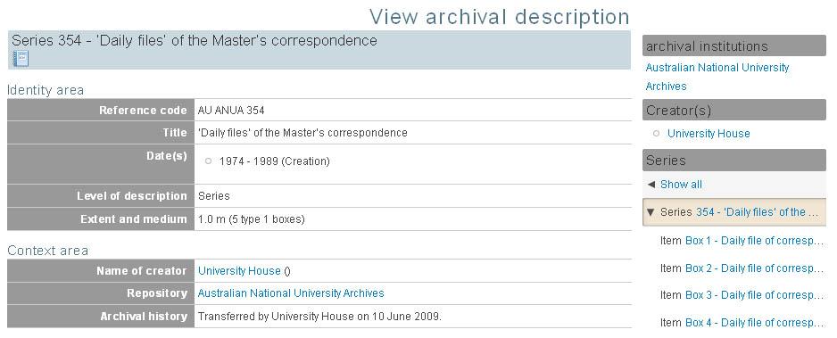
I have attached two images: 'treeview1' which shows the unrelated but consecutively numbered series displayed; and 'treeview2' which shows the expanded items of the selected series displayed.
We much prefer the second display, and it would be great if this was the default. The current display does not offer any benefit to the user, as it merely displays other series with a similar number but no contextual relationship. The expanded 'treeview2' display however, clearly shows that the series contains items, and allows the exploring of those items individually. As this option is the only way of seeing that items have been entered for series or deposits in AtoM, having items displayed by default in the treeview (as in v1.2) would be greatly beneficial for the user.
Thanks very much,
Archivist
ANU Archives Program
(Noel Butlin Archives Centre and University Archives)
Menzies Building 2
The Australian National University
Canberra ACT 0200
02 6125 0143

Adele T
Hello everyone,
Here is my input, but I am repeating some things:
- I would like it if the children would display if you clicked on the fonds name instead of the arrow. It took me a while to figure out the arrow...
- I like very much the scroll bar to see all the children. I think this is a great improvement. I tried to import a series with 200 children to see how it would work but got the 500 error. Could someone at Artefactual please upload a description with many children in the sample data so we can see how it works? When there are many results, does it still open up in the browse screen?
- I agree with others about the inclusion of other fonds in the treeview - I prefer to see all the fonds/collections in a browse menu and not in the tree view. At the same time, I'm sure there are some institutions that like this addition. Also, once I opened up the fonds (with the arrow!), the 'Show All' seemed like a good way to hide the other fonds. I would just add a word like "Show all fonds/collections."
- I would like to see inclusion of the identifier field in either the treeview or the browse. It does not matter to me if there is a sort functionality associated with it, but seeing the identifier is what permits me to see the difference between two children with similar names, so it would be very valuable.
JBushey, ICA-AtoM Product Manager
Thank-you for contributing to the Treeview discussion on the User Forum. Please be aware that we have now launched a Treeview page on the Qubit toolkit wiki: https://www.qubit-toolkit.org/wiki/Treeview. It provides background to the feature and documents possible solutions, future steps etc.. I encourage everyone to review it. More to come...
Best,
Jessica Bushey