NEW: Fresh Look
1,041 views
Skip to first unread message

Cameron (GQueues)
May 11, 2012, 5:36:33 PM5/11/12
to gqu...@googlegroups.com
GQueues has a new look!
The goals of the re-design were:
Hopefully you'll find it clean and refreshing. The changes are based on your feedback over the past several months and your suggestions while the new look was in beta the past two weeks.
The goals of the re-design were:
- Make everything easier to read - even queues with dark colors
- Increase the amount of space devoted to displaying tasks (maximize use of screen real estate)
- Make it easier to see all your queues and smart queues in the left panel
- Maximize the width available for the task description (have it adjust based on whether a task has a due date, reminder)
- Update the look and feel to be more modern, clean
Also I've added several new bits of functionality that have been requested by you:
- The option to choose a "Compact" display setting to see tasks in a smaller font with white space minimized - details
- The option to see task "Creation Dates" and sort by these as well - details
- Colored tags on tasks
- The option to Sort / Group by Tags - details
- A shortcut key to view all available shortcuts (just type a question mark - ? )
- Tasks that are overdue show their dates in red
- When adding a tag /assignment using the drop down menu the first option is automatically selected as you type so you can just press enter
Thanks to everyone who participated in the beta and offered ideas. If you have additional feedback feel free to post it below.
-Cameron

mic...@kinesissurvey.com
May 11, 2012, 9:23:30 PM5/11/12
to gqu...@googlegroups.com
I love it Cameron. The red for late thing is nice. Visually, I don't know why, but I like it more. Good job!
My little growing CPA firm in Texas is COMPLETELY dependent on the GQs for our task management. I hope you are making a ton of money and are in business a long time. We don't don't even call tasks, "tasks" anymore. They are "GQs".
My only suggestion for the future would be to somehow have a firm wide GQs that could be shared (in a way that shows all the notes, tags, and such-when I "assign" now, they don't see all the info) and have a view and/or manage type thing like google docs. I'm getting less willing to have someone log into my email so they can see all the GQ information. Or, if need to share, let all the GQ information show to the person to whom you have shared. I'm not sure what I'm doing wrong when I share and they can't see all I can see with my GQs.
Anyway, love it. Keep it up!

MT
May 11, 2012, 9:29:18 PM5/11/12
to gqu...@googlegroups.com
Colored Tags!
Thanks So Much Cameron!

Dan Haywood
May 12, 2012, 5:54:26 AM5/12/12
to gqu...@googlegroups.com
Looks good to me too.
I had installed the Stylish extension that someone posted, and the new look breaks it. But disabling Stylish plugin sorted things out.
Keep up the good work ... by the way, where do I vote to get searching in tasks?! Still waiting for that feature.
Cheers
Dan


Paul
May 14, 2012, 6:07:33 PM5/14/12
to gqu...@googlegroups.com
Hi Cameron,
Looks great but I wanted to give you just one suggestion related to *Next Actions* because I really would love to see that improvement happeing in GQueues. I saw GQueues supports Next Actions but right now it is not very flexible, meaning you cannot drag-and-drop and you are force to add strcitly the first or first three tasks of a list. I think Next Actions are really at the core of GTD. If you look at how Nozbe (another app you may know) manages Next Actions you can see how they do a great job, almost the whole app is built around Next Actions which gives you focus. That said, again GQueues is really great, etc, I just hope you can make the Next Actions improvement, and also evolve more the mobile app (add tags at least). I think if you make those change GQueues will be a lot much better.
Sincerely,
Paul

Stefan Lasiewski
May 15, 2012, 1:49:51 PM5/15/12
to gqu...@googlegroups.com
Hello,
I received an email about this new look. The email says:
http://www.gqueues.com/?utm_source=newsletter1&utm_medium=email&utm_campaign=newLayout#gqTourVideo
That URL redirects to:
http://www.gqueues.com/main#gqTourVideo
However, there is no video at that URL.
-= Stefan
On Friday, May 11, 2012 2:36:33 PM UTC-7, Cameron (GQueues) wrote:
I received an email about this new look. The email says:
The email says that the URL for this video is:

http://www.gqueues.com/?utm_source=newsletter1&utm_medium=email&utm_campaign=newLayout#gqTourVideo
That URL redirects to:
http://www.gqueues.com/main#gqTourVideo
However, there is no video at that URL.
-= Stefan
On Friday, May 11, 2012 2:36:33 PM UTC-7, Cameron (GQueues) wrote:

CyberCrone
May 15, 2012, 6:25:00 PM5/15/12
to gqu...@googlegroups.com
I've been trying to find out if there is a way to change color of category folders, but so far haven't seen a way, and search of forum doesn't turn up anything. Seems odd that I can't do this and I wonder if I have missed something? (It wouldn't be the first time.)
I'm a new user, only two days, but already know GQueues is the app I've been looking for for months. Hooray on you! Does many of things I need in a web-based PIM/task manager/whatever-you-want-to-call-it, and when you add multiple notes for each task and the ability to attach files, those will be enormously valuable to me and satisfaction will be approaching ~90%. The single remaining wish is for inserting graphics in notes; not able to do that currently? Is this on your list?
CyberCrone
Cameron (GQueues Team)
May 16, 2012, 10:51:32 AM5/16/12
to gqu...@googlegroups.com
Hi Toni -
Your are correct, right now there is no way to change the color of category folders.
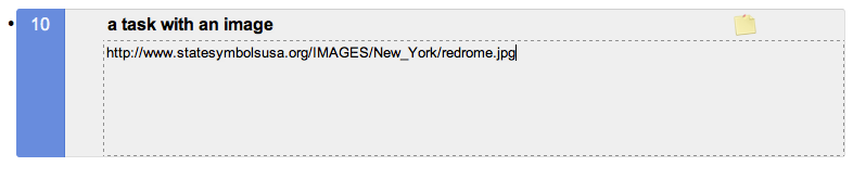
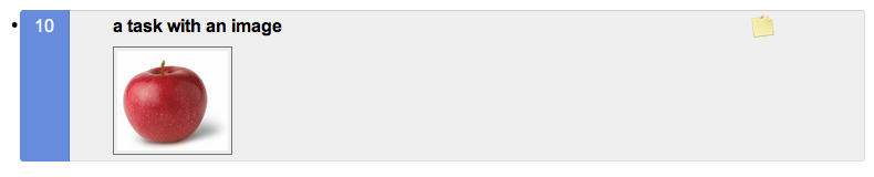
There is a "secret" way to have images in the notes. If you paste in a link to an image, GQueues will automatically display a thumbnail of the image.
When I build out the attachments feature you will then be able to upload images and have them displayed in notes.
Hope this helps,
Cameron
--
You received this message because you are subscribed to the Google Groups "GQueues Discussion Forum" group.
To view this discussion on the web visit https://groups.google.com/d/msg/gqueues/-/YsA4ZRPA8BQJ.
To post to this group, send email to gqu...@googlegroups.com.
To unsubscribe from this group, send email to gqueues+u...@googlegroups.com.
For more options, visit this group at http://groups.google.com/group/gqueues?hl=en.
te...@ruddellfarms.com
May 17, 2012, 11:18:27 PM5/17/12
to gqu...@googlegroups.com
thanks Cameron! Love it! :)
te...@ruddellfarms.com
May 17, 2012, 11:20:18 PM5/17/12
to gqu...@googlegroups.com
until installed in GQueues, you can search by clicking 'command+F' and a search box appears at page top and what you enter in it is highlighted in your list :)

Ben Edmonds
May 18, 2012, 8:42:17 AM5/18/12
to gqu...@googlegroups.com
Giant leap of improvement in the UI. Keeping in line with other core Google products is a key point for me. Partially on aesthetics grounds but I strongly believe the shared UI improves ease & productivity. Especially when new users come to Google or GQs.
~ It's cutting off the task list (though it does respond correctly with a scrollbar) - solution: browser refresh.
~ The full GQs copyright footer isn't seen - solution: use Sroll-to-the-top Chrome extension and scroll to the bottom.
Not big issues of course. Thanks.
.ben.
On Sunday, 13 May 2012 20:42:46 UTC+1, Karl wrote:
The new layout's a little fubar on my laptop running Linux and using Firefox with 1366x768 resolution. The same setup on my desktop, except 1024x768 resolution, seems to be fine. Screenshot attached.
On Sunday, 13 May 2012 20:42:46 UTC+1, Karl wrote:
The new layout's a little fubar on my laptop running Linux and using Firefox with 1366x768 resolution. The same setup on my desktop, except 1024x768 resolution, seems to be fine. Screenshot attached.
eberl...@berlingcreativeservices.com
May 19, 2012, 7:29:31 AM5/19/12
to gqu...@googlegroups.com
I would love to upgrade and pay for the Premium version but as it stands the Queue color choices are so horrendous that I cannot bring myself to pay and upgrade.
Do you have any plans in the very near future to change the color choices? A color picker would be nice but I would be fine with at least having the current colors appear more like their natural color. For instance, the red is too dark and ugly and the next level down is an ugly pink. The other colors are the same way. If the colors looked more natural I would upgrade and pay in a second. The new interface looks great but the color choices really take away from the new UI.
On Friday, May 11, 2012 5:36:33 PM UTC-4, Cameron (GQueues) wrote:
somewhere2go
May 20, 2012, 8:01:26 AM5/20/12
to gqu...@googlegroups.com
For me the colors are ok.

con...@patanddonna.com
May 22, 2012, 9:36:03 AM5/22/12
to gqu...@googlegroups.com
Only problem I have is when I try o mark a task complete it takes about 5 clicks of the mouse. it wants to move the task around. Same with the queues. I click one to open it and it changes the order. Very frustrating.
On Friday, May 11, 2012 5:36:33 PM UTC-4, Cameron (GQueues) wrote:
On Friday, May 11, 2012 5:36:33 PM UTC-4, Cameron (GQueues) wrote:
Cameron (GQueues Team)
May 22, 2012, 10:01:30 AM5/22/12
to gqu...@googlegroups.com
Thanks for the feedback, Connie. I'll adjust the code a bit so regular clicks are not interpreted as drags. I'll get it out in the next update. -Cameron
--
You received this message because you are subscribed to the Google Groups "GQueues Discussion Forum" group.
To view this discussion on the web visit https://groups.google.com/d/msg/gqueues/-/g_wOX55zgfMJ.
Karl
May 22, 2012, 10:39:01 AM5/22/12
to gqu...@googlegroups.com
Hi Cameron,
On Sunday, May 13, 2012 2:42:46 PM UTC-5, Karl wrote:
Any feedback or update on this? I've noticed the new layout is similarly mis-rendered on my office computer with a resolution of 1920x1080 (also using Firefox). I do find the new layout to be a significant improvement over the old one; it would be nice if the rendering problems could be resolved.
Thanks for a great product!
On Sunday, May 13, 2012 2:42:46 PM UTC-5, Karl wrote:
The new layout's a little fubar on my laptop running Linux and using Firefox with 1366x768 resolution. The same setup on my desktop, except 1024x768 resolution, seems to be fine.
Any feedback or update on this? I've noticed the new layout is similarly mis-rendered on my office computer with a resolution of 1920x1080 (also using Firefox). I do find the new layout to be a significant improvement over the old one; it would be nice if the rendering problems could be resolved.
Thanks for a great product!
Cameron (GQueues Team)
May 23, 2012, 4:46:50 PM5/23/12
to gqu...@googlegroups.com
Hi Karl -
It looks like your flavor of Linux doesn't have the Arial font installed, so it's displaying the page with a generic sans-serif font which is wider than Arial, and thus the text is not fitting in all the buttons correctly. I've made some adjustments to the code to account for this situation. It will go out in the next update.
-Cameron
--
You received this message because you are subscribed to the Google Groups "GQueues Discussion Forum" group.
To view this discussion on the web visit https://groups.google.com/d/msg/gqueues/-/lLtu8Do-z8IJ.
Karl
May 23, 2012, 5:10:47 PM5/23/12
to gqu...@googlegroups.com
Yup, that did it. Installing the Liberation fonts (which are metric-compatible with Microsoft fonts) fixed it.
Thanks!
Thanks!
Cameron (GQueues Team)
May 30, 2012, 9:53:55 PM5/30/12
to gqu...@googlegroups.com
This bug has been fixed, so things should look correct even if you only have the generic sans-serif font on a Linux system. Thanks again for pointing it out, Karl! -Cameron
On Wed, May 23, 2012 at 4:10 PM, Karl <karl...@fastmail.us> wrote:
Yup, that did it. Installing the Liberation fonts (which are metric-compatible with Microsoft fonts) fixed it.
Thanks!
--
You received this message because you are subscribed to the Google Groups "GQueues Discussion Forum" group.
To view this discussion on the web visit https://groups.google.com/d/msg/gqueues/-/BFQizqBZoygJ.
Message has been deleted
Message has been deleted
Martin Chapman
Oct 31, 2012, 9:26:44 AM10/31/12
to gqu...@googlegroups.com
Cameron,
On Friday, 11 May 2012 22:36:33 UTC+1, Cameron (GQueues) wrote:
The new Compact View is an improvement but (in my opinion) still takes up too much screen space for tasks with Notes and Tags which end up having three lines for each task.
Could you move the tags up to the first line of the task, in front of the task details, leaving the notes beneath on the second line.
Also, the gap between each line seems to be unnecessarily wide meaning wasted space between the lines.
I love the concept of GQueues, the way it integrates with Google Mail is just perfect but feel irritated by the wasted space between the lines when viewing task queues.
Its great to have the option for Comfortable or Compact View and due to this (in my opinion) you should really go for it and remove all additional wasted space on the Compact View.
This would satisfy those of us who want to see as many tasks as possible on the screen and are not really bothered about the "look" of the page.
For those who are more in tune with the aesthetics of the display and are not desperate to see as many tasks as possible on the screen there is the Comfortable view.
For those who want both, well they have to make a choice.
Thanks - Martin.
On Friday, 11 May 2012 22:36:33 UTC+1, Cameron (GQueues) wrote:

David Schulman
Nov 19, 2012, 11:01:51 AM11/19/12
to gqu...@googlegroups.com
Hi Cameron:
On Friday, May 11, 2012 5:36:33 PM UTC-4, Cameron (GQueues) wrote:
As you know, I love GQueues. I have a suggestion that I'd like to make. Can we have an even more compact display with each task taking only one line (perhaps but the date/time after the task, instead of above it).
On Friday, May 11, 2012 5:36:33 PM UTC-4, Cameron (GQueues) wrote:
rk...@barnard.edu
Jan 2, 2013, 5:21:25 PM1/2/13
to gqu...@googlegroups.com
One thing I would trade off (aesthetically) is a brighter yellow for the Note icon so that when I keep Notes hidden the icon is more noticeable so I see which ones have notes.
On Friday, May 11, 2012 5:36:33 PM UTC-4, Cameron (GQueues) wrote:
Reply all
Reply to author
Forward
0 new messages