geom_ribbon and when below or above y=0

smu
I can not find a solution for a rather simple plot, like this one
http://www.cpc.noaa.gov/products/precip/CWlink/pna/month_nao_index.shtml.
The idea is to use geom_ribbon with different colour for values below
with y<0 and y>0.
url <- 'http://www.cpc.noaa.gov/products/precip/CWlink/pna/norm.nao.monthly.b5001.current.ascii'
file <- tempfile()
download.file(url,file)
nao <- read.table(file, header = F)
names(nao) <- c('Year', 'Month', 'NAO')
nao$Date <- as.Date(paste(nao$Year, nao$Month, '15'), format = "%Y %m %d")
library(ggplot2)
ggplot(nao, aes(Date, ymin = ifelse(NAO>0, 0, NAO))) +
geom_ribbon(aes(ymax = ifelse(NAO>0, NAO, 0),
colour = ifelse(NAO>0, 'red', 'blue'),
fill = ifelse(NAO>0, 'red', 'blue')))
This seems to split the data into two parts (NAO>0 and NAO<0) which isb
not what i want.
ANy better ideas?
thanks and best regard,
Stefan
> sessionInfo()
R version 2.12.0 (2010-10-15)
Platform: i486-pc-linux-gnu (32-bit)
locale:
[1] LC_CTYPE=en_US.UTF-8 LC_NUMERIC=C
[3] LC_TIME=en_US.UTF-8 LC_COLLATE=en_US.UTF-8
[5] LC_MONETARY=C LC_MESSAGES=en_US.UTF-8
[7] LC_PAPER=en_US.UTF-8 LC_NAME=C
[9] LC_ADDRESS=C LC_TELEPHONE=C
[11] LC_MEASUREMENT=en_US.UTF-8 LC_IDENTIFICATION=C
attached base packages:
[1] grid graphics grDevices utils datasets stats methods
[8] base
other attached packages:
[1] ggplot2_0.8.8 proto_0.3-8 reshape_0.8.3
[4] plyr_1.2.1 ProjectTemplate_0.1-3 foreign_0.8-41
[7] yaml_1.1.0 testthat_0.3
loaded via a namespace (and not attached):
[1] digest_0.4.2 evaluate_0.3 stringr_0.4

Dennis Murphy
This seems to work, but produces no legend. OTOH, neither does the NOAA plot :) If you want a legend, put the fill = 'mycolor' stuff inside aes() and add a scale_fill_manual() statement.
ggplot(nao, aes(Date, y = NAO)) +
geom_ribbon(data = subset(nao, NAO > 0), aes(ymin = 0, ymax = NAO), fill = 'red') +
geom_ribbon(data = subset(nao, NAO <= 0), aes(ymin = NAO, ymax = 0), fill = 'blue')
HTH,
Dennis
--
You received this message because you are subscribed to the ggplot2 mailing list.
Please provide a reproducible example: http://gist.github.com/270442
To post: email ggp...@googlegroups.com
To unsubscribe: email ggplot2+u...@googlegroups.com
More options: http://groups.google.com/group/ggplot2
smu
thanks, but your plot is the same as mine, besides the colours.
Like mine, your plot splits the data into to parts and plots both.
Therefore, years with positive and negative NAO values occure, which is
just wrong.
regards,
stefan
> > To unsubscribe: email ggplot2+u...@googlegroups.com<ggplot2%2Bunsu...@googlegroups.com>
> > More options: http://groups.google.com/group/ggplot2
Dennis Murphy
Try this:
nao$pos <- with(nao, pmax(0, NAO))
nao$neg <- with(nao, pmin(0, NAO))
g <- ggplot(nao, aes(x = Date))
g + geom_ribbon(aes(ymin = 0, ymax = pos), fill = 'red') +
geom_ribbon(aes(ymin = neg, ymax = 0), fill = 'blue')
Does that work?
HTH,
Dennis
Dennis Murphy
D.
Is this the intended picture though? Looks like positives and negatives with neighboring dates will need displaced somehow or else you have this overlap as below:

Adam Loveland
216-689-5409
1Key
Dennis Murphy <djm...@gmail.com>
Sent by: ggp...@googlegroups.com12/17/2010 03:31 PM
ggp...@googlegroups.com smu <s...@z107.de> Re: geom_ribbon and when below or above y=0
More options: http://groups.google.com/group/ggplot2[attachment "nao.png" deleted by Adam Loveland/GL/KB/KeyCorp]
This communication may contain privileged and/or confidential information. It is intended solely for the use of the addressee. If you are not the intended recipient, you are strictly prohibited from disclosing, copying, distributing or using any of this information. If you received this communication in error, please contact the sender immediately and destroy the material in its entirety, whether electronic or hard copy. This communication may contain nonpublic personal information about consumers subject to the restrictions of the Gramm-Leach-Bliley Act. You may not directly or indirectly reuse or redisclose such information for any purpose other than to provide the services for which you are receiving the information. 127 Public Square, Cleveland, OH 44114
If you prefer not to receive future e-mail offers for products or services from Key
send an e-mail to mailto:DNERe...@key.com with 'No Promotional E-mails' in the
SUBJECT line.
smu
> See the attachment. My last response showed the revisions necessary to the
> data to produce what I believe is the correct plot. If you look carefully,
> you can see gaps on either side of zero, so it appears to be doing the right
> thing. If it's not, I'm open to corrections.
no sorry, still something is wrong, which gets visible, when a small part
is the data is plotted
nao$pos <- with(nao, pmax(0, NAO))
nao$neg <- with(nao, pmin(0, NAO))
nao = subset(nao, Date>as.Date('2009-01-01'))
g <- ggplot(nao, aes(x = Date))
g + geom_ribbon(aes(ymin = 0, ymax = pos), fill = 'red') +
geom_ribbon(aes(ymin = neg, ymax = 0), fill = 'blue')
# compared to
g + geom_line(aes(y=NAO))
I guess it would be easy correct, when the points where y=0 where
included in the dataset. But is this the only way to solve this problem?
regards,
stefan
Dennis Murphy
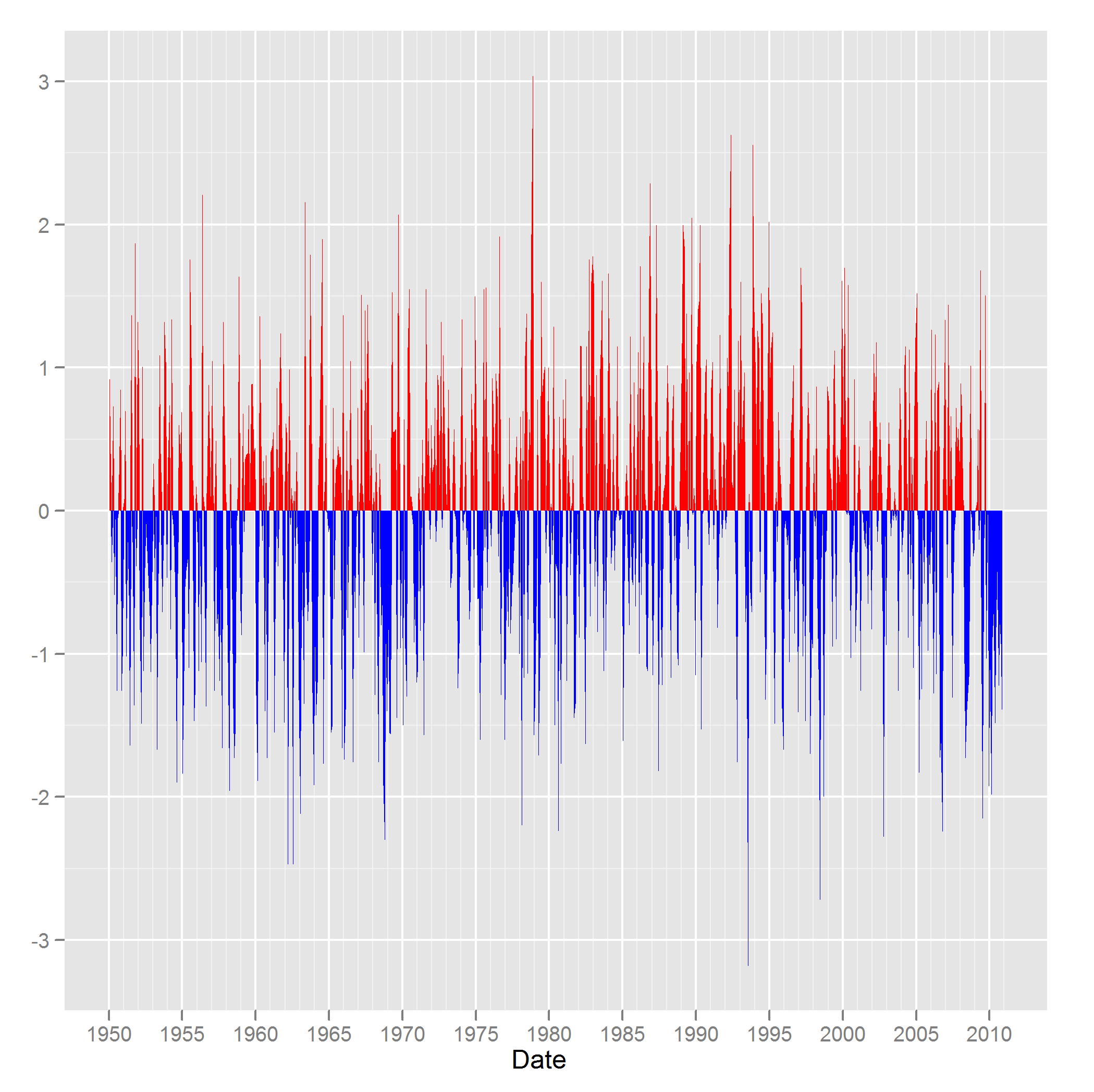
When you use geom_ribbon(), there are going to be regions of overlap if you zoom in far enough. The reason the blues and reds overlap in the subset is because there is either a single negative value in a region of positive values or vice versa, and geom_ribbon() needs to plot some area- you can see that it goes +/- 0.5 units to plot a triangle when the value is a singleton. Perhaps a viable alternative to geom_ribbon() would be geom_segment(). I'll show the code for both the full data and the subset:
url <- 'http://www.cpc.noaa.gov/products/precip/CWlink/pna/norm.nao.monthly.b5001.current.ascii'
file <- tempfile()
download.file(url,file)
nao <- read.table(file, header = F)
names(nao) <- c('Year', 'Month', 'NAO')
nao$Date <- as.Date(paste(nao$Year, nao$Month, '15'), format = "%Y %m %d")
nao$neg <- with(nao, pmin(0, NAO))
q1 <- ggplot(nao, aes(x = Date))
q1 + geom_segment(aes(xend = Date, y = pos, yend = 0), color = 'red') +
geom_segment(aes(xend = Date, y = neg, yend = 0), color = 'blue')
# On the subset:
last_plot() %+% nao2
Actually, I would probably add size = 1 to geom_segment() for visual emphasis in the latter case as follows:
ggplot(nao2, aes(x = Date)) +
geom_segment(aes(xend = Date, y = pos, yend = 0), color = 'red', size = 1) +
geom_segment(aes(xend = Date, y = neg, yend = 0), color = 'blue', size = 1)
You don't get the ribbon effect, but you don't get the color overlap, either. I don't see any material difference in the geom_segmented plot on the entire data frame from the geom_ribbon plot, but there is a clearly visible difference on the subset. I don't know if that's acceptable or not, but it's an alternative.
HTH,
Dennis
Dennis Murphy
nao2 <- subset(nao, Date > as.Date('2009-01-01'))
D.
Adam_L...@keybank.com
Hi Dennis,
I think it's correct. Having looked at it again, the issue I'm seeing is due to the date values all having the same day. If the data truly were daily, there'd be no issue using your solution.
But see my attachment for an illustration of how the use of monthly data, as opposed to daily, means this plot cannot look exactly as desired.
g <- ggplot(nao[nao$Year==1968,], aes(x = date))
geom_ribbon(aes(ymin = neg, ymax = 0), fill = 'blue')
Adam Loveland
216-689-5409
1Key
| Dennis Murphy <djm...@gmail.com>
Sent by: ggp...@googlegroups.com |
12/17/2010 04:44 PM |
|
|
See the attachment. My last response showed the revisions necessary to the data to produce what I believe is the correct plot. If you look carefully, you can see gaps on either side of zero, so it appears to be doing the right thing. If it's not, I'm open to corrections.
D.
On Fri, Dec 17, 2010 at 1:09 PM, <Adam_L...@keybank.com> wrote:
Is this the intended picture though? Looks like positives and negatives with neighboring dates will need displaced somehow or else you have this overlap as below:
More options: http://groups.google.com/group/ggplot2[attachment "nao.pdf" deleted by Adam Loveland/GL/KB/KeyCorp]
Adam_L...@keybank.com
Hello again,
I'm sorry to have confused the issue here. And I'm not sure if it's possible for geom_ribbon to create non-overlaping renders or not in cases involving neighboring dates with positive and negative values. And although I indicate below that I think it's due to having monthly data, I don't think that's correct. Sorry again if I've just confused the issue.
Adam Loveland
216-689-5409
1Key
| Adam Loveland/GL/KB/KeyCorp
12/17/2010 05:01 PM |
|
Hi Dennis,
I think it's correct. Having looked at it again, the issue I'm seeing is due to the date values all having the same day. If the data truly were daily, there'd be no issue using your solution.
But see my attachment for an illustration of how the use of monthly data, as opposed to daily, means this plot cannot look exactly as desired.
g <- ggplot(nao[nao$Year==1968,], aes(x = date))
g + geom_ribbon(aes(ymin = 0, ymax = pos), fill = 'red') +
geom_ribbon(aes(ymin = neg, ymax = 0), fill = 'blue')
See the attached.
smu
On Fri, Dec 17, 2010 at 02:37:31PM -0800, Dennis Murphy wrote:
> Hi:
>
> When you use geom_ribbon(), there are going to be regions of overlap if you
> zoom in far enough. The reason the blues and reds overlap in the subset is
> because there is either a single negative value in a region of positive
> values or vice versa, and geom_ribbon() needs to plot some area- you can see
> that it goes +/- 0.5 units to plot a triangle when the value is a singleton.
Yes, that was my problem, I thought there could be a simple approach to
solve, e.g. by determining, where y=0 and includes these dates in the
data.
Thank you for your suggestion of the segment plot, I think I will use
this solution.
best regards,
Stefan
Dennis Murphy
Hi Dennis,
Yes, that was my problem, I thought there could be a simple approach to
On Fri, Dec 17, 2010 at 02:37:31PM -0800, Dennis Murphy wrote:
> Hi:
>
> When you use geom_ribbon(), there are going to be regions of overlap if you
> zoom in far enough. The reason the blues and reds overlap in the subset is
> because there is either a single negative value in a region of positive
> values or vice versa, and geom_ribbon() needs to plot some area- you can see
> that it goes +/- 0.5 units to plot a triangle when the value is a singleton.
solve, e.g. by determining, where y=0 and includes these dates in the
data.
I don't think the problem is where y = 0; rather, it's where you get an isolated point in the series with respect to sign switch. You could use rle() to figure out where the isolated points happen to be; here's an example:
# rle() is short for run length encoding - the first component, lengths,
# indicates the length of each run, whereas values tells you which value
# of the argument object corresponds to each run
> rle(x > 0)
Run Length Encoding
lengths: int [1:11] 4 1 2 3 3 1 1 2 1 1 ...
values : logi [1:11] FALSE TRUE FALSE TRUE FALSE TRUE ...
> x
[1] -0.41401206 -0.85060433 -1.67046027 -0.31530086 1.93378263 -0.77367688
[7] -0.79069791 0.69257133 2.46788204 0.38892289 -0.03521033 -0.01071611
[13] -0.74209425 1.36974281 -1.22775441 0.29621976 0.28208192 -2.11044822
[19] 0.06657930 -0.18036208
To pick out the sign isolated elements of x, we do it in two stages:
(i) select out which elements of the run length vector == 1
(ii) make a new object that is the cumulative sum of the run lengths
(iii) pick out the elements of the series whose components in the cumulative sum vector
match those in (i) [got all that? :-]
# (i)
> whichIso <- which(rle(x > 0)$lengths == 1L)
> whichIso
[1] 2 6 7 9 10 11
# (ii)
> cslengths <- cumsum(rle(x > 0)$lengths)
# (iii) Find elements of the series that are sign isolated
> x[cslengths[whichIso]]
[1] 1.9337826 1.3697428 -1.2277544 -2.1104482 0.0665793 -0.1803621
You could always try geom_ribbon() on the non-isolated set of points and then use geom_segment() on the isolated points, but I think you'll still have some localized regions of overlap between non-isolated sets. Of course, geom_ribbon() will paint over the region on the other side of the isolated point; it's up to you to decide whether that is a feature or a bug (not in the function per se, but rather its implementation).
Re geom_segment(), you can thin the width of the segments in the complete series, but it will only go so far (I think size = 0.1 or 0.05 is the practical limit from playing with it the other day). The thinned result looks pretty good, but it's not perfect because of the number of time points in the series. Some overlap of color is inherent with so many sign switches. It becomes less of a problem when the length of the series is reduced.
HTH,
Dennis

Kohske Takahashi
d <- data.frame(x=rnorm(30,0,5), y=rnorm(30))
d <- d[order(d$x),] # sort along x
rx <- do.call("rbind",
sapply(1:(nrow(d)-1), function(i){
f <- lm(x~y, d[i:(i+1),])
if (f$qr$rank < 2) return(NULL)
r <- predict(f, newdata=data.frame(y=0))
if(d[i,]$x < r & r < d[i+1,]$x)
return(data.frame(x=r,y=0))
else return(NULL)
})
)
d2 <- rbind(d,rx)
ggplot(d2,aes(x,y)) + geom_point() + geom_area(data=subset(d2, y<=0),
fill="red") + geom_area(data=subset(d2, y>=0), fill="blue")
--
Kohske Takahashi <takahash...@gmail.com>
Research Center for Advanced Science and Technology,
The University of Tokyo, Japan.
http://www.fennel.rcast.u-tokyo.ac.jp/profilee_ktakahashi.html
smu
Hi Kohske,
thank you, perfect solution!
best regards,
Stefan