How to reduce data across multiple columns (to build a row chart)
1,047 views
Skip to first unread message
Jeff Friesen
Nov 3, 2013, 5:19:28 PM11/3/13
to dc-js-us...@googlegroups.com
I haven't run across an example like this and I'm stuck. Our database spits out something like this:

I want to visualize what household upgrade was recommended, mentioned and declined. I don't want to do it on a single job level (there are thousands of records) but using something like reduceCount().
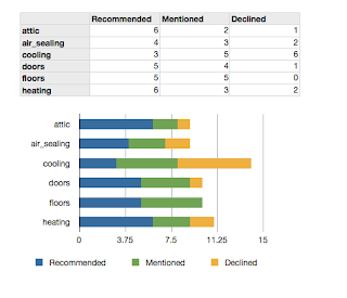
I faked it in a spreadsheet here, where each number in the column is a count of how many times that number (corresponding to recommended, mentioned, declined) occurred. Then I wanted to chart it as a stacked row chart.
Do I need to pre-process this data, using something like underscore? Even then, I'm still a bit lost on how to implement this in crossfilter+dc.js. I realize stacked row charts may not be supported. Even if it is just a row chart with the 'Recommended' data would be helpful. I'm also open to other visualization options.
here is a gist with sample data: https://gist.github.com/jefffriesen/7292490
Thanks for any help on this!
Nick Zhu
Nov 4, 2013, 3:27:15 PM11/4/13
to Jeff Friesen, dc-js-us...@googlegroups.com
You can achieve this by flatten the records into something like this:
[{type: 'attic', result: 'recommended'}, {type: 'doors', result: 'declined'}, ...]
creating a dimension on type then use the full reduce function in crossfilter to reduce count per each result type into a JavaScript object. You can see the bubble chart in NASDAQ demo for reference.
Cheers,
Nick
Jeff Friesen
Nov 4, 2013, 11:48:43 PM11/4/13
to dc-js-us...@googlegroups.com
Thanks Nick. I'll give this a shot
Jacob Rideout
Nov 5, 2013, 2:39:38 PM11/5/13
to dc-js-us...@googlegroups.com, Jeff Friesen
I created melt.js to solve just this problem: https://github.com/jrideout/melt.js
Nick Zhu
Nov 5, 2013, 3:09:29 PM11/5/13
to Jacob Rideout, dc-js-us...@googlegroups.com, Jeff Friesen
Nice library Jacob :) bookmarked it
Jeff Friesen
Nov 5, 2013, 8:29:53 PM11/5/13
to dc-js-us...@googlegroups.com
Jacob - melt.js works nicely. You should consider registering it with Bower (http://devhike.blogspot.com/2013/06/how-to-register-your-library-or.html)
Can someone point me in the right direction for a stacked row chart? I don't think that is natively supported. Based on reading tickets it seems like a renderlet may be involved, but it's hard to figure out what that does or how it could be used for this.
Can someone point me in the right direction for a stacked row chart? I don't think that is natively supported. Based on reading tickets it seems like a renderlet may be involved, but it's hard to figure out what that does or how it could be used for this.
thanks
On Sunday, November 3, 2013 10:19:28 AM UTC-7, Jeff Friesen wrote:
Nick Zhu
Nov 5, 2013, 9:15:02 PM11/5/13
to Jeff Friesen, dc-js-us...@googlegroups.com
Stacked row chart might take a little bit more work than what a renderlet can do. Feel free to create a request for this feature and I might take a crack at it soon since I need similar feature for one of my project.
Nick
Jacob Rideout
Nov 5, 2013, 9:35:36 PM11/5/13
to dc-js-us...@googlegroups.com, Jeff Friesen
I'm using a stacked "row chart" in of my projects by rotating the a stacked ordinal bar chart and cleaning up some of the text with a renderlet.
That might actually be the way to go for an official version too - though with mixins to have stackable charts be driven from either x or y keys rather than render hacks.
That might actually be the way to go for an official version too - though with mixins to have stackable charts be driven from either x or y keys rather than render hacks.
Reply all
Reply to author
Forward
0 new messages

