Calibration "too red"

Vincent Bernat
I have calibrated some screens with my ColorHug and I feel that the
calibration is a bit "red". This seems worse on LED screens. Can the
colorhug be used to calibrate LED screens? I have for example a
SyncMaster BX2240 (not a top screen, but not low-end too). GNOME color
manager created ICC profiles D65 with a white point at 6300K. I have yet
to try with the Live CD but is there some reasons for the screen to be
redish?
colord 0.1.16
gnome-color-manager 3.2.2
argyll 1.3.5 (patched by Debian)
colorhug-client 0.1.6

Chris Lord
--Chris

Pascal de Bruijn
> On 14 March 2012 11:07, Vincent Bernat <ber...@luffy.cx> wrote:
>>
>> Hi!
>>
>> I have calibrated some screens with my ColorHug and I feel that the
>> calibration is a bit "red". This seems worse on LED screens. Can the
>> colorhug be used to calibrate LED screens? I have for example a SyncMaster
>> BX2240 (not a top screen, but not low-end too). GNOME color manager created
>> ICC profiles D65 with a white point at 6300K. I have yet to try with the
>> Live CD but is there some reasons for the screen to be redish?
Are you sure about this?
Laptop displays are typically very very blueish. Leaving a lot to compensate.
If you are accustom to looking at a way to blue display, a corrected
display will look way too yellow/red at first.
Try working a week with the correction, so your brain has time to adjust.
Obviously I can't judge your calibration, but the above is a common
problem/mistake.
Also, my personal laptop has viewing angle issues. Where after
calibration I _do_ get excessive redness when I view my laptop's
display at an odd angle. There is no way to fix this, except making
sure you are viewing the display from an acceptable angle.
Regards,
Pascal de Bruijn

George Sedov
Same problem here: calibration is a _WAY_ too red. First I thought the same: need some time to adjust, as I noticed before that my screen felt bluish compared to others.
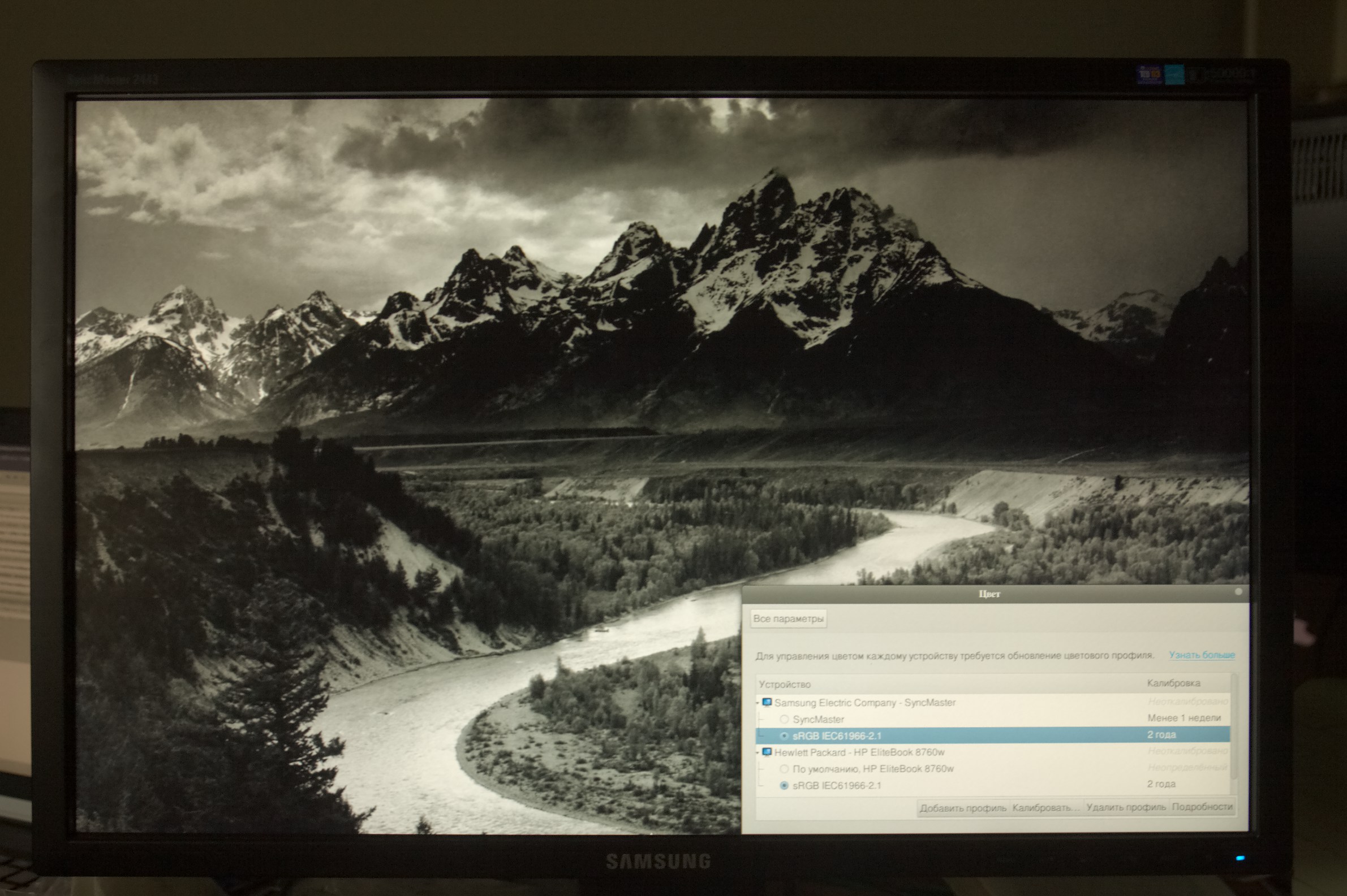
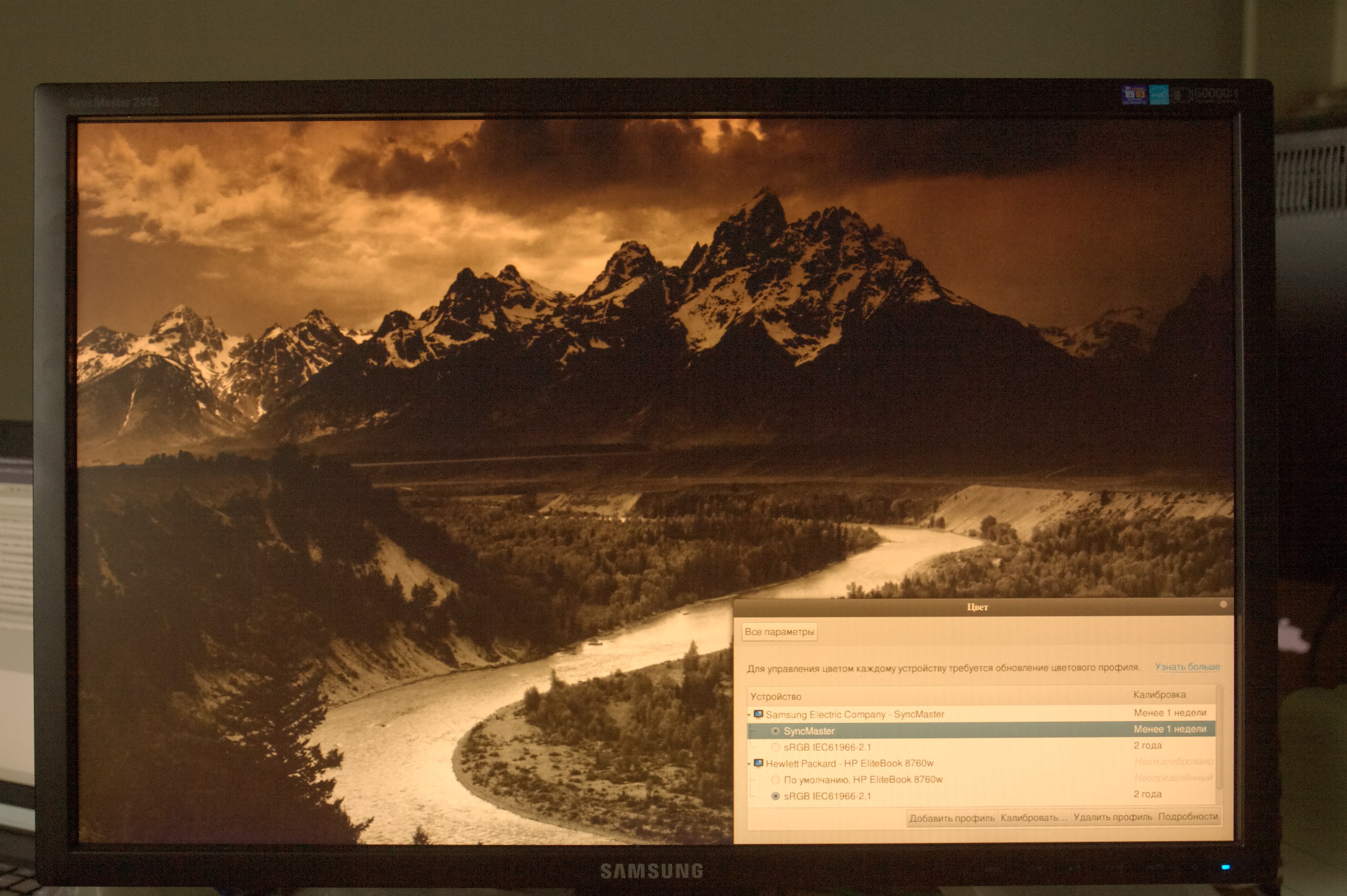
But here I tried to calibrate my SyncMaster 2443. The pictures are in attach. As I understand the silliness of judging the calibration from the picture, I provide both "before" and "after", where "before" is an sRGB IEC61966-2.1 profile shipped with gnome3/colord by default. Both pictures are shot using canon EOS 50D in RAW and are set with the color temperature of 7500K (as it is cloudy here right now). I can send RAWs as well if anyone is interested.
Cheers,
George

Chris Giltnane
On Mar 14, 2:44 pm, Pascal de Bruijn <pmjdebru...@pcode.nl> wrote:
red but lived with it for a week and now everyone else's screen just
looks wrong. I also did a non-scientific test and took some pictures
of coloured objects and then displayed them on the screen next too
real think and the colour was pretty much spot on with the correction
in place and way to blue without it.

Jose Carlos Garcia Sogo
explain why my profile (also reported by other user) ends up out of
the gamut in the red corner, as Pascal knows. It is true that we
managed to create one that was almost in-bounds, and things were
better, but still.
Kind regards,
--
José Carlos García Sogo
jcs...@gmail.com

Matthias Urlichs
Pascal de Bruijn:
> Also, my personal laptop has viewing angle issues. Where after
> calibration I _do_ get excessive redness when I view my laptop's
> display at an odd angle. There is no way to fix this, except making
> sure you are viewing the display from an acceptable angle.
Quick test:
Set the laptop screen to a uniform gray.
(You should do that anyway, if you do any color work.)
Move your face so that your eyes are placed somewhat perpendicular to the
top-left corner, at normal viewing distance.
Look at brightness and color of the other three corners.
Is there any visual difference to what you're seeing in the top left part
of the screen?
Repeat with the primary colors as background.
Did you answer "yes" to any of these question? If so, then your display is
part of the problem. Get a better monitor -- color-calibrating yours is
essentially useless.
--
-- Matthias Urlichs

Marco Tedaldi
> Hi,
>
> Same problem here: calibration is a _WAY_ too red. First I thought the same: need some time to adjust, as I noticed before that my screen felt bluish compared to others.
>
> But here I tried to calibrate my SyncMaster 2443. The pictures are in attach. As I understand the silliness of judging the calibration from the picture, I provide both "before" and "after", where "before" is an sRGB IEC61966-2.1 profile shipped with gnome3/colord by default. Both pictures are shot using canon EOS 50D in RAW and are set with the color temperature of 7500K (as it is cloudy here right now). I can send RAWs as well if anyone is interested.
>
> Cheers,
> George
>
Hi george. You would have to set your camera wb to the same as you set
your monitor.
so if you set your monitor wb to 6500 take the picture with a white
point of 6500. Otherwise you'll always get a tint.
If I understand this correctly, the monitor should ideally be set to the
same color temp as the ambient light is (because our eyes/brain are
adjusting to that as well).
In most cases, this can't be done practically :-(
But as a general question: how good is (a not calibrated) camera for
just a white balance check?
Could I just photograph my screen set to uniform gray and use
auto-white-balance in darktable to get the color temperature out?
best regards
Marco
Pascal de Bruijn
> On 14.03.2012 16:11, George Sedov wrote:
>> Hi,
>>
>> Same problem here: calibration is a _WAY_ too red. First I thought the same: need some time to adjust, as I noticed before that my screen felt bluish compared to others.
>>
>> But here I tried to calibrate my SyncMaster 2443. The pictures are in attach. As I understand the silliness of judging the calibration from the picture, I provide both "before" and "after", where "before" is an sRGB IEC61966-2.1 profile shipped with gnome3/colord by default. Both pictures are shot using canon EOS 50D in RAW and are set with the color temperature of 7500K (as it is cloudy here right now). I can send RAWs as well if anyone is interested.
>>
>> Cheers,
>> George
>>
>
> Hi george. You would have to set your camera wb to the same as you set
> your monitor.
> so if you set your monitor wb to 6500 take the picture with a white
> point of 6500. Otherwise you'll always get a tint.
>
> If I understand this correctly, the monitor should ideally be set to the
> same color temp as the ambient light is (because our eyes/brain are
> adjusting to that as well).
> In most cases, this can't be done practically :-(
>
> But as a general question: how good is (a not calibrated) camera for
> just a white balance check?
I doubt that will work well... You might be able to detect huge
deviations like this, but not finetuning.
Regards,
Pascal de Bruijn

Jaroslav Škarvada
(CFL, LED) and the readings were still too blue which resulted in too
red ICC (compared to Spyder 2 results). I created CCMX for my colorhug
(Lenovo T500 and i1 Pro spectrophotometer was used for this task):
http://jskarvad.fedorapeople.org/lenovo_t500_colorhug.ccmx. It helps a
lot, but the results still seem not to be optimal - if I lower the LCD
backlight the readings are still too blue even with this CCMX. I don't
know what's going there, but I will try to experiment more.
Vincent Bernat
disais:
> I have calibrated some screens with my ColorHug and I feel that the
> calibration is a bit "red". This seems worse on LED screens. Can the
> colorhug be used to calibrate LED screens? I have for example a
> SyncMaster BX2240 (not a top screen, but not low-end too). GNOME color
> manager created ICC profiles D65 with a white point at 6300K. I have
> yet to try with the Live CD but is there some reasons for the screen
> to be redish?
Another problem is that for two LED screens I have calibrated, the color
rendering of one of them is more redish than the rendering on the other
one. I have tried several calibrations, changed some settings on the
screen but I always end up with the same color rendering. It is easy to
see the difference in the rendering by putting a blank square between
the two screens.
--
Vincent Bernat ☯ http://vincent.bernat.im
Make it right before you make it faster.
- The Elements of Programming Style (Kernighan & Plauger)

jim hatch
Kevin MacKenzie
run. Checked the color values pre and post calibration for several
gray patches using a colorimeter. The perceived colour balance of the
calibrated display appears red, but the 'white' of the calibrated
monitor is correct (0.33,0.33 in CIE xy space).
(I have not done a full spectral test of different colours etc. that
is in my 'todo' list).
The redness is a result of what has been discussed above, as well as a
shift away from you being used to seeing an overly blue display. Try
using the calibrated settings for awhile, and then switch back to the
pre-calibrated settings, using a white background. You'll immediately
see how blue the native display settings are.

stens
me as well, I perceive my screen as too reddish after calibration.
However, I'd be fine to accept the result and to adapt to it over
time.
But what concerns me is that Jaroslav claims that the Spyder 2
provides a different calibration.
As well, we have quite a different range of monitors in our office and
all office mates here think as well that the generated profile
provides a red screen.
Would be great if we could get some comments on that. Perhaps there
are others out there who can compare 'commercial' calibration tools
with ColorHug.
Thanks
On Mar 15, 11:10 pm, Jaroslav Škarvada <ya...@yarda.eu> wrote:
> I have exactly the same problem. I tried with several LCD screens
> lot, but the results still seem not to be optimal - if I lower the LCD

Sven Arvidsson
> Hi there,
>
> me as well, I perceive my screen as too reddish after calibration.
> However, I'd be fine to accept the result and to adapt to it over
> time.
> But what concerns me is that Jaroslav claims that the Spyder 2
> provides a different calibration.
>
> As well, we have quite a different range of monitors in our office and
> all office mates here think as well that the generated profile
> provides a red screen.
>
> Would be great if we could get some comments on that. Perhaps there
> are others out there who can compare 'commercial' calibration tools
> with ColorHug.
> Thanks
I initially had the "everything's too red" problem too, but after
adjusting settings for contrast and gamma by following
http://www.lagom.nl/lcd-test/ and using the colour profile a while
everything seems quite correct now, and going back is not an option.
Uncalibrated the screen is too blue and just feels wrong.
--
Cheers,
Sven Arvidsson
http://www.whiz.se
PGP Key ID 760BDD22

SHeier
same result here. Calibration with colorhug on a Samsung Syncmaster 2442BW gives a very reddish screen.
I could not believe it to be only a matter of getting used to the new color temperature. So I asked around and could borrow two different colorimeters (unfortunately nobody I know seems to own a spectrometer...), a Spyder2 and GretagMacbeth eye-one display2 (now I think x-rite).
Doing the calibration as with the same settings as with the colohug, I get two different results. The calibration with the eye-one is slightly more blueish as the default screen settings, the Spyder2 calibration is even more red than the colorhug...
To make things worse, the Spyder2 has a blue/green filter in front of its sensor, which - according to the manual - you should use for calibrating a LCD, but not for a CRT. Again, I cannot believe to get a correct color calibration through a blue filter without correcting for this filter in software. I have no idea if this function is built into argyll for the spyder2, but calibrating the screen without this filter gave a result nearly identical to the eye-one.
Is there any way to tell, which calibration is correct? Or can this only done by a photospectrometer?
Mark Hills
given it a day's use so far and it's still feels very... red.
I profiled 3 separate monitors and applied to the X screen, always giving
a skew towards red.
(but consistent colours between all three montors, which is good)
I can understand a slight shift that will feel unfamiliar, but this is
quite beyond any of the presets on the monitor itself, for example.
To a novice like me, the out-of-gamut red in the resulting profiles seems
like it could be an indication something isn't quite right. I read that
others see this too. Is this normal?
http://www.pogo.org.uk/~mark/tmp/profiles.png
Although perhaps this would not cause red-ness but a skew away from red.
I used the live CD first, and re-produced it with Argyll built from source
and 'dispcal'.
I don't have another device to compare. But I did find this link, where
the same model of monitor is profiled with Spyder3 and another device,
both showing a very different red:
http://www.tftcentral.co.uk/reviews/content/spyder3elite.htm#third_party
I'm fairly new to this -- learning as I go, so please forgive any
inaccuracies.
Thanks
--
Mark
Graeme Gill
> Is there any way to tell, which calibration is correct? Or can this only done by a photospectrometer?
have confidence in. A spectrometer or an i1d3 probably meets this requirement.
Graeme Gill.

Giacomo Catenazzi
Matthias Urlichs
> But I think (IMHO) that a good test is to have a white screen and a
> white paper near the screen.
The problem is that you need standard (i.e. 6500°K) illumination for
this test to work. Where do you propose to get that from?
--
-- Matthias Urlichs
Giacomo Catenazzi
Graeme Gill
> But I think (IMHO) that a good test is to have a white screen and a white paper near the screen.
> They should have a similar white. (it is difficult to check the other colors without having good paper
> with know colors).
> With the white paper test, it seems that no-calibration was too blue, but now I'm slightly too red.
The normal assumption is that we will adapt our visual white point to
the dominant near neutral color in our central vision.
Things that can stop this working:
If the white point is not close to the daylight spectrum locus
(ie. it is not close to being a neutral color).
Enough light of a different color temperature in our periphery will
prevent 100% adaptation.
If the white point is too far from "normal" white color temperature
of about 5000 K (note that incandescent lamps are 2850K and we generally
adapt to that OK).
The other interpretation of "too red" is that the white looks white, but
greys look "too red". This is a fault of the calibration/profile in
not maintaining neutrality down the neutral axis.
Note that there are a multitude of problems that can crop up when
dealing with wide gamut displays in relation to how instruments
and people perceive the color. It's even possible with such displays
to have a situation where the screen looks to be one color when
we look at it directly, and a slightly different color when we
see it out of the corner of our eye or from a distance.
Graeme Gill.
jim hatch
jim hatch

Paramjit Oberoi
Then I discovered that the monitor has a feature called 'MagicColor" which adjusts the colors based on what's being displayed. Recalibrating after turning it off (and keeping it off) produces much better results.

Damien Thébault
> If the white point is not close to the daylight spectrum locus
> (ie. it is not close to being a neutral color).
> Enough light of a different color temperature in our periphery will
> prevent 100% adaptation.
> If the white point is too far from "normal" white color temperature
> of about 5000 K (note that incandescent lamps are 2850K and we generally
> adapt to that OK).
> The other interpretation of "too red" is that the white looks white, but
> greys look "too red". This is a fault of the calibration/profile in
> not maintaining neutrality down the neutral axis.
> Note that there are a multitude of problems that can crop up when
> dealing with wide gamut displays in relation to how instruments
> and people perceive the color. It's even possible with such displays
> to have a situation where the screen looks to be one color when
> we look at it directly, and a slightly different color when we
> see it out of the corner of our eye or from a distance.
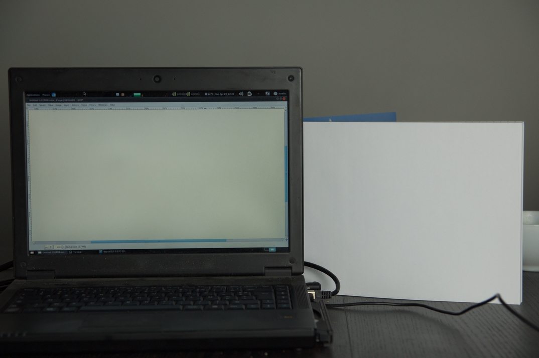
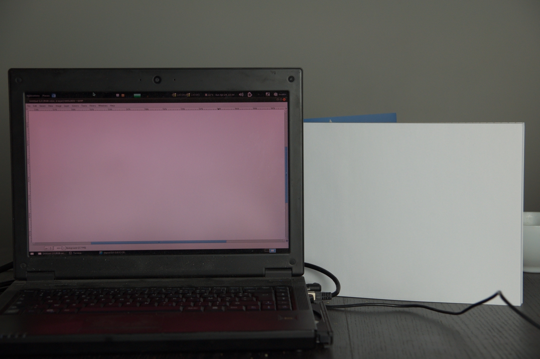
I have a photographic lamp labelled "soft-white" 5500K, so I thought
it would be a good thing to test with it.
I put paper sheets near the screen to reflect the lamp light, put my
DSLR (Nikon D90) on daylight White Balance.
After that, I opened the raw file in RawTherapee software, where I
found that D90's daylight color temperature is around 5025K with a
1.121 tint, so I corrected it to 5500K/1.0 there.
I took four shots of the screen+paper, the first time without any
calibration, the second time with colorhug profile, first at
perpendicular level, then from a higher perspective.
The pictures reflect what I see in real life, the screen color is more
red with the colorhug profile. Mainly when looking directly
perpendicular to the screen, a little less red upwards (but the
difference between the two positions is greater when using the
colorhug profile.
RawTherapee allows to compute a color temperature from a zone with the
white balance tool, so I checked that everything looked ok.
In all four shots, the paper is between 5500K and 5550K, with a tint
of 0.955, so it looks like everything is ok there.
The uncalibrated screen is between 5300K and 5350K, with a tint of
0.880, it's not that bad but it's a little bit more warm and purple.
The colohug-profiled screen is between 4680K/1.56 and 5060K/1.28 from
a perpendicular angle. And between 5225K/1.13 and 5467/0.987 from
upper. The color is warmer, but has a more green tint at the same
time.
So the pictures looks like a good test, and reflects what I see. I
don't know if the number are accurate, but they make sense. Please
correct me if you think that something looks wrong.
I could do the same test with my TV, which should have less
position-dependent color thanks to the screen technology (IPS vs TN
IIRC).
Richard Hughes said that he was aware of this, so this might be fixed
later. This kind of discussion is good for the community anyway.
Regards,
--
Damien Thebault
Graeme Gill
> The pictures reflect what I see in real life, the screen color is more
> red with the colorhug profile. Mainly when looking directly
say "magenta" rather than red), then I would
guess that "white point too far from the spectrum" locus is
the diagnosis, and the probable cause is an instrument
calibration that is insufficiently accurate for your particular
display & instrument combination.
Graeme Gill.

Jarl Arntzen
wrote:
This is very close to what I'm experiencing for my screen too, a Dell
1907FP LCD. I tried running the ColorHug on 3 occasions, although without
selecting a display type first. It gave results very close to what can be
seen in the images, but not quite as red.
I've also got a Spyder 3 Express and have run a calibration using that and
DispcalGUI against the same monitor which provided very nice, neutral
grays, and whites. I'd very much like to get to the bottom of the mystery
with the red-shift reported across the board.
I'm going to try out ColorHug on my Dell Precision 4400 now and report
back on how it differs from the calibration on the same monitor provided
by the Spyder 3 Express.
Kind regs,
Jarl Arntzen
Jarl Arntzen
Graeme Gill
Hi,
> What's noteworthy is that when I look straight at the screen at a 90 degree angle, the profile
> created by ColorHUG seem less red and even the grays look almost correct. Strangely, as soon as I
> deviate from that angle by tilting the screen back by as little as 10 degrees, the grays instantly
> take on a faint salmon-red hue and the effect is also more pronounced the more I tilt the screen
> back. At the maximum viewing angle (~10 degrees), all whites and grays on the screen seem to be
> different shades of salmon-red.
The angle dependence is also often different for different color channels, changing the
tint with angle as well. A shift to a brown seems common.
> This effect wasn't as pronounced for test 3 when I removed the grommet. So, one could therefore
> speculate that since ColorHUG only views the screen straight on through the narrow hole in the
> grommet, it calibrates very effectively for the screen as viewed from a perfect angle but does not
> take into account light that's emitted at other angles.
light from a wide angle - ie. the contrast ratio looks bad when measured that
way.
> In comparison, the Spyder3Express has some kind of circular aperture with a diameter of ~5 cm which
> might let in light form a wider angle which that may be the reason behind the more robust
> calibration. For the Spyder3Express calibrations, I can tilt back the screen quite far with the
> result of consistently darkening rather than reddening the color.
dynamic range. The low level measurement ability of the ColorHug doesn't seem
as good though - perhaps it is not narrow enough in its acceptance angle,
or perhaps there is some other limitation with its ability to measure low light levels.
The dominant difference though is that the Spyder curves are close to equal,
while the ColorHug has lots more red and less green hinting that it is not
calibrated correctly for this display.
Graeme Gill.

Matthias Welwarsky
> 4. Spyder3Express attached to screen using the normal suction cup.
> Calibration and profiling by dispcalGUI 0.7.8.9 and Argyll.
> Quite nice results.
white point and not to a D65 illuminant.
> What's noteworthy is that when I look straight at the screen at a 90
> degree angle, the profile created by ColorHUG seem less red and even the
> grays look almost correct. Strangely, as soon as I deviate from that angle
> by tilting the screen back by as little as 10 degrees, the grays instantly
> take on a faint salmon-red hue and the effect is also more pronounced the
> more I tilt the screen back. At the maximum viewing angle (~10 degrees),
> all whites and grays on the screen seem to be different shades of
> salmon-red.
native display white point, it appears less susceptible to viewing angle
changes than when setting the white point to D65. It's a problem of the
display, not of the ColorHug.
br,
matthias
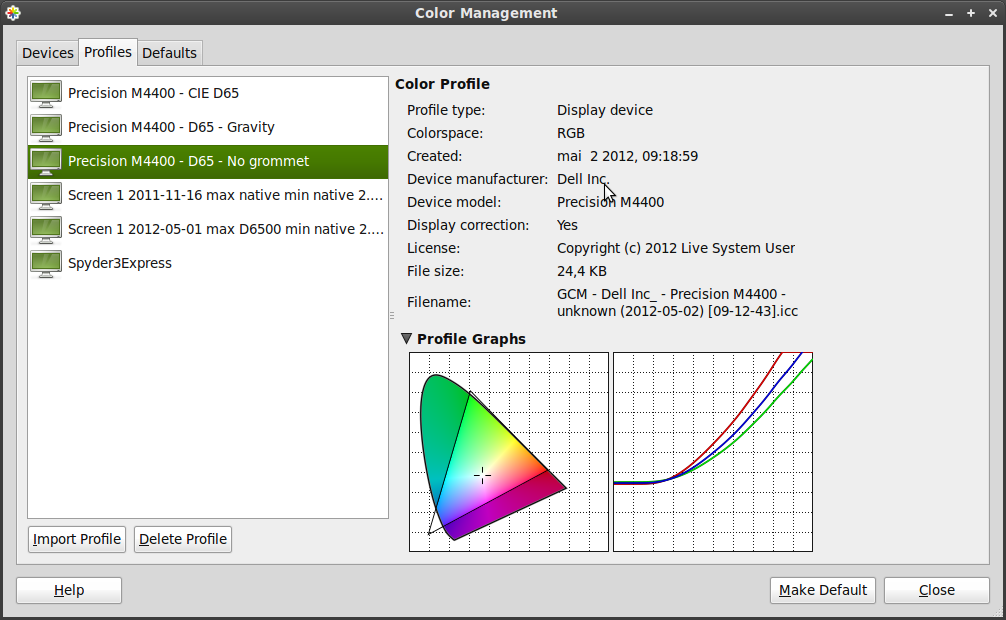
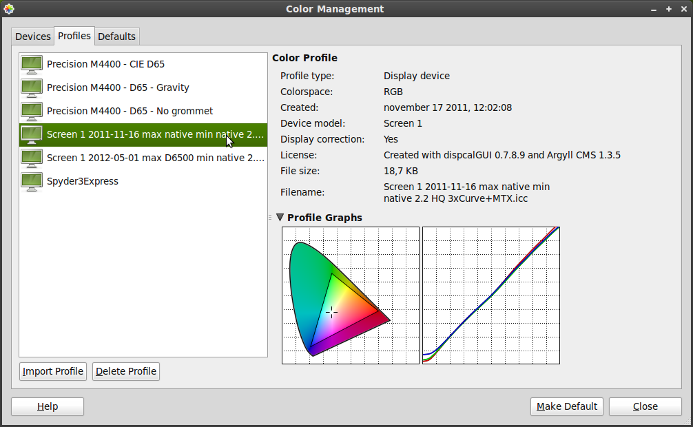
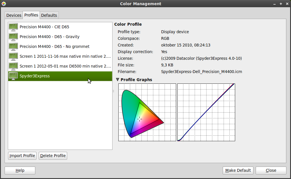
Mark Hills
> I've done my batch of experiments with the ColorHUG and Spyder3Express
> in relation to the "too red"-challenge.
>
> Here are my results. Numbering corresponds to numbered screenshots and
> icc-files in the attachments.
> Device model (cmmx) for Dell Precision 4400 used.
>
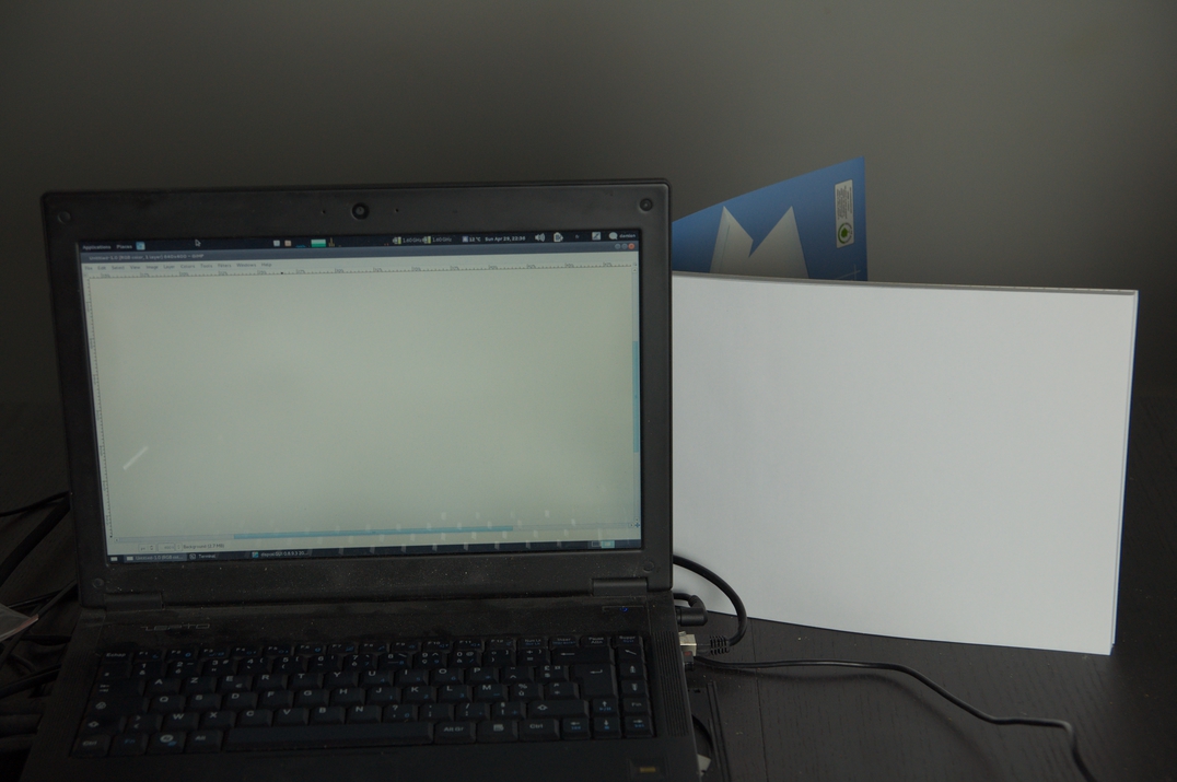
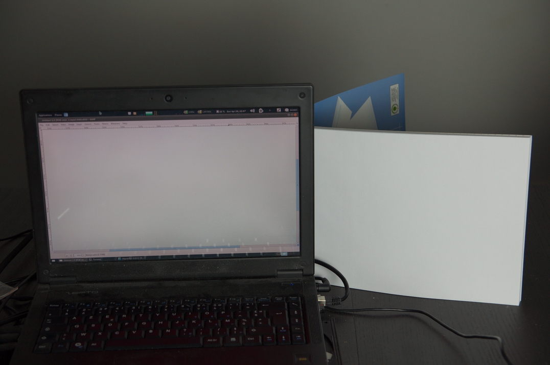
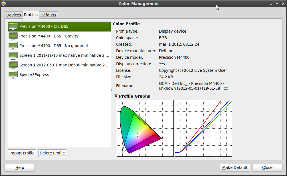
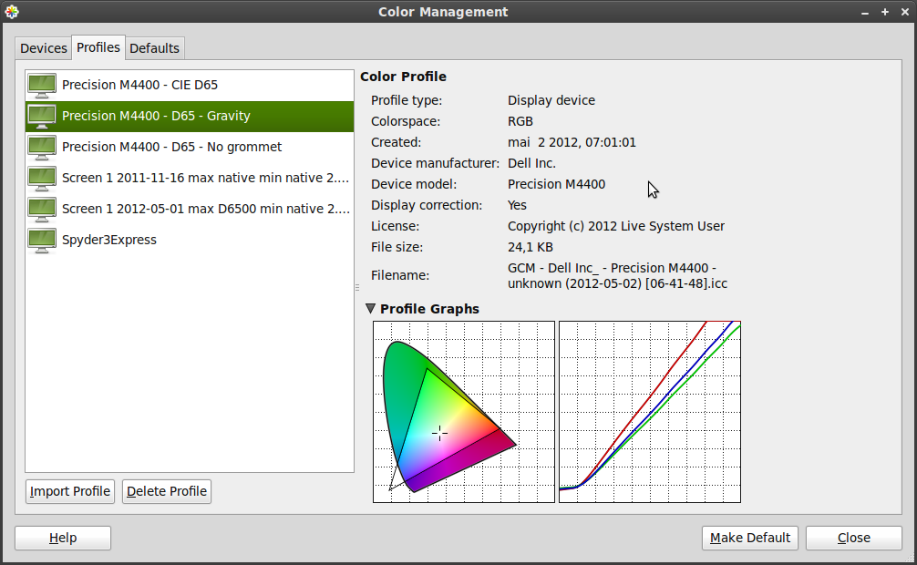
> 1. ColorHUG attached to screen with blutack. Result: too red.
> 2. ColorHUG laid down on horizontal screen and held in place by gravity.
> Result: too red but a little brighter.
> 3. ColurHug attached to screen with blutack and grommet removed to allow a
> full aperture for the CCD. Result: too red and very dark. An interesting
> side-effect is that the calibration took only 5 mins even when i selected the
> full 20 minute calibration.
>
> 4. Spyder3Express attached to screen using the normal suction cup. Calibration
> and profiling by dispcalGUI 0.7.8.9 and Argyll.
> Quite nice results.
> 5. Spyder3Express attached to screen using the normal suction cup. Calibration
> and profiling by Spyder3Express software on Windows 7.
times on the list now): your Colorhug profiles have the same problems as
mine -- at least one of the primaries clearly out of the visible spectrum.
But also green with a high Y value.
With this, and my limited knowledge, I don't see how it is plausable the
Colorhug data is representative of the display device, at all? :-(
In your case it seems you are using a Colorhug and the recommended ccmx
matrix, yet still getting very different results to the 'ground truth'.
Thanks for posting the ICC profiles, particularly the Spyder comparison.
--
Mark

Chris Lilley
JA> What's noteworthy is that when I look straight at the screen at a
JA> 90 degree angle, the profile created by ColorHUG seem less red and
JA> even the grays look almost correct. Strangely, as soon as I
JA> deviate from that angle by tilting the screen back by as little as
JA> 10 degrees, the grays instantly take on a faint salmon-red hue and
JA> the effect is also more pronounced the more I tilt the screen
JA> back. At the maximum viewing angle (~10 degrees), all whites and
JA> grays on the screen seem to be different shades of salmon-red.
This is fairly standard behaviour for a TN screen, and the reason people pay more for an IPS screen.
--
Chris Lilley Technical Director, Interaction Domain
W3C Graphics Activity Lead, Fonts Activity Lead
Co-Chair, W3C Hypertext CG
Member, CSS, WebFonts, SVG Working Groups
stens
http://blog.pcode.nl/2012/06/15/colorhug-red-shift-workaround/
Hope it helps. And big thanks to Pascal for spending time on it!!

J. Paul Bissonnette
"\" meant in a line of code. :D