Improve material designess of my Codename One App
96 views
Skip to first unread message

charlie....@gmail.com
Aug 23, 2016, 4:24:29 AM8/23/16
to CodenameOne Discussions
Hello Shai,
CP
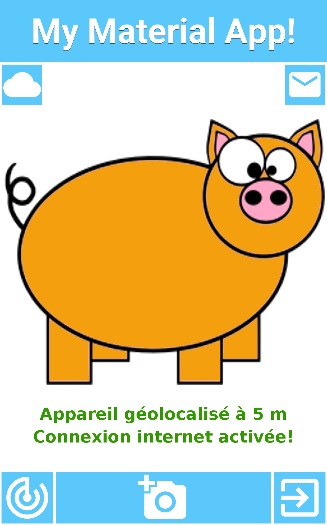
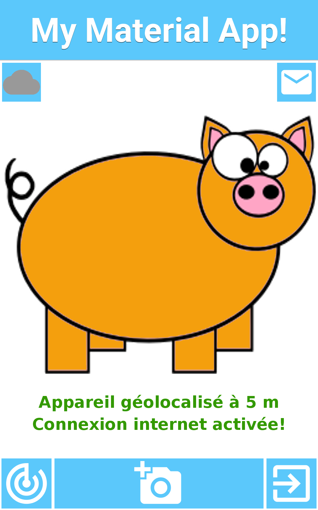
You kindly offered me to post here screenshots of my material designless app to give me advices on how to improve it. So here are 2 screenshots of the main form among which one when a button is pressed.
I'll be delighted to apply your tips and post the final (awesome) material design app on the CN1 gallery!
Thanks a lot,
Regards,
CP

Shai Almog
Aug 24, 2016, 12:17:40 AM8/24/16
to CodenameOne Discussions, charlie....@gmail.com
Hi,
it would help understanding the purpose of the application.
Change the font in the title to native:MainThin and set it's size in millimeters to create a more refined feel.
The icons don't seem like material design icons from FontImage. We have easy to use methods in toolbar such as addMaterialCommandToLeftBar/RightBar that make adding such commands into the toolbar really easy.
You can browse the icons visually here: https://design.google.com/icons/
The image in the middle of the screen sends a message of an application designed for children. A better graphic would go a long way.
charlie....@gmail.com
Aug 25, 2016, 7:16:14 AM8/25/16
to CodenameOne Discussions, charlie....@gmail.com
Hi Shai,
but I may have messed up with the style so that they don't look material anymore!
And thanks for the feedbacks. The purpose of the application is to spot dirts in the city (camera icon) which are geolocated. Then when they have been cleaned the user who spotted them receives a notification per email (email address to be set up through the letter icon which opens a new form). The user can see statistics about dirts in their vicinity (cloud icon), and can see where the dirts are around them (radar icon which opens a native map).
Regarding the material icons, I used for example :
FontImage.setMaterialIcon(takePicButton, FontImage.MATERIAL_ADD_A_PHOTO);
but I may have messed up with the style so that they don't look material anymore!
Indeed I first removed the toolbar but now I feel like it would be better to group all my secondary action buttons into a sandwich menu in this toolbar. So I will definitely use the methods you suggested. Thanks for pointing them out.
Shai Almog
Aug 26, 2016, 12:48:03 AM8/26/16
to CodenameOne Discussions, charlie....@gmail.com
Hi,
I would suggest that instead of the piglet you provide a list of the "reported" dirts.
I'm assuming you will use gamification to promote reporting so you should probably have "highest ranked" submitters in the main screen with a star ranking list and possibly a trophy.
Look at the design of travel2gether, it's in Hebrew but the gamification images are really great: https://www.codenameone.com/featured-travel2gether.html
This is important for this kind of app to increase engagement.
Reply all
Reply to author
Forward
0 new messages