Reusable Components first equinox update 2024

Jules Simplicio
Hi Firefox, here’s a first equinox update from the Reusable Components team about what we’ve been up to regarding new UI components, design tokens, and the Acorn Design System.
As a first step, we set up the build process from JSON → CSS. Learn more about this process in source docs. We're now investigating JSON → Figma variables. 👀
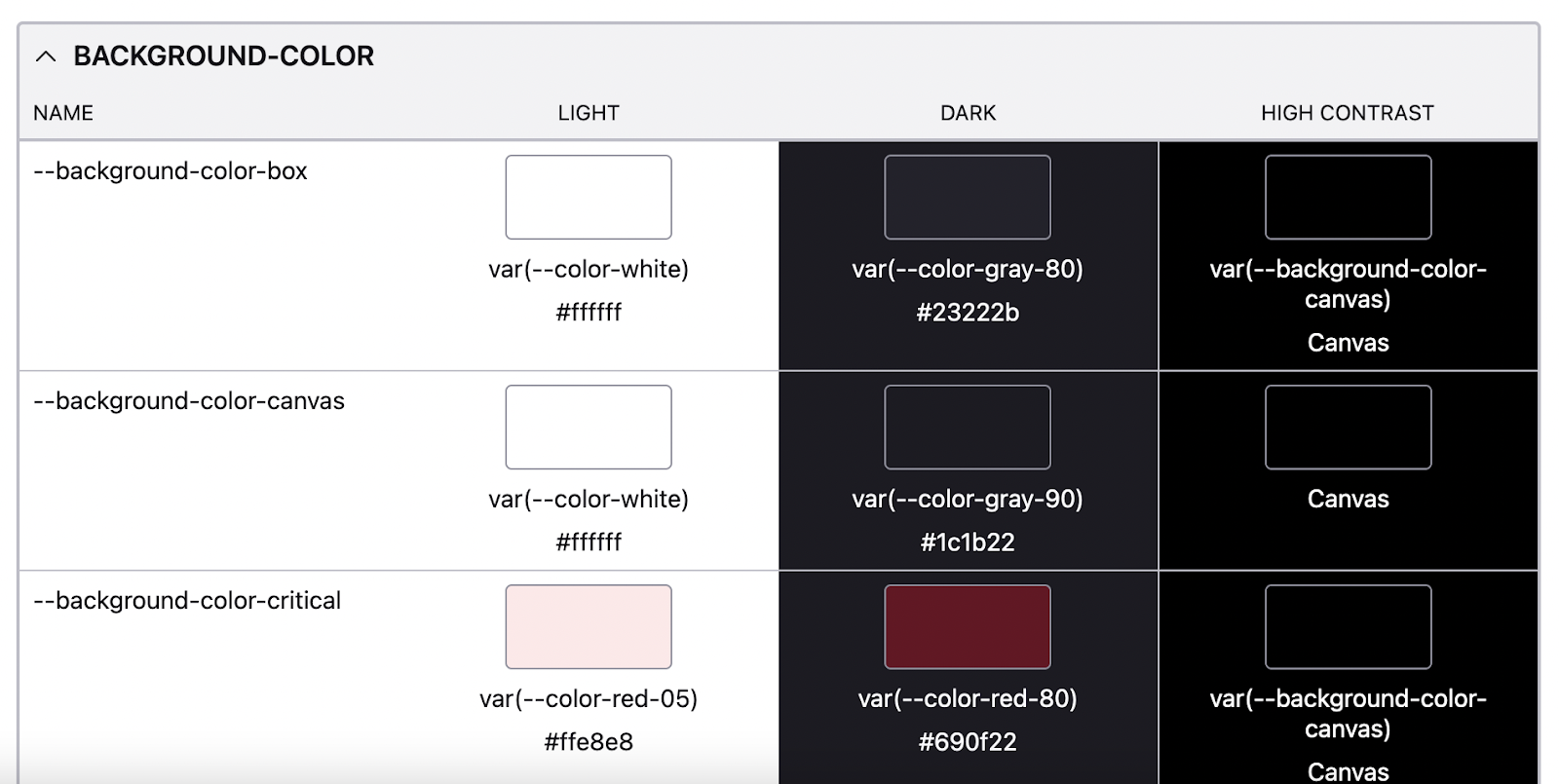
We published our design tokens guide (previously only hosted in Storybook) to Firefox Source Docs.
Fresh out the oven: Space tokens.
You can now also preview our token collection in Storybook 👀
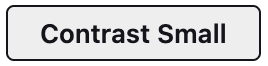
The moz-button component is now available for desktop usage. Using this component means that you can get button styles without needing to include the common.css file in your component or by using classes from the global.css styles in the browser chrome. One button that works wherever you need it!
There are multiple types of moz-button available: default, primary, destructive, icon and ghost. There are also two sizes: default and small.
This button implementation also responds politely to the macOS and Linux Increase Contrast and Windows High Contrast Mode accessibility settings.
With the moz-button changes we also now have a plethora of --button- design tokens available for use in other components that are intended to be styled similar to buttons.
Check out moz-button in Storybook!
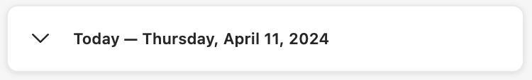
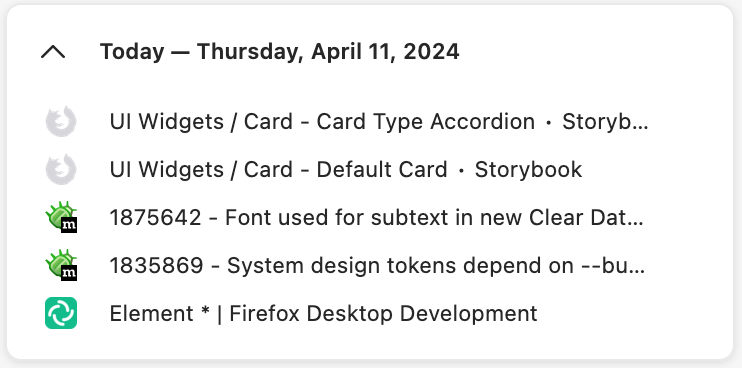
The moz-card component is available for desktop usage. This card features two variants, a plain card and an accordion (expand/collapse) card. This component handles the accessibility association between the heading and the content of the card so that you don't have to.
Check out moz-card in Storybook!
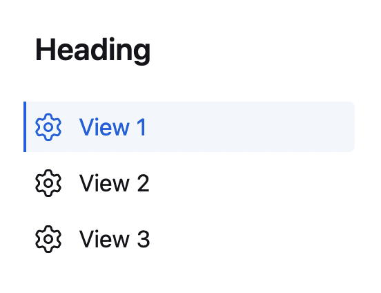
If you need a sidebar component for single page navigation between different views, then moz-page-nav may be the component for you. This component allows you to define some buttons that will navigate to different views/pages in your in-content pages (e.g, about: pages) without having to implement keyboard accessibility for this navigation. Additionally, this component handles the prefers-reduced-motion and prefers-contrast cases by adjusting the layout accordingly.
Check out moz-page-nav in Storybook!
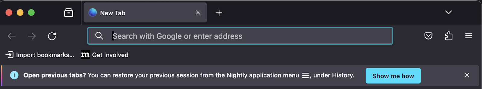
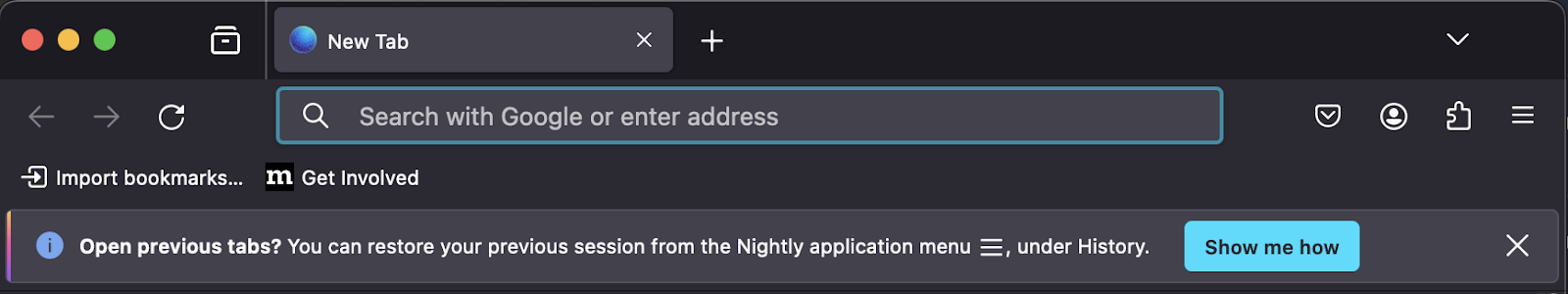
As of Bug 1845150 our infobars are using moz-message-bar under the hood. This helped resolve a number of small visual bugs and accessibility issues with the old infobar implementation, ensuring the element has sufficient contrast with the toolbar and cleaning up text centering and wrapping. It also resolved a longstanding issue where infobars were inadvertently pulling our in-content styles into the browser chrome.
Check out moz-message-bar in Storybook!
Thank you contributors ♥️
External: camilledavisdev and echrs
Mozilla staff: nordzilla, kcochrane, emilio and ayeddi!
Want to contribute to the Reusable Components effort? Please reach out to us on Slack in #firefox-reusable-components or on Matrix room #reusable-components:mozilla.org