How to show task activation in group level

杨国元
Hi HCP experts,
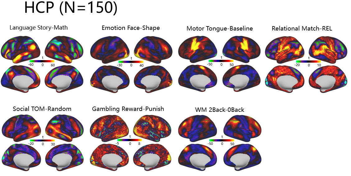
The problem of the high z-statistic values of the group analysis results of several hundred subject in HCP tfMRI has been discussed before. However, according to the statistical results across different tasks data of HCP, the threshold range of the t-value varies greatly. For example, the cortical activation of Gambling task is very low, while the t value of Language task is highly distributed throughout the cortical surface. In this case, when we have to show several tasks activation map in a paper, do we need to take the same value of t or z color bar value, such as z (-30~-2.32, 2.32~30)or using different color bar value for different tasks which shown as below. Or show the results of Cohen's d map with color bar between 0 to 1 instead of t or z maps due to we don't have a reasonable threshold value for z or t statistics. Looking forward to your reply and suggestions. Thank you very much!!
Best regrads,
Guoyuan

Glasser, Matt
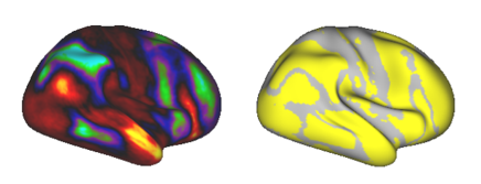
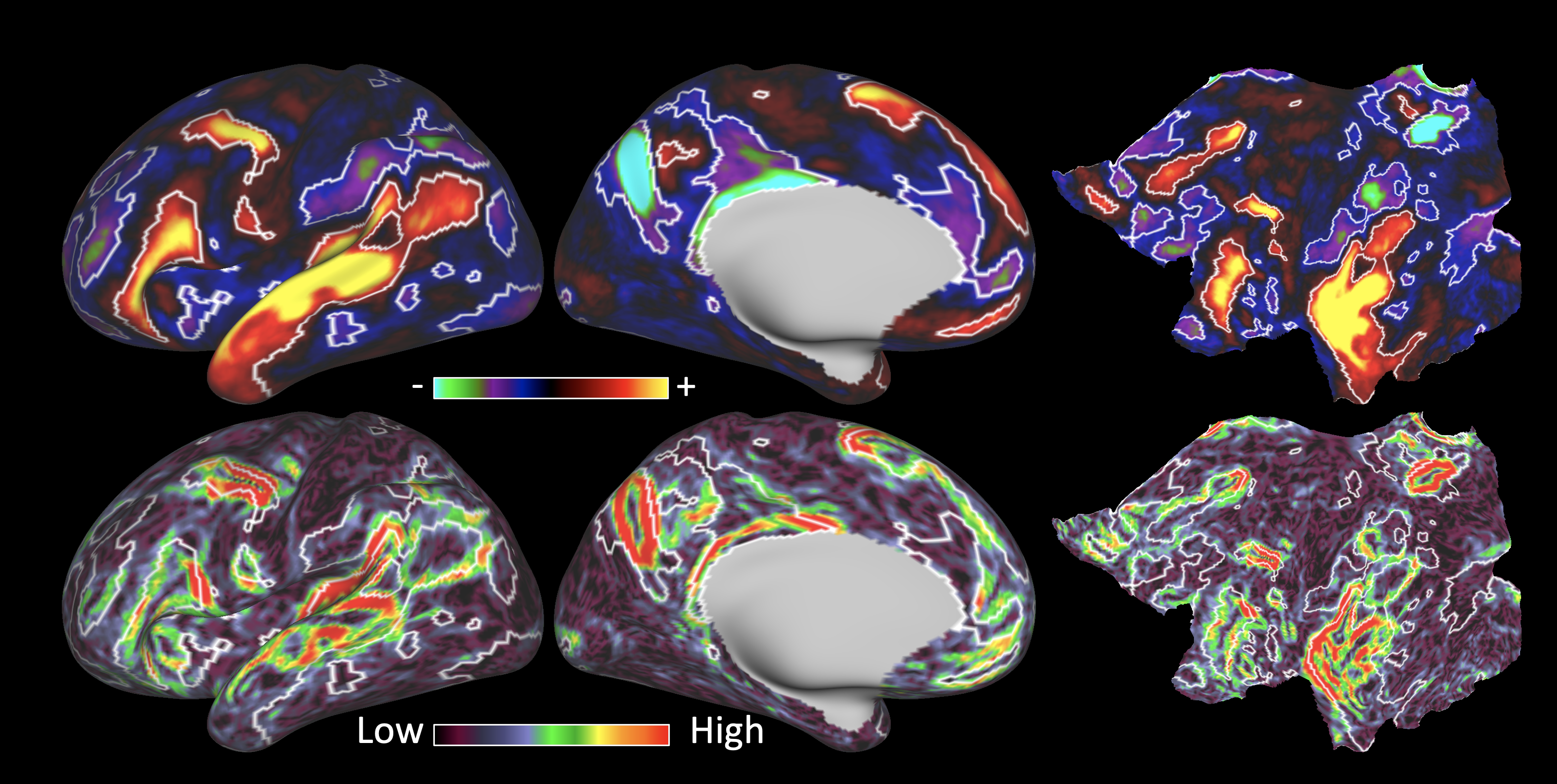
I’m not sure why the z-stats of a large group of subjects is a problem, rather it exposes the problem with the common practice in neuroimaging of showing thresholded statistical maps. The finding is because z or t stats are scaled by the number of subjects. Better to display an effect size measure such as %BOLD or Cohen’s d, which are more biologically interpretable anyway. You can then also display a threshold contour (e.g. a white or black line) to illustrate statistical significance when necessary. This is illustrated in supplementary figure 8 from Glasser et al., 2016 Nature Neuroscience. The gambling task didn’t work (at least the differential contrast didn’t work).
Matt.
--
You received this message because you are subscribed to the Google Groups "HCP-Users" group.
To unsubscribe from this group and stop receiving emails from it, send an email to
hcp-users+...@humanconnectome.org.
To view this discussion on the web visit
https://groups.google.com/a/humanconnectome.org/d/msgid/hcp-users/33df4817.23769.17c8eb85b8c.Coremail.yangguoyuan%40pku.edu.cn.
The materials in this message are private and may contain Protected Healthcare Information or other information of a sensitive nature. If you are not the intended recipient, be advised that any unauthorized use, disclosure, copying or the taking of any action in reliance on the contents of this information is strictly prohibited. If you have received this email in error, please immediately notify the sender via telephone or return mail.
杨国元
Hi Matt,
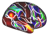
Many thanks for your prompt reply. I just checked the supplementary Figure 8, and my understanding is that the minimum z value as (5+/-) is acceptable? In addition, I’m a bit confused which shown as blow, if red and black (I added) indicate that the Z value is greater than 5 and less than -5 respectively, does the area of the blue arrow have not reached the statistically significant area (5+/-)? But the area with the blue arrow and the area with the black line are in a big gray mask, right?

Best regards,
Guoyuan
-----原始邮件-----
发件人:"Glasser, Matt" <glas...@wustl.edu>
发送时间:2021-10-17 23:16:43 (星期日)
收件人: "hcp-...@humanconnectome.org" <hcp-...@humanconnectome.org>
抄送:
主题: Re: [hcp-users] How to show task activation in group level
To view this discussion on the web visit https://groups.google.com/a/humanconnectome.org/d/msgid/hcp-users/288E8667-A7AE-47B9-B11E-AE24AEA6A79F%40wustl.edu.
Glasser, Matt
Z=+/-5 is about Bonferroni correction of the 2mm CIFTI grayordinates space (91282 grayordinates). That was illustrative for this purpose, but I am not intending to endorse a specific statistical threshold. The very dark blues/reds/blacks are not significant and everything else is (the z=+/-5 line is the white line). If you actually are interested in brain areal boundaries, gradients of effect size maps are much more reproducible than statistical threshold contours.
To view this discussion on the web visit https://groups.google.com/a/humanconnectome.org/d/msgid/hcp-users/55d6b890.232f2.17c8f04a857.Coremail.yangguoyuan%40pku.edu.cn.
杨国元
Hi Matt,
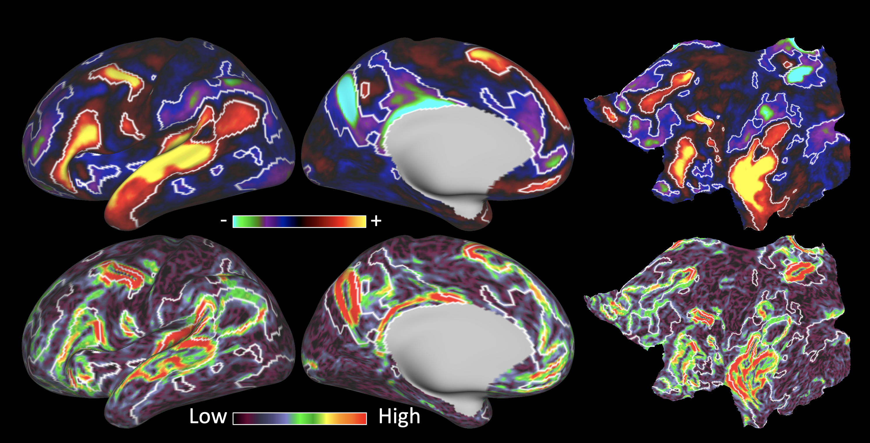
I totally agree with your suggestion, and now I am using the z value to draw white lines for z=+/-5. Regarding the method of drawing borders, I did this:
1. Use wb_command -cifti-math to binarized the z map with z value outside of +/-5.
2. Next, use wb_command -cifti-separate to convert the binaried z map (dtsereis.nii) to gifti (func.gii) format.
3. Finally, the func.gii format needs to be converted to label.gii, so that Workbech can display the boundary of binarized z map. As shown in the following example:
But I did not realize the use of wb_command to convert func.gii to label.gii. Do you have any way to achieve this step, or how does your 2018 Nature Neuroscience paper's Fig. 8 achieve it? Many thanks for your time.
Best regards,
Guoyuan
-----原始邮件-----
发件人:"Glasser, Matt" <glas...@wustl.edu>
发送时间:2021-10-18 00:17:38 (星期一)
To view this discussion on the web visit https://groups.google.com/a/humanconnectome.org/d/msgid/hcp-users/63AB3983-BD57-41A6-991B-82F07B985056%40wustl.edu.
Glasser, Matt
You can do it all in CIFTI with wb_command -cifti-label-import.
To view this discussion on the web visit https://groups.google.com/a/humanconnectome.org/d/msgid/hcp-users/5e477bd7.27fe8.17c93a24222.Coremail.yangguoyuan%40pku.edu.cn.
Coalson, Timothy Scott (S&T-Student)
Sent: Sunday, October 17, 2021 11:10 AM
To: hcp-...@humanconnectome.org <hcp-...@humanconnectome.org>
Subject: Re: Re: [hcp-users] How to show task activation in group level
Glasser, Matt
Indeed these results look a little weird because they were not denoised with sICA+FIX and temporal ICA (and there was a structured noise bias in this contrast). I have pasted below the updated results from the HCP course lecture:
210P:
210V:
We are actively working to make this denoised data available to folks.
Matt.
To view this discussion on the web visit https://groups.google.com/a/humanconnectome.org/d/msgid/hcp-users/SN6PR01MB4991C61363DF3B5AF9FF053B81BC9%40SN6PR01MB4991.prod.exchangelabs.com.