Extensions are hidden in weird menu by default now
195 views
Skip to first unread message

ErikRothoff
Sep 22, 2020, 3:27:59 PM9/22/20
to Chromium Extensions
In a recent release Chrome has started hiding browser actions in a puzzle-menu.
To have it visible the user needs to know to pin it, or know where to find it. This is really bad for multiple reasons: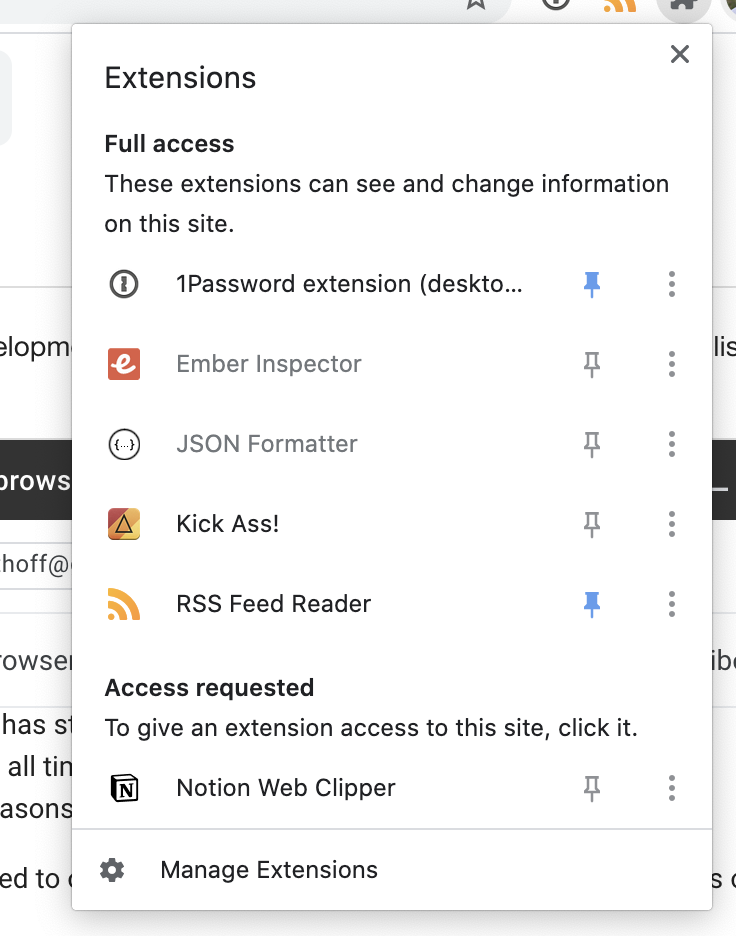
- Two clicks are required to open the popup, and the flow is pretty yanky with lots of jumping animations
- It's really hard to understand for non-tech-savvy users where it went (we get a lot of support requests about this), and how to rectify it
- The badge text is hidden by default, making it useless unless pinned
- The extension icon is not intuitive. Puzzle-piece? What does that signify?
- When opening the extension menu, it looks more informational than actionable. There is no affordance to say that "these items are actually clickable". See attached image. Also, there is a lot going on. Each line is actually 3 buttons? Activation button, pin button, and "More" button?
Did I miss an announcement about this? It's a pretty massive change, causing negative impact for our users. I realise there are tradeoffs, but there must be a better way? It's a really hostile change towards extensions since it's just sweeping them under the rug until the user forgets they have it installed.
@extension authors, what's your take on this? Did you even know about this?
@chrometeam, what's your plans to iterate and fix this?

mur...@influesolutions.com
Sep 22, 2020, 9:09:19 PM9/22/20
to Chromium Extensions, ErikRothoff
This was been discussed before, you can search this form for the messages.
Bottom line: not gonna change, not gonna improve, get used to it (yep, it's that bad)

MG
Sep 23, 2020, 4:45:10 AM9/23/20
to Chromium Extensions, mur...@influesolutions.com, ErikRothoff
Specially that it's unpinned by default and the vast majority of my users have no clue where the extension icon is.
Icon badge that shows a status update, interacting with the extension icon or opening the popup page, all of the 3 aren't used any more.
Icon badge that shows a status update, interacting with the extension icon or opening the popup page, all of the 3 aren't used any more.

Likely Logic
Sep 23, 2020, 8:07:19 AM9/23/20
to Chromium Extensions, MG, mur...@influesolutions.com, ErikRothoff
> Did I miss an announcement about this? It's a pretty massive change, causing negative impact for our users.
Yup, been talked about lots.Seein the animation like that, I feel an option to allow pinning extensions as they are installed would be good:

Charlie Sheleg
Sep 23, 2020, 10:29:49 AM9/23/20
to Chromium Extensions, ErikRothoff
You are welcome to jump on this terrific thread that illustrates how little regard Google has for their extension developers

Teddy
Sep 25, 2020, 7:45:11 AM9/25/20
to mur...@influesolutions.com, Chromium Extensions, ErikRothoff
Here's the original thread for reference:
https://groups.google.com/a/chromium.org/d/msg/chromium-extensions/rOso__zU_sM/2kUkcjFxAgAJ
--
*"This email and any files transmitted with it are confidential
and intended solely for the use of the individual or entity to whom they
are addressed. If you have received this email in error please notify the
sender immediately"*
Reply all
Reply to author
Forward
0 new messages