Mobile CLS
72 views
Skip to first unread message

TT Downloader
Jan 5, 2023, 2:34:12 AM1/5/23
to Chrome UX Report (Discussions)
Hello,
Our website url is https://ttdownloader.net. The website CLS on desktop is very good. But on mobile it's always showing need improvement. Any ideas how to fix this?
Thank you.

Barry Pollard
Jan 5, 2023, 6:21:39 AM1/5/23
to TT Downloader, Chrome UX Report (Discussions)
Below is the user flow on mobile:


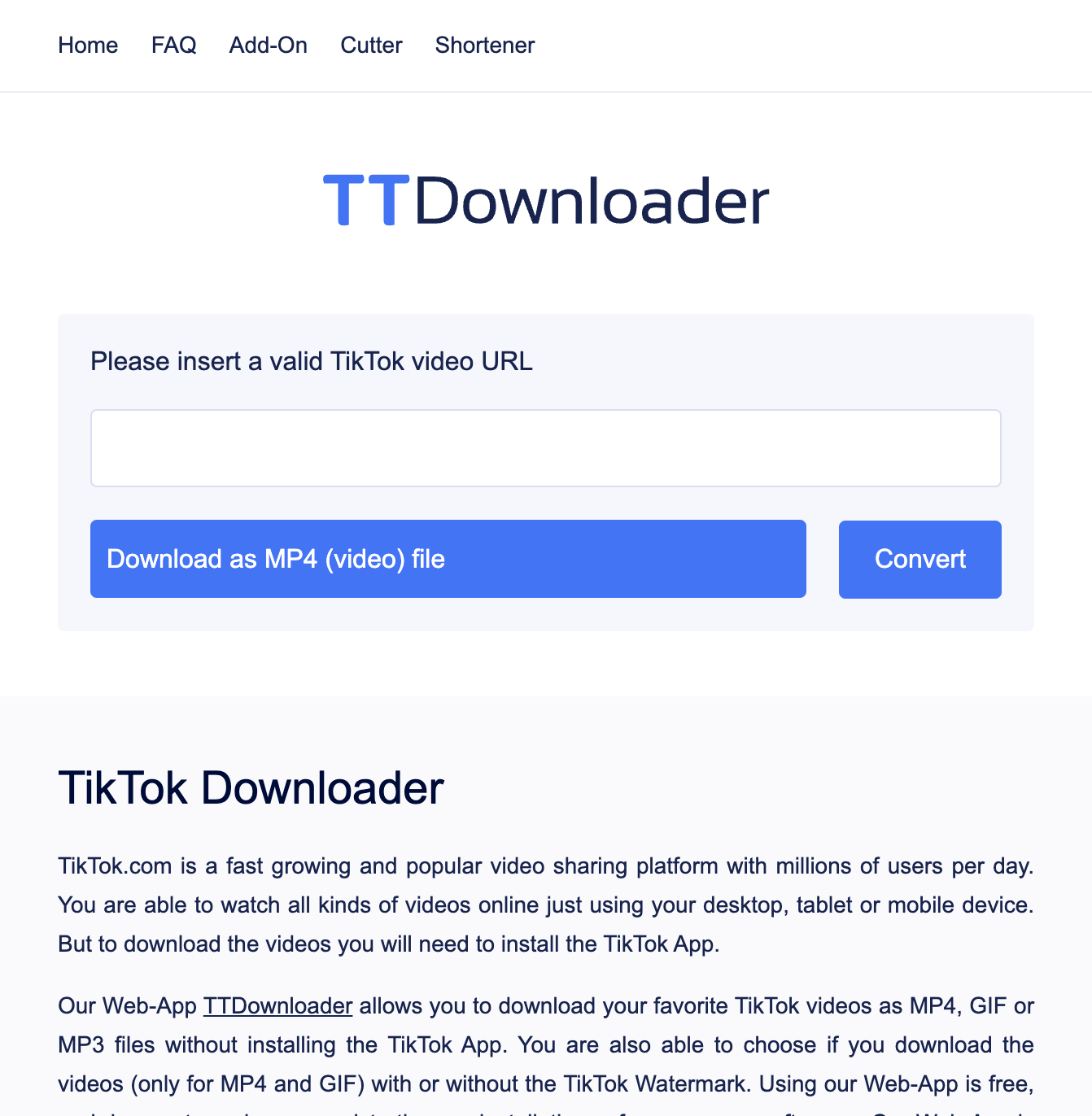


Note the movement of the "TikTok Downloader" heading and the text beneath it.
To explain these three screenshots:
- You load the page (first screenshot)
- You then enter a Tik Tok URL and click Convert and there is an immediate shift in content (second screenshot) as the text shifts UP. While not ideal, this is OK as after a user interaction, there is a 500ms grace period as it's often expected to shift content after clicking a button or doing some sort of interaction. So this shift won't be counted. So it's not that.
- However, after the conversion has been processed, it then offers four options (third screenshots) and shifts the text down again - and even further down than the initial load. As the conversion often takes more than 500ms this is seen as an unexpected shift and so DOES count towards the page's CLS score.
The reason the second shift is counted is that it could be distracting to the user. They may have started reading the text while it's converting and suddenly BAM! the text moves and the user is disorientated and has lost their place in the text.
On Desktop that second shift doesn't happen (though the first does), as the 4 options take up the exact same space as the "Initialize" loading box:
Any ideas how to fix this?
You need to do on mobile, what you do on desktop: handle all the necessary shifts within 500ms. As you can't control how long the conversion will take, and it's often likely to be longer than 500ms, you need to plan ahead of time to deal with the upcoming shifts immediately - perhaps by making the "Initialize" loading box as big as will be necessary so there is no shift. Or making the 4 options smaller so they fit on one line.
Personally, I'd also try to deal with the first shift (perhaps by keeping the original URL text box?) as the text shifting up, while not affecting your CLS score, still seems less than ideal to me (on both mobile and desktop). But the issue the metric has is with the second shift on mobile. Do remember however that the metrics are our best heuristic as to what we feel are a good measure of the user experience and that's not to say there are other improvements you can do, like here with the first shift, on top of any shifts that it highlights.
Thanks,
Barry
--
You received this message because you are subscribed to the Google Groups "Chrome UX Report (Discussions)" group.
To unsubscribe from this group and stop receiving emails from it, send an email to chrome-ux-repo...@chromium.org.
To view this discussion on the web visit https://groups.google.com/a/chromium.org/d/msgid/chrome-ux-report/e3b9ad9f-ed25-4dd6-aea2-6331f61342a6n%40chromium.org.
Reply all
Reply to author
Forward
0 new messages