Logo

79 views
Skip to first unread message

Mihai Cadariu

unread,
Oct 22, 2011, 9:45:45 PM10/22/11
to tridion-p...@googlegroups.com
Seems like I have too much free time :p So I searched some logos for 'powerools'. That about the following?

1.


2.


3.


Alvin Reyes

unread,
Oct 22, 2011, 10:56:22 PM10/22/11
to tridion-p...@googlegroups.com
I like the third one, though we probably should use it as inspiration and/or draw something ourselves.

Maybe combine #3 with a certain Tridion-ish character?
powertools_buddy.png


Not sure it'll vibe with SDL's marketing efforts, but maybe it'll work if we add some shoes so no one notices?

powertools_buddy_withshoes.png


Copyright notice: parody is typically considered fair use. Neener neener!
powertools_buddy.png
powertools_buddy_withshoes.png

Julian Wraith

unread,
Oct 23, 2011, 8:35:58 AM10/23/11
to tridion-p...@googlegroups.com, tridion-p...@googlegroups.com
Is that not something from fraggle rock?

Sent from my iPod

On 23 Oct 2011, at 04:56, Alvin Reyes <reyes....@gmail.com> wrote:

I like the third one, though we probably should use it as inspiration and/or draw something ourselves.

Maybe combine #3 with a certain Tridion-ish character?
<powertools_buddy.png>


Not sure it'll vibe with SDL's marketing efforts, but maybe it'll work if we add some shoes so no one notices?

Dominic Cronin

unread,
Oct 23, 2011, 8:54:43 AM10/23/11
to Tridion PowerTools
Can't we get a good-old-fashioned Tridion boomerang in full-on-Orange
in there somewhere?

On Oct 22, 10:56 pm, Alvin Reyes <reyes.alv...@gmail.com> wrote:
> I like the third one, though we probably should use it as inspiration and/or
> draw something ourselves.
>
> Maybe combine #3 with a certain Tridion-ish character?
> [image: powertools_buddy.png]
>
> https://picasaweb.google.com/lh/photo/x-QHG43AZ7jlnqOoVCDSo8bW7DaEKt9...
>
> Not sure it'll vibe with SDL's marketing efforts, but maybe it'll work if we
> add some shoes so no one notices?
>
> [image: powertools_buddy_withshoes.png]
>
> https://picasaweb.google.com/lh/photo/HK0hMJGgtMCnCYzKfDY7jcbW7DaEKt9...
>
> *Copyright notice: parody is typically considered fair use. Neener neener!*
>
>
>
>
>
>
>
> On Sat, Oct 22, 2011 at 6:45 PM, Mihai Cadariu <mitz...@gmail.com> wrote:
> > Seems like I have too much free time :p So I searched some logos for
> > 'powerools'. That about the following?
>
> > 1.<http://t3.gstatic.com/images?q=tbn:ANd9GcQ24zRGXBWFno2_oStJZoCCpzQudC...>
>
> > 2. <http://www.clipartpal.com/_thumbs/tool_tool_114972_tns.png>
>
> > 3.
> > <http://www.clipartpal.com/_thumbs/080/batch_01/builder_with_a_drill_t...>
>
>
>
>  powertools_buddy.png
> 31KViewDownload
>
>  powertools_buddy_withshoes.png
> 31KViewDownload

Chris Summers

unread,
Oct 23, 2011, 9:41:19 AM10/23/11
to tridion-p...@googlegroups.com

Alvin Reyes

unread,
Oct 23, 2011, 11:26:39 AM10/23/11
to tridion-p...@googlegroups.com
We'll make a comic strip or cartoon featuring the orange logo! :-)

Alvin

Kunal Shetye

unread,
Oct 24, 2011, 11:43:20 AM10/24/11
to tridion-p...@googlegroups.com
I've tried something below based on Dominic's inputs and my Photoshop skills :P

power-tools-128.png
Thanks,
Kunal Shetye.
power-tools-128.png

Kunal Shetye

unread,
Oct 25, 2011, 3:53:26 AM10/25/11
to tridion-p...@googlegroups.com
Alright!

With some new improved feedback on Skype yesterday.

Here is a revised edition of the logo :

power-tools-128-new.png
Thanks,
Kunal Shetye.
power-tools-128.png
power-tools-128-new.png

Kunal Shetye

unread,
Oct 25, 2011, 4:42:19 AM10/25/11
to tridion-p...@googlegroups.com
Another edition (with Tridion Logo) - 128x128 px:

power-tools-128--by-128.png

Thanks,
Kunal Shetye.
power-tools-128.png
power-tools-128--by-128.png
power-tools-128-new.png

Graeme Wigglesworth

unread,
Oct 25, 2011, 5:19:54 AM10/25/11
to tridion-p...@googlegroups.com
Could we not use the Tridion Logo as a head with the construction hat on it?

Graeme Wigglesworth
Independent Tridion Expert
07810 317 637
power-tools-128.png
power-tools-128--by-128.png
power-tools-128-new.png

Peter Kjaer

unread,
Oct 25, 2011, 5:53:12 AM10/25/11
to tridion-p...@googlegroups.com
While I like where you are going with this, the boomerang is only found in old Tridion logos.
So based it off the boomerang will not mean anything to 2011 users.

It would make more sense to base it off the 2011 logo, since that is the version that we are building the PowerTools for :)

john winter

unread,
Oct 25, 2011, 6:22:14 AM10/25/11
to tridion-p...@googlegroups.com
I had a few moments to fiddle about with photoshop.  maybe a little too subtle in that its hard to tell the difference with the current logo.
pt_logo_1.png

Frank van Puffelen

unread,
Oct 25, 2011, 6:26:41 AM10/25/11
to Tridion PowerTools
Well... marketing hinted that the boomerang is still somewhat present
in the new logo, by the triangular dark shadow in the left. You can
see it in John's effort below as the hard hatter's head is just inside
it. :-)

Frank van Puffelen

unread,
Oct 25, 2011, 6:28:18 AM10/25/11
to Tridion PowerTools
Nice one John. I'd go for the way most SDL WCMS logos now look: make
the hard-hatter big and put a small version of the Tridion logo in the
bottom right of it.

On Oct 25, 6:22 am, john winter <johnwin...@gmail.com> wrote:
> I had a few moments to fiddle about with photoshop.  maybe a little too
> subtle in that its hard to tell the difference with the current logo.
>
> On 25 October 2011 11:53, Peter Kjaer <pkjaer....@gmail.com> wrote:
>
>
>
>
>
>
>
> > While I like where you are going with this, the boomerang is only found in
> > old Tridion logos.
> > So based it off the boomerang will not mean anything to 2011 users.
>
> > It would make more sense to base it off the 2011 logo, since that is the
> > version that we are building the PowerTools for :)
>
>
>
>  pt_logo_1.png
> 39KViewDownload

Nuno

unread,
Oct 25, 2011, 10:02:42 AM10/25/11
to Tridion PowerTools
I think this is a really cool logo! Wonder how it would look on
smaller versions - we might have to make the hard-hatter
proportionally bigger.

On Oct 25, 6:22 am, john winter <johnwin...@gmail.com> wrote:
> I had a few moments to fiddle about with photoshop.  maybe a little too
> subtle in that its hard to tell the difference with the current logo.
>
> On 25 October 2011 11:53, Peter Kjaer <pkjaer....@gmail.com> wrote:
>
>
>
>
>
>
>
> > While I like where you are going with this, the boomerang is only found in
> > old Tridion logos.
> > So based it off the boomerang will not mean anything to 2011 users.
>
> > It would make more sense to base it off the 2011 logo, since that is the
> > version that we are building the PowerTools for :)
>
>
>
>  pt_logo_1.png
> 39KViewDownload

Alvin Reyes

unread,
Oct 25, 2011, 11:51:24 AM10/25/11
to tridion-p...@googlegroups.com
Nice contributions all. I like the current logo idea with hard hat inside--maybe that white swoosh could be changed to a screw driver and/or hammer to make it clear it's not a regular logo when smaller.

Maybe Dominic and old schoolers can get the orange boomerang in a "ClassicPowertool" that either reverts the CME to a pre 5.3 look or converts all modular templates to VBscript equivalents. :-)

I think there may be room for Kunal's old school tribute as an easter egg. :-)

I'll at least collect the ideas in a blog post to show how much fun we're having.

Alvin

Alvin Reyes

unread,
Oct 25, 2011, 1:46:37 PM10/25/11
to Tridion PowerTools
Proof that we're "working" hard:
http://www.createandbreak.net/2011/10/logo-fun-with-tridion-powertools.html

On Oct 25, 8:51 am, Alvin Reyes <reyes.alv...@gmail.com> wrote:
> Nice contributions all. I like the current logo idea with hard hat inside--maybe that white swoosh could be changed to a screw driver and/or hammer to make it clear it's not a regular logo when smaller.
>
> Maybe Dominic and old schoolers can get the orange boomerang in a "ClassicPowertool" that either reverts the CME to a pre 5.3 look or converts all modular templates to VBscript equivalents. :-)
>
> I think there may be room for Kunal's old school tribute as an easter egg. :-)
>
> I'll at least collect the ideas in a blog post to show how much fun we're having.
>
> Alvin
>

Julian Wraith

unread,
Oct 25, 2011, 4:24:27 PM10/25/11
to tridion-p...@googlegroups.com, Tridion PowerTools
:D

Sent from my iPod

john winter

unread,
Oct 25, 2011, 5:52:20 PM10/25/11
to tridion-p...@googlegroups.com
we're hardly working :)

I've attached the psd of the logo file I was working on if anyone wants to have a play with it.
Tridion_StartScreen_logo.psd

Frank van Puffelen

unread,
Oct 25, 2011, 6:09:57 PM10/25/11
to tridion-p...@googlegroups.com

unsubscribe


http://www.sdl.com/images/SDL_Innovate2012_emailsignature_sm.jpg

Santa Clara | March 5-6 www.sdl.com/innovate


SDL PLC confidential, all rights reserved. If you are not the intended recipient of this mail SDL requests and requires that you delete it without acting upon or copying any of its contents, and we further request that you advise us.
SDL PLC is a public limited company registered in England and Wales. Registered number: 02675207.
Registered address: Globe House, Clivemont Road, Maidenhead, Berkshire SL6 7DY, UK.

Frank van Puffelen

unread,
Oct 25, 2011, 6:24:30 PM10/25/11
to Tridion PowerTools
Sorry guys, I was trying to cancel my email subscription to the group
after I discovered the RSS feeds.
I learned the hard way that replying to those email notifications is
actually the quickest way to join the conversation. :-)

Is there any way to delete my previous response?

On Oct 25, 6:09 pm, "Frank van Puffelen" <fvanpuffe...@sdl.com> wrote:
> unsubscribe
>
> From: tridion-p...@googlegroups.com
> [mailto:tridion-p...@googlegroups.com] On Behalf Of john winter
> Sent: Tuesday, October 25, 2011 5:52 PM
> To: tridion-p...@googlegroups.com
> Subject: Re: Logo
>
> we're hardly working :)
>
> I've attached the psd of the logo file I was working on if anyone wants to
> have a play with it.
>
> On 25 October 2011 19:46, Alvin Reyes <reyes.alv...@gmail.com> wrote:
>
> Proof that we're "working" hard:http://www.createandbreak.net/2011/10/logo-fun-with-tridion-powertool...
> </pre>
> <p class=MsoNormal style='mso-margin-top-alt:auto;mso-margin-bottom-alt:auto;
> line-height:normal'><a href="http://www.sdl.com/innovate"><span style='font-size:12.0pt;font-family:"Arial","sans-serif";
> mso-fareast-font-family:"Arial","sans-serif";mso-fareast-language:EN-GB;
> mso-no-proof:yes'><img width=215 height=81 id="_x0000_i1025"
> src="http://www.sdl.com/images/SDL_Innovate2012_emailsignature_sm.jpg"
> alt="http://www.sdl.com/images/SDL_Innovate2012_emailsignature_sm.jpg" border=0></span><span
> style='font-size:12.0pt;font-family:"Arial","sans-serif";mso-fareast-font-f amily:
> "Arial","sans-serif";mso-fareast-language:EN-GB'><o:p></o:p></span></a></p>
>
> <p class=MsoNormal style='mso-margin-top-alt:auto;mso-margin-bottom-alt:auto;
> line-height:normal'><b><span style='font-size:9.0pt;font-family:"Arial","sans-serif";
> mso-fareast-font-family:"Arial","sans-serif";color:#005841;mso-fareast-lang uage:
> EN-GB'>Santa Clara | March 5-6 </span></b><span style='font-size:12.0pt;
> font-family:"Arial","sans-serif";mso-fareast-font-family:"Arial","sans-seri f";
> mso-fareast-language:EN-GB'><a href="http://www.sdl.com/innovate" style="color:#005841"><b><span
> style='font-size:9.0pt;font-family:"Arial","sans-serif"'>www.sdl.com/innovate</span></b></a>
> <o:p></o:p></span></p><br>
>
> <font face="arial"  size="1" color="#736F6E">
> <b>SDL PLC confidential, all rights reserved.</b>
> If you are not the intended recipient of this mail SDL requests and
>
> requires that you delete it without acting upon or copying any of its contents, and we further request that you advise us.<BR>
> SDL PLC is a public limited company
>
> registered in England and Wales.  Registered number: 02675207.<BR>
> Registered address: Globe House, Clivemont Road, Maidenhead, Berkshire SL6 7DY, UK.
> </font>

Raul Escudero

unread,
Oct 26, 2011, 10:01:38 AM10/26/11
to Tridion PowerTools
Hi all,
Don't know how to insert my image,
I think this link is enough, and hope you liked it.

https://picasaweb.google.com/115442088754829150320/ScrapbookPhotos?authuser=0&feat=directlink

Raúl.

On 25 oct, 17:51, Alvin Reyes <reyes.alv...@gmail.com> wrote:
> Nice contributions all. I like the current logo idea with hard hat inside--maybe that white swoosh could be changed to a screw driver and/or hammer to make it clear it's not a regular logo when smaller.
>
> Maybe Dominic and old schoolers can get the orange boomerang in a "ClassicPowertool" that either reverts the CME to a pre 5.3 look or converts all modular templates to VBscript equivalents. :-)
>
> I think there may be room for Kunal's old school tribute as an easter egg. :-)
>
> I'll at least collect the ideas in a blog post to show how much fun we're having.
>
> Alvin
>

john winter

unread,
Oct 26, 2011, 10:03:50 AM10/26/11
to tridion-p...@googlegroups.com
Hi Raul,

It's perfect !

Kunal Shetye

unread,
Oct 26, 2011, 10:18:09 AM10/26/11
to tridion-p...@googlegroups.com
+1

Thanks,
Kunal Shetye.

Dominic Cronin

unread,
Oct 26, 2011, 12:40:39 PM10/26/11
to tridion-p...@googlegroups.com
Great! ....but just to be picky... shouldn't those be power tools rather
than hand tools? :-)

<runs ducking for cover>

D

On 26-10-2011 16:01, Raul Escudero wrote:
> Hi all,
> Don't know how to insert my image,
> I think this link is enough, and hope you liked it.
>
> https://picasaweb.google.com/115442088754829150320/ScrapbookPhotos?authuser=0&feat=directlink
>

> Ra�l.

Julian Wraith

unread,
Oct 26, 2011, 1:59:22 PM10/26/11
to tridion-p...@googlegroups.com, tridion-p...@googlegroups.com
Love it :)

Sent from my iPod

On 26 Oct 2011, at 18:40, Dominic Cronin <dominic...@gmail.com> wrote:

> Great! ....but just to be picky... shouldn't those be power tools rather than hand tools? :-)
>
> <runs ducking for cover>
>
> D
>
> On 26-10-2011 16:01, Raul Escudero wrote:
>> Hi all,
>> Don't know how to insert my image,
>> I think this link is enough, and hope you liked it.
>>
>> https://picasaweb.google.com/115442088754829150320/ScrapbookPhotos?authuser=0&feat=directlink
>>

>> Raúl.

Alvin Reyes

unread,
Oct 26, 2011, 2:23:40 PM10/26/11
to tridion-p...@googlegroups.com
So would that be things like an electric screw driver, jack hammer, and duct tape?

Angel Puntero

unread,
Oct 26, 2011, 2:30:35 PM10/26/11
to tridion-p...@googlegroups.com
i definitely vote for the duct tape!

Nuno Linhares

unread,
Oct 26, 2011, 3:14:50 PM10/26/11
to tridion-p...@googlegroups.com
I would hold on putting actual Power Tools until it does something POWERful...

Since all it does so far is counting items, I'd maybe add a measure tape: http://www.globalindustrial.com/p/tools/test-measurement/Measuring-Tapes/stanley-max-1-1-8-x-25-tape-english

Chris Summers

unread,
Oct 26, 2011, 3:33:11 PM10/26/11
to Tridion PowerTools
Perhaps we should call them Community tools instead of Powertools
then...

Who wants to change all the project folders and namespaces :D

Mihai Cadariu

unread,
Oct 26, 2011, 4:36:31 PM10/26/11
to tridion-p...@googlegroups.com
Lots of ducktape :)


Cheers,
Mihai

Sent from my iPhone

Nuno

unread,
Nov 1, 2011, 4:52:52 PM11/1/11
to tridion-p...@googlegroups.com
So far the one I like the most is John's proposal, but the "head in the boomerang" is perhaps too subtle.

John: can we try making this bigger somehow?

And underneath we can try writing Power Tools where "Power" uses the SDL "gold" and Tools the Tridion green-ish?

I am a total disaster where it comes to graphics, but if you send me your original file I'll try to mock something up.

N

Alvin Reyes

unread,
Nov 1, 2011, 6:52:40 PM11/1/11
to tridion-p...@googlegroups.com
Great job to everyone who submitted graphics and ideas!

I think we can combine a few of the submitted ideas with Nuno's preferences for colors to get the shiny 2011 logo as seen in John's, but with Raul's text, and a more prominent hat (maybe Kunal's?). We'll need to see if we need a different thumbnail view as well. Even if we can't combine all the ideas, I did want to immortalize you online at: http://www.createandbreak.net/2011/10/logo-fun-with-tridion-powertools.html as an appreciation for the input (to be transparent there's a win-win from that extra $0.01 from Google ads for the increased traffic).

Final thoughts, suggestions, or mockups?

Let me know if we should make it a vote and where we should do that (+1 on wiki pages, twitter, comments on http://www.createandbreak.net/2011/10/logo-fun-with-tridion-powertools.html#comments, here?). I'd like to coincide this with the anticipated 1.0 release of the entire tool set. We'll close issue 1 for the logo in the next week if not sooner.

Alvin Reyes

unread,
Nov 3, 2011, 4:58:40 AM11/3/11
to tridion-p...@googlegroups.com
See some semi-final thoughts and suggestions at http://www.createandbreak.net/2011/10/logo-fun-with-tridion-powertools.html.


Getting the sheen to overlap the inside graphics was "fun."

Next steps:
1) please send in additional feedback on these in this forum; feel free to suggest color changes, replacement graphics, or resizing and which version you prefer (1 to 3 from left-to-right)
2) if there's a strong consensus we'll go with a winner and cleanup/touch-up a final version
3) if this post goes quiet, no worries, the project leads will work it out and we'll post a new logo on the PowerTools site and then start using it with/related to the project

Going forward we can revisit the logo at major milestones or parliamentary style -- one suggests, another seconds, and the rest votes. Or was that everyone yells at each other?

FYI: I'd like to intentionally include a saw or electric drill to convey the potential of hurting yourself if you don't know what you're doing. Maybe even make some of the text uneven or seem to bump or break other parts of the graphic. Collectively I believe we're excited to release the project to the community but we also have legitimate concerns on how Tridion customers could run into issues with the tools especially if they have the wrong expectations ("they're perfectly safe!").

RL power tools have simple and clear graphics that you'll laser out your eye, burn your arm, or die. I'm thinking the next set of graphics could mimic the same idea but with components and databases instead of body parts. :-)
PT_logo_drafts_v1.png

Graeme Wigglesworth

unread,
Nov 3, 2011, 5:01:23 AM11/3/11
to tridion-p...@googlegroups.com
For me I would say the middle one....

Graeme Wigglesworth
Independent Tridion Expert
07810 317 637


Jeremy Grand-Scrutton

unread,
Nov 3, 2011, 5:13:06 AM11/3/11
to tridion-p...@googlegroups.com
#1 for me.

Kunal Shetye

unread,
Nov 3, 2011, 5:15:37 AM11/3/11
to tridion-p...@googlegroups.com
#1 for me as well.

Thanks,
Kunal Shetye.

Binary Basher

unread,
Nov 3, 2011, 5:36:05 AM11/3/11
to tridion-p...@googlegroups.com

For me it's the 3rd logo, a little dripping of red binary 0/1's would be good :-)

Just a thought but could we mention community or OS?

Dylan

unread,
Nov 3, 2011, 5:38:35 AM11/3/11
to tridion-p...@googlegroups.com
#1 - think the contrasting colour makes it stand out more :)

Peter Kjaer

unread,
Nov 3, 2011, 6:08:24 AM11/3/11
to Tridion PowerTools
I like them all, but I think #2 is probably best.

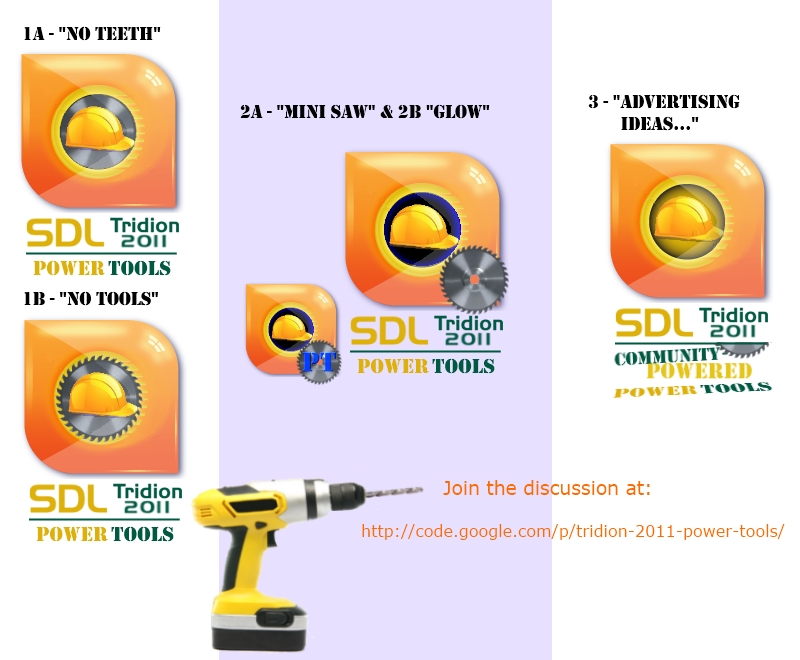
The third one is not clear enough when the image is small (which it
will be most of the time).
The first one is great too, but the offset saw on #2 makes it more
distinct when compared to the Tridion logo.

Keep in mind that we will probably need a version without the text
underneath it, so the clearer the logo part is the better.

Chris Summers

unread,
Nov 3, 2011, 6:28:36 AM11/3/11
to tridion-p...@googlegroups.com
I like #1, but I don't think it needs the wrench and screwdriver. The "tools" part is referenced by the saw blade.

Angel Puntero

unread,
Nov 3, 2011, 8:14:56 AM11/3/11
to Tridion PowerTools
My favourite is the #1, but it sounds good to remove the wrench and
screwdriver. Anyways when the image is small, they wont be too visible

Mihai Cadariu

unread,
Nov 3, 2011, 10:49:29 AM11/3/11
to tridion-p...@googlegroups.com, Tridion PowerTools
I like #1 as well. A bit of concern about the wrench and saw disk - will it be identifiable on small logo?


Cheers,
Mihai

Sent from my iPhone

Dominic Cronin

unread,
Nov 3, 2011, 3:05:21 PM11/3/11
to tridion-p...@googlegroups.com
Love the way this is turning out. Great stuff.

Alvin Reyes

unread,
Nov 3, 2011, 3:45:21 PM11/3/11
to tridion-p...@googlegroups.com
Thanks for the great feedback and perceptive points. We have a popular winner!

#1 got the most votes with a request to remove the tools. See #1B, specifically for the leading logo.

I also wanted to see if it was the saw or the contrast that made #1 popular. We can start using #1B, but see some variations in case anything appeals to you between options 1 and 2 (glowing background, shiny background, no saw, larger bottom-saw icon, etc).

I liked Ryan's point on emphasizing the community and open source aspects. It might not fit in a logo per se, but I imagine some kind of quasi-marketing "campaign" with an animation, banners, etc highlighting these points--see some starting ideas in 3. I'd love help with this, let me know or feel free to start. ;-)

Oh, and funny how the orange logo looks like a tape measure. :-)


finals_2.png

Mihai Cadariu

unread,
Nov 3, 2011, 6:44:09 PM11/3/11
to tridion-p...@googlegroups.com
Definitely #1B for me. I like the rough look with those teeth ;)

Kunal Shetye

unread,
Nov 3, 2011, 11:14:21 PM11/3/11
to tridion-p...@googlegroups.com
#1B for me too!

But would the "teeth" be visible when we shrink the logo? :(

Thanks,
Kunal Shetye.

Peter Kjaer

unread,
Nov 4, 2011, 4:47:35 AM11/4/11
to tridion-p...@googlegroups.com
1B is definitely the best of finals_2. 
I still worry that it's too similar to the Tridion logo, especially when small. 
But I'm not sure if we will really need a small version; I guess that would mostly be the case for the individual tools (toolbar, context menu).

Angel Puntero

unread,
Nov 4, 2011, 6:14:20 AM11/4/11
to Tridion PowerTools
+1 to #1B

Looks great to me

On 3 nov, 20:45, Alvin Reyes <reyes.alv...@gmail.com> wrote:
> Thanks for the great feedback and perceptive points. We have a popular
> winner!
>
> *#1 got the most votes with a request to remove the tools.* See #*1B*,
> specifically for the leading logo.
>
> I also wanted to see if it was the saw or the contrast that made #1
> popular. We can start using #1B, but see some variations in case anything
> appeals to you between options 1 and 2 (glowing background, shiny
> background, no saw, larger bottom-saw icon, etc).
>
> I liked Ryan's point on emphasizing the community and open source aspects.
> It might not fit in a logo per se, but I imagine some kind of
> quasi-marketing "campaign" with an animation, banners, etc highlighting
> these points--see some starting ideas in 3. I'd love help with this, let me
> know or feel free to start. ;-)
>
> <https://lh6.googleusercontent.com/-jmStkQUjIcU/TrLrVY5GaxI/AAAAAAAAIG...>
> Oh, and funny how the orange logo looks like a tape measure. :-)
>
> <https://lh3.googleusercontent.com/-eLKW6rWEwag/TrLuYhUqmeI/AAAAAAAAIG...>
>
>  finals_2.png
> 314 KVerDescargar

Alvin Reyes

unread,
Nov 4, 2011, 9:12:44 AM11/4/11
to tridion-p...@googlegroups.com
It's rather small on the Google Code project to see the effect. :-)

I was thinking bolts in the corners or bigger teeth might help (half joking).

But good point on how often we need a small version. I'll get everyone the core graphic images to re-use and play with in your icons.

Thanks!

Alvin

Alvin Reyes

unread,
Nov 4, 2011, 8:38:00 PM11/4/11
to tridion-p...@googlegroups.com
What if we added something to the small version to make it distinct? hehe

Have a great weekend and thanks!


1b_with_handle_no_text.png

Dylan

unread,
Nov 4, 2011, 10:31:18 PM11/4/11
to tridion-p...@googlegroups.com
Come on Alvin - that looks like it's something being forced in rather than a tool - in fact, it looks quite scary (that could be the wine?!)

Dylan

unread,
Nov 4, 2011, 10:32:53 PM11/4/11
to tridion-p...@googlegroups.com

Alvin Reyes

unread,
Nov 5, 2011, 1:09:21 PM11/5/11
to tridion-p...@googlegroups.com, tridion-p...@googlegroups.com
Ha! I mean ah!

There are some ideas there for the scarier tools like component synchronizer.

How about a Pac Man animation during the sync but with a little chainsaw wielding character cutting through a series of components?

Alvin

Dominic Cronin

unread,
Nov 5, 2011, 1:18:33 PM11/5/11
to tridion-p...@googlegroups.com
A sequence of increasingly scary images on each of the "Are you really sure?", "Are you really, really sure?", "Are you really, really, really sure?" dialogs?

D

Alvin Reyes

unread,
Nov 5, 2011, 6:18:27 PM11/5/11
to tridion-p...@googlegroups.com
Lol--We'll need to add a DialogueClicker tool!

Alvin
Reply all
Reply to author
Forward
0 new messages