Vertex colors

Robert Miller
pointed out( http://trac.sagemath.org/sage_trac/ticket/2684 ), red is
not an ideal color for vertices, since it is too dark. I propose we
change them to white.
Thoughts?

William Stein
Post some screen shots. Press shift-applekey-4 and select a region.
Wouldn't white be invisible since the background is white?
William
Robert Miller
http://sage.math.washington.edu/home/rlmill/vert_white.png
On Mar 28, 6:36 pm, "William Stein" <wst...@gmail.com> wrote:
>
> > I thought it appropriate to put this one to vote. As someone has
Robert Miller

Jason Grout
> Also try:
>
> http://sage.math.washington.edu/home/rlmill/vert_ff9999.png
>
> http://sage.math.washington.edu/home/rlmill/vert_ffff99.png
I like the yellow the best. Also, I've forwarded these to the student
who brought up the issue in the first place and will report back with
their answer.
Thanks,
Jason

Robert Bradshaw
I like the yellow best too, we could even do a deeper yellow and it
would still be easy to read. I really don't like the white.
- Robert
Robert Miller
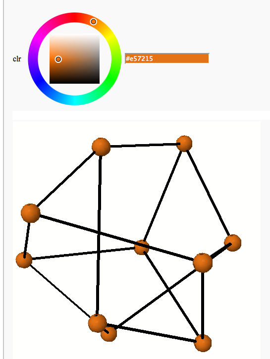
Jason Grout
For anyone who wants to join in on the fun, here is a short @interact
for picking the color of the vertices:
g=graphs.PetersenGraph()
@interact
def color_vertices(clr=Color('yellow')):
g.show(vertex_colors={clr.html_color(): g.vertices()})
Thanks,
Jason
Jason Grout
I'm pretty sure William meant to post something similar to the following:
g=graphs.PetersenGraph()
@interact
def color_vertices(clr=Color('yellow')):
g.show3d(vertex_colors={clr.rgb(): g.vertices()})
Jason
Jason Grout
And this looks even better:
g=graphs.PetersenGraph()
@interact
def color_vertices(clr=Color('yellow')):
g.show3d(vertex_colors={clr.rgb(): g.vertices()},aspect_ratio=[1,1,1])
(that last show3d line should be one line)
Note that aspect_ratio argument. I've made a trac ticket addressing the
issue: http://trac.sagemath.org/sage_trac/ticket/2724
Jason
Robert Bradshaw
Interact sure is fun :).
Anyway, my vote is for solid yellow #ffff00. Colorful but readable.
With the white the nodes were harder to pick out from the edges. I
have to admint I like the red for the 3d visually better, but it's
just not as readable in 2d.
- Robert

gerhard
(including considerations such as color blindness).
See:
http://www.personal.psu.edu/cab38/ColorBrewer/ColorBrewer_intro.html
-gerhard

Justin C. Walker
On Mar 29, 2008, at 12:33 , Jason Grout wrote:
[snip]
> And this looks even better:
>
> g=graphs.PetersenGraph()
> @interact
> def color_vertices(clr=Color('yellow')):
> g.show3d(vertex_colors={clr.rgb():
> g.vertices()},aspect_ratio=[1,1,1])
>
> (that last show3d line should be one line)
>
> Note that aspect_ratio argument. I've made a trac ticket addressing
> the
> issue: http://trac.sagemath.org/sage_trac/ticket/2724
Indeed it does. I noticed this in my system log while fiddling with
this interact:
Mar 29 12:43:49 zippo [0x0-0x1b01b].com.apple.Safari[255]:
sphere_157390 created; number of isosurfaces = 1
Mar 29 12:43:49 zippo [0x0-0x1b01b].com.apple.Safari[255]: isosurface
sphere_562380 center {-0.95996656291 -0.726509326833 -5.58443688277}
sphere 0.415563117234;
This comes from Jmol, and I get a bunch of these plopped into the
system log each time I click. There's this as well:
Mar 29 13:10:18 zippo [0x0-0x1b01b].com.apple.Safari[255]: Init Jmol
Mar 29 13:10:18 zippo [0x0-0x1b01b].com.apple.Safari[255]:
language=en_US
Mar 29 13:10:18 zippo [0x0-0x1b01b].com.apple.Safari[255]: Jmol applet
jmolApplet35[9156846702098846]
Mar 29 13:10:18 zippo [0x0-0x1b01b].com.apple.Safari[255]:
AppletRegistry.checkIn(jmolApplet35[9156846702098846])
Mar 29 13:10:18 zippo [0x0-0x1b01b].com.apple.Safari[255]: (C) 2007
Jmol Development
Is there a way to calm Jmol down, or is this "normal"?
Justin
--
Justin C. Walker, Curmudgeon at Large
Institute for the Absorption of Federal Funds
-----------
My wife 'n kids 'n dogs are gone,
I can't get Jesus on the phone,
But Ol' Milwaukee's Best is my best friend.
-----------
Jason Grout
I sent:
Which of the following four images do you like the best for readability?
Or do you have a different default color for vertices that you would
prefer?
http://sage.math.washington.edu/home/rlmill/vert_ff9999.png
http://sage.math.washington.edu/home/rlmill/vert_ffff99.png
http://sage.math.washington.edu/home/rlmill/vert_white.png
The student responded thusly:
I looked at them and like the yellow the best, but think anyone like myself
would be fine with any of the three (though the last is a little dull
:)). I
can say that a little color is helpful because it helps to distinguish the
inside of the circle (vertex) from the outside. This might sounds
strange but
the world close up looks very different.
Thanks for looking into this more
Thanks, Jason

kcrisman
screens and projection, and here is what she said, if it helps make a
decision.
- kcrisman
++++++++++++++++++++++++
I like the light pink the best. The red is a little dark and makes it
hard to read the black lettering inside. The yellow makes the
vertices disappear so I can't see them at all. The light green is
also very difficult for me to read, though if I concentrate hard
enough it works. I also like the light blue color, though I think it
would be nice if it was a little bit less bright, maybe a slightly
more muted blue tone. The white works though it makes finding the
vertices slightly more difficult since they don't just jump out by
being a different color.