Installer 002

Khaled Abou Alfa
I've finished the installer markups from my POV. I've kinda stepped back
from Michael's version but only in the tabs to be honest. The way things
are set up and move forward remain the same. The reason for this was
mainly because I tried to make the admin panel closer to the installer
and it started going away from the 'cleaner' look we've got so far.
Mike, I know you're working on your tweaked installer as well, but I
thought I'd get my thoughts down so we're on the same page in terms of
the steps.
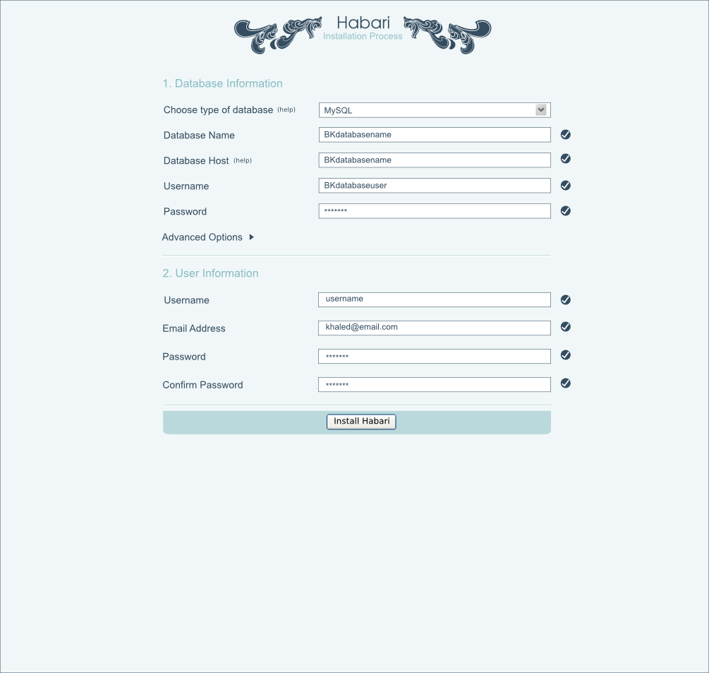
>From the mock ups the installation process is two tier. First we have
the database information, then we have the user information.
Mockup 1 - You can see anything but the information you have to. Once
all the fields have a tick then the second section drops down.
I've done a couple of things here, for a start the fields that have been
completed are presented in a darker teal colour, errors in pink and
fields that haven't been completed yet in grey. I'm not sure how much of
a pain this is to actually code up but I thought it was a nice little
touch.
I've also included the little help links to the elements I think the
novice user will have problems with. Directing them to the manual
straight away I think is a very good idea. Those are the two areas that
I think will cause problems in terms of confusing what this all actually
means.
Mockup 2 - Owen you were wondering about the error message being above
the fold, where it's moved down closer. The reason I've not put it
underneath is mainly aesthetic reasons. It just really didn't look
correct to me underneath or above the field.
Mockup 3 -
Once the section has been completed successfully then the bottom install
button appears.
Alternatives?
Talking with Scott, he was asking whether or not we can hide the above
element once it's done. I'm not completely adverse to the idea, it just
maybe it's a bit superflous, as it's only two sections that need to be
filled, not 10 etc. I know it's not difficult to hide the top and open
the bottom section in javascript (actually similar to Owen's sidebar)
but I don't know if this is really necessary. Let the user see all his
options completed?
To be honest, I'm not terribly precious about this subject.

BlueSaze
It really looked different and gave a Clean minimal look .i.e less
number of fields and a step-by-step approach.
Currently there are too many fields show in the 2ndMockup seems a bit
overwhelming from a end-user's prespective.
Can't we Do this step-by-step. I think we should take Scott's advice on
Hiding the First element once its done with.
Also some suggestions instead of help text we could have a small
question mark ? against each field. Hovering over the question mark
with your mouse will bring a small tool tip explaining what the Field
is for. Clicking it will take the user to a separate help page with
more advanced details.
What the advanced Options for ?
On Jan 14, 4:03 pm, Khaled Abou Alfa <khaled.aboua...@gmail.com> wrote:
> Right Gang,
>
> I've finished the installer markups from my POV. I've kinda stepped back
> from Michael's version but only in the tabs to be honest. The way things
> are set up and move forward remain the same. The reason for this was
> mainly because I tried to make the admin panel closer to the installer
> and it started going away from the 'cleaner' look we've got so far.
>
> Mike, I know you're working on your tweaked installer as well, but I
> thought I'd get my thoughts down so we're on the same page in terms of
> the steps.
>
> >From the mock ups the installation process is two tier. First we havethe database information, then we have the user information.
> 002-installer-phase1.png
> 80KViewDownload
>
> 002-installer-phase2.png
> 110KViewDownload
>
> 002-installer-phase3.png
> 105KViewDownload
BlueSaze
Won't the installer check the system requirements i.e. PHP5 etc before
it allows the user to install Habari.
I think important from a newbies perspective. Most newbies might try
running it even if they don't have php5 . One of reason why Joomla
turns out to be more popular than Drupal.
Here is a overview of the installation process
http://dev.joomla.org/content/view/2013/93/
Though we do not have to necessarily Make it as complicated as that of
Joomla. I feel we should take a 4 step approach (actually 3).
1. Check Pre-installation requirements
2. Database setup
3. User info setup
4. Finish

Owen Winkler
>
> Mockup 2 - Owen you were wondering about the error message being above
> the fold, where it's moved down closer. The reason I've not put it
> underneath is mainly aesthetic reasons. It just really didn't look
> correct to me underneath or above the field.
If the installer verifies this data as you enter it into the fields,
then why should the error message be anywhere other than where you are
currently entering data?
I understand that it might not look perfect with the error under the
field, but to me, it doesn't make sense to have the error message
somewhere other than where the error is actually happening.
Owen

Robin Adrianse

Broken Kode
error message if in fact it does work then you see what the mockups are
looking like. Still haven't mocked up the error message, but don't
worry, that should take too long to deal with either.
check the installer requirement document as sent by Firas.

Kyle
web form does it. So, you're confronted with the problem of making it
like everything else so that the user is not confused or simply
changing it to the sensible way you just put forward even though it may
be against the majority of web forms out there.
Owen Winkler
>
> While I would agree with you in principle, this is the way almost every
> web form does it. So, you're confronted with the problem of making it
> like everything else so that the user is not confused or simply
> changing it to the sensible way you just put forward even though it may
> be against the majority of web forms out there.
I posit that either way is not confusing. The way where the error
message is at the top might be familiar, therefore not confusing. The
way where the error message is next to the field that caused the error
is intrinsically not confusing.
And so I ask, do it the way everyone else does it because that's the
way other people do it, or do it in a way that makes sense?
I hate to reference everyone's favorite pundit, but this is one of
those cases where his advice makes sense:
http://www.useit.com/alertbox/20010624.html
Owen
Kyle
up 20 minutes before. Haha.
I'd actually agree with your method for user purposes, which, in my
opinion, out ranks looks. However, if looks are the main goal, I agree
with Khaled and would rather see it at the top.