Website v2

Khaled Abou Alfa
more tightly. It's all in arial with the exception of the habari and the
spread the news (so that text underneath the icons, that can be real
text).
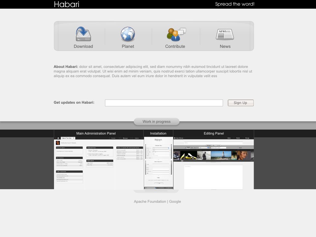
Planet is for the post by the dev with the tag habari coming from them
(think wp dashboard only on the official site, much like most open
source projects out there come to think about it).
News is for the official word from Habari.
Hope that all makes sense now.

FreAkErZ
Can't wait to see that in the admin panel too... w00t
Andrew
> 004-mockup.svg
> 974KDownload
>
> 004-mockup.png
> 154KViewDownload

Karthik
comes with something better. Khaled you rock..

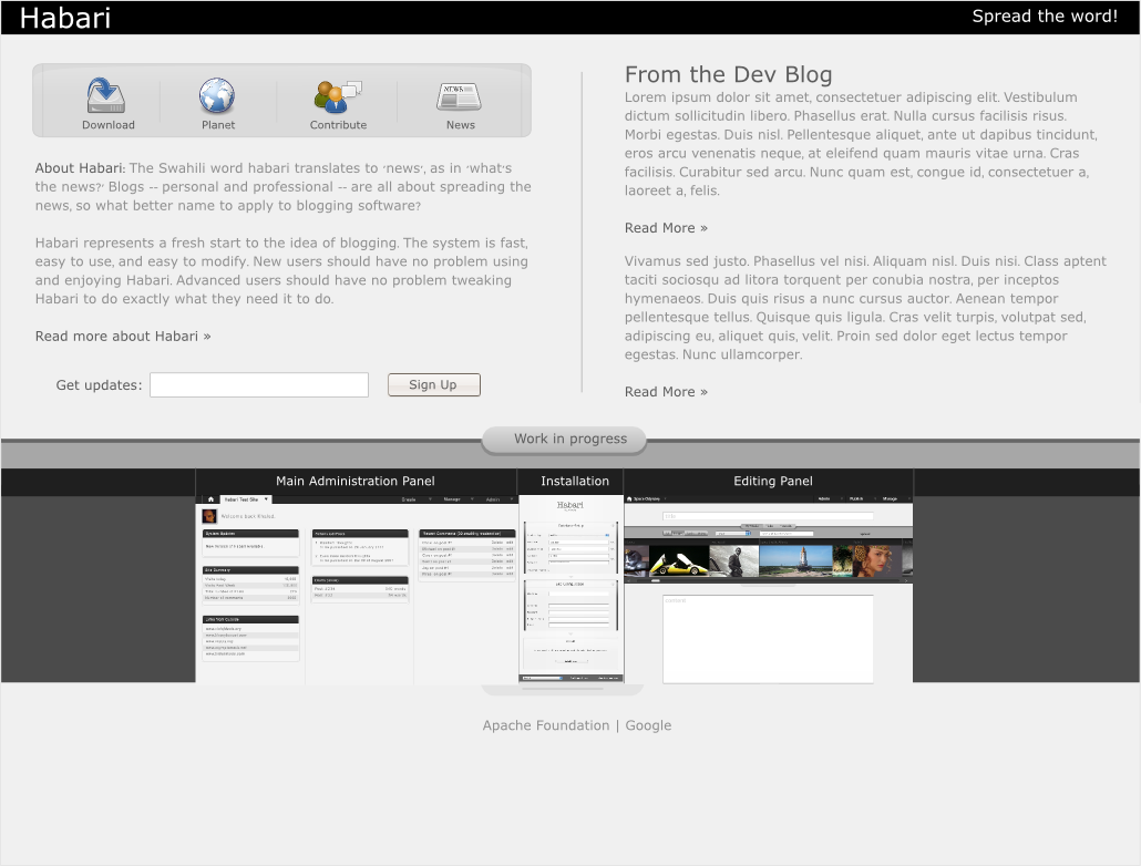
Chris J Davis
I would like there to be some content from the dev blog excerpted to
the front page, and the bar with the icons needs to command a little
less space. Attached is a little tweaking:

Michael Bishop
up
http://habari.heimidal.net/mockup_horizontal.png
This is almost completely coded in XHTML/CSS, and will be converted to
habari tomorrow.
I still do not think that mockups should be on the home page. They
would be far better suited in the dev blog until they are part of the
core.
No offense to the work that's been put into them, but putting things
that are not functioning features on the home page would be no
different than listing other features that are not part of the trunk.
To me its almost false advertising.
Michael
> website-003.svg
> 807KDownload
>
>
>
> website-003.png
> 256KViewDownload
> > <004-mockup.svg>
> > <004-mockup.png>

Root
> website-003.svg
> 807KDownload
>
>
>
> website-003.png
> 256KViewDownload
>
>
>
> On Feb 4, 2007, at 5:56 AM, Khaled Abou Alfa wrote:
>
> > <004-mockup.svg>
> > <004-mockup.png>

Scott Merrill
> Brian and I have worked up our own version, and have it almost coded
> up
> http://habari.heimidal.net/mockup_horizontal.png
>
> This is almost completely coded in XHTML/CSS, and will be converted to
> habari tomorrow.
What will be the destination of the "community" link?
--
GPG 9CFA4B35 | ski...@skippy.net | http://skippy.net/
Root
On the front page that is 2 columns. Are those two runs of the posts
function?
Is it static text?. Is it a page? Is it hard coded into the template?
How do you want your bacon? Just let me know.
On Feb 4, 4:35 pm, "Michael Bishop" <bishopblogwo...@gmail.com> wrote:
> Brian and I have worked up our own version, and have it almost coded
> uphttp://habari.heimidal.net/mockup_horizontal.png
Root

khaled Abou Alfa
We can add as much text to the subequent pages as we like but for the front page my instincts are calling for less on the page.
Final thought about the order of the calls to action should be download/contribute/news/planet.
Right, time to go kick a cat or something.
As for not including mockups, well no it's not false advertising because we haven't released anything. When someone goes to the download section they'll be informed that there is not even a dev release as yet. It's all being created as we speak, they can however get the files via SVN (and that's where you'll lose the neophite that doesn't know what SVN is in the first place). The mockups are what draw people to the software who might be able to contribute in other ways.
Root
sizes please.?
Then we can code them in.
On Feb 4, 5:16 pm, "khaled Abou Alfa" <brokenk...@gmail.com> wrote:
> I'm still keen on keeping things dead simple, so my imediate instinct is not
> to put all the dev stuff on the front page, but that's my opinion here. Last
> I'll talk about this but if you guys are dead keen on putting that
> information on the front page, make the text smaller. It's too large in your
> mockup Chris. From your mockup it gives the impression that the dev blog is
> the most important element on the page, visually it's got the most weight,
> while the calls to action are subdued to the side, which I don't think
> should be the case.
>
> We can add as much text to the subequent pages as we like but for the front
> page my instincts are calling for less on the page.
>
> Final thought about the order of the calls to action should be
> download/contribute/news/planet.
>
> Right, time to go kick a cat or something.
>
> As for not including mockups, well no it's not false advertising because we
> haven't released anything. When someone goes to the download section they'll
> be informed that there is not even a dev release as yet. It's all being
> created as we speak, they can however get the files via SVN (and that's
> where you'll lose the neophite that doesn't know what SVN is in the first
> place). The mockups are what draw people to the software who might be able
> to contribute in other ways.
>
Root
post? Or a page?
On Feb 4, 5:01 pm, "Root" <atthe...@gmail.com> wrote:
Root
(local) current version of Habari in xhtml /CSS. And I am currently
following the Khaled / Chris model. But I await further instructions
from the stake holders. Khaled could we also have the graphics for the
below the fold stuff. The coming shortly images. ?
Root
but each has its own implications.
On Feb 4, 5:19 pm, "Root" <atthe...@gmail.com> wrote:
khaled Abou Alfa
Root
On Feb 4, 5:31 pm, "khaled Abou Alfa" <brokenk...@gmail.com> wrote:
> Root all the icons/images etc can be found in the SVG I attached. Download
> inkscape and you should be able to extract everything.
>
Root
On Feb 4, 5:31 pm, "khaled Abou Alfa" <brokenk...@gmail.com> wrote:
> Root all the icons/images etc can be found in the SVG I attached. Download
> inkscape and you should be able to extract everything.
>
Root
likely to need them. :) I just need a zip of jpg / png whatever. I
have no intention of editing the darn things.
On Feb 4, 5:31 pm, "khaled Abou Alfa" <brokenk...@gmail.com> wrote:
> Root all the icons/images etc can be found in the SVG I attached. Download
> inkscape and you should be able to extract everything.
>
khaled Abou Alfa
Root
On Feb 4, 5:39 pm, "khaled Abou Alfa" <brokenk...@gmail.com> wrote:
> okay dude, don't fret, I'll sort you out with the images at one point.
>
khaled Abou Alfa
Root
images. There is some other stuff I need
other folks to answer. Do you want to go fixed width or em? My choice
would be em.
On Feb 4, 5:51 pm, "khaled Abou Alfa" <brokenk...@gmail.com> wrote:
> Yeah I know :), it's was just the Root email onslaught :). It was an email a
> minute :).
>
Scott Merrill
> You know me. Complete inertia or complete mania. No rush on the
> images. There is some other stuff I need
> other folks to answer. Do you want to go fixed width or em? My choice
> would be em.
My choice would be for you guys to trim your replies so you're not
including 20K of previously quoted and now extraneous conversation!
You should select the option that makes the most sense for your design.
If you want it to be fixed width, then make it fixed width and
articulate to us _why_ it should be fixed width. If you want it em
(whatever that means) then make it em and explain to us _why_.
Root
images. There is some other stuff I need
other folks to answer. Do you want to go fixed width or em? My choice
would be em.
On Feb 4, 5:51 pm, "khaled Abou Alfa" <brokenk...@gmail.com> wrote:
> Yeah I know :), it's was just the Root email onslaught :). It was an email a
> minute :).
>
Root
coding it. :)
Root
On Feb 4, 6:00 pm, Scott Merrill <ski...@skippy.net> wrote:
Sorry . Is that better Scott.
Root
column (at the top ) layout. But what is that text.? Are they posts or
pages? Or hard coded? Includes? What. Or shall I just do it?
Scott Merrill
> Scott we / I have raised a couple of questions here. Chris shows a two
> column (at the top ) layout. But what is that text.? Are they posts or
> pages? Or hard coded? Includes? What. Or shall I just do it?
It's quite clear to me that the content on the right column should be
the X most recent posts from the dev blog. The content on the left
column should be explanatory text about Habari: the what, who, and why,
as it were.
--

mumbles
Cant we combine Khaled's and Chris's mockups, ie
Can we keep the big download/planet/contribute/news bar, and put make the
About 70% of the page and the From the dev blog 30%?
Nice work by the way for all the mockups I have seen so far.
Got back from a Sunday away to about 50 e-mails ;P
John"mumbles"edmondson
Root
On Feb 4, 6:14 pm, Scott Merrill <ski...@skippy.net> wrote:
Thats great. No reason to stick to the standard install. We may as
well hack it to death. Is the host set up? Is Habari installed?. Who
has ftp / ssh to the host? Who are the stakeholders / decision
makers.? Does it need to be signed off? From where we are now if I had
images it wouldn't take long to roll out.
Scott Merrill
Yes, the host is up, and Habari is installed. The owner of the host
(moeffju) has access.
The stakeholders are the Habari community. The decision markers are the
members of the Habari project team, as identified on the front page of
the Habari Google Code site.
Yes, it must absolutely be "signed off" by the project team. If we all
like and approve it, we can move forward on making it live. If we feel
there are changes that need to be made, they will be discussed here.
I fully expect this to be an iterative process.
Root
click that and go to a single post and comments. But where has the
left hand page gone? What are the navigation options? Other than the
latin text what is the content?. We do not use cats so what is that -
tags ? Do you want a 3 to 2 col switch? Whats the spec? But returning
to the *call to action* - and Khaled is right on the money with this -
what do we want the viewer to actually DO?. In what order of priority.
Do we want him to sign up to get mail? No we want him to download. Do
we want him to transition here to Google to help with the dev? Or do
we want him to stay and read a lot of stuff. Or go to the dev blog. Is
that going to be maintained or are you going to be busy here? Who is
producing the content? How do we present the links on the front page?
The link text of Developers Blog suggests that this is all quite
static. The blog follows the click. But we a more button. So is that
to the blog? Or somewhere else? What is the architecture?
It is hard work being a client of mine I can tell you. :)

Blake Johnson
front page, making for 3 links rather than 4. I also think news items
on that version have the appropriate weight that Khaled refers to.
Maybe the designers need to go back a forth a few more times before
this is coded up?
--Blake
Root
On Feb 4, 6:23 pm, Scott Merrill <ski...@skippy.net> wrote:
> Root wrote:
Iteration is OK up to a point. But it conflicts with the goal of
expedition.
We need people to step up and state what they want. We need to work to
a spec and a timetable.
Michael Bishop
On Feb 4, 11:53 am, Scott Merrill <ski...@skippy.net> wrote:
> Michael Bishop wrote:
> > Brian and I have worked up our own version, and have it almost coded
> > up
> >http://habari.heimidal.net/mockup_horizontal.png
>
> > This is almost completely coded in XHTML/CSS, and will be converted to
> > habari tomorrow.
>
> What will be the destination of the "community" link?
The thought is that the main page is a starting point, a portal, that
takes you to internal pages that go from there. A page that will
delineate the various aspects of participation, and external
contributions, themes/plugins, etc.
Again, the idea is to get a site up now, and add content as it
exists. No sense in having a documentation link for example, when
there's no documentation.
So for now, the community page will outline how to get involved, to
the wiki, etc.
As time goes by, this could grow. I really feel having a link now to
a "planet" that doesn't exist is fruitless.
I also still stand by the point that having a bunch of screen shots is
selling something that's not there. I don't think weeding out newbs
is the goal of having SVN, and savvy users are going to get the SVN,
and see a totally different interface, and go wtf?
Those mocks are months away from implementation, and a dev release is
weeks at most. But if recognized participants in the community think
having pretty pictures of stuff that *might* be in a release down the
road is good for the project now obviously I can't do anything about
it.
I would like some sort of vote though as to what this page is going to
be, and who is going to do it, as I've been one of the few who have
tried to move the idea forward to something real.
http://habari.bishopblogworks.com/project/index.htm
Is the mock that Brian Rose and I collaborated on (well, he made it
pretty) and I'm starting to put into XHTML. I am not trying to shoe
horn it into habari yet, as some features are still be tweaked to make
this site work. But I certainly do not want to waste anyone's time,
mine included, if everyone is hell bent on using Chris's or Khaled's.
Brian and I tried to take some elements from Khaled's and streamline
it to reflect the *current* state of the project and the work we had
done so far. The truth is all the mocks have great elements, it's
time to act, and stop nitpicking, IMVHO.
As I've stated numerous times, it's not to say it doesn't need more
work, or couldn't be coded better, but as it sits when I write this,
it is XHTML 1.0 Strict, and as far as I can tell, though w3c.org is
down, the CSS should be error free.
This is going to be an evolution regardless, so it should be taken
that way. I think it is a very solid first face to put on habari,
considering the opinions of what the site *shouldn'* have to start.
Michael
Root
Root
out of all issues as to what should be in this site. Or how it is
styled. In sofar as any one wants me to I will just code whatever is
put in front of me. And at the moment I am on the Khaled / Chris
thing. It is immaterial what I think.
Scott Merrill
>> What will be the destination of the "community" link?
>
> The thought is that the main page is a starting point, a portal, that
> takes you to internal pages that go from there. A page that will
> delineate the various aspects of participation, and external
> contributions, themes/plugins, etc.
> So for now, the community page will outline how to get involved, to
> the wiki, etc.
Okay. That's fine. I just wanted some understanding of where it would
take me should I click on it. "Community" is a broad term, and doesn't
have any specific implications: clicking "Community" I could reasonably
expect to see links to the home pages of the developers, for example.
> As time goes by, this could grow. I really feel having a link now to
> a "planet" that doesn't exist is fruitless.
One thing that has been discussed elsewhere is the idea of making
habariproject.org the central hub for _all_ Habari communities around
the world. So the French community would have a site at
habariproject.org/fr/ and the Russian community at habariproject.org/ru/
etc etc.
It was further suggested that we could display recent posts from these
sites on the front page. I _really_ like this idea. A "Planet" icon
could sit atop a column of recent posts from the various international
sites on habariproject.org.
> I also still stand by the point that having a bunch of screen shots is
> selling something that's not there. I don't think weeding out newbs
> is the goal of having SVN, and savvy users are going to get the SVN,
> and see a totally different interface, and go wtf?
+1 I don't think the front page is the place for this. When we have a
fully-functional administrative interface which we would like to show
off, we should include copious screenshots on a "Features" walk-through
type of page.
> I would like some sort of vote though as to what this page is going to
> be, and who is going to do it, as I've been one of the few who have
> tried to move the idea forward to something real.
>
> http://habari.bishopblogworks.com/project/index.htm
This is the best example implementation yet, because it gives _everyone_
HTML and CSS with which to work. This is terrific! Thank you.
I particularly like the "h" in the newspaper. ;)
This is a solid foundation from which a number of permutations be can
explored. A fourth column for international posts would be something
for which I would advocate. I would also suggest making the text at the
very top a bit more succinct.
Evenetually, we _will_ need links to the online manual, as well as a
tour of features. Perhaps these could live in the column under the
"Download" link...
Root

vkaryl
"h" in the newspaper as well.... That's a very nice "skin" there
overall....
Michael Bishop
On Feb 4, 1:57 pm, Scott Merrill <ski...@skippy.net> wrote:
> Michael Bishop wrote:
> >> What will be the destination of the "community" link?
>
> > The thought is that the main page is a starting point, a portal, that
> > takes you to internal pages that go from there. A page that will
> > delineate the various aspects of participation, and external
> > contributions, themes/plugins, etc.
> ...
> > So for now, the community page will outline how to get involved, to
> > the wiki, etc.
>
> Okay. That's fine. I just wanted some understanding of where it would
> take me should I click on it. "Community" is a broad term, and doesn't
> have any specific implications: clicking "Community" I could reasonably
> expect to see links to the home pages of the developers, for example.
And that very well could/should be on that page. There really hasn't
been a lot of discussion about real content outside some basics, and
once the home page is hashed out, I'm sure more hashing will come with
other pages.
>
> > As time goes by, this could grow. I really feel having a link now to
> > a "planet" that doesn't exist is fruitless.
>
> One thing that has been discussed elsewhere is the idea of making
> habariproject.org the central hub for _all_ Habari communities around
> the world. So the French community would have a site at
> habariproject.org/fr/ and the Russian community at habariproject.org/ru/
> etc etc.
Currently there is a drop down for that at the bottom. It could be
moved to somewhere more noticable.
>
> It was further suggested that we could display recent posts from these
> sites on the front page. I _really_ like this idea. A "Planet" icon
> could sit atop a column of recent posts from the various international
> sites on habariproject.org.
I had missed that in the thread I started last week about hp.o
content, but it's not really an issue. A 4th column, or moving the
content that's below community to above the icons and replacing that
with those posts is easy to do, either now, or next week when we have
content to put there.
> >http://habari.bishopblogworks.com/project/index.htm
>
> This is the best example implementation yet, because it gives _everyone_
> HTML and CSS with which to work. This is terrific! Thank you.
>
> I particularly like the "h" in the newspaper. ;)
That's all Brian Rose. I suggested the icon needed some color to fit
with the other icons/contrast the muted colors, he did the rest.
>
> This is a solid foundation from which a number of permutations be can
> explored. A fourth column for international posts would be something
> for which I would advocate. I would also suggest making the text at the
> very top a bit more succinct.
All the text is really filler, not much effort was put into that, as
we were trying to "nail" the look and feel, and then have a separate
argument over content ;)
> Evenetually, we _will_ need links to the online manual, as well as a
> tour of features. Perhaps these could live in the column under the
> "Download" link...
Agreed. As I mentioned, we are really trying to approach this from a
now standpoint, vs a when things are more complete idea.
All the images are in the dropbox that Firas built, and obviously the
XHTML/CSS can be gotten from source on the link page. This was never
an attempt to monopolize the site, but get it going forward and
encourage input. Not splinter and divide.
Michael
I'd also like to say I do not want to appear to be speaking for
Brian. We have worked on this together, but I don't want to appear to
be putting words in his mouth on any other issues.
Root
On Feb 4, 6:14 pm, Scott Merrill <ski...@skippy.net> wrote:
> It's quite clear to me that the content on the right column should be
> the X most recent posts from the dev blog. The content on the left
> column should be explanatory text about Habari: the what, who, and why,
> as it were.
>
> --
> GPG 9CFA4B35 | ski...@skippy.net |http://skippy.net/
That looks like a more link on both sides. So those would be posts. A
double loop yes? And are comments going to be activated on those posts?
Brian Rose
>
> > The thought is that the main page is a starting point, a portal, that
> > takes you to internal pages that go from there. A page that will
> > delineate the various aspects of participation, and external
> > contributions, themes/plugins, etc.
> ...
> > So for now, the community page will outline how to get involved, to
> > the wiki, etc.
>
While figuring out this layout last night, I went back and forth over
"Community" vs "Contribute". In the end, I decided that new users are
likely to understand that the words "Community" will connect them with
people; however, I'm undecided as to where information about
contributing should be housed.
> One thing that has been discussed elsewhere is the idea of making
> habariproject.org the central hub for _all_ Habari communities around
> the world. So the French community would have a site at
> habariproject.org/fr/ and the Russian community at habariproject.org/ru/
> etc etc.
>
> It was further suggested that we could display recent posts from these
> sites on the front page. I _really_ like this idea. A "Planet" icon
> could sit atop a column of recent posts from the various international
> sites on habariproject.org.
I understand the motivation behind this, and I'm sure we can work it
into an iteration of the site in the very near future. Right now,
though, I think it's imperative that we get a site together that
doesn't have an overtly "under construction" feel when this goes live
(as soon as tomorrow), which is exactly what will happen if we add too
many features and are forced to through "Coming Soon" all over the
place.
> > I also still stand by the point that having a bunch of screen shots is
> > selling something that's not there. I don't think weeding out newbs
> > is the goal of having SVN, and savvy users are going to get the SVN,
> > and see a totally different interface, and go wtf?
>
> +1 I don't think the front page is the place for this. When we have a
> fully-functional administrative interface which we would like to show
> off, we should include copious screenshots on a "Features" walk-through
> type of page.
+1. I completely agree that putting screenshots of a user interface
that is not yet implemented is a bad idea. People will get confused
when they see the screenshots of this gorgeous interface with a cool
media browser, then download the package. It's better to put those on
another page specifically devoted to ideas and concepts.
> >http://habari.bishopblogworks.com/project/index.htm
Awesome, Michael. :)
> This is the best example implementation yet, because it gives _everyone_
> HTML and CSS with which to work. This is terrific! Thank you.
>
> I particularly like the "h" in the newspaper. ;)
Thanks. ;) I really wanted that element in there, and now there's no
reason to be worried about branding and what not.
> This is a solid foundation from which a number of permutations be can
> explored. A fourth column for international posts would be something
> for which I would advocate.
As I stated above, we can add to this design over and over again -
it's not very complex markup and the layout is entirely grid based.
> I would also suggest making the text at the
> very top a bit more succinct.
All of the copy on the page was purely meant as a placeholder. If
someone else has a good idea for what it should say, please let us
know here.
> Evenetually, we _will_ need links to the online manual, as well as a
> tour of features. Perhaps these could live in the column under the
> "Download" link...
My thoughts exactly... for now. :)
Scott Merrill
>> It was further suggested that we could display recent posts from these
>> sites on the front page. I _really_ like this idea. A "Planet" icon
>> could sit atop a column of recent posts from the various international
>> sites on habariproject.org.
>
> I understand the motivation behind this, and I'm sure we can work it
> into an iteration of the site in the very near future. Right now,
> though, I think it's imperative that we get a site together that
> doesn't have an overtly "under construction" feel when this goes live
> (as soon as tomorrow), which is exactly what will happen if we add too
> many features and are forced to through "Coming Soon" all over the
> place.
The French Habari community is amazingly active. From what I've seen,
there's a growing Chinese community, too.
Habari currently supports multi-site configurations, and the
installation of Habari that is running habariproject.org is ready for
per-language sub-site installations. I think this is something we
should build from the beginning.
Brian Rose
We intend to build multilingual support into the initial version of
the site. However, I think I'm a bit confused:
Khaled mentioned (whether it was here or on IRC, I'm not sure) that
"Planet" would contain posts and information aggregated from the
developers' websites - specifically blog posts tagged with "habari."
It would seem there are two separate visions for what "Planet" should
be used for - if it is indeed going to be used for
internationalization, I'm all for it. If the plan is to simply
aggregate content from elsewhere, I think we can hold off a week or
two.
Scott Merrill
>> Habari currently supports multi-site configurations, and the
>> installation of Habari that is running habariproject.org is ready for
>> per-language sub-site installations. I think this is something we
>> should build from the beginning.
>
> We intend to build multilingual support into the initial version of
> the site. However, I think I'm a bit confused:
>
> Khaled mentioned (whether it was here or on IRC, I'm not sure) that
> "Planet" would contain posts and information aggregated from the
> developers' websites - specifically blog posts tagged with "habari."
> It would seem there are two separate visions for what "Planet" should
> be used for - if it is indeed going to be used for
> internationalization, I'm all for it. If the plan is to simply
> aggregate content from elsewhere, I think we can hold off a week or
> two.
I don't think any old post tagged "Habari" deserves a spot on our front
page. However, posts from the native-language instances of Habari
living at habariproject.org/CC/ _should_ receive front-page exposure.
These are the official native-language sites for Habari, and deserve top
billing.
I imagine we'd have no more than one post per language on the front
page, and no more than, say, 10 or 12 post total from the non-English sites.
Brian Rose
> page. However, posts from the native-language instances of Habari
> living at habariproject.org/CC/ _should_ receive front-page exposure.
> These are the official native-language sites for Habari, and deserve top
> billing.
I agree. I'll work on adding this in.
In the meantime, everyone should take a look at
http://habari.heimidal.net/mockup_horizontal_sub.png and let me know
your opinions.

Computer Guru
more "authority" on the Habari topic get a link on your front page,
AND exclude sites you don't want on there (say for instance, HW :D)
It's not a perfect API, but for an implementation like this (which i
never thought of before to tell the truth) it's genius.
--
Computer Guru
Founder
NeoSmart Technologies
http://neosmart.net/blog/
Chris J Davis
Khaled: The font size is large since I lean toward larger fonts for
better accesability. I routinely have to increase the font size on
sites because they start off to small. So for me it has nothing to
do with importance. If you want to add more importance to other
areas, I would ask you explore ways that don't decrease the
readability of the textual content.
Root: The Content on the right would be a Posts::get() call that
retrieves the (n) most recent posts, probably where (n) = 2or 3. My
vision for the left content would be the Read More >> goes to a
Habari explanation page, most likely the googel project page for
now. That bit could be inline text, and not handled by Habari.
The rest I leave to the creativity of the people doing the actual work.
Alas I am now off to a Superbowl party, so I will be unable to
respond to any more emails tonite. Thanks for all the work everyone
is putting into this. I can't wait to see how it comes out.
Chris
Brian Rose
This is a very quick mockup just to give my idea for the Planet
section. I'm going off of what Scott said as I think he's right -
posts from the international sections should be showcased on the
homepage.

Owen Winkler
This looks neat.
I was thinking that the planet would be an additional icon with the
other three at the top (making 4), and the posts from the
international sites would appear like they do under the dev blog
column. That way, our international friends get above-the-fold
billing.
Owen
Brian Rose
> other three at the top (making 4), and the posts from the
> international sites would appear like they do under the dev blog
> column. That way, our international friends get above-the-fold
> billing.
My biggest concern was how long that column might get. Do we intend to
limit it to three or four posts?
Michael Bishop
Looks good, though it needs some proportion to the rest of the mid
section content.
Michael
Owen Winkler
>
> limit it to three or four posts?
>
I think it would look more cohesive if we did that and limited it to
just a few posts instead of ten or more. We could have the main
"Planet" link go to a page that displays the most recent post from
every language.
Owen
Brian Rose
> just a few posts instead of ten or more. We could have the main
> "Planet" link go to a page that displays the most recent post from
> every language.
Latest iteration: brightened up the colors (Firas mentioned it was a
bit dismal) and added the Planet section:
Robin Adrianse
vkaryl
paying attention.... it's looking REALLY classy guys! I didn't think
the other was "dismal" (probably because my favorite weather is 65 and
raining/35 and snowing; and my favorite music is ALWAYS in a minor
key), but this is nice too (and you'll NEVER please everyone - just
make the admin backend themeable and that'll do....)
Great work!
Michael Bishop
to have been sent to the nether world, so I'll wait until it appears
or not.
However, on the line of what Brian and I are working on, I think a
decision needs to be made if we want 4 columns, and have both
community and planet, or move the content from community to the
section above, the "about" might you call it.
If that's the case, do we want to use the planet icon, or community
icon, and then include the various posts from those blogs?
I'm more inclined to do the latter, avoid the whole "planet" term, and
everything be encompassed by the community portal idea. Again, my
idea for that was as another "mini" portal, and the use of it (the
term community) was based on the emphasis on that word within the
things I've read from the project founders.
The other thing to emphasis is that this can always be modified later
this week, next, when ever new and important information warrants
being on the home page. Least we forget, there is still much more to
getting hp.o off the ground than the home page, and important
decisions will need to be made about internal content, the "meat" so
to speak.
And if I haven't mentioned, I'm very excited by the entirety of the
habari project, and would like to take a sec to thank all those who
have already contributed so much of their time and effort in getting
things this far. I really think a diverse and dynamic community will
evolve, and I look forward to being a part of it, in what ever
capacity I can.
Michael
Root
The question of em based design (where the width alters with the font
size) is also related. The spec could do with a bit of firming up.
Chris J Davis
on the side of large text for readability, and ensure we are casting
an eye toward proper contrast. The text is much to small in this
mockup, and the contrast between links and non-linky text, and text
and background is not high enough for my taste.
I would suggest knocking this down to 2 columns, three at the most,
and increasing the contrast and font size.
Thoughts?
Chris
Owen Winkler
>
> Bringing my statement back from the ether, I would really like to err
> on the side of large text for readability, and ensure we are casting
> an eye toward proper contrast. The text is much to small in this
> mockup, and the contrast between links and non-linky text, and text
> and background is not high enough for my taste.
It's always unpopular to say this, but if you're having trouble
reading the small text, there are assistive technologies that will
display the text larger. Press Ctrl++ on Firefox, for example.
I point this out for two reasons. First, it allows us to design our
base design how we want, not by some restriction that the text be big
enough to be "readable". How big is that, anyway? A nearly-blind
grandmother may need 40pt text, which would likely be bigger than we
would want to provide. I can read the small text just fine. What's
readable for me is not what's readable for the grandma, and it seems
reasonable to set the base size based on what works in the design, not
on some "readable" size that we would have difficulty defining.
Second, allowing for font size changes in the browser based on these
manual controls or a user stylesheet ensures that we do work with
these assistive technologies. When you press those keys, the font
size should get larger, and the design should not break. Maybe the
design would by necessity break when the font gets larger, which is a
tangible consideration.
> I would suggest knocking this down to 2 columns, three at the most,
> and increasing the contrast and font size.
>
> Thoughts?
I think it looks great as-is. Could the text be a little larger,
maybe. 2 columns? No way.
I'm getting generally bored with the web-2.0 "you're all probably
blind, so let's make the text as big as possible" design philosophy,
and I don't see a real benefit to using 2 columns over 3 or 4 that
isn't simply an effort to make the text larger.
Also, I hate old people and people who don't share my obviously
perfect opinions.
Owen

Justin Moore
> I'm getting generally bored with the web-2.0 "you're all probably
> blind, so let's make the text as big as possible" design philosophy,
> and I don't see a real benefit to using 2 columns over 3 or 4 that
> isn't simply an effort to make the text larger.
>
> Also, I hate old people and people who don't share my obviously
> perfect opinions.
+1 for sarcastic honesty
Justin Moore
www.wantmoore.com
Chris J Davis
compromise. I have better vision that most people my age, but all my
monitors are set at high resolution which means the text needs to be
reasonably sized to begin with. On your site Owen, I can't read the
comment text, ever. I have to increase the font size at least one
time to make it readable at all.
I am of the mind that we don't screw users. The font size should be
reasonable, so that people can easily access the content. I also am
all for allowing for assistive technologies, but making the font
squinty, and saying "well they can just increase the font size" is
not acceptable in my book.
Chris
Michael Bishop
On Feb 5, 9:47 am, Chris J Davis <c...@chrisjdavis.org> wrote:
> This has nothing to do with web 2.0, and more to do with a good
> compromise. I have better vision that most people my age, but all my
> monitors are set at high resolution which means the text needs to be
> reasonably sized to begin with. On your site Owen, I can't read the
> comment text, ever. I have to increase the font size at least one
> time to make it readable at all.
>
> I am of the mind that we don't screw users. The font size should be
> reasonable, so that people can easily access the content. I also am
> all for allowing for assistive technologies, but making the font
> squinty, and saying "well they can just increase the font size" is
> not acceptable in my book.
>
> Chris
>
Isn't that the point of using em based font sizes? So that those that
need to expand the font can? Or I'm not accessibility expert, but
there are preferences for most browsers that let the end user define
their own default font size?
If just find if difficult to see how a project that is espousing all
the modernity of PHP5 and OOP, are going to tank on modern design
principles.
Michael
Chris J Davis
Chris
Root
Owen Winkler
>
> Regardless of technology, you need to have a sensible default.
>
I'm all for a sensible default, and if that means using a slightly
larger font, then ok. I don't think that compromise will require that
we reduce the number of columns to two though.
We should see what font looks reasonable in three columns, as I'm sure
that the font used in the last mockup is just based on fitting all the
text cleanly into four columns.
Owen
Chris J Davis
Chris
Root
user agent / user. IMHO it is the task of the web dev to do as little
as possible to disturb that process whilst doing the max to give
accessibilty and consistency in behavior across platform.
vkaryl
(REALLY close to 60....) I don't have any trouble reading the print
on Owen's site.... in fact, I can't remember the last time I had
trouble online on my dev screen (1024x768) - my 1600x1200 screen,
yeah, there's sites I have a hard time with on that, but I don't surf
on that one....
I'd suggest picking a nicely readable font size at 1024x768, then use
ems to set it up so those with the need for larger font sizing can get
it in an accessible, usable manner....

Matthias Bauer
> However, on the line of what Brian and I are working on, I think a
> decision needs to be made if we want 4 columns, and have both
> community and planet, or move the content from community to the
> section above, the "about" might you call it.
Maybe this question should get its own thread, it's kinda far off the
threading scale here.
> If that's the case, do we want to use the planet icon, or community
> icon, and then include the various posts from those blogs?
IMO, the Community blurb could go into the About text, and then
Community would encompass Planet in the main nav. Thus, three columns.
The design looks awfully crowded with 4 columns to me, and I worry about
forcing (too) small text sizes on users. I like 10pt, personally, and
anything under 10px is definitely too small for me to use.
> I'm more inclined to do the latter, avoid the whole "planet" term, and
> everything be encompassed by the community portal idea.
+1
> Again, my idea for that was as another "mini" portal, and the use of it
> (the term community) was based on the emphasis on that word within the
> things I've read from the project founders.
I think right now the question is mostly what should be where on the
startpage. We really want to get the local communities' news on the
frontpage, I think. Question then is, where, and how.
-Matt
Matthias Bauer
http://img527.imageshack.us/img527/597/habarimockfwd5.png
I tried to keep it similar to the admin.
Pro: Two columns, larger fonts, less 'wasted' space, without looking too
crowded.
-Matt