Admin Panel - Header

Khaled Abou Alfa
that I've not really got a solution yet for the rest of the areas, so
I'm going to concentrate on elements that we can use throughout the
admin. These elements really are:
1. Header
2. Footer
3. System Messages
4. Titles for the pages we're on (I'm not going to go into why I think
these are needed again, my previous emails address this issue in more
detail).
5. Help icon. This is important from a new user to general good
practice of making the admin as easy to understand and utilise as best
the user can.
I think once we've got these elements established, we can actually
move forward implementing them and then working on the inbetween stuff
accordingly. Once I've got a couple more ideas about how best to
tackle establishing and discussing the rest of the page elements in
all the admin pages, I'll share. I'm not shying away from that area of
work, i just think there are elements here that we could potentially
bottom out and therefore claim a small victory and get some positive
thoughts for the whole process.
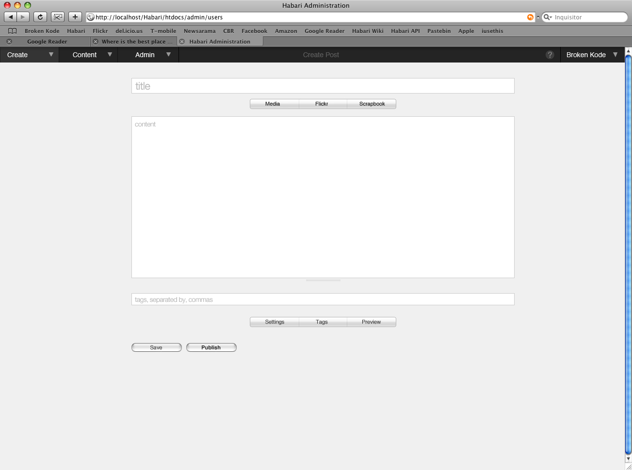
So from the first mockup below you'll see several edits. The first is
that we've got create, content and admin. The change here is in order
and then in the change of wording from Manage to Content. I had an IRC
conversation (can't remember with whom) and it was considered maybe
more intuitive, so consider this the throwing at the wall and seeing
what sticks element of the design. Now the other change is that the
title of the page is now in the middle of the actual header. This
isn't particularly intrusive and we're not adding a secondary bar that
some peeps really didn't like. Also you'll notice that there is no
footer in these mockups either. Not in link form or otherwise. Those
elements are used in a different method altogether.
On the far right hand side we've got the title of the site, with a
drop down menu and the help icon. More on the help icon in a little
bit. Lets move onto the next image...

Scott Merrill
> This is for the help icon. By clicking on the help icon in the top
> right hand side, you basically open several elements on the page. The
> first is the secondary bar right underneath which is going to be very
> useful real estate. We basically have the links in here and any other
> messages that we feel might be of use to the end user. i've also added
> a couple of additional help comments where I felt it was necessary.
I don't like having to click a button to see the links to the manual
and the wiki. I'd like to explore how we can link to these resources
easily with a single click. Is it possible? Do others think it's a
good idea?

Owen Winkler
>
> So from the first mockup below you'll see several edits. The first is
> that we've got create, content and admin. The change here is in order
> and then in the change of wording from Manage to Content. I had an IRC
> conversation (can't remember with whom) and it was considered maybe
> more intuitive, so consider this the throwing at the wall and seeing
> what sticks element of the design.
This is my first encounter with these menu options. I tried to imagine
what my thought process was for writing a new post. Unfortunately, I
became confused by having two potential options for selection. Granted,
one was a *better* choice, but it seems to me that there should instead
be an *only* choice, especially for mission-critical features such as
composing a post. I'm not saying to reduce the menu count, I'm just
saying that I'm not sure this is the best solution.
> Now the other change is that the
> title of the page is now in the middle of the actual header. This
> isn't particularly intrusive and we're not adding a secondary bar that
> some peeps really didn't like.
Of all of the changes here I dislike this one the most.
One of the more jarring aspects of our admin, in my opinion, is that the
admin menu doesn't align to the page the way the rest of the content
does. That said, jamming all of this extra stuff into the menu bar
makes it look cluttered and confusing.
I stand with my opinion that the previous mockups that show the title,
search, and help on a separate bar are less confusing and actually take
up less space than current page titles which are not as neatly organized.
> Also you'll notice that there is no
> footer in these mockups either. Not in link form or otherwise. Those
> elements are used in a different method altogether.
The footer seems like a necessary cap to the end of the page. Without
it there, it feels like something is visually missing.
Also, the links that it contained are things that should be available
from every page of the site. The things they link to are components
that we've felt from the beginning are an essential part of what makes
the project work.
> So right here you can see that the drop down menu on the right hand
> side is for additional websites that are controlled from the same
> admin panel. It's pretty simple really and it's something that I
> included in my very first mockups so many moons ago (we're talking
> nearly a year ago mockups). So the idea is you can flip between
> websites from here.
We've always talked about this and envisioned this as the solution, but
I don't even see this making it into 1.0, unfortunately.
> Also I've included the log out option in this drop
> down menu as well. The reason is that as you can see I've eliminated
> the footer altogether. This is for good reason. While I wasn't adverse
> to a bar right at the bottom it wasn't a popular idea. And while the
> alternative of having either links without a border and another with
> the border might seemed ok, I think ultimately we can get rid of it
> altogether and address this element in a completely different way.
As I've said above, I'm not a fan of this. I don't recall hearing
opposition to the footer before, just that the current one lacked any
structure or style.
The log out option should go somewhere in the admin, since the user
needs a place to forcefully discontinue his session at a public
terminal, but I'm not sure that it should be tucked into another
dropdown menu. The footer was a comfortable place for this element.=, I
think.
> This is for the help icon. By clicking on the help icon in the top
> right hand side, you basically open several elements on the page. The
> first is the secondary bar right underneath which is going to be very
> useful real estate. We basically have the links in here and any other
> messages that we feel might be of use to the end user. i've also added
> a couple of additional help comments where I felt it was necessary.
> I've got to be honest, I'm not completely married to the way it's
> being shown, but something similar I think is essential to make sure
> the end user knows what we're talking about on the page. While it
> might only be used once by the end user, it only takes once to impress
> them with all these little touches that make their lives easier and
> more fun to use the software.
I think that this is a great way to visualize help, especially if we add
direct links to the appropriate places in the manual to expand on each
of the points shown in the help bubbles.
> This final image basically uses the same real estate discussed above
> for system messages. These could be error messages or successful
> installation messages, whatever. The colours are not the final ones, I
> was just trying to convey the mood that we'd be trying to achieve.
This seems reasonable. Once again I am concerned about another element
that is full-width when the rest of the page content isn't. Does the
text in this area wrap at the content width, or does it wrap fluidly?
I think this is the right place for this element, but there will be
dissonance between the way the bars display the information.
Owen
Khaled Abou Alfa
On 2 Feb 2008, at 03:52, Owen Winkler wrote:
>
> Khaled Abou Alfa wrote:
>>
>> So from the first mockup below you'll see several edits. The first is
>> that we've got create, content and admin. The change here is in order
>> and then in the change of wording from Manage to Content. I had an
>> IRC
>> conversation (can't remember with whom) and it was considered maybe
>> more intuitive, so consider this the throwing at the wall and seeing
>> what sticks element of the design.
>
> This is my first encounter with these menu options. I tried to
> imagine
> what my thought process was for writing a new post. Unfortunately, I
> became confused by having two potential options for selection.
> Granted,
> one was a *better* choice, but it seems to me that there should
> instead
> be an *only* choice, especially for mission-critical features such as
> composing a post. I'm not saying to reduce the menu count, I'm just
> saying that I'm not sure this is the best solution.
I hear you about the choice of the word. I stand firmly behind the
fact that the administration panel is a separate entity to the create
section which is different to the managing your content section. There
should be three distinct sections IMHO. However since people have
expressed that 'Manage' does not describe the section properly I'm
looking for alternatives that could provide an apt description.
'Content' is one option. Does anyone else have any better words that
we could use for this section? Remembering it's managing your content.
Your posts, your links, your comments, spam etc. That is what we are
trying to describe here.
>
>
>> Now the other change is that the
>> title of the page is now in the middle of the actual header. This
>> isn't particularly intrusive and we're not adding a secondary bar
>> that
>> some peeps really didn't like.
>
> Of all of the changes here I dislike this one the most.
>
> One of the more jarring aspects of our admin, in my opinion, is that
> the
> admin menu doesn't align to the page the way the rest of the content
> does. That said, jamming all of this extra stuff into the menu bar
> makes it look cluttered and confusing.
>
> I stand with my opinion that the previous mockups that show the title,
> search, and help on a separate bar are less confusing and actually
> take
> up less space than current page titles which are not as neatly
> organized.
Well we do have several options for this. We've got the secondary menu
bar. We've got integration into the top menu bar as shown in this
mockup. We've got the couple of options that Mike proposed as well.
It's really a question as to what is the most appropriate for the
application. Flipping through the mockups, my vote is to go with
putting in the top, since it seems to me like the option that does put
it out of the way, however it's still there. I can appreciate it's a
personal preference really, but by putting it there I honestly think
it doesn't draw undue attention to itself while maintaining the
information that we are trying to portray. How does everyone else
feel? Is one of the options more suitable or more exciting visually?
Do you guys think that having that additional text and help icon
clutter the top menu bar?
>
>
>> Also you'll notice that there is no
>> footer in these mockups either. Not in link form or otherwise. Those
>> elements are used in a different method altogether.
>
> The footer seems like a necessary cap to the end of the page. Without
> it there, it feels like something is visually missing.
>
> Also, the links that it contained are things that should be available
> from every page of the site. The things they link to are components
> that we've felt from the beginning are an essential part of what makes
> the project work.
My thought process on this particular element is that combining all of
the help links and information into a cohesive collection makes them
more relevant. In the same way that we are combining all of our admin
links, our create links and our manage links we're also consolidating
our help information links as well. The truth of the matter is you're
really only going to be looking for those links, when potentially
things go wrong or you want more information? That information is made
important by the virtue it's at the top where the system messages
occur. I have an issue with grouping the manual link, the wiki link
and mailing list along with the logout link. It doesn't really fit
there, or at least I think it doesn't.
>
>
>> So right here you can see that the drop down menu on the right hand
>> side is for additional websites that are controlled from the same
>> admin panel. It's pretty simple really and it's something that I
>> included in my very first mockups so many moons ago (we're talking
>> nearly a year ago mockups). So the idea is you can flip between
>> websites from here.
>
> We've always talked about this and envisioned this as the solution,
> but
> I don't even see this making it into 1.0, unfortunately.
I understand, but I just wanted to include that in our current mockups
so that we don't forget that it's something we'd like to achieve at
some point, no?
>
>
>> Also I've included the log out option in this drop
>> down menu as well. The reason is that as you can see I've eliminated
>> the footer altogether. This is for good reason. While I wasn't
>> adverse
>> to a bar right at the bottom it wasn't a popular idea. And while the
>> alternative of having either links without a border and another with
>> the border might seemed ok, I think ultimately we can get rid of it
>> altogether and address this element in a completely different way.
>
> As I've said above, I'm not a fan of this. I don't recall hearing
> opposition to the footer before, just that the current one lacked any
> structure or style.
>
> The log out option should go somewhere in the admin, since the user
> needs a place to forcefully discontinue his session at a public
> terminal, but I'm not sure that it should be tucked into another
> dropdown menu. The footer was a comfortable place for this
> element.=, I
> think.
The default way that the programme has been built and that you've
talked about extensively is that you get logged out after 20 minutes
automatically. That's the basic feature. i've never had to use that
link because I'm logged out before I get the chance. Now everything is
grouped to control the site through drop down menus and since we've
got a link to the site, then it stands to reason to have the logout
from the admin to be in close proximity to that. Whether or not that
should be a drop down menu item or something different I guess we
should discuss, but ultimately I think that's where the logout link
should be located.
We can have a look at which way makes the best impact on the message
we're trying to convey. I'd expect it to be in line with the content
width to be honest, from an aesthetic pov, however it's something to
have a look at and see what it looks like in practice.