Habari Website

Khaled Abou Alfa
to designing the official website at some point. I'm most definitely not
giving him a deadline because that shouldn't be how you contribute to a
project you love. You should just get on and do it. I've got faith
you'll come through buddy but for now I can understand things not being
the right time etc.
As such I'm going to talk about the mockups that have been going through
the list and try and turn a pragmatic eye to them and set up a proper
design discussion about these things because these things need
direction.
I've heard that people say the website shouldn't tie up with the
software as if we're beholden to this. We can have the website in one
way, the installer in another and the actual software in another way. I
think that's bollocks. Seriously. These areas don't have to beholden to
each other, however they seriously do need to be linked together to
provide a cohesive experience. Part of the joy of Habari from a design
POV is that we're starting from the ground up, we can actually step back
and take a minute to take stock.
So we've got the task of creating a quick and ready website that will
allow (amongst other things) devs to talk about Habari in an official
capacity, which is an important issue at the moment since the project
doesn't have an official voice.
Before I jump into the actual design, lets consider the ethos behind the
current crop of designs that have come through with Habari. We have
tried at every stage to question every additional element that is put
onto the page. Our core values here isn't about information overload,
it's about putting all the right elements on the page that will be used
on a regular basis, it's about simplifying and streamlining the design
down to the essential areas. The fact that it's a minimal design is one
that has been battered again and again because through simplicity we're
able to make software that people will understand how to use and make
the most of rather than being confused and moving on.
That ethos should therefore be moved into EVERY design we do. If our
design philosophy was to make it as detailed as possible, then that's
what the design elements should look like.
The second part is consistency in what we do through the life of the
project. I don't want to be making any onerous precedence where we
basically are putting anything up there because it's about speed. Even
when we're in a rush we should remain true to the core values of the
designs. If we decide in the future to go in a different direction then
it'll be important to migrate all aspects at the same time etc.
So with that ethos in mind lets talk about what is essential at this
stage (it'll differ I'm sure in versions down the line once we ebb
closer to 1.0).
Here's my list.
1. We need the name Habari there. It should be big enough to see
straight away so that people are clear as to where they are. I've
discussed this before as to why we shouldn't and won't be putting an
logo elements on the final page. Why? Because we haven't decided on it.
It's that simple. Let's not put a visual associating Habari when really
we haven't had to time to think through the implications. The logo will
come through and when it does I'm sure we'll all be completely happy
with it. Hopefully in a Firefox sort of way happy, since as far as I'm
concerned that's one of the most (if not the most) successful internet
icon of the past few years. Hey if we're going to have goals lets make
them as high as possible.
2. The motto, which is Spread the Word!
3. An small explanation of what Habari means and what it actually is.
This needs to be limited to either a sentence or 2 maximum. Should take
10 seconds to read and easily to digest that just gives the person who's
visiting the site for the first time all the quick information about
what they're looking at.
4. Calls to action. This is a simple idea. We want people to do things
once they come to the site right? Otherwise why would be here. So what
do we want the user to do? Well:
a) Download the source.
b) Learn about Habari and what makes it special
c) Contribute to the community
d) For those that have been here before and want to see how the
development is going maybe is planet habari like page.
e) COntrinute to the Wiki and documentation
These are all that I can think of at the moment to be honest. It's these
5 calls to action. The thing is at this stage I don't think any one
should take a higher preference to the other because we're building the
community. We don't know what the majority of poeple coming to the site
will want. SOme might be coming over to see what's going on, other to
see what they can contribute, still others to download and play around
with the software, others to hear about the development, however can
anyone here actually tell me the precentage of users at this stage? No
because we don't even have a developer's preview out yet, so we can
decided which area should have a larger space than the other.
The way these are shown should ideally be flexible enough to add more
calls to action for the foreseable future until we get closer to version
1.0
5. Mockups. When people come to an open source software site they
generally want to see what the actual software looks like as it informs
them how mature or not the project actually is and whether or not they
can be bothered to contribute to it. They say never judge a book by it's
cover, however I'm sorry to say that in the crowded world of blogging
software it's important that the software has that edge. And we need to
market every area to pull in as many new contributors as possible and
build the community as much as possible. The screenshots are our cover
and as such we should be highlighting these on the front page because
they'll draw the user in.
First of all I'll say that I never do this, critique other people's
designs however it's important to illustrate where I feel these are
going wrong in relation to the thoughts I've written above.
Maybe I should create a document (or put it on the wiki) that sets out
our design philosophy so that people can read that first before jumping
in, I dunno we'll see).
So lets look at the current designs on the table and how they fare (I
think these are the latest versions of both):
1. This is the one done by Brian:
http://habari.heimidal.net/mockup_with_content_new_3.png
2. While this one was done by Dean:
http://dev.deanjrobinson.com/habari_design/habari_mockup1.png
1. Brian's mockup:
The first thing that I've got to say is it doesn't really follow the
design ethos. There's a lot going on in the page. It does have some nice
large chunky calls to action on the side. There's a lot of text there
though. A lot less needs be said and that might be where images come
through.
The issue is that the download section is given one kind of treatment,
the what is habari is given another importance, documentation is given
yet another set of importance and so on (see number 4).
It's also got information regarding the latest plugins and the latest
theme. Maybe down the line but not now as we've only got like 1 theme
and a handful of plugins. Is it really that important to put this
information on the front page now? I don't think so.
It's got the motto but not what the project is actually called right
there at the top. There is space for it at the top left hand corner
however.
A green colour has been added to this. This instantly is giving the site
a branding direction which we've gone around the mill on this. Colour
will come eventually (this could be just in the icons or whatever)
however we shouldn't really be putting ourselves being associated with
specific colours at the moment since they're bound to change in the next
few months anyway.
There is no pictures of the mockups on there so the instant grab isn't
actually there.
2. Dean's mockup:
Well we've got colour in this one and the flower logo. Once again we've
got a lot of words on the front page that well doesn't really need to be
there from the word go. Maybe potentially down the line however not at
the moment.
The pane on the right hand side is a good idea of icons for calls to
action. That's the focus that people look at. The thing is that it's to
the side. A lot of our current design mockups is centre based. I say
this because it's decisions like this that might not seem like much to
the casual user but if we get it right from now we link things up in a
tight and professional looking design.
Now based on that I spent seriously 30 minutes on the attached mockup.
It's just to illustrate where the design could have gone and how it
keeps in with things. and keeps things simple. I've put the icons there
just for show, so that you know what we're talking about. It's meant to
convey the ideas I've discussed is all. I'm not planning on spending any
more time on this as I've spent an hour writing this email and 30
minutes to illustrate my point, arguably I could have spent that time
better but I'm trying to make a point here and I'm an extremely verbose
asshat.
The design might seem far too married to the mockups at the moment and I
think the mockup area might be much to have the same design but I think
the idea is solid in how and where the mockups should be conveyed.
The idea is thinking about what's really essential on the page and why.
Khaled
www.brokenkode.com

BlueSaze
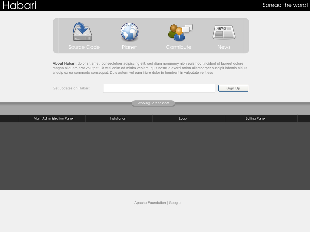
at the users. Don't you think "Download" will be more appropriate Than
"Source Code"
> 002-mockup.png
> 101KViewDownload

chrisjdavis
something up, yesterday. If this means a K2 look until this is done,
that is fine. Information is needed badly right now, not design
perfection.
So I am +1 on following this path design wise, but I am also +1
getting something up now.
> ...
>
> read more »

Brian Rose
On Feb 3, 6:59 am, "chrisjdavis" <chrisdmi...@gmail.com> wrote:
> This looks good to me as well. As I said before, we need to have
> something up, yesterday. If this means a K2 look until this is done,
> that is fine. Information is needed badly right now, not design
> perfection.
>
> So I am +1 on following this path design wise, but I am also +1
> getting something up now.
Getting something up quickly should be #1 priority for everyone
involved in this process. If someone has the time (I do on Sunday) to
chop up Khaled's design, it could work.
> > > 1. Brian's mockup:
> > > The first thing that I've got to say is it doesn't really follow the
> > > design ethos. There's a lot going on in the page. It does have some nice
> > > large chunky calls to action on the side. There's a lot of text there
> > > though. A lot less needs be said and that might be where images come
> > > through.
I appreciate the critique. I believe that the best way to get what we
ultimately want is to critique each others' designs on a foundational
level and approach each design choice from a number of different
perspectives. My mockup was intended to be a launching point to get
others to try something from a different approach and, quite honestly,
I didn't expect it to be all that well-received. I rather like what
you've put together compared to my mockup and will probably hold on to
my design for a theme idea down the line.
That said, there are a couple of things that I think need some
revision. Even if these things aren't considered right now for time's
sake, I think an evaluation would be a good idea later:
1. Button labels. "Source Code" sounds rather difficult to a lot of
potential users; "Download" is much clearer and less daunting.
"Planet" doesn't mean anything to a new user; "Community" might be a
better choice. "News" should be come first, as there will be more of
it at this stage than we may even anticipate currently.
2. Lack of information. Pictures (including screenshots) may be worth
a thousand words, but those words may not always be enough to explain
how different Habari is. If I wandered across this site via a link
from a friend's blog, I would have no idea where to start except to
dive right in and download something. Once I do that, what next?
A good example of how this kind of layout can be pulled off is
http://rubyonrails.org/ - they provide info on subpages to do what's
needed. The problem is that it's often not enough information for new
users, and it's difficult to figure out where to go next.
Regardless of these two things, I think a design needs to be fleshed
out in short order. I'll be more than happy to convert what you've
created to markup if everyone would like to see this a reality; if we
want info up ASAP, it may be in our best interest to start writing
copy for the various subpages before that is even finished.

vkaryl
points about new users are more than valid!
>
> 1. Button labels. "Source Code" sounds rather difficult to a lot of
> potential users; "Download" is much clearer and less daunting.
> "Planet" doesn't mean anything to a new user; "Community" might be a
> better choice. "News" should be come first, as there will be more of
> it at this stage than we may even anticipate currently.
>
+1 - even I hadn't a clue about "Planet"....

Michael Bishop
On Feb 3, 5:02 am, Khaled Abou Alfa <khaled.aboua...@gmail.com> wrote:
> 5. Mockups. When people come to an open source software site they
> generally want to see what the actual software looks like as it informs
> them how mature or not the project actually is and whether or not they
> can be bothered to contribute to it. They say never judge a book by it's
> cover, however I'm sorry to say that in the crowded world of blogging
> software it's important that the software has that edge. And we need to
> market every area to pull in as many new contributors as possible and
> build the community as much as possible. The screenshots are our cover
> and as such we should be highlighting these on the front page because
> they'll draw the user in.
>
Are you suggesting showing your mockups on installer/admin that have
yet to be implemented in the code? Or is this a "down-the-road"
feature of the home page? If the goal is to get something up *now*,
how would showing advanced ideas of what *might* be there helpful in
portraying the current state? Or are you suggesting using screenshots
of the current interface? Should the page also talk about what other
features *might* be in habari down the road, but arent'
> First of all I'll say that I never do this, critique other people's
> designs however it's important to illustrate where I feel these are
> going wrong in relation to the thoughts I've written above.
>
> Maybe I should create a document (or put it on the wiki) that sets out
> our design philosophy so that people can read that first before jumping
> in, I dunno we'll see).
>
Am I to understand then that your design philosophy is the bottom line
for habari? That it's written in stone?
> So lets look at the current designs on the table and how they fare (I
> think these are the latest versions of both):
>
> 1. This is the one done by Brian:http://habari.heimidal.net/mockup_with_content_new_3.png
>
> 2. While this one was done by Dean:http://dev.deanjrobinson.com/habari_design/habari_mockup1.png
>
> 1. Brian's mockup:
> The first thing that I've got to say is it doesn't really follow the
> design ethos. There's a lot going on in the page. It does have some nice
> large chunky calls to action on the side. There's a lot of text there
> though. A lot less needs be said and that might be where images come
> through.
How are images accessible? chrisjdavis has already mentioned that
buttons for fields should be default for accessibility. If all there
is on the home page are a bunch of cute icons, how does that help some
one with a disability visiting the site? I'm not one for not using
graphic images, but there should be concise text to go along with
that.
>
> The issue is that the download section is given one kind of treatment,
> the what is habari is given another importance, documentation is given
> yet another set of importance and so on (see number 4).
>
> It's also got information regarding the latest plugins and the latest
> theme. Maybe down the line but not now as we've only got like 1 theme
> and a handful of plugins. Is it really that important to put this
> information on the front page now? I don't think so.
How is that much different than your "planet" concept, other than you
are using a singular phrase that is ambiguous at best. News and
Planet really are one in the same to me.
>
> It's got the motto but not what the project is actually called right
> there at the top. There is space for it at the top left hand corner
> however.
>
> A green colour has been added to this. This instantly is giving the site
> a branding direction which we've gone around the mill on this. Colour
> will come eventually (this could be just in the icons or whatever)
> however we shouldn't really be putting ourselves being associated with
> specific colours at the moment since they're bound to change in the next
> few months anyway.
I highly doubt the average user visiting the site is going to
immediately associate the "product" with a color. No more so than
icons, IMO.
>
> There is no pictures of the mockups on there so the instant grab isn't
> actually there.
Again, are you suggesting showing mockups for something that hasn't
been implemented? They download the source, install, see an admin
totally different than the home page, think they've done something
wrong or worse.
I'm confused. You are basically knocking what's been put forth,
saying you've spent all of 30minutes on what you think is superior to
what's been put forth, and have no desire to further that design, and
once again aren't offering source files to allow others to build on
the design, or make it real code.
What really is the goal here? And how is using k2 in the interim not
"branding" habari right off the bat? Seeing k2 default on the page
would be no more harmful of using a green color, or a logo that might
not be there a month from now ,IMO
I am all for helping code up any one of the designs (Brian, I learned
I'm much better at .psd files than .ai but that's another discussion).
But it seems the goal is to get something up, even if it doesn't fit
ALL the criteria of any design ethos.
The design and content can be tweaked all along, just as the code is
being done on a daily basis. I disagree that the site has to be any
more polished the final product is at this point.
Michael B

Root
there is no page or link functionality?
chrisjdavis
Michael Bishop
On Feb 3, 5:52 pm, "chrisjdavis" <chrisdmi...@gmail.com> wrote:
> What exactly is 'link' functionality?
>
I assumed it meant "blogroll"/bookmarks functionality.
MB

Owen Winkler
>
> On Feb 3, 5:52 pm, "chrisjdavis" <chrisdmi...@gmail.com> wrote:
> > What exactly is 'link' functionality?
> >
> I assumed it meant "blogroll"/bookmarks functionality.
This is not a feature of Habari in our current milestone release.
Owen

Matthias Bauer
> But it seems the goal is to get something up, even if it doesn't fit
> ALL the criteria of any design ethos.
>
> The design and content can be tweaked all along, just as the code is
> being done on a daily basis. I disagree that the site has to be any
> more polished the final product is at this point.
I'd just like to say: That's how it is :)
Right now, we need a site, quickly. If it looks like the rest of Habari,
that's good, but it doesn't have to be perfect *now*.
-Matt
vkaryl
going is freshness. So throw something up now, then freshen it
(adding content of course as well!) in a week or so. Repeat as
needed....
Isn't the POINT right now to be "present"? So that those who run
across a mention of Habari while doing a search in google for
"blogging tools" or whatever have a landing strip? A site now
certainly does not have to be the site next week, or next month, or
next year....
V

Mumbles
http://habari.heimidal.net/habariproject.org/index.html looks good but
i think the bottom fotter bit needs to be darker
And i have always been jealous of Khaled's designs.
Next time i meet him im going to by him a drink and not the other way
round.