Table Screwiness
0 views
Skip to first unread message

khaled Abou Alfa
Aug 29, 2007, 6:05:13 PM8/29/07
to habar...@googlegroups.com
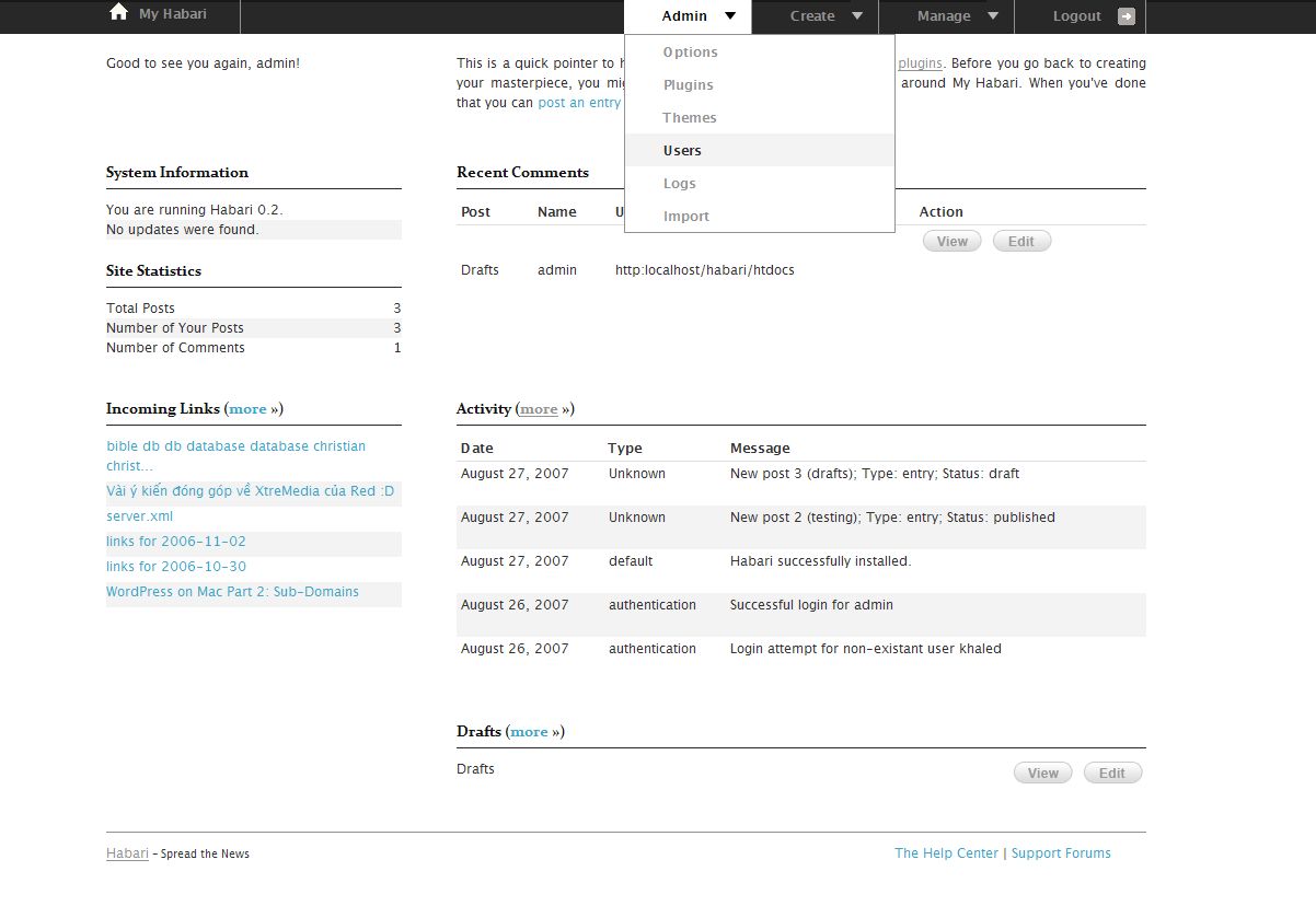
Ok not sure if this is something related to Firefox, Blueprint, Habari, or tables in general, but there seems to be some weirdness going on with the actual tables. Have a look at the latest trunk. There are two tables the recent comments and the recent activity. The recent comments tables screws up at the top with additional padding for some reason. The recent activity table screws up with additional padding on the bottom. No idea where this is coming as both should be 18px height as per the
typography.css file. I've attached a screenshot.

Michael Bishop
Aug 29, 2007, 8:07:01 PM8/29/07
to habari-dev
Could this be related to an issue reported with BluePrint
http://code.google.com/p/blueprintcss/issues/detail?id=2
> habari_svn_screen.jpg
> 121KViewDownload

Root
Aug 31, 2007, 5:28:58 AM8/31/07
to habari-dev
Khaled we should not be using px anyway. Period.
And drop down menus bring big accessibility problems.
And centered panels waste space.
And the graphic seems to be far larger than the real thing would be.
Not sure that is a good thing even for just reviewing graphics.
And drop down menus bring big accessibility problems.
And centered panels waste space.
And the graphic seems to be far larger than the real thing would be.
Not sure that is a good thing even for just reviewing graphics.
Root
Aug 31, 2007, 5:31:20 AM8/31/07
to habari-dev
khaled: how the heck can anyone advise on a CSS / html problem looking
at a graphic ?
at a graphic ?
> habari_svn_screen.jpg
> 121KViewDownload
khaled Abou Alfa
Aug 31, 2007, 6:10:53 AM8/31/07
to habar...@googlegroups.com
I disagree that drop down menus provide accesibility problems, otherwise we wouldn't have them on Facebook, in every application Google has and in Yahoo as well and well honestly the list goes one. The reasons behind the use of drop down menus has been covered previously and extensively.
As for the tables, the problem was the images within them that was causing the problem. This has been sorted out now in the latest SVN. These are now text links for now as there are several areas that we need to consider before any else.
Not sure what you're reffering to with regards to centered panels? Are you talking about the entire admin? My original thoughts were different about this, however a fluid design looks completely wack on larger screens which more and more people are buying. Yes we shouldn't be driving away people with smaller screens (especially mobile screens imo) but the majority of users (and there is loads of evidence online to support this) will be at least 1024 and above. This does of course open the debate to whether or not we go 800 wide and cater to everyone but we're not really pushing the boundaries of using the available space? Do we go for a standard 1024 and then we don't have the native support for 800 wide? Do we go for a fluid design and make anyone with a large screen feel that everything is over stretched?
My personnal perference and it's completely up for discussion nothing is ever set in stone is 1024 as a minium. I originally wanted to use the max-width attribute but alas IE doesn't support it.
Root
Aug 31, 2007, 6:46:32 AM8/31/07
to habari-dev
Khaled - I do not think it is going to be useful to anyone for me to
continue this dialogue with you;
along these lines.
continue this dialogue with you;
along these lines.
If I am in a position to offer up a better alternative I will do so.
But I am not getting into a slanging match. Not with you.
And not on something as important as this.
But I do not think the proces itself is the best way to go.
I am out of it.
Reply all
Reply to author
Forward
0 new messages