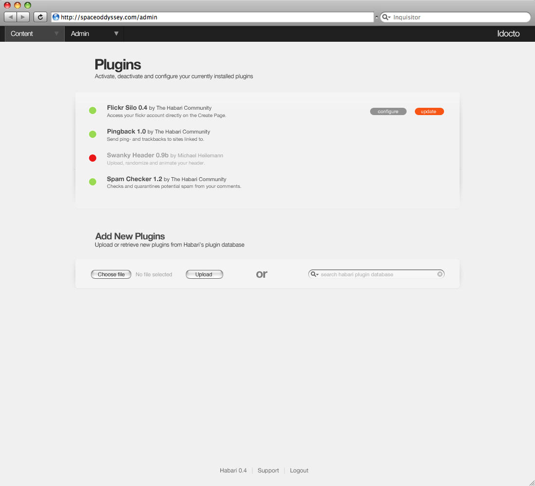
My Plugin Page Mockup #1

Michael Heilemann
not 100% on this, but since I've been going in circles in the last
hour, I figured it was time to just post it.
It should be self-explanatory. If it isn't, I didn't do my job
properly... damn. And in that case, you can go read the flickr notes
(http://www.flickr.com/photos/heilemann/2183367609/), which should
explain everything.
- Mike

Christian Mohn (h0bbel)
config options etc. are presented (eg. on one page that expands etc.),
BUT;
a) Where did the colors come from? Colors has not been discussed yet,
and given the track record of discussions on similar issues I don't
think we should stray much from the black/grey we use until now.
Colors is a completely new ballgame. ;-)
b) Where did the dropshadow come from? Thats not like anything else in
admin?
On Jan 10, 11:39 pm, "Michael Heilemann" <heilem...@gmail.com> wrote:
> Let me just attach the file here as well, for archival purposes.
>
>
>
>
> > I've tried doing a mockup of how I see the plugins page working. I'm
> > not 100% on this, but since I've been going in circles in the last
> > hour, I figured it was time to just post it.
>
> > It should be self-explanatory. If it isn't, I didn't do my job
> > properly... damn. And in that case, you can go read the flickr notes
> > (http://www.flickr.com/photos/heilemann/2183367609/), which should
> > explain everything.
>
> > - Mike
>
>
>
> 145KViewDownload
Michael Heilemann
a) Where did the colors come from? Colors has not been discussed yet,
and given the track record of discussions on similar issues I don't
think we should stray much from the black/grey we use until now.
Colors is a completely new ballgame. ;-)
b) Where did the dropshadow come from? Thats not like anything else in
admin?

Robin Adrianse
b) Where did the dropshadow come from? Thats not like anything else in
admin?As I see it, there is only one page currently 'fully' designed in the admin, namely the Create Page page. And because the Create Page consists mostly of form elements, it creates its own layout structure.The Plugins page on the other hand is mostly text, which, if left without guides, just ends up floating in mid-air. I tried a variety of approaches to tying the content down, and ended up with what you see.As I said, I'm not 100% on it yet. Especially because these new elements need to be able to carry themselves on other pages as well, which might not be the case.

Geoffrey Sneddon
This is the first mockup of the plugin page that I actually like.
First thing that jumps out at me is how low the contrast is between
the background and any disabled plugin, and the second is the broken
up drop-shadow, which should IMO come all the way down from the top
menu to the bottom of the options (so only the footer menu is outside
of it).
--
Geoffrey Sneddon
<http://gsnedders.com/>

Michael C. Harris
> a) Where did the colors come from? Colors has not been
> discussed yet, and given the track record of discussions on
> similar issues I don't think we should stray much from the
> black/grey we use until now. Colors is a completely new
> ballgame. ;-)
>
> Colors haven't been needed so far, which to my knowledge, is the only
> reason they haven't been touched upon.
> I'm still all in favor of keeping the admin largely monochrome, except
> when it comes to 'functional colors', which is what these are.
I'm colour blind, and while I can differentiate the green and red
here, I don't like colour-based UI elements like this. I don't look
for it and the meaning isn't obvious to me.
--
Michael C. Harris, School of CS&IT, RMIT University
http://twofishcreative.com/michael/blog

Khaled Abou Alfa
Michael Heilemann
I'm colour blind, and while I can differentiate the green and red
On Fri, Jan 11, 2008 at 08:11:46AM +0100, Michael Heilemann wrote:
> a) Where did the colors come from? Colors has not been
> discussed yet, and given the track record of discussions on
> similar issues I don't think we should stray much from the
> black/grey we use until now. Colors is a completely new
> ballgame. ;-)
>
> Colors haven't been needed so far, which to my knowledge, is the only
> reason they haven't been touched upon.
> I'm still all in favor of keeping the admin largely monochrome, except
> when it comes to 'functional colors', which is what these are.
here, I don't like colour-based UI elements like this. I don't look
for it and the meaning isn't obvious to me.

Peter Westwood
Hash: SHA1
Michael Heilemann wrote:
|
|
| On Jan 12, 2008 10:04 AM, Michael C. Harris <michael...@gmail.com
| <mailto:michael...@gmail.com>> wrote:
|
|
| On Fri, Jan 11, 2008 at 08:11:46AM +0100, Michael Heilemann wrote:
| > a) Where did the colors come from? Colors has not been
| > discussed yet, and given the track record of discussions on
| > similar issues I don't think we should stray much from the
| > black/grey we use until now. Colors is a completely new
| > ballgame. ;-)
| >
| > Colors haven't been needed so far, which to my knowledge, is
| the only
| > reason they haven't been touched upon.
| > I'm still all in favor of keeping the admin largely
| monochrome, except
| > when it comes to 'functional colors', which is what these are.
|
| I'm colour blind, and while I can differentiate the green and red
| here, I don't like colour-based UI elements like this. I don't look
| for it and the meaning isn't obvious to me.
|
|
| Well correct me if I'm wrong, but isn't green universal for 'go' and red
| 'no go'? I'm trying to figure out what it is that isn't obvious about
| the colors as such?
|
It is yes. However, red-green colour blindness affects about 10% of the
male population [1]. Therefore using red and green to discern something
on a UI that it placed in the same position is a bad idea.
Icons or separate indicators traffic light style are probably more
appropriate.
[1] http://en.wikipedia.org/wiki/Color_blindness#Prevalence
westi
- --
Peter Westwood
http://blog.ftwr.co.uk | http://westi.wordpress.com
~ C53C F8FC 8796 8508 88D6 C950 54F4 5DCD A834 01C5
-----BEGIN PGP SIGNATURE-----
Version: GnuPG v1.4.7 (MingW32)
Comment: Using GnuPG with Mozilla - http://enigmail.mozdev.org
iD8DBQFHiKjjVPRdzag0AcURAtOLAKCYz0xGxZ+6V5Uu2GRvJyi+mDyCYQCdHqTb
Sj9TGoSojbeK5+FUmmnipNc=
=Ra5V
-----END PGP SIGNATURE-----
Michael Heilemann
It is yes. However, red-green colour blindness affects about 10% of themale population [1]. Therefore using red and green to discern something
on a UI that it placed in the same position is a bad idea.
Michael Heilemann
I do like the drop shadow idea, but I'm not so keen on it's implementation here. I know what you're doing however the slight effect kinda starts adding elements to the page that i don't see as necessary in this context, maybe use it as a separator between a sidebar?
The thing is, and it might be just me, I don't feel that the way this page is presented, it fits within the feel that has been established on the create page. I'm not very keen on the huge amount of wasted space in the middle between the title of the plugin (and description) and the actions to those plugins. Also I'm not very keen on how wide the bottom section is with the addition of the search function to the right of the plugin addition function.
I like the colour indicators (although not the colours chosen) to tell the different plugin states, however I do think we should have the drop down page filter integrated in there.
Final point, is how these design principals that are shown here get integrated into the rest of the pages (as you've mentioned). I was thinking about this yesterday and i think we should have an asset toolbox of elements that we should use in the admin panel to create that integration between the pages, and so that any additional pages we create or are created have a set of rules which they can adhere to?

Rich Bowen
I like that you can choose files and add them from within the interface. I'm not sure how that would work to be honest but the only way I can think of is how Tiddlywiki for example deals with themes. They're downloaded directly from the theme author's link and are installed accordingly. i don't know if this is possible for us but that would be pretty damn cool function. I also like the placement of this additional functionality at the bottom of the page.
Michael Heilemann
Having the ability for one server to HTTP GET a file from another server and do something magical with it is potentially very dangerous. I'm sure that we're all aware of that, but it's worth stating explicitly, and being sure that
Michael C. Harris
I'm not talking about what's universally accepted, I'm talking about
how I personally interact with a UI (and with colour in general). A UI
should be as intuitive as possible (leaving aside recent arguments
elsewhere regarding the meaning of intuitive). You're making the
assumption that green == active through go is intuitive, and to me it
isn't.
I mention my colour blindness because that's likely the reason I don't
relate to colour-based UI elements in the way that you expect. Of
course I worked it out, and I'd be fine with it now, but because of
the extra cognitive effort that I have to make with colour-based UI
elements, my initial reaction was negative.
cheers, Michael

Ali B.
-- Eleanor Roosevelt