More Admin Edit mockups

Khaled Abou Alfa
said before, icons for home and log out are only there temporarily. The
orange is only there when you hover over it's black under normal
circumstances.
Added a bit of branding (although I'm going to have a more serious look
at the logo tonight sometime.
Khaled

chrisjdavis
from Mike's comp, but at with the dimensions and missing items(like the
logout bit) from yours.
Chris
> --=-gzgwV18Q3nkMmYVA09cF
> Content-Type: image/png
> Content-Transfer-Encoding: base64
> Content-Disposition: inline;
> filename="005-publish_attach.png"
> X-Google-AttachSize: 115746

khaled Abou Alfa

Michael Bishop
On Jan 21, 7:59 am, Khaled Abou Alfa <khaled.aboua...@gmail.com> wrote:
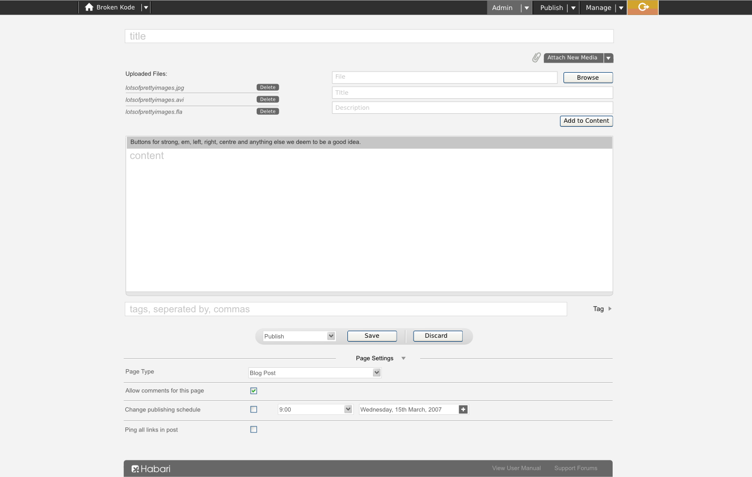
> I've tweaked some stuff further in line with discussions etc. Like I've
> said before, icons for home and log out are only there temporarily. The
> orange is only there when you hover over it's black under normal
> circumstances.
>
I know it's a point of contention, but is the media manager section
capable of being hidden as well?
MB
broke...@gmail.com
------------------

k0ma
isn't bad either. I'm not really digging the orange on the logout
button, though.

Steven Campbell
1. The footer is excellent. I especially like the logo down there.
Haven't seen that one before, but it certainly is my favorite.
2. The color of the logout button.
3. Just the general look of pretty much everything.
The bad:
1. The interruption of the title and the content by the media uploader.
Perhaps the upload can be hidden with a click, like tags and page
settings?
2. The buttons - save, discard, browse, add to content. They should be
replaced with images or changed color because they don't fit with the
rest of the scheme.
3. The navigation goes outside of the post boundaries. It should be the
same width as the footer - it doesn't look natural going outside.
Otherwise, great job Khaled.
khaled Abou Alfa
The good:
1. The footer is excellent. I especially like the logo down there.
Haven't seen that one before, but it certainly is my favorite.
2. The color of the logout button.
3. Just the general look of pretty much everything.
The bad:
1. The interruption of the title and the content by the media uploader.
Perhaps the upload can be hidden with a click, like tags and page
settings?
The media uploader is when you actually want to upload things. check out previous mockups where this area is completely hidden. You can change where you would like to upload media from with the use of the arrow drop down menu (flickr, zooomr etc) so that's all pretty well hidden until you want it.
2. The buttons - save, discard, browse, add to content. They should be
replaced with images or changed color because they don't fit with the
rest of the scheme.
My inclination is to leave the action buttons are they are. Let the OS deal with the buttons. It makes more sense for people that are using the software.
3. The navigation goes outside of the post boundaries. It should be the
same width as the footer - it doesn't look natural going outside.
Well, that's a point, I kinda like the fact that the nav stretches out completely, while the central area has got a max width (and before anyone says anything, yes it can be done for IE6 and IE7 so move on). I'm just looking at the alternatives, even had an option for the rounded corner style (as per the bottom bar) for the top bar as well, but I think having a power bar right at the top makes a lot more sense visually.
Otherwise, great job Khaled.

Matthew
> with the buttons. It makes more sense for people that are using the
> software.
I couldnt agree more.

Root
the habari user going to be?
And what is the coding standard vis a vis javascript and conditional
CSS in the admin panel. Can it be done your way? Yes.
Is it a good thing?
chrisjdavis
khaled Abou Alfa wrote:
> I'll do that and send it through (with the shelf as well?)
>
No, you can leave the shelf out. I am not convinced that it ISN"T a
good idea to have one yet; I need to ruminate on that a bit more.

Mr. Awesome
> What is the minimum browser spec for the habari user going to be?
min-width:1000px; to be: min-width:775px;
It's no big deal though. ;) :)
--
spencerp
http://spencerp.net
k0ma
yet functional. Everything is where I'd expect it to be. Very
intuitive, without any superfluous elements.
I wish I had more to say but I really can't find any faults.
Root
recognised by IE 6.