Website mockups v3

Khaled Abou Alfa
columns. It wouldn't be how I would approach this however obviously
everyone else feels differently.
However if we're going to have the columns then let's get the basics
down guys.
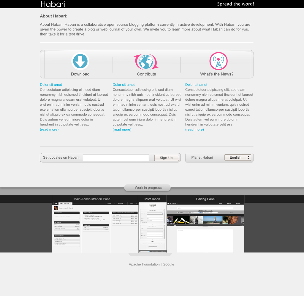
So how have I tweaked this up:
1. A proper grid that ties things together. 15px border and 15px
inbetween. The nav bar at the top follows a slightly tweaked grid in so
much that for design implementation they've got the additional 15px as
part of the bar.
2. Tie it up to the current mockups and where we're going with the
design overall. Using the SAME shades of grey and the 'same widgets',
specifically talking about the gallery button and the borders around the
newsletter and language change.
3. Icon colours. The good news is that Yoram is sorting out the icons as
we speak so we should have some really funky things going on there. For
all those that are in the dark, it's the designer that came forward
wanting to help a few weeks ago (here's his site,
http://bureaublumenberg.net/ nuff said). Until that happens, these icons
basically keep things simple, give the site some much needed colour
while at the same time not overpowering the entire page and pulling the
whole thing in all directions.
4. Mockups at the bottom. My view on this is as follows. If we don't
include the work we're currently working on then we'll be missing a
massive trick. That's what we're aiming for, and to a certain extent we
have at the moment. Is it false advertising? I dunno are we selling
anything? We don't have a release so those that are looking at this know
what to expect when we eventually release something. The reason it's
important to get these on there right now because to be fair it's the
most visual and easy to convey aspect of the project. It's what will
draw the casual guy in to actually stop sitting on the fence and
contribute.
5. Typography. Chris you mentioned that you don't want something small
and hard to read. THat's cool, but the chosen font here is 12pt, which
to be honest is an entirely readable size of font any which way you cut
it. However to improve legibility I've increased the spacing and that
does add some more clarity. In addition to that the colour contrast
between the two has been upped a bit.
Saying it's all about the community and it's new and all is great, but
so is like 90% of the other blogging platforms out there.
In addition to that it's clearly indicated that it's all work in
progress and as of yesterday Owen had implemented the beginning of the
installer. So it's definitely NOT false advertising.
Khaled
www.brokenkode.com

Michael Heilemann
The three columns of text need to correspond to the three columns as marked by the lines in the icon area. Currently the two columns on the outside 'spill' their text out past what seems like the natural boundary.
Showing off mockups as what's being worked on can be dangerous. So many people have their ass wound up too tight and are just looking for ways to take potshots at anything and everything. One thing is having discussion about this on the dev list, another is wearing it as a shirt.
And another thing is the feeling that arises if some great mockup is presented, and then it doesn't happen for a long time. I've done this with K2, and I personally feel like I'm betraying people by promising them something I haven't yet delivered.
Luckily they are a patient bunch ;)
I'd much rather see a dev blog where people post small 'today I did this, it is good because so and so'. Doesn't have to be anything major; just small tidbits of 'hey, did you know that if you want to do this, all you have to do is this and this'. That would incidentally also be one of the things I think WP does very poorly. They never talk about how things work down inside their engine. You want to know? Grab a hammer and see how it breaks...
Who knows how much better a lot of plugins could be, if only those people knew some of the thinking behind the architecture?
- Mike

Brian Rose
>
> 1. A proper grid that ties things together. 15px border and 15px
> inbetween. The nav bar at the top follows a slightly tweaked grid in so
> much that for design implementation they've got the additional 15px as
> part of the bar.
>
> 2. Tie it up to the current mockups and where we're going with the
> design overall. Using the SAME shades of grey and the 'same widgets',
> specifically talking about the gallery button and the borders around the
> newsletter and language change.
While nice, I think it's extremely dull. I vastly prefer the way one
of my more recent mockups turned out over the gray we've all been
using thus far:
http://habari.heimidal.net/mockup_less_dismal.png
I intend to turn this into a three-column layout, dropping "Planet".
If we want to use different icons, that's fine - I just need an a few
opinions on direction.
> 3. Icon colours. The good news is that Yoram is sorting out the icons as
> we speak so we should have some really funky things going on there. For
> all those that are in the dark, it's the designer that came forward
> wanting to help a few weeks ago (here's his site,http://bureaublumenberg.net/nuff said). Until that happens, these icons
> basically keep things simple, give the site some much needed colour
> while at the same time not overpowering the entire page and pulling the
> whole thing in all directions.
I think the pink is far more overpowering than the icons in the last
set of mockups. These hold all of the weight on the page, and my eye
is immediately drawn to a broadcast tower. I also think that, with
action verbs such as "Download" and "Contribute", "What's the News?"
should read "Learn" or "Communicate".
> 4. Mockups at the bottom. My view on this is as follows. If we don't
> include the work we're currently working on then we'll be missing a
> massive trick. That's what we're aiming for, and to a certain extent we
> have at the moment. Is it false advertising? I dunno are we selling
> anything? We don't have a release so those that are looking at this know
> what to expect when we eventually release something. The reason it's
> important to get these on there right now because to be fair it's the
> most visual and easy to convey aspect of the project. It's what will
> draw the casual guy in to actually stop sitting on the fence and
> contribute.
Once again, I disagree. Habari is not yet in a state where the
software can speak for itself. Mockups should exist on the Contribute
page or in a News post.
>
> 5. Typography. Chris you mentioned that you don't want something small
> and hard to read. THat's cool, but the chosen font here is 12pt, which
> to be honest is an entirely readable size of font any which way you cut
> it. However to improve legibility I've increased the spacing and that
> does add some more clarity. In addition to that the colour contrast
> between the two has been upped a bit.
Agreed.
>
> Saying it's all about the community and it's new and all is great, but
> so is like 90% of the other blogging platforms out there.
There's one big difference: software is actually being written. A
download will be available soon. Habari has moved past the conceptual
stage and is already getting recognition. If we explain our goals _as
a community_, people will understand how Habari is different from
WordPress.
> In addition to that it's clearly indicated that it's all work in
> progress and as of yesterday Owen had implemented the beginning of the
> installer. So it's definitely NOT false advertising.
No one said it was, but it's also not a finished product.

Root
Brian Rose wrote:
> > So how have I tweaked this up:
> > 5. Typography. Chris you mentioned that you don't want something small
> > and hard to read. THat's cool, but the chosen font here is 12pt, which
> > to be honest is an entirely readable size of font any which way you cut
> > it. However to improve legibility I've increased the spacing and that
> > does add some more clarity. In addition to that the colour contrast
> > between the two has been upped a bit.
>
Fonts and all things therein are part of the transitional process
between the vision graphic and working code. IMHO it is silly to talk
about font size outside of the code.
Pt is used in graphic design. Px is not used in web design - least not
by many folks.
A proper font schemata is simple to implement. In the meantime every
one can just relax. Fonts are going to be fine. For everybody.
Robin Adrianse
by many folks.
Root

vkaryl
On Feb 6, 2:55 pm, "Root" <atthe...@gmail.com> wrote:
> I can only repeat my earlier reply. Px are not used here at all.
>
> Robin Adrianse wrote:
> > Pt is used in graphic design. Px is not used in web design - least not
> > by many folks.
>
> > Uh.... what? Pixels are commonplace in web design... though em's are more
> > accessible.
>

BlueSaze
I think there needs to be more white spacing between the columns.

Karthik
On Feb 7, 12:48 pm, "BlueSaze" <blues...@gmail.com> wrote:
> ++1 I don't think its dull I like it....its clean and minimal. Though
> I think there needs to be more white spacing between the columns.
btw i think a touch of pink on the download icon will do good too..
Nichod
"Khaled" influenced;)
Suggestions:
If the "Work in progress" area is to be retained it should not be
shifted so far down from the rest of the content. Personally I'd move
the Work in progress front and center. But this should only happen
once its more official and implemented. It would fit nicely into the
"About" area.