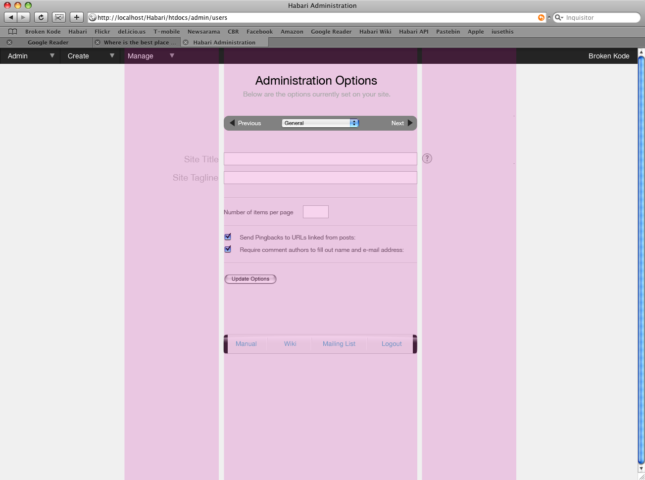
Administration Options mockups v4

Khaled Abou Alfa
I'm going to break the mails into smaller bite size chunks therefore
concentrating the discussions hopefully. So as a proposed solution to
the options page, it's similar to the filter methods in the plugin
page, however in this case we can have any number of pulldown options
you can think of, all located in any which way you want. We can try
and define them and then let plugin developers fit their options
within preset options or add a new one. The inspiration for his
actually was when Michael mentioned the hundreds of options that could
be available. The only programme I know well enough to know that
they've got serious problems with options, and yet it all works for me
is photoshop. So under preferences you've got 10 main headings and
each has a collection of options. That's the methodology I'm thinking
we can adopt here. In addition we've also got the next and previous
links on either side which should help with additional queue for
people to go through the various option sub-pages. Obviously we still
need to consider what the default option sub-pages will be but this
solution should hopefully be a decent solution for the issues/problems
that have been mentioned with regards to the previous solutions.
I've also updated the footer to have the black sides, because I
actually quiet liked that from bishop's mockup. I did check the option
of having the top and bottom elements being smaller, but that really
did look odd, which is why those elements are a similar size
throughout the actual page.
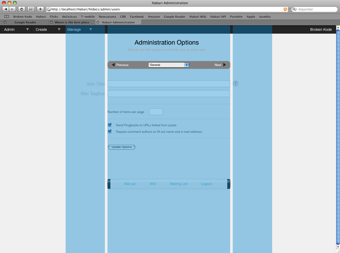
Finally I've included a slightly wider version. Now from my point of
view the narrower option is just a tighter solution. It's not narrow
as much as it is essentially the correct size. The wider option (which
isn't that much wider I must add) just looks overflowing and does look
odd.

Scott Merrill
> Finally I've included a slightly wider version. Now from my point of
> view the narrower option is just a tighter solution. It's not narrow
> as much as it is essentially the correct size. The wider option (which
> isn't that much wider I must add) just looks overflowing and does look
> odd.
The wider version is, to my eyes, only trivially wider. It provides
no benefit or drawback compared to the narrow version.
I'm not sure I like the drop-down control for option selections. I
still think a single Options page with expandable sections would be
nice to see.

Ali B.
Okay peeps,
I'm going to break the mails into smaller bite size chunks therefore
concentrating the discussions hopefully. So as a proposed solution to
the options page, it's similar to the filter methods in the plugin
page, however in this case we can have any number of pulldown options
you can think of, all located in any which way you want. We can try
and define them and then let plugin developers fit their options
within preset options or add a new one. The inspiration for his
actually was when Michael mentioned the hundreds of options that could
be available. The only programme I know well enough to know that
they've got serious problems with options, and yet it all works for me
is photoshop. So under preferences you've got 10 main headings and
each has a collection of options. That's the methodology I'm thinking
we can adopt here. In addition we've also got the next and previous
links on either side which should help with additional queue for
people to go through the various option sub-pages. Obviously we still
need to consider what the default option sub-pages will be but this
solution should hopefully be a decent solution for the issues/problems
that have been mentioned with regards to the previous solutions.
I was kinda in favor of the tabs for the main pref headings. But I can see that it would be very cluttered (if even implementable) if the number of the headings extends to more than 5. Which would eventually lead to having sub-headings, for which I am in no favor.
Still a + for trying out the expandable list as Scott suggested for comparison.
I've also updated the footer to have the black sides, because I
actually quiet liked that from bishop's mockup. I did check the option
of having the top and bottom elements being smaller, but that really
did look odd, which is why those elements are a similar size
throughout the actual page.
Great job as well for this one. You made it more outstanding while still blending in. I wouldn't change have any second thoughts about this one.
--
Ali B.

Owen Winkler
something for us to see. I personally appreciate it, and the community
is definitely better off as a result of your work.
Let me first capture some things that I do like in the latest set of
mockups.
I like the page heading and subheading. Overlooked when we're aiming at
everything else, I think these succinctly say what we're trying to do.
Also, I like the way that we're defining a narrower column in these
pages. I agree that we should not use the entire page width for a textbox.
Still, I like your wider sample better, not just for aesthetic reasons,
but because of the additional room it provides for more complicated
controls underneath.
Please remember that although our built-in form system only currently
supports a limited number of controls, these controls should eventually
include things like a fancier javascript-based grid for freeform
key-value pair entries. Complex controls may need the room.
The overall objective of this page is to let the user edit the option
they want as quickly as possible. We perceive that this page will have
many options on it, and so organizing them feels important.
Unfortunately, I must admit that I'm not fond of the dropdown or
next/previous links for this purpose. It doesn't feel as quick as it
should. Whether ajax is used or not, it'll still feel like a page load
moving from group to group.
As skippy suggested in his email, I think I would like to see an options
page that has all options tucked into sections that expand.
An idea that may have slipped through previous messages is to include an
"Options Search" in the place where the dropdown appears in these mockups.
If all option sections are shown on the page, it should be possible to
show only those option sections that match keywords typed into this field.
So for example, if you are looking for options to control your photo
uploads, you might type "photo". If the word "photo" appears in the
options section for the Flickr silo, then that section would remain on
the page while others were vanished. By including text for the "help"
links along with the control labels, appropriate keywords will be
present in each section.
Upon completing the search, the sections could be expanded, allowing
direct view of the options most likely to be of concern.
By including a search, finding the correct options becomes trivial. It
will not matter if you know which section contains the options you are
looking for. If you do know the section, open it -- the interface works
as-is.
Anyway, that's my great idea and now I'm spent. Do with that what you
will. That said, I think we should reach some conclusion to this soon.
We're rounding the corner for 0.4, and it would be nice if we had all
of this figured out and implemented before 0.5.
Owen

Michael Bishop
classified, and how they will be filtered based on user. If all
plugin options will be simply classified under "plugins", themes under
something like "presentation", then why not leave them on their
corresponding page, and simply hide the deactivate/activate button
based on permissions? In some ways, that might be beneficial in that
someone with access to edit options, but not deactivate the plugins,
can at least see what plugins are deployed on the site. I can't
imagine a scenario where an admin would grant that kind of permission,
but not want them to see what's being used. They'd be able to view
the version, if an update is available, and visit the author's site to
get more info/help if they have a question about the configurations
they have access to.
Likewise, if plugins will have the option to set some required level
to be accessible, that could be used on the plugin page as well,
simply hidden like the activate/deactivate button, vs having it
filtered out on a master options page.
To be clear, when I say classified, I mean what determines what goes
in what "expandable section", and what will these sections will be
called? Granted having a search feature would eliminate some issues,
but if a plugin author thinks their plugin is classified as foo, but I
intuitively think it should be bar, I might not know where to look.
If it's on the plugin page, I'll know exactly where it is. Or are you
guys saying "expandable section" simply means that specific option,
thus they are all listed on the page, with no top level
classification? And if that's the case, I could still see a very long
page, even with each section's specific configuration options closed.
I really want to jump on the one page for all options wagon, but I
just don't understand how they will be organized in a way that's
logical and clean.
~miklb

Michael Heilemann
I am hitting a wall grasping the concepts of how these options will be
classified, and how they will be filtered based on user. If all
plugin options will be simply classified under "plugins", themes under
something like "presentation", then why not leave them on their
corresponding page, and simply hide the deactivate/activate button
based on permissions? In some ways, that might be beneficial in that
khaled Abou Alfa
Now the thing is I believe that both parties have good points forward, however we're just going around in circles right now. It's not that we're making a rash decision mind, we've been discussing this for many many emails and several IRC conversations I'm sure.
To summarise the two options are:
Option 1.
The site administration (which are presented via the core options, plugin options and theme options) are provided in a single page under the Options page. These will either be subdivided or grouped in a 'logical' order. This order is going to be iterative to be sure and one that will no doubt be something that is trail and error more than anything, as it's dealing with external plugin authors as well. For example we might have a Feeds subcategory, which includes all the feeds elements, what information is provided in the feed say, full post or summary? A plugin could then add to this subcategory the option of providing say a copyright notice at the bottom.
If a plugin author decides to put the options under a specific heading that the users find counter intuitive, then it's a matter of discussing it with the plugin author for future iterations or changing the code slightly if they're really adamant about this.
Some plugin developers might ask that they have a separate subcategory and again the system should be flexible enough to provide them with this (both in code and from a design POV).
The final breakdown would need to be discussed by all involved to come up with a streamline yet comprehensive list.
Option 2:
Leave all core options within the Options page. All plugin options to be kept inline in the plugin page, theme options within the theme page. This would then allow the end user to go to these individual areas to modify the options/configurations of the plugin/theme involved. The final design of the options page would be sufficient enough to allow for the actual plugin developer or whatever to house all of their options comfortably, without compromising the page by making it very long.
The thing is I honestly don't know what we need to do in order to come to that decision. Do we continue to discuss and try and achieve a happy middle? Should we take a vote on this? Should we leave it and come back to it after we've all thought about it a little bit more?
Owen Winkler
> I think we should take a step back and consider the way forward as we
> have two distinct camps of thought here.
Ok, but let me rephrase this first set of options since they make some
assumptions as written that we should not make.
Choice 1 - Options for each discrete component appear on their component
pages.
Options for a specific plugin appear on the plugin list. Options for
the theme appear somewhere near the theme selection. Options for core
appear on a dedicated core options page.
Choice 2 - All options appear in a single place.
A single Options page displays options for every component -- plugin,
theme, core.
Please ignore for the time being anything having to do with organizing
options on their respective pages for either choice.
There are considerations to take into account when making a choice
between these two. First, when a user looks for an option, where will
they instinctively look in the admin? Second, will security
implications interfere with the access of options? Third, what is the
most efficient way to allow admins to find and change a setting - get in
and get out?
What comes next is my opinion on the above.
When a user (admin or not, but particularly users who cannot install
plugins or themes but have the ability to set their options) looks for
an option, I believe that they will not instinctively know whether the
setting they are looking for is something provided by a plugin or theme.
Given a choice of menu options, I think they will certainly choose
one that says "Options" over one that says "Plugins".
As a result, they would end up hunting for the correct options page if
we chose Choice 1. This is inefficient, and since efficiency is a goal,
it's also ineffectual design. Even if they did know they were looking
for a plugin option, they would be able to find the option on the
combined full list of available options.
If people are looking for plugin options, and the options are all on the
options page, then they would never go to the plugin activation page to
look for options. Even if they did, it should be trivial to include a
link there to the options page to remind them where the options are.
And if we're really fancy, we could link directly to the individual
plugin options. But they're probably not going to make this mistake
more than once.
If someone has some logic to dispute the above, that's what would
convince me to change my mind. So far, I'm unconvinced.
Can we decide on this one thing before we move to the next issue, which
is how to disclose the options?
People have been talking a lot about grouping things, and there is
currently no way in the code to group anything. We can surely add
stuff, but before we do, we should decide what the best way is so that
we're not making coding changes to accommodate functionality we're not
going to use. Whatever we decide, it's likely to change the
architecture of plugin UI radically. I am not opposed to this (what
we're doing right now is not perfect), but I don't want to do it twice.
So yes, can we please come to consensus on this one thing before moving
on to the next?
Owen
Scott Merrill
> plugins or themes but have the ability to set their options) looks for
> an option, I believe that they will not instinctively know whether the
> setting they are looking for is something provided by a plugin or theme.
> Given a choice of menu options, I think they will certainly choose
> one that says "Options" over one that says "Plugins".
> Can we decide on this one thing before we move to the next issue, which
> is how to disclose the options?
+1 for an "all Options, regardless of origin, on a single page".

Doug Stewart
-1 from me. It breaks the traditional computer interface that most
folks are comfortable, IMNSHO. I don't go to a single screen on my
Mac to configure every single piece of software I've installed (which
is a bit of how I view plugins -- discrete pieces of code and/or
software packages that I install to increase my productivity and
functionality), I configure each in its own preferences menu (or, for
some items in a System Preferences pane).
By moving to a one-size-fits-all/lump sum model, you're losing the
interactivity advantages afforded to those that leverage these
traditional computer interface schemes.
The idea is to design top-flight blogging software, not bust interface
paradigms.
Just my $.02.
--
-Doug
Owen Winkler
>
> -1 from me. It breaks the traditional computer interface that most
> folks are comfortable, IMNSHO. I don't go to a single screen on my
> Mac to configure every single piece of software I've installed (which
> is a bit of how I view plugins -- discrete pieces of code and/or
> software packages that I install to increase my productivity and
> functionality), I configure each in its own preferences menu (or, for
> some items in a System Preferences pane).
There is a great deal of difference between being accustomed to poor
interface design and actually having a good interface. I'd rather
Habari users became comfortable with finding their options all under a
single navigation item.
Still, I think it is inappropriate to characterize plugins as separate
applications. Plugins extend Habari. Applications do not extend the
operating system.
In that case, consider what does extends the operating system. In both
OSX and Windows there is a single control panel that houses all
configuration options for the operating system. When new options are
available (at least in Windows) they are revealed in the control panel.
If I remember correctly, the options in OSX even stay within the same
control panel window until you click some kind of "back" button.
> By moving to a one-size-fits-all/lump sum model, you're losing the
> interactivity advantages afforded to those that leverage these
> traditional computer interface schemes.
I think it's possible to put those interactive controls into what I've
described. I also am not aware of any implicit advantages over a
proposed alternative.
Owen
Michael Heilemann
Doug Stewart
>
> There is a great deal of difference between being accustomed to poor
> interface design and actually having a good interface. I'd rather
> Habari users became comfortable with finding their options all under a
> single navigation item.
>
I don't disagree. What I do know is that average users are very
quickly frustrated with having to learn new interfaces. If a piece of
software has an interface that is familiar and/or a direct analog to
something they're already comfortable with, you will retain the users.
If they have to go hunting to find what they're looking for (read:
MT3.x interface), you'll frustrate and lose users' interest.
> Still, I think it is inappropriate to characterize plugins as separate
> applications. Plugins extend Habari. Applications do not extend the
> operating system.
>
> In that case, consider what does extends the operating system. In both
> OSX and Windows there is a single control panel that houses all
> configuration options for the operating system. When new options are
> available (at least in Windows) they are revealed in the control panel.
> If I remember correctly, the options in OSX even stay within the same
> control panel window until you click some kind of "back" button.
>
This is incorrect. All system-level options are contained in the
System Preferences application. Applications that want to put options
on the main Syspref pane end up on the bottom, ala
http://img.skitch.com/20080108-g2ye56efuhs1125td8y4sqh4mk.jpg
Clicking on the preferences icon takes you to a sub-pane, ala
http://img.skitch.com/20080108-be1mycxfnn1x389dwhtci7jwhy.jpg
> I think it's possible to put those interactive controls into what I've
> described. I also am not aware of any implicit advantages over a
> proposed alternative.
>
Throwing all the options into a single page is clutter. Imagine if
your XP Control Panel was one GIANT screen with your network, graphics
card, firewall, installed software, group policy settings, etc. all
listed on a single pane. Interface nightmare, IMHO.
--
-Doug
Owen Winkler
> I don't disagree. What I do know is that average users are very
> quickly frustrated with having to learn new interfaces. If a piece of
> software has an interface that is familiar and/or a direct analog to
> something they're already comfortable with, you will retain the users.
> If they have to go hunting to find what they're looking for (read:
> MT3.x interface), you'll frustrate and lose users' interest.
It's interesting that users will be frustrated having to learn new
interfaces, but making it like Movable Type will frustrate them too.
What ever will we do???
If there is no analog to our software with an acceptable UI, then I
think we're perfectly within our rights to build something in which
options are easy to locate.
>> Still, I think it is inappropriate to characterize plugins as separate
>> applications. Plugins extend Habari. Applications do not extend the
>> operating system.
>>
>> In that case, consider what does extends the operating system. In both
>> OSX and Windows there is a single control panel that houses all
>> configuration options for the operating system. When new options are
>> available (at least in Windows) they are revealed in the control panel.
>> If I remember correctly, the options in OSX even stay within the same
>> control panel window until you click some kind of "back" button.
>>
>
> This is incorrect. All system-level options are contained in the
> System Preferences application. Applications that want to put options
> on the main Syspref pane end up on the bottom, ala
Yeah, all of the options are in the same System Preferences application.
> Clicking on the preferences icon takes you to a sub-pane, ala
Right, with the little back and "Show All" buttons at the top.
The salient point here being that you don't go hunting in a Hardware or
Audio area for the options pertaining to your sound card. Or even if
those sections are separated out, those areas are all contained in a
single place.
It's like when 3COM cards come with that extra little application. I'm
left wondering why they couldn't have created a stinking Control Panel
applet like every other proper network card, so that I'd be able to
configure it in the same place as everything else.
> Throwing all the options into a single page is clutter. Imagine if
> your XP Control Panel was one GIANT screen with your network, graphics
> card, firewall, installed software, group policy settings, etc. all
> listed on a single pane. Interface nightmare, IMHO.
I think maybe you're skipping ahead in the discussion. We're only
answering the question of whether principal plugin options should be on
the plugin activation page or on a shared options page with theme and
core options. We're specifically not discussing what that page looks
like. There's no point in that until the first decision is made.
Besides, one could easily make the argument that options would be
identically cluttered if plugin options (of which the bulk of options
will be anyway) were all on the plugin activation page, or that there is
a way (say, make it look like the System Preferences page in OSX) to
organize options on a single Options page that makes it all work.
Owen
Scott Merrill
> System Preferences application. Applications that want to put options
> on the main Syspref pane end up on the bottom, ala
>
> http://img.skitch.com/20080108-g2ye56efuhs1125td8y4sqh4mk.jpg
>
> Clicking on the preferences icon takes you to a sub-pane, ala
>
> http://img.skitch.com/20080108-be1mycxfnn1x389dwhtci7jwhy.jpg
Aside from the fact that clicking an option opens a new window, this
is largely how I'd like to see Habari operate. Groups of related
controls would be lumped together under a heading somewhere, allowing
an operator to drill down to those sets of options they want to
manipulate.
> Throwing all the options into a single page is clutter. Imagine if
> your XP Control Panel was one GIANT screen with your network, graphics
> card, firewall, installed software, group policy settings, etc. all
> listed on a single pane. Interface nightmare, IMHO.
If all the options were in a single list, without categorization or
hierarchy or navigation, I would agree with you.
But I think a hierarchical view -- headings and sub-headings -- that
can be expanded or collapsed would be a pretty good way to minimize
the amount of time an operator spends clicking about when they install
and / or reconfigure their site.
Thinking back to my WP days, I had a fair number of pluins installed,
many of which inserted their own menus. Once I had the settings
running the way I wanted, I didn't have to go back to twiddle them.
Sticking with the OSX metaphor: how often do you open up the
"Displays" item, or the "International" once you have things set the
way you like? Now, how is that different from a collapsed-by-default
set of options in a Habari Options list somewhere? You're not
changing them, so they wouldn't be displayed -- they'd be tucked
inside the "My Cool Plugin" heading, which could be expanded if you
decided to change those settings.
Cheers,
Scott
Doug Stewart
> > I don't disagree. What I do know is that average users are very
> > quickly frustrated with having to learn new interfaces. If a piece of
> > software has an interface that is familiar and/or a direct analog to
> > something they're already comfortable with, you will retain the users.
> > If they have to go hunting to find what they're looking for (read:
> > MT3.x interface), you'll frustrate and lose users' interest.
>
> It's interesting that users will be frustrated having to learn new
> interfaces, but making it like Movable Type will frustrate them too.
> What ever will we do???
>
You just pegged my Sarcasm Geiger. *grin*
The MT discussion from earlier was based upon MT4.x. I can whip up
some screenies from a test MT3.x install that I have to illustrate
just how confusing it used to be. MT4 is light years better than it
was, but it is far from perfect in an overall sense. I was previously
advocating specifically for the way in which they model plugin
options.
> If there is no analog to our software with an acceptable UI, then I
> think we're perfectly within our rights to build something in which
> options are easy to locate.
> > This is incorrect. All system-level options are contained in the
> > System Preferences application. Applications that want to put options
> > on the main Syspref pane end up on the bottom, ala
>
> Yeah, all of the options are in the same System Preferences application.
No, "links" to all of the options are in the Syspref app. The options
are contained on a separate screen.
>
> > Clicking on the preferences icon takes you to a sub-pane, ala
>
> Right, with the little back and "Show All" buttons at the top.
>
> The salient point here being that you don't go hunting in a Hardware or
> Audio area for the options pertaining to your sound card. Or even if
> those sections are separated out, those areas are all contained in a
> single place.
>
> It's like when 3COM cards come with that extra little application. I'm
> left wondering why they couldn't have created a stinking Control Panel
> applet like every other proper network card, so that I'd be able to
> configure it in the same place as everything else.
>
I think you're misinterpreting me here. I'm not advocating for an
NVIDIA taskbar entry, I'm advocating for plugin options being
explicitly tied with the plugin itself in a very direct fashion.
The arguments against segmenting the options out is that users that
don't have access to activate/deactivate plugins may become easily
confused. Imagine another use case, where such a user becomes quite
acclimated to changing plugin options in a monolithic options screen
such as the one you advocate. Now, a user WITH de/activation rights
goes ahead and deactivates the plugin user A is concerned with. With
no warning, those options entries go away and user A is left
scratching her head as to where she misplaced that option.
> I think maybe you're skipping ahead in the discussion. We're only
> answering the question of whether principal plugin options should be on
> the plugin activation page or on a shared options page with theme and
> core options. We're specifically not discussing what that page looks
> like. There's no point in that until the first decision is made.
>
> Besides, one could easily make the argument that options would be
> identically cluttered if plugin options (of which the bulk of options
> will be anyway) were all on the plugin activation page, or that there is
> a way (say, make it look like the System Preferences page in OSX) to
> organize options on a single Options page that makes it all work.
>
I'm advocating an interface that encourages a "drill-down" approach to
options setting. I want to manage my spam-fighting options, so I hit
Options->Plugins->Spam Dogma 3.1 and configure the woolyboogers out of
the sucker. No muss, no fuss, and I know I have a repeatable workflow
every time.
The problem WordPress has is that it doesn't enforce such a
drill-down, allowing plugins to hook into the top-level menu items
willy-nilly. This is not a good thing and thus should be avoided.
--
-Doug
Doug Stewart
> many of which inserted their own menus. Once I had the settings
> running the way I wanted, I didn't have to go back to twiddle them.
> Sticking with the OSX metaphor: how often do you open up the
> "Displays" item, or the "International" once you have things set the
> way you like? Now, how is that different from a collapsed-by-default
> set of options in a Habari Options list somewhere? You're not
> changing them, so they wouldn't be displayed -- they'd be tucked
> inside the "My Cool Plugin" heading, which could be expanded if you
> decided to change those settings.
>
That's pretty much what I was advocating with the MT screenies I
posted last week.
However, I'm objecting to placing plugin options within the same
context as system-level ones. I think they deserve (and work best
within) their own context inside of the application's flow.
--
-Doug
Ali B.
If all the options were in a single list, without categorization or
> Throwing all the options into a single page is clutter. Imagine if
> your XP Control Panel was one GIANT screen with your network, graphics
> card, firewall, installed software, group policy settings, etc. all
> listed on a single pane. Interface nightmare, IMHO.
hierarchy or navigation, I would agree with you.
But I think a hierarchical view -- headings and sub-headings -- that
can be expanded or collapsed would be a pretty good way to minimize
the amount of time an operator spends clicking about when they install
and / or reconfigure their site.
Although it's pretty soon to tell, and it may seem like a cosmetic addition,but a search box would make it even less time consuming. I don't know about any of you guys, but the only way that I would be accessing the options is through the search. I think if we would be considering implementing this, I would say that I am +1 for the 2nd Choice, "All options in one single page" that is. Otherwise, I can't honestly tackle any preference for any of them.
--
Ali B.

Randy Walker
~Randy
Khaled Abou Alfa
work we can definitely make this solution work for all eventual
iterations, keeping things in a pretty logical and informed position
without confusing the end user and catering to both the power user and
the simple contributor.

Matt Read
Hash: SHA1
I would like to see one page, but not one long list. I think all
options (plugin, theme, core etc..) should be available in one single
spot, similar to the KDE control centre. You can go to each "option
module" without ever leaving the control centre, but it's not just one
super long page of inputs.
I would also like to see the line blurred between core and
plugin/theme options. So if we had a "look and feel" section for the
options page, plugins and/or themes that deal with that section, could
place their options there right along with the core options.
Say I install a smilies plugin (like the great Tabasamu plugin ;) ),
I'm extending habari to use smilies, so I want to set those smilies in
habari, not in some page with other "plugins". Also, say you had a
contact form plugin, I don't want to set my personal data, like email
etc.. for the core options, then go to another page and set more
"personal" options for plugin A, then plugin B.
Basically, I want to use Habari, not a bunch of plugins.
But yes, there are cases out there where a plugin would require it's
own page, or section of options... well, I think ... there must be
.... ;)
-----BEGIN PGP SIGNATURE-----
Version: GnuPG v1.4.6 (GNU/Linux)
Comment: http://firegpg.tuxfamily.org
iD8DBQFHhD+fIC5Lv8K7w/sRAqfgAJ0VbuxP5/Otg/NX93S0BvDayXbn5gCfWb6A
UCZYQbmYE+qiiSh1gNu9WxY=
=B3AV
-----END PGP SIGNATURE-----
Michael Bishop
proposal for how these will be classified. That was my initial
question. I too think a single option page makes sense, but I'm
confused how they would be classified easily, and logically be
organized. So if the consensus is leaning towards the single page,
please put forth a solution for organization and classification.
Obviously, at this point of development, the options page would be
small, but think 6 months from now, a year from now, and what kind of
things will be available, and how a model could be set in place now so
as not to have to disrupt this page once the plethora of plugins that
will come down the pipe arrive ( to reiterate Owen's concern).
Off the type of my head, terms like: media, images, syndication,
presentation, administrative, mobile, come to mind, but I'm sure
there's a collection of experienced bloggers within this project who
can focus this into a system that can be expanded upon, yet logical
for plugin authors to intuitively classify their work. I truly think
once this becomes more concrete, the page will fall into place.
I too applaud Khaled for getting the ball rolling with his visual
perspective, I think it often takes something visual to define
something that appears esoteric, and make it accessible.
Also, in response to BigJibby (Matt Read), that's an interesting
perspective about plugins, in that the plugins extend _your_ Habari,
and aren't separate entities. I hadn't looked at it from that
standpoint in regards to the the end user, it's *their* site, not core
code vs plugins. I still think restraint should be maintained in that
the core code stays extremely lean, yet allow plugins to extend beyond
anyone's wildest dreams, but taking the perspective of the end user's
experience be one of a seamless one, is worth noting, IMO.
~miklb
Khaled Abou Alfa
General, Writing, Reading, Discussion, Privacy, permalinks,
miscellaneous
Scott Merrill
> functionality to Serendipity.
> since this email would be no good without a mockup from me, I thought
> I'd provide the open/hide option in there as well, just so we've got
> another option on the table as well.
I like the look of that!
I think it might be helpful to include a text description alongside
the section headers. This would serve two purposes:
1) it would explain to new users in general terms what the section
contains. Some new users might know what "Syndication" means in the
way of options, for example.
2) it would help steer plugin authors toward using the appropriate
section when adding options to their plugins. "My plugin modifies the
Atom feed, so it should go in Syndication, I guess".
Ali B.
--
Ali B.
broke...@gmail.com
To that end however I think these side descriptions can easily be provided via the help icon to make these elements appear and disappear which we should hopefully be using for this sort of thing (ie descriptions etc )
------------------
-----Original Message-----
From: "Scott Merrill" <ski...@skippy.net>
Date: Wed, 9 Jan 2008 19:41:30
To:habar...@googlegroups.com
Subject: [habari-dev] Re: Administration Options mockups v4
Michael Heilemann
it a hell of a lot easier to gain an overview.
There seems to be three ways to go. Tabs, fold-out sections and
sidebar.
Tabs can be used efficiently as long as we keep the number of tabs
down to 4-5 or so. Above that, and you lose the overview and ability
to quickly skim.
Fold-out Sections puts everything into one flow, but changes your
'geographic' awareness, depending on which sections are closed and
which are open.
And that's why I'm in favor of the sidebar. It's easy to skim, it is
infinitely expandable and the links do not change position in relation
to each other.
khaled Abou Alfa
Of the remaining options, you're right tabs doesn't work after a specific number as it's not really infinitely expandable.
Fold-out option, while can be done relatively neatly, I think you're right in saying that is does create a bit of an issue in terms of understanding where you are. Also I can't see it as being a bit of an issue with respect to really long option pages (which is kind of what we would like to avoid). How could this be solved neatly if say we needed to have secondary and tertiary pages of a specific options page?
I think you're right that the list on the side is probably the best way to go. I did struggle with this originally (for like 5minutes) in how it can be integrated successfully into the way we've set the design up currently, but I think I've got an idea about how to make this side list work and how we can extend this to other pages that would benefit from this side list (users, plugins and maybe even the manage section, although I haven't given that area any thought whatsoever at the moment).
Probably send something through tonight sometime.