Admin Mockups Gallore

Khaled Abou Alfa
As a small proviso, I'm just going to say that I see this process as
iterative. I draw a line in the sand, for which I hope/expect you guys
to come back with feedback of elements that I might have missed,
forgotten or not even thought about. i go back, lather rinse repeat.
So these set of mockups basically give us a number of elements that I
would hope form the set of design rules and thoughts for the rest of
the admin, and keeping in tune with what has been established on the
publish page.
One thing i've tried to do is make it such that we have a consistent
set of size rules with relation to the admin. I propose that the
administration panel go no further than 790px. I understand that it
slightly breaks within the scrollbar of an 800x600px screen, but to be
honest with you, it's a pretty small fraction (10px if we assume the
scrollbar is 20px wide, generally). Now as you'll see from all the
mockups I've included, the border is set to have a central column and
two columns on either side. The side columns will be used for text
information etc, while the central column will be used for the actual
meat and potatoes. Before jumping up and down in disgust (I know this
is probably going to get a lot of polarised views) i urge you to have
a look at the images as a complete set and see how the actual elements
on the page work with each other. If you still feel that there is
something fundamentally wrong here, by all means please voice them.

Scott Merrill
> pagesplitter, we just have the tabs at the bottom. Ideally what I
> would like is that these tabs do not have to reload the page to get to
> them (as reloading would kind of defeat the purpose of trying to
> streamline the main drop down menu).
I think the horizontal tabs makes it awkward to quickly adjust all the
settings on a site. I would like to see, as a comparison, what the
Options page would look like if the horizontal tabs were replaced with
list elements that could be expanded. Then all the options would be
on a single page, but not necessarily visible until expanded.
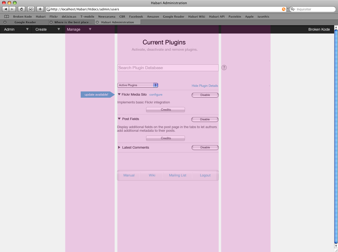
> Final note on the plugin page, is that we've got the update arrow
> which I think could be an extremely useful and powerful feature. it's
> one of those things that is always a bit of a pain in the ass. The
> update arrow could be a link to the plugin to be downloaded, which
> would be pretty cool.
Even if updating requires manual intervention, I really like the update flag.
> The pulldown menu would allow for various
> options like, Disabled plugins, Active plugins, all plugins or a
> disable all plugins option (maybe?).
I like that idea a lot! Being able to filter the list of plugins to
only those that are active is a brilliant idea.
> Now the search plugin database is
> really intended to allow you to look at the various database plugins
> that are available for Habari and go and download them. it just makes
> those simple forum questions, is there a plugin for such and such less
> frequent. Oh I'm sure they'll exist but alas, it might be less and
> that'll be good thing for the eventual forum support mavens :). if
> everyone thinks this is a good idea then I can work on this a bit to
> make it such that you can add more databases if you want (although I
> would expect that's not something that's going to be relevant for a
> while).
I like the idea of searching a plugin database from within Habari.
That's a very handy function.
I think any such search mechanism should go to a single server
endpoint, which would perform the query and return the results.
Certainly the endpoint would interrogate the habariproject.org
database of plugins. I think we would do well to consider allowing
third-party repositories to be connected to the server endpoint, so
that additional resources could be queried. How additional
repositories are added to the master list is up for discussion at a
later time.
(And I think it goes without saying that searching for and acquiring
plugins / themes / etc from within Habari should send _zero_ personal
data about the current Habari installation back to the mothership.)
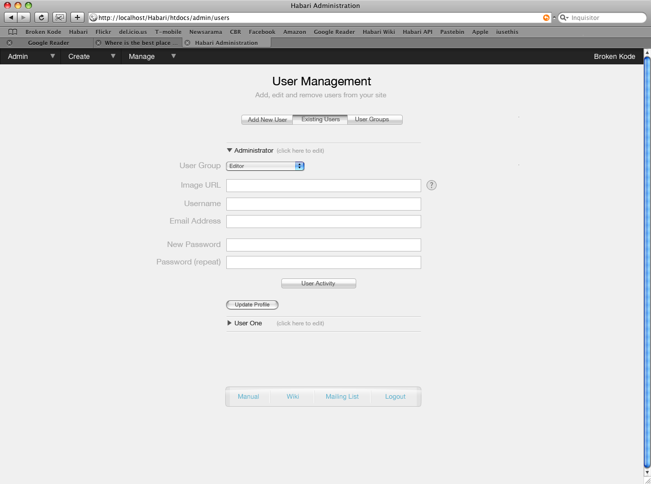
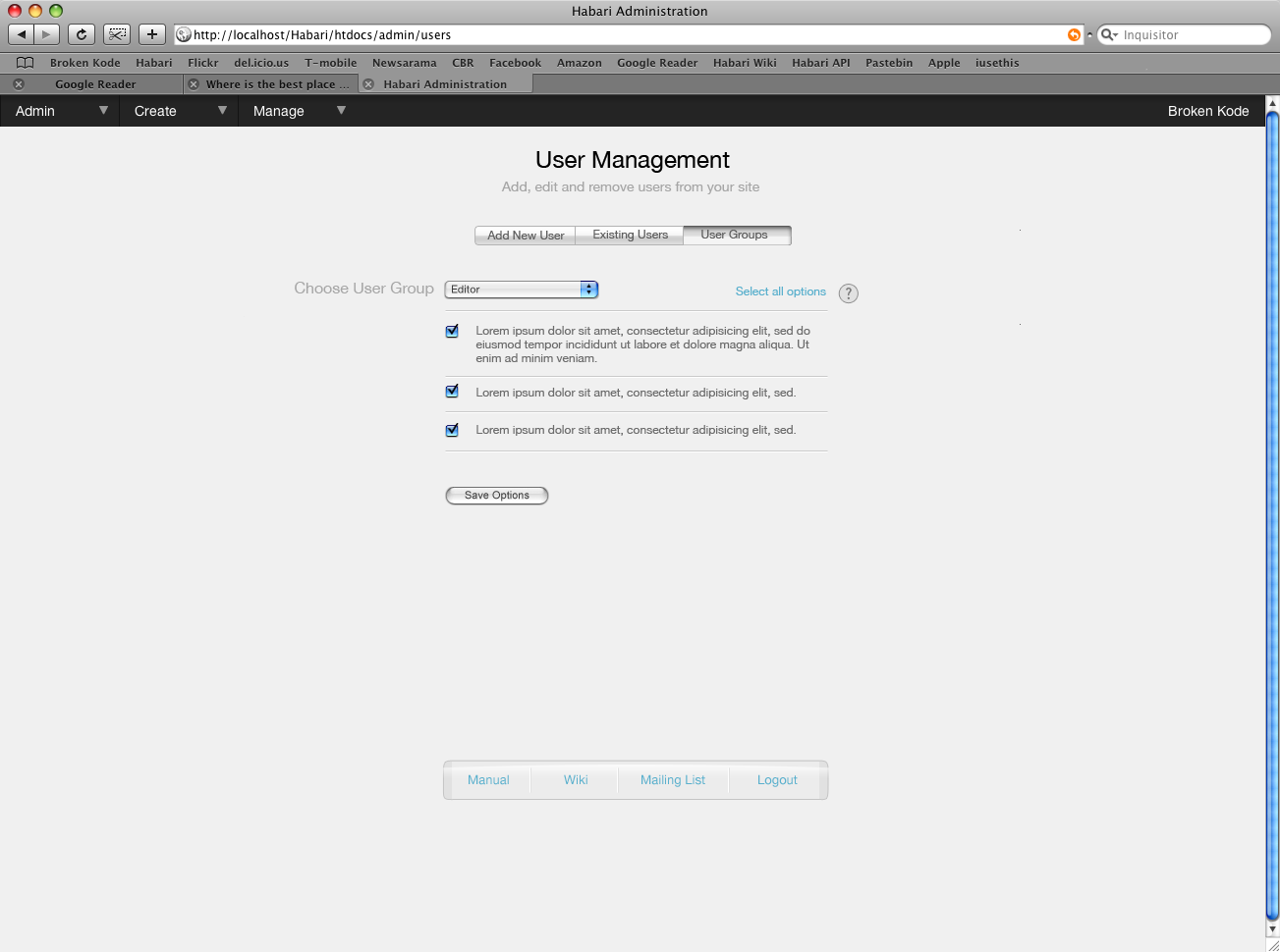
> Ok, let's move onto the users page. This follows the same ideas that
> were put forward for the options page, in terms of having the tab
> options right at the top. So the first thing we're shown as a default
> is the Add New User section. Pretty self explanatory. The only
> addition i've put here is the option to change the user's group.
So you could edit all users from a single list in the current
incarnation, yes? While I think that's a nice idea, it might break
down on a very busy site with lots and lots of users.
(Incidentally, this list of expandable bits is how I'd like to see the
Options page.)
> Moving onto the existing user section, this takes a little bit from
> the plugin menu and a little bit from the stuff established on the
> publish page. The dark arrow that hides/shows the full option is
> there, but as it doesn't seem to me like it makes much sense to have
> the option to open all the user options, I've added the text that you
> have to click on the name to open the user options. I'm a bit torn
> about that to be honest. Part of me wants to completely forget about
> that line, but another part of me is saying that this is really
> necessary to not confuse people into not knowing what is available to
> them. i've hidden all the user activity within a proper page splitter.
> I can design this as well, it's not necessary information, but rather
> a nice to have really, so i've kept it within there. This is where
> you'd put how many comments a user has put, how many posts they've
> done, that sort of thing.
Is the "User Activity" button how one accesses the page splitter? I
don't think the user stats are so overwhelming that we couldn't simply
display them by default. Why use a page splitter just to show a
couple of lines of data?
Incidentally, I believe that users can (and should) be able to be
members of more than one group. I'm not sure how to represent that in
the interface short of a list of checkboxes. Certainly when creating
a new user I think it's acceptable to present a drop-down for their
"primary group" (which has no special significance other than its the
first group to which they are assigned), but once editing a user we
need to allow them to be in multiple groups.
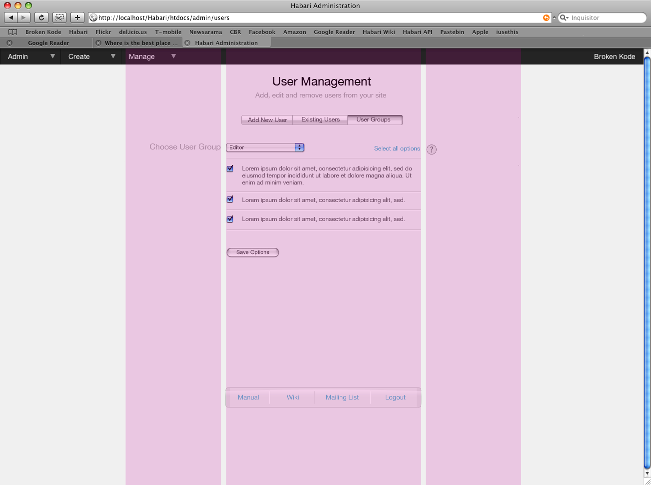
> And then we move onto the final page of the evening, which is the user
> Groups. This is my first pass at this, so please bear with me, i'm
> sure i've missed something pretty fundamental here.
I like your vision, but I think it'll make things awkward when
managing a large number of groups.
I would like to see the list of extant groups in a list view, with
each group a hyperlink. Clicking a group would reveal that group's
permissions.
From the User Group tab, one should be able to add a new group. There
should be a textfield with a submit button at the top of the list of
groups so that one can quickly and easily add a new group. (It might
be nice to permit the addition of permissions in the same way, when
looking at the list of permissions. I'm not sure we want end users
directly creating permissions, though. Thoughts?)
> Each group would then have their own set of permissions,
> which i'm assuming are going to probably be tick box type of options?
That's how I see it.
Overall, I like what you've presented. It's a consistent, easy-to-use
window on Habari administration.
Cheers,
Scott

Ali B.
I have a couple notes which are presented below.
Now you'll say, but some users might expect that the configuration
options for these elements will need to be found next to plugin or
theme. Well that can be solved by providing a link that takes you
directly to the relevant section of the options page. You'll do this
once and then you'll know that the options page actually hold all the
options for everything else. I will admit that I did flirt with the
idea to have options available in two areas (ie one in the plugin area
for example and then again in the option area, or have the options
area have a limited menu of options from the actual plugin, however
while talking to Owen he thought this would cause us more problems
than it's worth, which after thinking about it further, I agree with
this).
I am, still, not sure if the plugin configurations belong to the general options page rather than the plugin list (an expandable window equivelant to the credits). But if we still have to put it there, I think you might want to consider making the configuration link next to the plugin more appearant (button with text and arrow..etc).
So what's the deal with the options page then? Well rather than have a
pagesplitter, we just have the tabs at the bottom. Ideally what I
would like is that these tabs do not have to reload the page to get to
them (as reloading would kind of defeat the purpose of trying to
streamline the main drop down menu). This is just another method of
grouping and presenting the information. This would then follow
throughout the rest of the admin when it is necessary to have several
options/fields that we can group in a specific way.
I sorta agree with Scott here. But I personally can't make the decision, It may be better with expandable list elements (something similar to the plugin list) and it may not. If you could make a mockup of that it would be great.
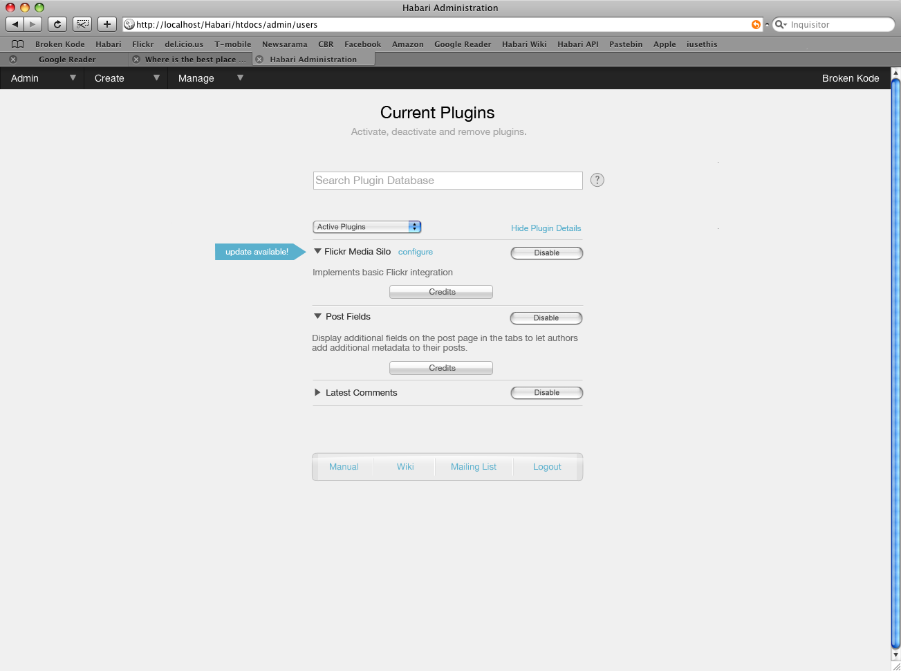
Final note on the plugin page, is that we've got the update arrow
which I think could be an extremely useful and powerful feature. it's
one of those things that is always a bit of a pain in the ass. The
update arrow could be a link to the plugin to be downloaded, which
would be pretty cool. The pulldown menu would allow for various
options like, Disabled plugins, Active plugins, all plugins or a
disable all plugins option (maybe?). Now the search plugin database is
really intended to allow you to look at the various database plugins
that are available for Habari and go and download them. it just makes
those simple forum questions, is there a plugin for such and such less
frequent. Oh I'm sure they'll exist but alas, it might be less and
that'll be good thing for the eventual forum support mavens :). if
everyone thinks this is a good idea then I can work on this a bit to
make it such that you can add more databases if you want (although I
would expect that's not something that's going to be relevant for a
while).
The update arrow is a great idea, backed up with a plugin database to also facilitate the search, which is a great idea as well. Maybe the search results would be an "expandable section" (I will call it that until someone tells me what it's called, the black portion that expands in the middle of the page :D)
Khaled
--
Ali B.

Christopher Davis

Michael Heilemann
khaled Abou Alfa
The issue of width has been coming up several times now, which obviously means that people think it's an issue. I am loathe however to use the full issue width just because we have it. That doesn't seem like a very practical or useful method really as I believe we should only use what we need. . I can see that arguement ringing true for the plugins page, however doesn't really fly for me when it comes to the pages with text fields. These pages don't need to be any wider than that, when the input is probably going to be a few words or a couple of numbers maximum. Having a text field that's 790px wide just because we have the width seems overkill to me and not very elegant either. However to that end I knew that this would be an issue and I have actually done a few mockups with the a wider option, which I'll distribute at some point shortly.
As for not doing mockups, I've got to say I disagree :). We're drawing lines in the sand and promoting discussions like these that spawn off action lists about how to go through the motions; what needs to be done etc. So I don't think this is a wasted exercise at all. It helps people get to grips with what they feel should be in there and what it looks like, rather than what is in their imagination (if anything). All useful stuff.
I think you're right, we should have a decent list of options that we would need, however one thing that I would like to avoid (which is why I've tried to organise them in the way they have been) is the MASSIVE list of options that can be seen in something like punbb. While a great bit of software, the options page is very unweildly. It gets to the stage, where you honestly can't see the woods from the trees and you're completely blinded. That is why I'm very keen on the grouping of these options by what they actually affect.
Michael Heilemann
arguement ringing true for the plugins page, however doesn't really fly for me when it comes to the pages with text fields. These pages don't need to be any wider than that, when the input is probably going to be a few words or a couple of numbers maximum. Having a text field that's 790px wide just because we have the width seems overkill to me and not very elegant either. However to that
As for not doing mockups, I've got to say I disagree :). We're drawing lines in
however one thing that I would like to avoid (which is why I've tried to organise them in the way they have been) is the MASSIVE list of options that can be seen in something like punbb. While a great bit of software, the options page is

Michael Bishop
the plugin page (as much as an exercise in mocking up a page in BP as
for any other reason).
http://bloggingmeta.com/images/habari_grid_plugins_footer.jpg
I tried to keep mostly within the same confines of Khaled's draft,
except I didn't see the need to have a second button to show
"credits", and I used the graphics from the installer for the footer,
mostly because I didn't have the graphics Khaled used in his, though I
think it's a bit more cohesive, but that's certainly debatable.
This is using the span-22 for the content, and span-4 for the
sideboxes. I had asked Khaled on IRC about what the right column was
being used for, and he said it was still being decided, so I just
stuck that box in there to show the width, not as a definitive use.
(I'm still not sure what the space is for).
So, all in all, it's not a major deviation from the original design,
just wider basically. (I did give the content a lighter background
color, I'm still personally not a fan of the solid background, and the
darker color. For me, it's a bit too drab, and think on some level it
can actually not encourage writing, the antithesis of blogging.)
If anyone wants to see the layout with the grid overlay,
http://bloggingmeta.com/images/ishot-68.png.
~miklb
Scott Merrill
> sideboxes.
I'm not a designer, and I'm not very artistically inclined. But I'm
left scratching my head why the main Habari menu spans the entire
width of the window, but the administrative tasks are constrained to a
smaller column.
Is there a specific, defined benefit for this?
Michael Heilemann
I'm not a designer, and I'm not very artistically inclined. But I'm
left scratching my head why the main Habari menu spans the entire
width of the window, but the administrative tasks are constrained to a
smaller column.
Is there a specific, defined benefit for this?