Improving the preference pane

Chris Forsythe
So about 3 months ago I was speaking to Austin Sarner about random
things, and Growl came up. I mentioned that I wouldn't mind a
cohesive, well thought out redesign of the Growl preference pane. He
said he'd get to it, and I didn't think much of it at the time.
A short time later, he shows me the beginnings of what I am attaching
here today. I was pretty much blown away. It was different, yet right
up our alley (I think). It relays a lot of what we've been trying to
do with the prefpane. It resolves the apps tab issue, I think. It
makes the displays tab more useful, and networking is better. General
I love, and then we have a trendier about tab that fits in with more
indy-ish/newer apps.
This was all done by Clemens Knieper and Austin Sarner. I only told
them what I disliked after they did a considerable amount of work
already, so that they knew they were on the right track. The
coverflow for instance in the displays tab just makes sense, and is a
pretty neat way to display that content.
The icon is done by iiro, and we'll need permission to it. It's
similar to one done by ice spectre. We'll need permission. It's at http://iiroku.deviantart.com/art/Growl-icon-64883575
We will need icons for the toolbar looking thing, and probably an
artist to help in general.
Anyhow, here's the mockups:

Peter Hosey
> <GROWLApplications.png>
1. I dislike the >>>><<<<. I'd much rather have a plain vertical
gradient background.
2. Different icons:
* General: Something else, but that's a server icon.
* Applications: NSDefaultApplication
* Display: Smoke in front of CandyBars and Bubbles.
* Network: Network Utility (with the iMacs on the radar screen).
* About: Growl icon?
3. I do not want to implement a custom checkbox. The Aqua checkboxes
are just fine.
I do love the layout, though. Makes good use of the extra horizontal
space we have since Leopard.
Chris Forsythe
On Jun 8, 2008, at 10:53 PM, Peter Hosey wrote:
>
> On Jun 08, 2008, at 20:32:24, Chris Forsythe wrote:
>> <GROWLApplications.png>
>
> 1. I dislike the >>>><<<<. I'd much rather have a plain vertical
> gradient background.
I'll hold my opinion until I see some mockups. :)
>
> 2. Different icons:
> * General: Something else, but that's a server icon.
> * Applications: NSDefaultApplication
> * Display: Smoke in front of CandyBars and Bubbles.
> * Network: Network Utility (with the iMacs on the radar screen).
> * About: Growl icon?
These are all temporary.
>
> 3. I do not want to implement a custom checkbox. The Aqua checkboxes
> are just fine.
>
I think it's much prettier.
> I do love the layout, though. Makes good use of the extra horizontal
> space we have since Leopard.
I completely agree
Peter Hosey
1. I'd rather have the iPhone-style on/off button here. (Yes, we'd
have to implement it custom. In this case, I wouldn't mind.)
2. I don't think the switch+at-login checkbox need an explanatory label.
3. Obvious capitalization correction
4. We banished “Hide all notifications” once. I hereby banish it
again.
5. I think we could improve that corner selector by putting a right
triangle on each one. Each triangle would brighten the area within it
(e.g., white at 10% alpha).
Here's my edit of the mock-up:
Christopher Forsythe
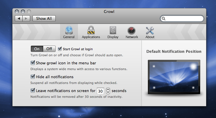
On Jun 08, 2008, at 20:32:24, Chris Forsythe wrote:> <GrowlGeneral.png>
1. I'd rather have the iPhone-style on/off button here. (Yes, we'd
have to implement it custom. In this case, I wouldn't mind.)
That's the button in your mockup too right?
2. I don't think the switch+at-login checkbox need an explanatory label.
If we have room for it, it might be nicer to leave it in. It makes sense to you and I to not need it, but some people might need it.
3. Obvious capitalization correction
Agreed.
4. We banished “Hide all notifications” once. I hereby banish it
again.
Alright with this.
5. I think we could improve that corner selector by putting a right
triangle on each one. Each triangle would brighten the area within it
(e.g., white at 10% alpha).
Here's my edit of the mock-up:
I switched back and forth, and found it was a bit more distracting to have these than the original. How much do you care about this change, from a 1 being really don't care, to a 10 being really care enough to fly to my house and hit me in the face if I continue to disagree with you.
The corners here are 40px on the sides, and are vertical
gradients: white × 10% at the top, 50% gray × 10% at the bottom.
Looks good, especially at actual size.