manhattan plot
365 views
Skip to first unread message

Hermann Norpois
Mar 11, 2013, 1:00:23 PM3/11/13
to ggp...@googlegroups.com
Hello,
I dont find a proper and simple way to produce a manhattan plot (y-axis: -log pval, x-axis: chr and bp).
I think of a syntax like this:
ggplot (df)+ geom_point (aes (x=bp, y= -log p))
...but I dont have an idea how to deal with the chromosomes (chr).
Thanks
Hermann
> df
snp chr bp p
1 rs1 1 12 0.02
2 rs2 1 14 0.40
3 rs4 2 16 0.05
4 rs6 2 20 0.08
5 rs8 3 14 0.07
> dput(df)
structure(list(snp = structure(1:5, .Label = c("rs1", "rs2",
"rs4", "rs6", "rs8"), class = "factor"), chr = c(1, 1, 2, 2,
3), bp = c(12, 14, 16, 20, 14), p = c(0.02, 0.4, 0.05, 0.08,
0.07)), .Names = c("snp", "chr", "bp", "p"), row.names = c(NA,
-5L), class = "data.frame")

William Beasley
Mar 13, 2013, 6:40:46 PM3/13/13
to ggp...@googlegroups.com
I like the facets for this. But if you didn't want facets (and instead wanted one big frame), Winston's new book has a very similar example in Section 3.10 (Fig 3-30). MLB batters are sorted by league (ie chromosome), and then by the batting average (ie, bp).

Winston Chang
Mar 13, 2013, 7:38:24 PM3/13/13
to William Beasley, ggp...@googlegroups.com
FWIW, here's the code and the image that William is referring to:
library(gcookbook) # For the data set
library(ggplot2)
tophit <- tophitters2001[1:25, ] # Take the top 25 from the tophitters data set
# Get the names, sorted first by lg, then by avg
nameorder <- tophit$name[order(tophit$lg, tophit$avg)]
# Turn name into a factor, with levels in the order of nameorder
tophit$name <- factor(tophit$name, levels=nameorder)
ggplot(tophit, aes(x=avg, y=name)) +
geom_segment(aes(yend=name), xend=0, colour="grey50") +
geom_point(size=3, aes(colour=lg)) +
scale_colour_brewer(palette="Set1", limits=c("NL","AL")) +
theme_bw() +
theme(panel.grid.major.y = element_blank(), # No horizontal grid lines
legend.position=c(1, 0.55), # Put legend inside plot area
legend.justification=c(1, 0.5))
-Winston
On Wed, Mar 13, 2013 at 5:40 PM, William Beasley <wibe...@hotmail.com> wrote:
I like the facets for this. But if you didn't want facets (and instead wanted one big frame), Winston's new book has a very similar example in Section 3.10 (Fig 3-30). MLB batters are sorted by league (ie chromosome), and then by the batting average (ie, bp).
--
--
You received this message because you are subscribed to the ggplot2 mailing list.
Please provide a reproducible example: https://github.com/hadley/devtools/wiki/Reproducibility
To post: email ggp...@googlegroups.com
To unsubscribe: email ggplot2+u...@googlegroups.com
More options: http://groups.google.com/group/ggplot2
---
You received this message because you are subscribed to the Google Groups "ggplot2" group.
To unsubscribe from this group and stop receiving emails from it, send an email to ggplot2+u...@googlegroups.com.
For more options, visit https://groups.google.com/groups/opt_out.
Hermann Norpois
Mar 16, 2013, 1:18:00 PM3/16/13
to Winston Chang, ggp...@googlegroups.com
Thanks.
This was very helpful.
But I still have question.
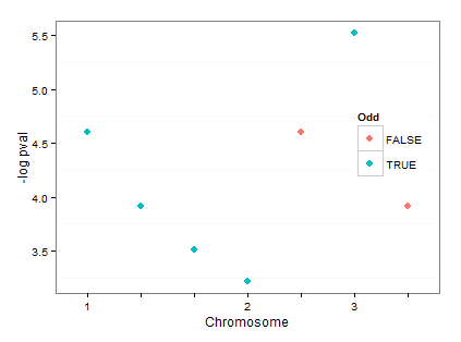
I modified your example for my purpose but there is something missing and I dont know how to do. Prinicpally the "picture" is phantastic. But on the x axis I need the numbers of the chromosomes (instead of bp). The dots are plotted in dependence of bp (so geom_point (aes (x=bp, y=mlp)... This is correct but I dont want the bps to be listed at the x-axis. But I want to see the numbers of the chromosome only.
Thanks
Hermann
ggplot(df) +
geom_point(aes(x=bp, y= mlp), size=3, colour = ifelse (chr %% 2 ==1, "black", "grey")) +
ylab ("-log pval")+
theme_bw() +
theme(panel.grid.major.y = element_blank(), # No horizontal grid lines
panel.grid.major.x = element_blank(),
legend.position=c(1, 0.55), # Put legend inside plot area
legend.justification=c(1, 0.5))
> dput (df)
structure(list(snp = structure(c(1L, 4L, 5L, 6L, 7L, 2L, 3L), .Label = c("snp1",
"snp10", "snp11", "snp2", "snp3", "snp5", "snp6"), class = "factor"),
chr = structure(c(1L, 1L, 1L, 2L, 2L, 3L, 3L), .Label = c("1",
"2", "3"), class = "factor"), bp = structure(c(2L, 3L, 4L,
5L, 7L, 1L, 6L), .Label = c("10", "12", "14", "15", "2",
"20", "6"), class = "factor"), p = c(3, 4, 5, 2, 3, 2, 1),
mlp = c(3.91202300542815, 3.50655789731998, 3.2188758248682,
4.60517018598809, 3.91202300542815, 4.60517018598809, 5.52146091786225
)), .Names = c("snp", "chr", "bp", "p", "mlp"), row.names = c(NA,
-7L), class = "data.frame")
This was very helpful.
But I still have question.
I modified your example for my purpose but there is something missing and I dont know how to do. Prinicpally the "picture" is phantastic. But on the x axis I need the numbers of the chromosomes (instead of bp). The dots are plotted in dependence of bp (so geom_point (aes (x=bp, y=mlp)... This is correct but I dont want the bps to be listed at the x-axis. But I want to see the numbers of the chromosome only.
Thanks
Hermann
ggplot(df) +
geom_point(aes(x=bp, y= mlp), size=3, colour = ifelse (chr %% 2 ==1, "black", "grey")) +
ylab ("-log pval")+
theme_bw() +
theme(panel.grid.major.y = element_blank(), # No horizontal grid lines
legend.position=c(1, 0.55), # Put legend inside plot area
legend.justification=c(1, 0.5))
structure(list(snp = structure(c(1L, 4L, 5L, 6L, 7L, 2L, 3L), .Label = c("snp1",
"snp10", "snp11", "snp2", "snp3", "snp5", "snp6"), class = "factor"),
chr = structure(c(1L, 1L, 1L, 2L, 2L, 3L, 3L), .Label = c("1",
"2", "3"), class = "factor"), bp = structure(c(2L, 3L, 4L,
5L, 7L, 1L, 6L), .Label = c("10", "12", "14", "15", "2",
"20", "6"), class = "factor"), p = c(3, 4, 5, 2, 3, 2, 1),
mlp = c(3.91202300542815, 3.50655789731998, 3.2188758248682,
4.60517018598809, 3.91202300542815, 4.60517018598809, 5.52146091786225
)), .Names = c("snp", "chr", "bp", "p", "mlp"), row.names = c(NA,
-7L), class = "data.frame")
2013/3/14 Winston Chang <winsto...@gmail.com>
William Beasley
Mar 24, 2013, 12:38:38 PM3/24/13
to ggp...@googlegroups.com, Winston Chang
I can think of several fancier ways to do this (including defining a formatter function), but here's a simple manual way that indicates the chromosome on the first bp within each batch.
Define these before the declaration of the graphing code:
bpBreaks <- as.character(c(10, 12, 14, 15, 2, 20, 6))
bpLabels <- c("1", "", "", "2", "", "3", "")
Add this to the graphing code:
scale_x_discrete(breaks=bpBreaks, labels=bpLabels) + xlab("Chromosome") +
Reply all
Reply to author
Forward
0 new messages