console-setup Georgian fonts, need test. მიშველეთ გეთაყვა.[BPG&GIA]

Vladimer Sichinava
console-setup-ის მანტეინერმა გამომიგზავნა
ფონტები სადაც ის ცნობილი/უშნო/და მარცხენა ფეხზე ამდგარი ფონტებია ჩაყრილი.
16 ზომა, ბატონმა გიამ დაამზადა.
დარჩა 13,14,15,16,18
შევეცადე 16იდან გლიფების კოპირება მარა...მერე მოვწვი რომ ზომებში არასოდეს ჩაჯდებოდა...
ჰოდა ავიღე და fontforge-ს ცოტა ჩავუჯექი და 14 ზომა დავამზადე, ასე ვთქვათ gia-ს ფონტებს თან
ვუცქეროდი და თან "ჩემი" ცვლილებებიც შევიტანე. ჰოდა ახლა მაინტერესებს თქვენი აზრი, შენიშვნა
ან სულაც შესწორება. აი მაგალითად კრიტიკული ასოების "ლ" "დ"-ს მიმართებაში და ასე შემდეგ.
გიგზავნით h14_gia_based_need_test-14.bdf ფაილს.
სანამ სხვებს მივახრჩობდე და + შეცდომით, ისევ ჯობია თქვენ გადახედოთ პირველ ნამუშევარს

დიდი მადლობა.
ლადო

BPG Kolumbus
BPG Kolumbus

Denis Moyogo Jacquerye
On Jun 7, 5:43 am, "BPG Kolumbus" <gougouchvili.vissar...@kolumbus.fi>
wrote:
> BPG_DejaVu.zip
> 148KDownload
Hi BPG,
Thank you for the candidate Georgian range.
It looks really good.
There's just a few things I want to ask:
1. Unicode provides mapping between Asomtavruli and Nuskhuri. The
BPG_DejaVuSans has Mtavruli instead of Asomtavruli.
According to the Unicode book: ‘A word is always entirely presented in
Mtavruli or not. Mtavruli is a font style, similar to small caps in
the Latin script.’ Would it be better to have Asomtavruli?
2. The height of short Nuskhuri is a bit less than the height of
lowercase Latin. Is this normal?
3. The horizontal curve are wider than the vertical curves, and a bit
shorter or wider than Latin/Cyrillic/Greek curves. Is this normal?
Things like height and curve weight can be specific to Georgian so I
don't know it changing them is necessary. We can do it but it is
better if you do it as you know it should look.
Do you plan on making a Bold variant?
We'll release it in DejaVu when we have both Regular and Bold.
Thank you,
Denis Moyogo Jacquerye
BPG Kolumbus
**********************************************
აბგდევზთიკლმნოპჟრსტუ
ႠႡႢႣႤႥႦႧႨႩႪႫႬႭႮႯႰႱႲႳ
**********************************************
Targets for Georgian - visual and practical
* Unocode standard for Georgian now is not up to date comparing to new trends in Georgian mass media and the web - sharply influenced by Western media
See: http://www.parliament.ge
Pitch comparison:
Latin chars: ~ 190; Georgian chars: ~ 170
Nullam dolor turpis, auctor ut, egestas vel, ultrices eu, urna. Morbi vulputate scelerisque elit. Fusce ut ante non erat viverra interdum. Nulla facilisi. Donec neque nisi, condimentum eu, aliquet nec, commodo a, nunc.
NULLAM DOLOR TURPIS, AUCTOR UT, EGESTAS VEL, ULTRICES EU, URNA. MORBI VULPUTATE SCELERISQUE ELIT. FUSCE UT ANTE NON ERAT VIVERRA INTERDUM. NULLA FACILISI. DONEC NEQUE NISI, CONDIMENTUM EU, ALIQUET NEC, COMMODO A, NUNC.
**********************************************
Vladimer Sichinava
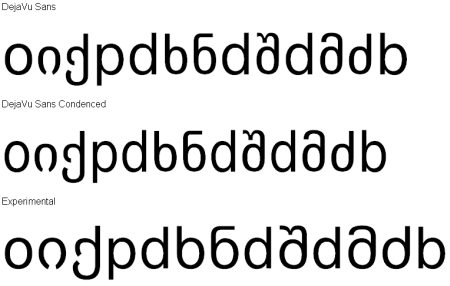
I've tested DejaVuSans_Experimental-Ka.ttf and here is result:
http://gnome.inet.ge/alinux/tmp/experimental.png
General(experimental)interface:
http://gnome.inet.ge/alinux/tmp/experimental2.png
I'm against that style.
#####################################
Sincerely I prefer (June 14 2007) DejaVuSans.ttf:
http://gnome.inet.ge/alinux/tmp/proposed.png <--- And what about you do you like that ?
UNIC PROBLEM is Bold fonts wideness!!!:
http://gnome.inet.ge/alinux/tmp/wideness.png
may vi solve that inconvenience ?
Thank you for your attention,
Vladimer Sichinava
BPG Kolumbus
qopdb qopdb qopdb qopdb
იძხნმ იძხნმ იძხნმ იძხნმ
იძხნმ იძხნმ იძხნმ იძხნმ
__________________________________________________________
Condenced 14 pt:
qopdb qopdb qopdb
qopdb
qopdb qopdb qopdb
qopdb
იძხნმ
იძხნმ იძხნმ იძხნმ
იძხნმ იძხნმ იძხნმ იძხნმ
Vladimer Sichinava
It was my fault...
I used other experimental font.
Your proposed Sans and Bold fonts are perfect.
Denis Moyogo Jacquerye considers normal that bold behaviour...
http://gnome.inet.ge/alinux/tmp/wideness.png
Congrats!! Soon we'll see Georgian DejaVuuuuuuu :)
in Georgian: დიდი მადლობა :) (Thank You!)
With best regards...
Vladimer
BPG Kolumbus
BPG Kolumbus
----- Original Message -----From: Vladimer Sichinava

Ben Laenen
Hi BPG,
First of all, thanks for the great work you've done :-)
On Thursday 14 June 2007, BPG Kolumbus wrote:
> Now i have checked all Georgian range for Sans and Sans Condenced and
> it is as it is to be. I also extensivelly tested hardcopy printing
> and it looks OK...
> 4. Representation of the "de facto" (not existed in Unicode *)
> Capital/Title case "Mkhedruli Mtavruli" instead of practically unused
> anient "Asomtavruli" **
> * Unocode standard for Georgian now is not up to date comparing to
> new trends in Georgian mass media and the web - sharply influenced by
> Western media
> ** Example of extensive usage of Geogian "Mkhedruli Capitals" in the
> range of Unicode old "Asomtavruli" is the web site of the Parliament
> of Georgia where Georgian "Capitals" are used same as in English and
> other Latin based scriptures. See: http://www.parliament.ge
Denis and I had a lengthy discussion about the issue of Mtavruli again
this afternoon. Basically, we came to no conclusion about the issue...
So the facts being:
* The Unicode standard mentions Mtavruli as a style variant of
Mkhedruli. This means Mtavruli will not get their own code points in
Unicode, and I'm not aware of a proposal for it lying around somewhere
to disunify Mtavruli from Mkhedruli.
* No specific code points doesn't mean Mtavruli can't be in the same
font as Mkhedruli: the variants can (well, should, but can't at the
moment) be accessed with OpenType features. (So Georgian people: arise
to get that feature added to the text renderers :-) )
* Georgian fonts "hijacked" the Asomtavruli code points since that
script isn't used anymore (due to the lack of the feature mentioned
above). They even used code points that aren't defined by Unicode.
* Not following the standards is *really* bad. Using undefined code
points is even worse, because those can lead to rendering problems.
So now we are between two walls: as a Unicode font we can't afford to
put Mtavruli in the area of Asomtavruli, since the latter may be added
in a distant future, and then we would really have a problem.
On the other hand, we cannot deny the current usage. I could evangelize
a lot here about how bad it is, it doesn't take away the fact that
numerous text documents already use the Asomtavruli code points for
Mtavruli.
In short: Unicode has a serious problem here, because a variant of the
standard is in use now, and I really doubt Unicode will change that
standard, unless some serious work is done by Georgian people for that
to happen, with a *lot* of good arguments why to change the code points
(mentioning current usage is different from the standard would be a
good argument, I'd think, but it's going to need a lot more than
that)... I'd like to get the opinion of other people that know about
the issue first as well before taking a decision on what to do with
Mtavruli.
But no issues with Mkhedruli, that can be merged in DejaVu easily
without controversies :-)
Greetings
Ben
Vladimer Sichinava
I'm ready to start fighting!
The whole Georgian Unicode story is ridiculous!
I suggest, let's do some petition:
http://www.petitiononline.com/petition.html
People help us!
Vladimer Sichinava
to make a georgian petition site:
http://petition.ge/
2007/6/16, Vladimer Sichinava <vlsic...@gmail.com>:
--
E 'l naufragar m'è dolce in questo mare...
Vladimer Sichinava
Is there some *.ttf of Chkoni?
I'll test that font too..
Vladimer
Ben Laenen
> I think that the unic possibility is do something with Unicode
> standard... I'm ready to start fighting!
hehe, that's the spirit :-)
But don't just start a petition or something, you really need to contact
a few people in Unicode (like Everson which I mentioned in the previous
mail), convince them of the fact that you need separate slots for
Mtavruli, and that it isn't some style variant of Mkhedruli, and when
you've convinced the important people, you're halfway (then the request
is made, discussed, reviewed, discussed again, reviewed, discussed
again... and finally voted).
And be ready to keep fighting the next years for this, getting something
done in Unicode is something that can take a very long time :-)
Greetings
Ben
BPG Kolumbus
Nothing is to be done - I was just joking...
It is better to test sherif "Mkherduli" for DejaVu and correct bugs - if
any...
It is attached "BPG Chkoni" -- full version, insertded into DejaVu Serif -
this is almost finished version.
BPG
Vladimer Sichinava
Sincerely, "BPG Chkoni"-s curly style is not too much suitable for Web surfing or similar(It's only my opinion)...
I prefer BPG Elite or BPG Academy...which one I'm not sure for the moment...
could you please send me that 2 files.
in .ttf format with different fontnames:
BPG Chkoni
BPG Academy
I need to differ them in font list...
I have some problems with my fontforge :(
###################################################
Hi Ben,
Notice that on this screenshot latin letters
http://gnome.inet.ge/alinux/tmp/good.png <--- are better than ---> http://gnome.inet.ge/alinux/tmp/bad.png
what's the point ?
I know that Georgian Sans is not hinted...is it possible to have Georgian GUI with
http://gnome.inet.ge/alinux/tmp/bad.png <--- this Geo chars...
and when there is latin somewhere in gui..system should
use http://gnome.inet.ge/alinux/tmp/good.png <--this Latin letters.
is that possible ?
I don't really like this Latin range: http://gnome.inet.ge/alinux/tmp/bad.png
Sincerely yours,
Vladimer
BPG Kolumbus
----- Original Message -----From: Vladimer Sichinava
BPG Kolumbus
----- Original Message -----From: Vladimer Sichinava
Cc: Ben LaenenSent: Sunday, June 17, 2007 04:58
André Bouatchidzé
Hi,
First of all, thank you very much for your work, BPG! The beta fonts
look great. I love the experimental version of Sans which may seem too
wide but is super-easy to read on the screen (maybe it could, at least,
be adopted as as a basis for Sans Mono?). The last version of Serif
(based on non-curly Chkoni) is excellent too. I hope Sans Mono will
follow...
As for my opinion about the fate of asomtavruli range, I already
exposed it in my previeous post. The best thing about Unicode is, well,
its standardness and a stadard can't be perfect by definition. Lobbying
should be made by Unicode Consortium to get a separate range for
mkhedruli mtavruli and I hope it will eventually get a separate slot
like latin small caps.
BTW, if some testing is required on Mac OS X, I'm ready to beta-test
the new versions (the current ones generate some error messages when
activated via Font Book but are recognized when installed manually).
Best Regards,
- André.
Ben Laenen
> Lobbying should be made by Unicode Consortium to get a separate range
> for mkhedruli mtavruli and I hope it will eventually get a separate
> slot like latin small caps.
That's not true: Latin smallcaps don't have separate code points. There
are only a lot of letters in the standard that look like they are
smallcaps that can be found all over the different Unicode blocks, but
they aren't smallcaps and cannot be used that way. Latin smallcaps
usually have a height which is a bit taller than x-height (in a lot of
cases, this is not a standard rule, but it's often applied), while the
letters that look like smallcaps in Unicode have x-height.
But yes, try to get a comment about the issue from someone at Unicode
and see if it would make sense to lobby for separate code points for
Mtavruli.
Greetings
Ben
BPG Kolumbus
André Bouatchidzé
გამარჯობათ ბატონო ბესარიონ,
> გმადლობთ ႡႮႢ ფონტების გამოცდისათვის.
მადლობა თქვენ იმისათვის, რომ დაინტერესდით ამ პროექტით და ასეთი
მშვენიერი შრიფტები მოამზადეთ. დიდი მადლობა აგრეთვე გამოგზავნილი
ტექსტებისთვის, რომელთაც დიდი ინტერესით გავეცანი. აგრეთვე გადავიკითხე
შემდეგი ტექსტი, რომელიც საკმაოდ ძველია მაგრამ მაინც აქტუალური და,
რამდენადაც ვხვდები, თქვენი დაწერილია:
http://www.geocities.com/bpgfonts/general-intro.htm
ყოველგვარი გაუგებრობის თავიდან ასაცილებლად ჩემს პოზიციას დავაფიქსირებ:
თანამედროვე ქართულში ნამდვილი მთავრულის შემოღების მომხრე გახლავართ.
ხოლო რაც შეეხება ასოების მოხაზულობას, უბრალოდ მიმაჩნია, რომ ქართულში ის
არსებობს ასომთავრულის სახით. ანუ ვემხრობი უძველესისა (ხუცურის
მთავრულის) და უახლესის (ჩვეულებრივი მხედრულის) სინთეზს, ფაქტიურად აკაკი
შანიძის ვერსიას. აი რამოდენიმე არგუმენტი:
1. კულტურული თვალსაზრისით, ჩემი აზრით, ეს იქნებოდა გარკვეული ანბანური
შიზოფრენიის თავიდან აცილების საშუალება: ამ შემთხვევაში ჩაითვლება, რომ
ქართულში არსებობს ერთად-ერთი მთავრული (უძველესი ხელნაწერების, საუკეთესო
ტაძრების კედლებისა და ხატების...) და მისი მოხაზულობა, ისევე როგორც
ევროპულ ენებში, უფრო ძველია და განსხვავდება მხედრულისგან. მეორეს მხრივ
"მხედრულის მთავრული" შეიძლება დარჩეს ტიპოგრაფიულ და/ან დეკორატიულ
ვარიანტად ზიგიერთ კონკრეტულ შემთხვევაში რადგან მისი ასოების მოხაზულობა
მხოლოდ პროპორციით და სტრიქონზე ვერტიკალური პოზიციით განსხვავდება უბრალო
მხედრულისგან.
2. ესთეტიკური თვალსაზრისით -- მესმის, რომ ეს ძალზე საკამათო შეიძლება
იყოს -- მემგონი მთავრულის ფუნქციაა სწორედ საკმარისად გამოიყოს ტექსტში
და ამ შემთხვევაში ასომთავრული თავისი ფორმით მშვენივრად ერწყმის
მხედრულს, და თქვენივე ფონტები ამის ნათელი მაგალითია.
3. ტიპოგრაფიული თვალსაზრისით თქვენს მიერ გამოგზავნილ ტექსტებში
მთავრულის აუცილებობასთან მიმართებაში მოყვანილი ყველა არგუმენტი რა თქმა
უნდა სწორია და მე მათ აღარ გავიმეორებ.
> პირველ რიგში ხაზგამით უნდა აღვნიშნოთ, რომ როდესაც მხედრულის Ⴋთავრულზე
> ვლაპარაკობთ (და ყოველთვის ლაპარაკობდნენ ამ ასორმოცდაათი წლის
> განმავლობაში) - ყოველთვის მხედველობაში გვაქვს მთავრული, „კაპიტალები“
> ზუსტად იმ გაგებითა და ფუნქციით, როგორიცაა ლათინურ დამწერლობებში, და -
> არავითარ შემთხვევაში რაიმე განსაკუთრებულ შრიფტზე, ფონტზე (მით უმეტეს
> რაღაც „სმოლ ქაფსებზე“)!
გაცილებით უფრო ფუნდამენტური საკითხია ვიდრე "small caps"-ებისა ლათინურ
შრიფტებში.
> ასე, 150 წლის განმავლობაში მუშაობდა და მუშაობს მოჯადოებული წრე:
> იძახიან - თუ დაინერგება ფართოდ პრაქტიკაში მხედრულის მთავრული (ისევე
> როგორც ლათინურშიაო) - მაშინ მივიღებთ სტანდარტსო... და ფართოდ კი
> მხედრულის მთავრული არ ინერგება იმიტომ, რომ - არ არსებობს სტანდარტი...
გადაწყვეტილების მიღება და შემდეგ, სიტყვაზე, განათლების სამინისტროს
დირექტივა, რომ ბავშვებს სკოლაში დაფაზე და რვეულებში _წერა_ ასწავლონ
უკვე მთავრულის გამოყენებით. არა მგონია, რომ ამას ხელს უშლიდეს რაიმე
სწორი კომპიუტერული სტანდარტის არარსებობა, სამაგიეროდ პოლიტიკური ნების
გარეშე აქ მართლაც და არაფერი გამოვა.
პატივისცემით,
- ანდრე.
André Bouatchidzé
> And, this is a candidate for DejaVu Mono (very draft).

Well, I was waiting for this one! I tested it a little bit today and it
seems already better than any other georgian monospaced font for screen
I've tried until now. Do you think, BPG, it is possible for it to look
wider without looking worse?

> Now very soon we are to make all disisions and based on them I'll
> prolong or quit doing this or that font...

Does it mean that georgian letters will be included in version 2.18?
I think also georgian Sans Experimental could be a good starting point
for inclusion in Sans, and the Sans normal -- into Sans Condensed.
- André.
Vladimer Sichinava
> And, this is a candidate for DejaVu Mono (very draft). Well, I was waiting for this one! I tested it a little bit today and it seems already better than any other georgian monospaced font for screen I've tried until now. Do you think, BPG, it is possible for it to look wider without looking worse? > Now very soon we are to make all disisions and based on them I'll > prolong or quit doing this or that font... Does it mean that georgian letters will be included in version 2.18?
I think also georgian Sans Experimental could be a good starting point for inclusion in Sans, and the Sans normal -- into Sans Condensed.
Next week we should decide Serif destination and if possible Mono too...
Vladimer (Lado)
BPG Kolumbus
Actually I have started experimenting with wider letters ("BPG Mrgvlovani" -
which are mentioned as "experimental") but they do not feet at all.
Then I have especially analyse Latin and other letters width and shapes in
DejaVu Mono and only after testing and experimenting have choose existing
proportions. I'll prolong experimenting with width...
Mainly now I concentrate fo find best shape for double width ("m" width)
letters დ თ ო ფ ღ
BPG
----- Original Message -----
From: "André Bouatchidzé" <and...@mac.com>
To: <geof...@googlegroups.com>