[Conversion Room - APAC] Introducing Flow Visualization: visualizing visitor flow
14 views
Skip to first unread message

vinoaj
Oct 20, 2011, 2:29:37 AM10/20/11
to conversion...@googlegroups.com
Many of you have shared with us difficulties you’ve experienced when using traditional path analysis tools. For instance, many of these tools don’t sensibly group related visitor paths and pages, and segmentation analysis can be difficult. You’re looking for better ways to visualize and quickly find those insights about how visitors flow through your sites.
The Google Analytics team has been listening and is working hard to meet your needs. Our design team chose not to build individual “path analysis,” which can quickly become complicated. Instead, they took inspiration from a wide range of sources to reimagine approaches for visualizing visitor flow. Our goal is to help marketers and analysts better optimize their visitor experience by presenting the ways that visitors flow through their sites in an intuitive and useful way.
This morning at Web 2.0 Summit, Susan Wojcicki & I unveiled the release of “Flow Visualization” in Google Analytics, a tool that allows you to analyze site insights graphically, and instantly understand how visitors flow across pages on your site. Starting this week, “Visitors Flow” and “Goal Flow” will be rolling out to all accounts. Other types of visualizers will be coming to Google Analytics in the coming few months, but in the meantime, here’s what you can expect from this initial release.
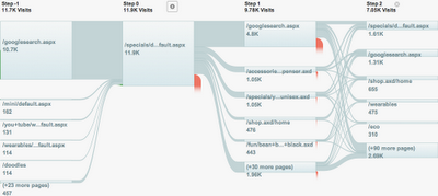
Visitors Flow
The Visitors Flow view provides a graphical representation of visitors’ flow through the site by traffic source (or any other dimensions) so you can see their journey, as well as where they dropped off. You’ll find this visualizer on the left hand navigation menu, where you’ll see a new “Visitors Flow” link under the Visitors section.

Nodes are automatically clustered according to an intelligence algorithm that groups together the most likely visitor flow through a site.
You’ll also notice that we made the visualization highly interactive. You can interact with the graph to highlight different pathways, and to see information about specific nodes and connections. For example, if you want to dive deeper into your “specials” set of pages, you can hover over the node to see more at a glance.

This type of visualization allows you to answer important questions, such as “How successful is my new promo page?” In the example above, a marketer instantly gains the insight that there are 5.46K visits (based on the sources on the left hand side) and the majority of visits to the “specials” or promo page come from Google search.
To take this a step further, you can drill down into any node by “exploring the traffic” through the node. In this case, you can see how visitors coming specifically from Google search journeyed across your site.

We realize that you might want to specifically focus on a node, so we’re providing data on all the visits that lead to that node, and not just the ones that come from the top sources in the Visitors Flow. You can also traverse the path forwards or backwards on this visualizer to gain more insight on how engaged the users are to your new promotion.
Goal Flow
Goal Flow provides a graphical representation for how visitors flow through your goal steps and where they dropped off. Because the goal steps are defined by the site owner, they should reflect the important steps and page groups of interest to the site. In this first iteration, we’re supporting only URL goals, but we’ll soon be adding events and possibly other goal types.

You can find the Goal Flow visualizer in the Conversions > Goals section of the “Standard Reporting Tab.” Goal Flow helps you understand:
You can also apply any advanced segments to a Flow Visualizer. In addition, for those who want to see how visitors arrive at a page (or pages) of interest, they can select that page (or pages) and visualize “backward”. Such “reverse paths” could help site owners identify suboptimal placement of content. Similarly, “forward” paths from a page (or pages) can be visualized to understand most visited pages or to see visitor flow leakages that a site owner might be unaware of.

Pages before and after the node of interest are automatically grouped based on the most common “visitor” flows, and we’re building continued improvements to help group together sensible visitor paths and page nodes.
If you don’t have goals or goal funnels already set up, don’t worry. You can create a new goal or goal funnel from your profile settings and check it out right away - it works backwards on your historical data.
These two views are our first step in tackling flow visualization for visitors through a site, and we look forward to hearing your feedback as all users begin experiencing it in the coming weeks. We’re excited to bring useful and beautiful tools like these to help you understand your site, so stayed tuned for more!
As always, we welcome your input on how we can make Flow Visualization truly useful for you, so let us know in the comments, or send us your thoughts.
Posted by Phil Mui, Google Analytics team
--
Posted By vinoaj to Conversion Room - APAC at 10/19/2011 11:29:00 PM
The Google Analytics team has been listening and is working hard to meet your needs. Our design team chose not to build individual “path analysis,” which can quickly become complicated. Instead, they took inspiration from a wide range of sources to reimagine approaches for visualizing visitor flow. Our goal is to help marketers and analysts better optimize their visitor experience by presenting the ways that visitors flow through their sites in an intuitive and useful way.
This morning at Web 2.0 Summit, Susan Wojcicki & I unveiled the release of “Flow Visualization” in Google Analytics, a tool that allows you to analyze site insights graphically, and instantly understand how visitors flow across pages on your site. Starting this week, “Visitors Flow” and “Goal Flow” will be rolling out to all accounts. Other types of visualizers will be coming to Google Analytics in the coming few months, but in the meantime, here’s what you can expect from this initial release.
Visitors Flow
The Visitors Flow view provides a graphical representation of visitors’ flow through the site by traffic source (or any other dimensions) so you can see their journey, as well as where they dropped off. You’ll find this visualizer on the left hand navigation menu, where you’ll see a new “Visitors Flow” link under the Visitors section.

Nodes are automatically clustered according to an intelligence algorithm that groups together the most likely visitor flow through a site.
You’ll also notice that we made the visualization highly interactive. You can interact with the graph to highlight different pathways, and to see information about specific nodes and connections. For example, if you want to dive deeper into your “specials” set of pages, you can hover over the node to see more at a glance.

This type of visualization allows you to answer important questions, such as “How successful is my new promo page?” In the example above, a marketer instantly gains the insight that there are 5.46K visits (based on the sources on the left hand side) and the majority of visits to the “specials” or promo page come from Google search.
To take this a step further, you can drill down into any node by “exploring the traffic” through the node. In this case, you can see how visitors coming specifically from Google search journeyed across your site.

We realize that you might want to specifically focus on a node, so we’re providing data on all the visits that lead to that node, and not just the ones that come from the top sources in the Visitors Flow. You can also traverse the path forwards or backwards on this visualizer to gain more insight on how engaged the users are to your new promotion.
Goal Flow
Goal Flow provides a graphical representation for how visitors flow through your goal steps and where they dropped off. Because the goal steps are defined by the site owner, they should reflect the important steps and page groups of interest to the site. In this first iteration, we’re supporting only URL goals, but we’ll soon be adding events and possibly other goal types.
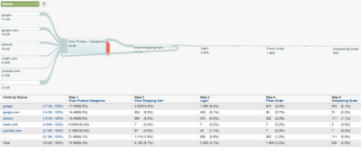
You can find the Goal Flow visualizer in the Conversions > Goals section of the “Standard Reporting Tab.” Goal Flow helps you understand:
- The relative volume of visits to your site by the dimension you choose (e.g. traffic source, campaign, browser)
- The rates at which visitors abandon different pathways
- Where and how visitors navigate each of the steps that you defined
- How the visitors interacted with your site, including backtracking to previous goal steps
You can also apply any advanced segments to a Flow Visualizer. In addition, for those who want to see how visitors arrive at a page (or pages) of interest, they can select that page (or pages) and visualize “backward”. Such “reverse paths” could help site owners identify suboptimal placement of content. Similarly, “forward” paths from a page (or pages) can be visualized to understand most visited pages or to see visitor flow leakages that a site owner might be unaware of.
Pages before and after the node of interest are automatically grouped based on the most common “visitor” flows, and we’re building continued improvements to help group together sensible visitor paths and page nodes.
If you don’t have goals or goal funnels already set up, don’t worry. You can create a new goal or goal funnel from your profile settings and check it out right away - it works backwards on your historical data.
These two views are our first step in tackling flow visualization for visitors through a site, and we look forward to hearing your feedback as all users begin experiencing it in the coming weeks. We’re excited to bring useful and beautiful tools like these to help you understand your site, so stayed tuned for more!
As always, we welcome your input on how we can make Flow Visualization truly useful for you, so let us know in the comments, or send us your thoughts.
Posted by Phil Mui, Google Analytics team
--
Posted By vinoaj to Conversion Room - APAC at 10/19/2011 11:29:00 PM
Reply all
Reply to author
Forward
0 new messages