Logo

Krzysztof Koźmic
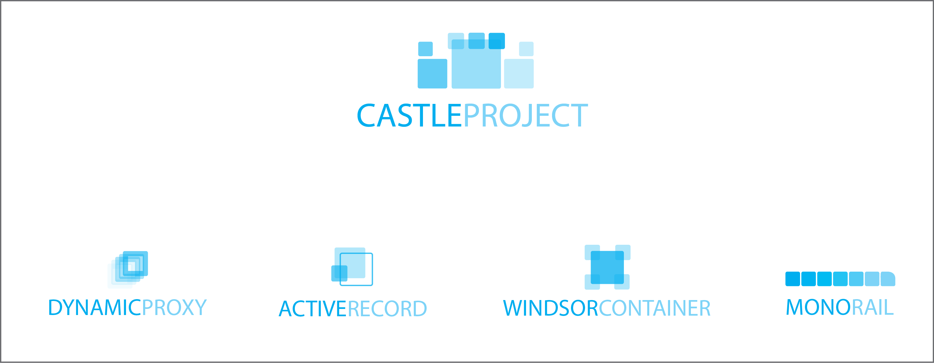
I asked my wife (who is a graphic designer) to have a go at refreshing
logo of Castle project and creating actual logos for our main projects,
and she had a while this weekend, so we sat, I tried to explain what
Castle and each project in turn are all about, and here's what she came
up with.
What do you guys think? She's not terribly happy with AR logo, so that
one could probably see some changes, and colors are not final either,
but have a look and let me know what you think (about the logos and logo
refresh idea).
cheers,
Krzysztof

Jonathon Rossi
I also don't think it is clear enough that the castle logo is actually a castle. I think without the text there wouldn't be too many people who would know what it is was meant to be.
It might also be because at the moment we don't really have logos for the projects, some are just a just a large icon sized photo. So it can take a bit to get used to thinks.
Does your wife have time to throw together a mock up web site template with those type of colours with the logos, if Henry hasn't already organised something.
--
You received this message because you are subscribed to the Google Groups "Castle Project Development List" group.
To post to this group, send email to castle-pro...@googlegroups.com.
To unsubscribe from this group, send email to castle-project-d...@googlegroups.com.
For more options, visit this group at http://groups.google.com/group/castle-project-devel?hl=en.
--
Jono

Rafael Teixeira
---------------------------------------
"We live in a world operated by science and technology. We have also arranged things so that almost no one understands science and technology. This is a prescription for disaster. We might get away with it for a while, but sooner or later this combustible mixture of ignorance and power is going to blow up in our faces."
-Carl Sagan

John Simons
Sorry maybe this is just me but I think MR logo looks too much like a progress bar.
I know this may sound a lot out there, but would it be nice to make the logos kind of lego pieces and make the castle logo with those lego pieces?
Cheers
John
From: Rafael Teixeira <mon...@gmail.com>
To: castle-pro...@googlegroups.com
Sent: Tue, 7 September, 2010 8:14:17 AM
Subject: Re: Logo

hammett
2010/9/6 John Simons <johnsi...@yahoo.com.au>:
--
Cheers,
hammett
http://hammett.castleproject.org/

Daniel Hölbling
Krzysztof Koźmic
+1
sent from my HTC Desire
On 09/09/2010 8:01 AM, "Daniel Hölbling" <tigr...@tigraine.at> wrote:
I'd love it if the MonoRail logo could have it's upper left corner rounded a bit so it resembles a train a bit more.. only a very tiny radius, but it may look cool.ActiveRecord looks a bit too much.. The lower left is a bit too cluttered with 3 layers ontop of each other.. Windsor and DynProxy look totally awesome!
greetings Daniel2010/9/6 Krzysztof Koźmic <krzyszto...@gmail.com>
Hi guys,
>
> I asked my wife (who is a graphic designer) to have a go at refreshing logo of Castle project a...
--> You received this message because you are subscribed to the Google Groups "Castle Project Developm...
--
You received this message because you are subscribed to the Google Groups "Castle Project Develo...

Dru Sellers
hammett
2010/9/10 Dru Sellers <d...@drusellers.com>:
--
Cheers,
hammett
http://hammett.castleproject.org/
Krzysztof Koźmic
hammett
2010/9/10 Krzysztof Koźmic <krzyszto...@gmail.com>:

Henry Conceição
Cheers,
Henry Conceição
2010/9/15 Krzysztof Koźmic <krzyszto...@gmail.com>:

Ron Grabowski
together!
Dru Sellers
-d
hammett

Roelof Blom
On Wednesday, September 15, 2010, Krzysztof Koźmic

Ken Egozi
http://www.kenegozi.com/blog
http://www.delver.com
http://www.musicglue.com
http://www.castleproject.org
http://www.idcc.co.il - הכנס הקהילתי הראשון למפתחי דוטנט - בואו בהמוניכם
Rafael Teixeira
John Simons
Great work Krzysztof's wife.
Cheers
John
Subject: Re: Logo
Daniel Hölbling
> <castle logo pack v2bl.png>
> <castle logo pack v2prpl.png>
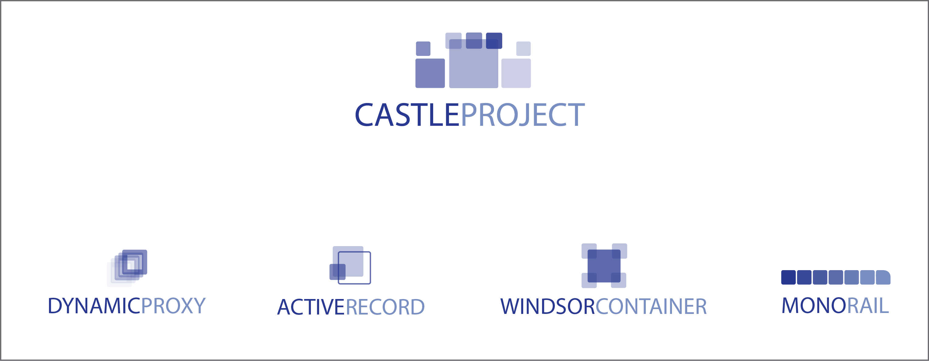
Krzysztof Koźmic
remarks, do we go ahead with using these logos from now on? (this
includes also updating the website etc).
Krzysztof
On 19/09/2010 11:31 PM, Daniel Hölbling wrote:
> +1 on the purple ones.
>
> On 15.09.2010, at 13:50, Krzysztof KoĹşmic<krzyszto...@gmail.com> wrote:
>
>> Here comes slightly updated version.
>>
>> What do you think?
>>
>> Krzysztof
>>
>> On 11/09/2010 2:18 PM, hammett wrote:
>>> By having I mean, could you share them?
>>>
>>> 2010/9/10 Krzysztof KoĹşmic<krzyszto...@gmail.com>:
>>>> That's how they are being created. Only the preview is .png
>>>>
>>>> 2010/9/11 hammett<ham...@gmail.com>
>>>>> Any chance of having those in vector graphics format?
>>>>>
>>>>> 2010/9/10 Dru Sellers<d...@drusellers.com>:
>>>>>> +1
>>>>>>
>>>>>> 2010/9/8 Krzysztof KoĹşmic<krzyszto...@gmail.com>
>>>>>>> +1
>>>>>>>
>>>>>>> sent from my HTC Desire
>>>>>>>
>>>>>>> On 09/09/2010 8:01 AM, "Daniel HĂślbling"<tigr...@tigraine.at> wrote:
>>>>>>>
>>>>>>> I'd love it if the MonoRail logo could have it's upper left corner
>>>>>>> rounded
>>>>>>> a bit so it resembles a train a bit more.. only a very tiny radius, but
>>>>>>> it
>>>>>>> may look cool.
>>>>>>> ActiveRecord looks a bit too much.. The lower left is a bit too
>>>>>>> cluttered
>>>>>>> with 3 layers ontop of each other.. Windsor and DynProxy look totally
>>>>>>> awesome!
>>>>>>> greetings Daniel
>>>>>>>
>>>>>>> 2010/9/6 Krzysztof KoĹşmic<krzyszto...@gmail.com>
Rafael Teixeira
Rafael "Monoman" Teixeira
---------------------------------------
"We live in a world operated by science and technology. We have also arranged things so that almost no one understands science and technology. This is a prescription for disaster. We might get away with it for a while, but sooner or later this combustible mixture of ignorance and power is going to blow up in our faces."
-Carl Sagan
